
Great bones: 133 Molesworth Street
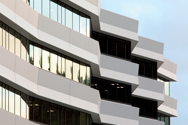
Studio Pacific Architecture’s dynamic design for the western façade of 133 Molesworth Street references the speed of the busy motorway that it overlooks.
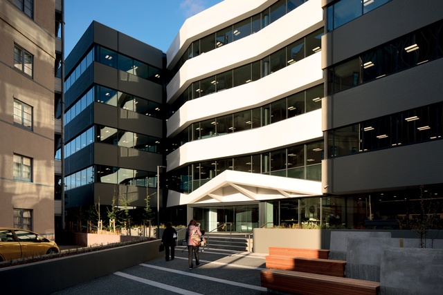
The south-western corner, which now has a more regularised form compared with the orthogonal design of the original building, which featured lots of stepping back to create terraces.

The eastern elevation has been transformed to give the building more street presence on Molesworth Street and to more easily draw visitors to the main entrance.

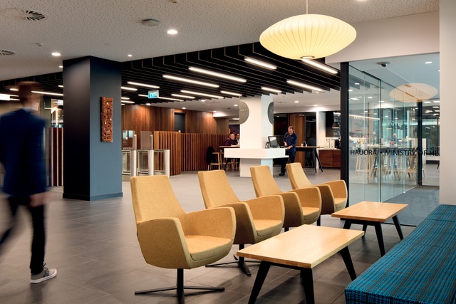
The open-plan foyer, reception and café has a warm and inviting palette of materials.
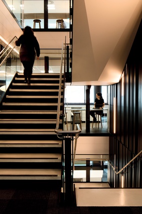
“The focal point of the stairs is a dramatically-lit black backdrop, while adjacent hub spaces were designed, again, to encourage social interaction.”
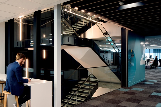
“The main stairs are transparent and designed to encourage people to walk and talk, rather than take the lift.”
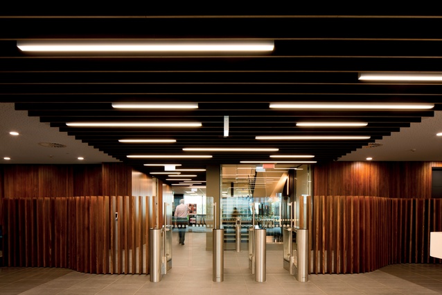
The foyer features slick stainless-steel access scanners.
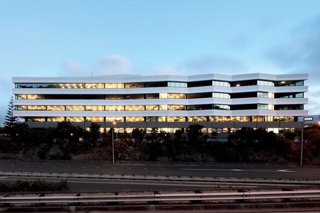
The western elevation of the 96m-long building has overhangs that create shading. From the upper floors, the motorway can hardly be seen.
The original building was named after the first Colonial Architect, William Clayton, who designed the wooden government buildings in Lambton Quay, also.
Studio Pacific Architecture has rebuilt an innovative building in central Wellington that was the first in the world to be constructed using lead-rubber base isolation as earthquake protection.
In Thorndon, Wellington, 1982, the first building in the world was constructed using lead-rubber base isolation for earthquake protection.
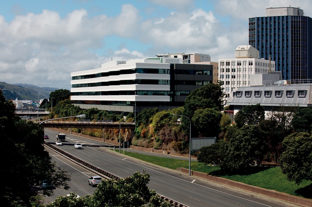
Sited at the northern edge of the capital’s business and government area on the edge of the motorway, the William Clayton Building (for the Government Office Accommodation Board) was designed by Duncan Joiner and team in the Government Architect’s office. It sat on 80 lead-rubber bearings, allowing it to move up to 150mm in any horizontal direction. In 1983, it was awarded an NZIA Local Award and was described by the jurors as a welcome and significant change from the previous overbearing, high-rise development.
Joiner described the original building design as “an integrated spatial, urban design, and structural concept (including seismic base isolation), which developed some well-researched spatial implications of people’s behaviour in work places”. Informed by his PhD studies, the design aimed “to provide each staff member with a unique and identifiable place to work while, at the same time, achieving the spatial connectedness of an open landscape office”.

There were a number of entrances and terraces accessible from the office spaces for informal meetings or individual working on fine days. The low-rise was large but had irregularly-shaped floors to provide a range of open and enclosed spaces with views and daylighting. The sloping roof lean-tos could be extended to make future minor additions if required.
At the time of design, seismic base isolation had been recently developed in New Zealand for a railway viaduct. However, the William Clayton Building was the world’s first use of lead-rubber seismic base isolators in a building. “It is an architectural technology that New Zealand has since given to the world,” stated Joiner.
“But the building was disciplined and adventurous in other respects too – with an internal climate relying on natural ventilation and a solar hot water system, another first for a New Zealand government office building, and hence the large sloping roof on the plant room to support the solar panels. This was, therefore, a significant piece of New Zealand architecture from a number of perspectives, with work culture and technology integrated through architectural design.” Its spatial concept was subsequently adopted in a number of government buildings in different styles and locations around the country.
Given this substantial history, it was no doubt with some trepidation that Wellington firm Studio Pacific Architecture undertook the task of upgrading what is now known as 133 Molesworth Street – for a new owner and a new tenant; both looking for a highly-efficient building. The new tenant’s staff were working across three buildings at the time and needed a more cost-effective way of operating.
The architects started the rebuild with the entire façade removed and just the basic structure intact. They have nearly doubled the lettable floor area, creating 19,700m2 by adding only one floor to what is a 96m-long building. The existing floor plan was deemed inefficient by modern standards, designed from a humanist perspective – however, technologies back then were not what they are today and there were issues with heat gain on the western façade and noise from the adjacent motorway.
Studio Pacific addressed this by adding big overhangs for shading (louvres were considered too expensive) and a modern glazing system that makes the interior amazingly quiet. Blinds are barely needed. The new and reconditioned spandrels were left reasonable high to match the existing structure. Projections on this façade were driven by the architects’ parti idea to echo the speed of the motorway, creating a dynamic surface that also responds to the owner’s desire for a gateway building to the city. A natural consequence are new bay-window effects.

The original entrance, sited on the eastern elevation, lacked street presence and the pathway was labyrinthian, so the architect looked for opportunities to add some sculptural gestures by framing the entry with sculptural panels, pushing out the façade about 7m over the front entrance and adding a strong triangular canopy. By alternating solid and void, black and white, the façade is far more dynamic and, combined with a wider pathway, visitors are easily drawn to the entrance.
The clever base isolation technology was retained but with 40 per cent of the isolators replaced to take account of the heavier building. While, normally, buildings have isolation between the basement and the ground floor, here it sits below the basement, making it far easier for the architects to detail. The owner was keen to go over the seismic code for risk management and to ensure that the building is adequately protected, should the code be updated in the future.
The refurbished building is now 130 per cent of the New Building Standard (NBS) with an IL3 (level of importance for seismic performance), allowing 400mm of ‘rattle space’, instead of the previous 150mm.
Two weeks after staff started moving into the upgraded building, a large earthquake struck Wellington. As if to plan, the building performed really well, and staff from other sites were able to use the building, ‘camping’ here using the hot-desking arrangement, which is designed around activity-based working.
The basement also incorporates a dedicated emergency response room, including satellite phones and related facilities. The building can be powered with an emergency generator for 72 hours. Down here, there is also a small car park, lockers, a generous bike park and – something I’ve only ever seen in surf-lifesaving clubs – a light, warm and well-used drying room, featuring a long line of skylights and dehumidifiers that suck the moisture out of rows of hanging towels and clothes. The tenant is keen to encourage employees to bike, walk, run and exercise, which sets a great example.
The base build was designed by Studio Pacific, while the interior fit-out was done by Telco. On the ground floor, a large foyer includes a very smart café. The main stairs are transparent, designed to encourage people to walk and talk, rather than take the lift. Its focal point is a dramatically-lit black backdrop, while adjacent hub spaces were designed, again, to encourage social interaction. Three cores sit in the middle of the building, each with toilets, kitchens and lockers, and meeting rooms line up along the cores. Staff enjoy 360 degree views of the neighbouring cityscape and the green hills of the town belt.

The architects started this rebuild with what they described as ‘great bones’ to work with and, to their credit, given the constraints, they’ve done a very good job, particularly in the way they’ve created a dynamic façade, reused and recycled old materials and created both functional and enjoyable spaces for staff.
However, the design seems restricted by the requirements of bureaucratic tick-boxing, the expectations on lettable floor area and a limited budget. The owners and city planners appear, also, to have shown little regard for the building’s substantial architectural history and legacy. Could the architects have pushed back at the owner to achieve a more sympathetic transformation of the original design? Perhaps, but would they have retained the job? This project addresses some important industry issues that require greater debate.


