
All the right moves
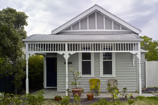
The original frontage of the Melbourne home was retained in the renovation.
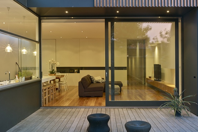
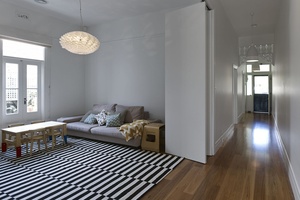
The living room opens on to a new deck.
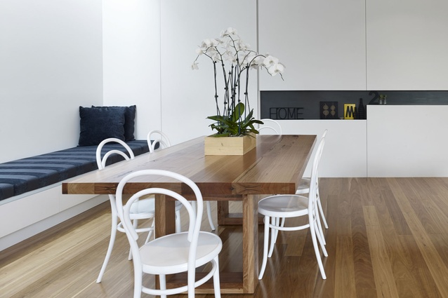
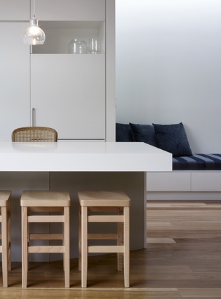
The dining area with a bench seat which has a 5.5-metre-long skylight above it.

Architect Andrew Wilson focused on making the interior a beautiful space.
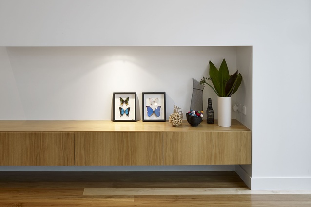
The living room features satin-finished oak cabinetry.
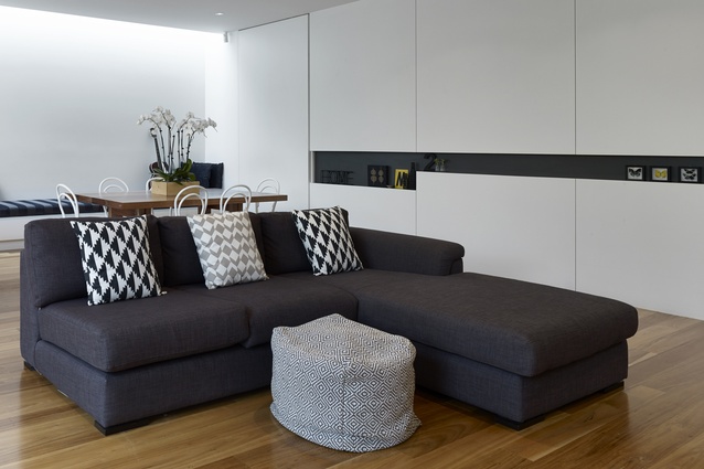
The open-plan dining and living area features a strict palette of white, black, grey and wood.
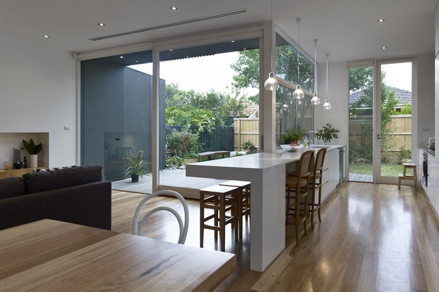
Tallowwood floorboards were installed throughout the house.
The new kitchen features a glass splashback.
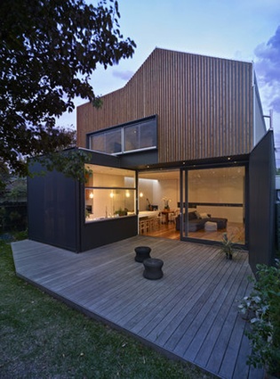
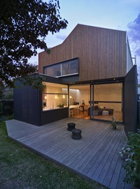
The exterior of the Melbourne home.
When the owners of this three-bedroomed house in the leafy Melbourne suburb of Northcote decided to renovate, they were smart about it. Thirty-somethings Richard and Marigold, along with their two sons, five-year-old Henry and three-year-old Jude, moved out and stayed in a rental property for the 10 months the renovation took to complete. It provided a much-needed buffer from the demolition and construction but, most significantly, it allowed architect Andrew Wilson, director of Melbourne-based Wilson Architecture, free rein.
“I don’t like anaemic interiors,” Wilson says. “So much minimalist architecture is elegant but cold and I try to bring life to things. Making this interior a beautiful space to be in was something I was very focused on.”
Wilson divided the house into three distinct zones and although the front half (consisting of master and guest bedrooms, ensuite, powder room and lounge room) required only minimal refurbishment, the back half of the house received a complete makeover plus a second-storey addition.
His brief from Richard and Marigold, who work in finance and accounting respectively, was simply to create more space. The young family had outgrown the house since moving in five years earlier and needed more room. Achieving a sense of generosity within the existing layout was no easy task. Wilson grappled with a problematic, pre-existing renovation at the back of the house. The dysfunctional jumble of oddly planned rooms, including a third bedroom clumsily tacked onto the kitchen, had created a rabbit-warren-like effect that lacked cohesion and spatial logic. The only solution was to rip out the internal walls throughout the back half of the house and begin with a clean slate. The resulting open-plan space is striking for its modern, elegant simplicity.
“Coming to the end of the hallway and then opening up to the rear was a fairly straightforward thing to do,” says Wilson. “What was critical was the relationship between the kitchen, dining area and laundry room and how they would all work together.”
Neatly aligning these spaces along the north wall provided a compositional spine that is reinforced by the bench seat in the dining area and the 5.5-metre-long skylight above it. The laundry’s ‘secret’ pivot door is a clever detail that hides this service area from view when entertaining.
Wilson shows incredible restraint in his material palette, which allows the Tallowwood floorboards (installed throughout the house) and the living room’s satin-finished oak cabinetry to shine, provide warm accents in an otherwise white space and successfully act as a complementary backdrop to the family’s key pieces of furniture. The niche in the wall along the stair is the renovation’s only structural embellishment, creating playful, visual interest where there could just as easily have been a plain plaster wall. The space’s most resounding design expression is the quality of light.
“Light-filled interiors featuring lots of uniformly sized windows are par for the course these days,” says Wilson.
“But what we have here is a range of openings from large doors to small slot windows and a strip skylight, all placed to enable different characters of light throughout the space.”
A shaft of midday sun dramatically penetrates the dining room in spring, while warm, dappled afternoon light crosses the deck in summer. If all the openings had been the same then this effect could not have been achieved. Wilson also had to mitigate the sun’s harshness because of the rear western aspect and he did so by incorporating a living-room eave and installing an operable external awning, which blocks out 93 per cent of UV light without obstructing visibility.
Wilson’s floor plan had to be very close to the original footprint, which proved cost effective; the budget was reasonable and care had to be exercised when allocating resources. It also meant a second storey had to be added to create more space. Upstairs includes a play area, bathroom and two bedrooms. Planning regulations restricted the height of the addition, so Wilson chose a pitched roof form.
The gable adds dynamic lines and angles to the upstairs interior. From the street, the addition blends in seamlessly with the existing house, while the rear elevation is striking for its stained cypress batten cladding. The contrast with the white of the interior living spaces and the black window and sliding door frames achieves a thoroughly appealing, contemporary aesthetic.
Creating a sense of functionality, especially when the existing interior was so dysfunctional, was at the top of Wilson’s design agenda. That he succeeded in doing so is due in no small part to careful detailing and an intelligent plan that made the most of the existing footprint.


