Beca
Beca House, former home to the Auckland Regional Council. Beca’s tenancy is spread across a number of levels, each of which has a distinctive colour scheme.
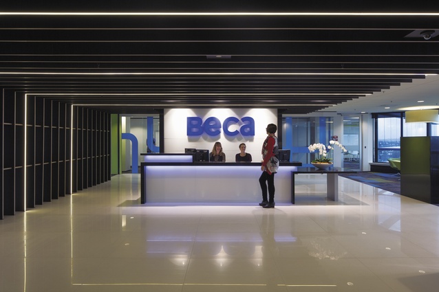
The client reception on level six. There is a smaller check-in reception in the ground-floor lobby of the building.
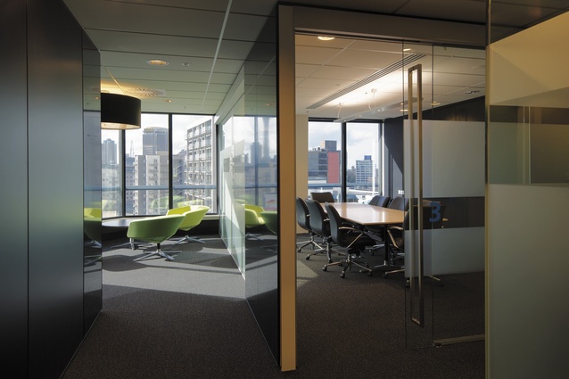
Break-out area seating along the building’s north-western flank and a glimpse into one of the building’s numerous meeting rooms.
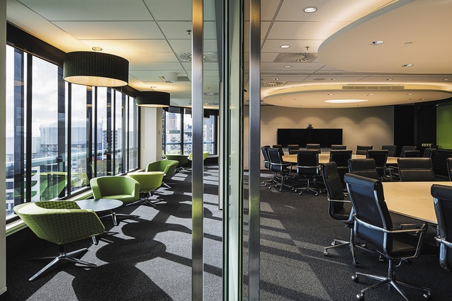
The boardrooms are enclosed by electronically switchable glass and each one features a large, organically-shaped bespoke table, which can be modified to suit the size and privacy requirements of meetings therein.

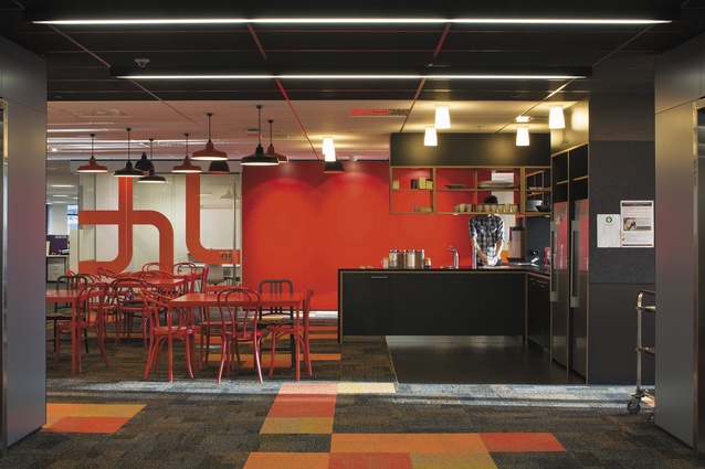
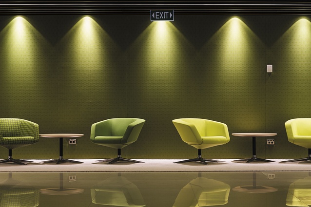
A typical ‘hub’ with cruciform-shaped kitchenette surrounded by a variety of colourful furnishings to create a bright, inviting place for working and socialising. Each floor was given a separate identity through individual colour themes in this central space, with the furniture, light fixtures, and graphics all reflecting the theme.

A studio space for less-formal, meeting-room-based collaboration.
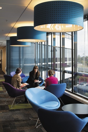
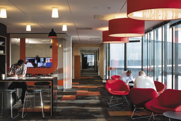
Break-out seating orientated towards natural light and views.
An exposed plywood edge detail was used throughout wall and joinery detailing to give a cohesive and crafted quality to the construction of the fit-out.
While not relying on an industrial aesthetic, the elements allude to an industrial or constructive origin, such as the metal lampshades, abstracted pipework in the glazing film patterns and the expressed construction and jointing of joinery, fins and screens.
Often unseen, but all important, Beca’s white-coated technicians undertake their research and testing in spaces located in the basement car park.
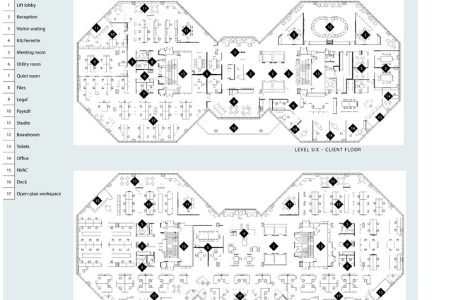
Floor plan.
Ground-level lobby.
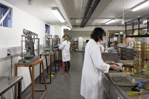
Often unseen, but all important, Beca’s white-coated technicians undertake their research and testing in spaces located in the basement car park.
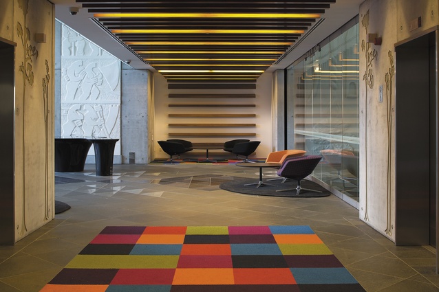
A client waiting area on level six.
Until recently, Beca’s Auckland offices were scattered between three locations. The company’s move into a single building was significant, not just for the logistics and space required for housing 900 staff together physically, but the project – dubbed One Beca – was also about creating a unified Beca mentality and philosophy. The latter, of course, is trickier to do well than is simply succeeding with the layout.
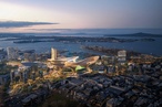
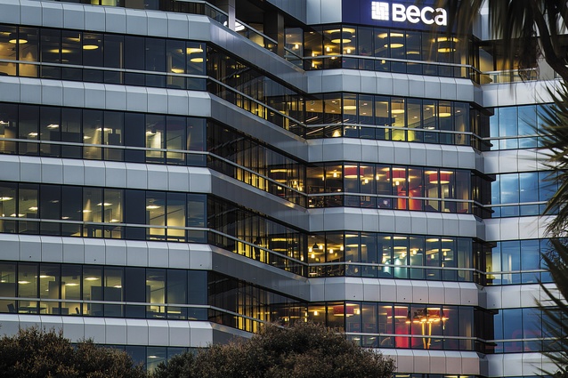
Formerly housing Auckland City Council, the conjoined double-octagon building sits in a slightly in-between part of town: perched over the motorway, just below K Rd, but above the city centre. The ugly building from the outside makes the surprise of the bright, stylish and functional interior that much more impressive.
Designed and implemented by Studio Pacific Architecture, Beca’s offices take up eight floors and over 14,000m2 of floor area, including multiple boardrooms, meeting spaces, break-out spaces, open-plan workspaces and offices.

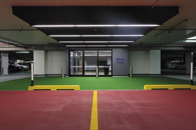
Deciding on a strategic brief from the outset of the process was key to the creation of a strong, simple cohesive idea through the multiple levels of the fit-out. Shauna Heminghouse, project architect, explained it was important to holistically enhance Beca’s engineering and consultancy business and to present a fresh and professional image of its expanding organisation. This was particularly focused on in the first moments of entering, whether in the glass atrium space, which will shortly have a concierge to greet and direct clients, or the visitor car park, which has been colour-coded for ease of use. Even the basement car park, an area usually ignored in even the most obsessive fit-outs, has been edged with laboratories; glass-cabinet-like rooms that create interest in a space generally bereft of personality.
This element of showcasing Beca’s knowledge and expertise was the second key element that has defined much of the fit-out’s focus. Rather than hiding much of what employees do behind closed doors, there has been a considered push to have meetings, libraries and work on show. On the central elevator cores, huge stylised murals of Beca’s projects have been emblazoned, celebrating its work and again, its expertise. In a similar way, a graphic was developed from industrial pipework that has been used throughout in different colours as a screening device on glass panels of meeting rooms.
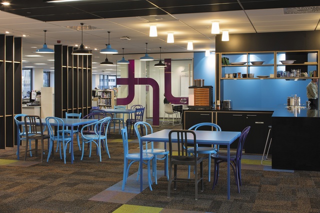
Colour is one of the most noticeable aspects of this fit-out. Each floor is given a separate identity through individual colour themes in this central space, with the furniture, light fixtures, and graphics all reflecting the theme. The colours of the various hub spaces on the floors are even visible from the exterior of the building at night, providing a glimpse into the vibrant heart and buzz of work going on within. Especially due to Beca’s concerted effort to repurpose and reuse a significant amount of desking and chairs from its former offices, the bold colour scheme pulls the spaces together.
On each floor, a central cruciform-shaped kitchenette unit sits like an informal reception to the side of the elevators. By bringing this social space into the centre of the floor, informal interaction is prioritised and actively encouraged. This is actually a hugely significant shift in how to approach a working environment. The fit-out has been designed with distinct zones, which are layered through the plan for individual and team-based working, transitioning into ‘studio’ spaces – open work areas that facilitate collaboration, creative thinking and working. For an engineering-based company to so actively embrace these loose and creative studio spaces, merging social and meeting spaces, is an impressive strategic transformation supporting a range of ways to work.
The kitchenettes are black, against the riot of colour in painted Thonet and Emeco chairs, and the cruciform-shaped kitchens turn on each level so that, again, in a subtle way, there is differentiation on each floor. Each level isn’t a cookie-cutter replica of the one below. As well as durable, black stone, the kitchens use a lot of ply with a black laminate face and an exposed edge. This same detail has been brought throughout the fit-out in many unexpected ways, to create a cohesive, crafted quality to the construction throughout. Ends of wing walls are sheathed in strips of this plywood, desks and shelving in copy stations also use it, and, in particular, in each social area and also in the reception area, a series of plywood fins creates a subtle screen.
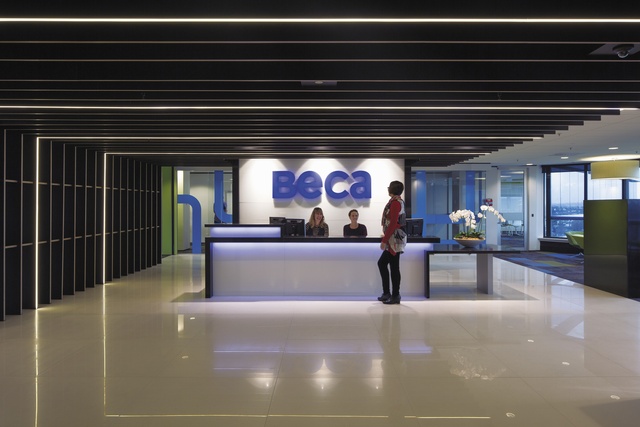
In the reception area, some of the fins have been emphasised with delicate LED strips embedded along the edge. The plywood simultaneously underscores a controlled and clean aesthetic but, being plywood, also offers a slight industrial ruggedness, well suited to this consultancy. Even the location of the reception within the building is unique and simultaneously plays with those elite and egalitarian dichotomies. Located on the sixth floor, at the heart of building, the reception allows impressive views over the city and to the water.
The reception level is also where the large boardrooms are located. Technology has been prioritised throughout this fit-out, but no place more so than in these large meeting spaces where electronically switchable glass, and a suite of AV equipment, and electronic whiteboards are hidden behind brightly coloured panels.
A company’s office environment should be an extension of how it sees itself and how it portrays itself to clients. With a bright, interactive and integrated interior, Beca is showing itself to be a confident and innovative organisation.