
Black triangle: Platform House
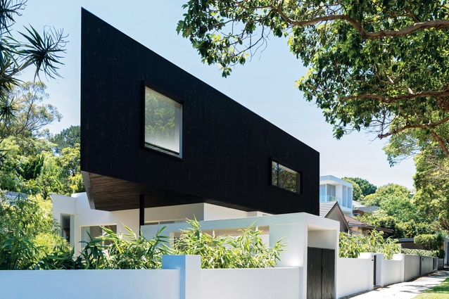
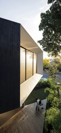
The hard-to-miss triangular form of the extension cantilevers dramatically to the west, supported by a single column.
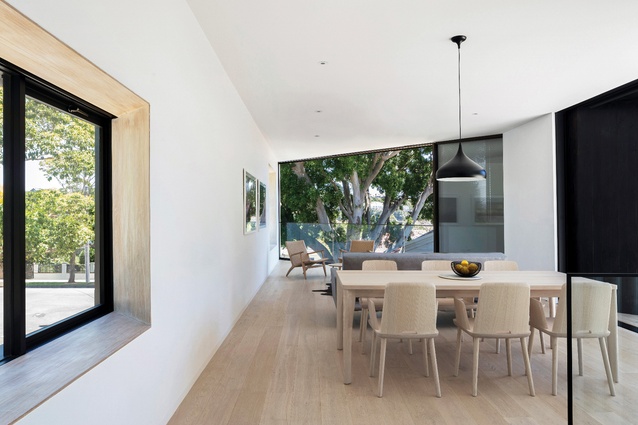
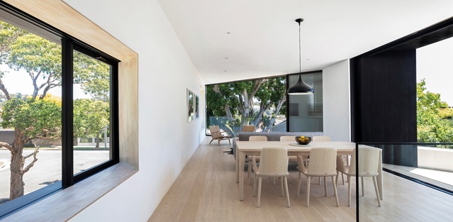
The upper-level volume is punctuated with generous openings that mediate the boundary between inside and outside.
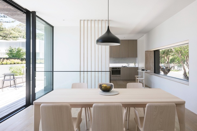
The living spaces feature a pared-back palette of European oak flooring, blackbutt window reveals and clean white walls.
Cypress timber cladding has been charred to a midnight black using the Japanese technique of shou sugi ban .
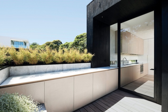
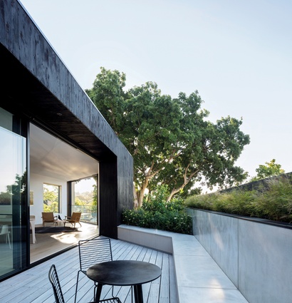
The bright, north-facing deck offers connection to the public sphere and curated views of the leafy surrounds.
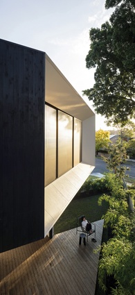
The ground-floor deck provides a quiet, secluded space sheltered by the cantilevered volume’s soffit.
Responding to its tricky triangular block, this house by Studio Plus Three is an inversion of the traditional two-storey home, with a raised platform for living offering panoramic views and a genuine connection to the public realm.
There aren’t too many suburbs across the country that boast convenience and charm quite like Bellevue Hill does. It’s seemingly close to everything – the CBD, schools, public transport, a number of shopping centres – but feels like it’s not. And therein lies its appeal.
This eastern Sydney neighbourhood is leafy and quiet and even has its own patch of natural bushland in the form of Cooper Park. So much of its charm comes from the built environment as well, with heritage buildings peppering the area’s narrow streets alongside modern homes of impressive form and design.
For Studio Plus Three’s clients, Ken and Adeline, it was the perfect place to return with their two young sons, after living and working in Singapore for an extended period of time. Living overseas during the design phase, the couple left directors Simon Rochowski, Julin Ang and Joseph Byrne the clear directive to have fun with it. Having this type of free rein proved advantageous because this site is about as challenging as they come.
The site, originally a square-shaped corner block, had previously been subdivided on a forty-five-degree angle, leaving two modest triangular sites. Ken and Adeline’s three-bedroom, single-storey home had no discernible outlook or relationship to the outdoors, a lack of natural light and compromised spatiality. The only way to reconcile these issues was to add a first-floor volume.
“We could have spent a lot of money trying to achieve those things on the ground level,” says Simon. “But we realized that if we actually inverted that idea, and put all the living and social spaces upstairs and all the private spaces downstairs, we’d get a much better, albeit slightly out of the ordinary, result.”
The addition is nothing short of outstanding: a brilliantly bold, rigorously conceptualized structure that takes the limitations of the site’s shape and makes them a feature of the house.
The hard-to-miss triangular form cantilevers dramatically to the west, supported by a single column, making its expression all the more impressive. It was important that the cladding be lightweight and so Simon and Julin applied cypress timber, charring it to a midnight black using the ancient Japanese technique of shou sugi ban.

Engineering aside, the dark exterior also serves to heighten the lightness of the interior. As Julin explains, “We wanted there to be a contrast between the inner and outer parts of the volume so that when it’s cut away, the light beneath the dark is revealed.”
It’s an idea that had its origins in the playful concept of a coconut and manifests in pared-back, open-plan kitchen, dining and lounge spaces finished with pale European oak flooring, blackbutt window reveals and clean white walls. These elevated living areas are undeniably light and airy. But most importantly, they provide the connection to the outdoors that the clients desired. With each side of the volume punctuated by generous openings, the boundary between inside and outside is cohesively mediated.
“It was this connection to the natural environment that we really wanted to achieve, so each of the openings addresses a specific tree,” notes Simon. “We were also trying to get a sense of the surrounding greenery going all the way through the house.”
The western aspect’s large Moreton Bay fig tree feels like part of the interior, framed perfectly as it is by a full-height window, which provides views to the CBD and adjacent roads below. Yet it is problematic in also letting in unfiltered western sun and not providing any privacy from Ken and Adeline’s closest neighbour. A bespoke patterned metal sliding screen elegantly resolves these issues in one gesture, even allowing dappled light to dance around the interior when drawn.
This is a truly social home that has a nuanced dialogue with the public sphere, unlike so many Sydney houses that are closed to the street. In this respect, the design is influenced by Simon and Julin’s time spent in Holland, where every home has a very open relationship with the street. Such openness is best expressed in the north-facing deck, which borrows outdoor space to make the interior seem larger than it is.
The architects looked to Katsura Imperial Villa in Kyoto for inspiration and in many ways this deck is like a pavilion in an expansive garden because of the leafy outlook. It’s also logical in plan, with openings from the dining area and kitchen providing an easy circulation path.
In displaying a careful attention to detail, the angle of the bench seat (as well as the internal window reveals) echoes the forty-five-degree cut of the site, ensuring that the upper level’s triangular form is no mere gimmick. This area is one of two new outdoor settings that Studio Plus Three seamlessly incorporated into the scheme. And it contrasts nicely with the ground-floor deck, a more secluded space sheltered by the cantilevered volume’s soffit and accessible via both boys’ bedrooms.
Only minor updates and some reconfiguration were needed downstairs, making way for a fourth bedroom, closet and ensuite and a staircase that’s bathed in plenty of natural light from the upper level. This is architecture that pursues simplicity through meticulously articulated planning and sophisticated yet rational design. Its unwavering respect for context and a strong connection to the landscape is its ultimate success, allowing this house to finally breathe.
This article first appeared on architectureau.com.


