
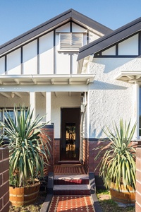
Calm simplicity: Marrickville House
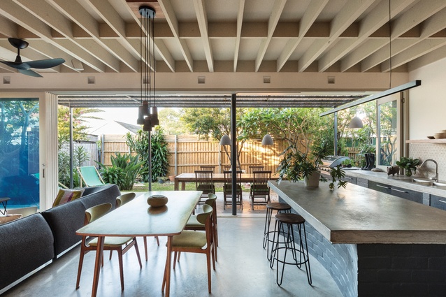
The kitchen and living area extend into the garden, making the most of the northern light.
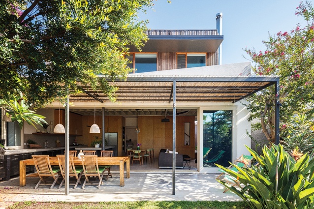
Cedar cladding left to weather and grey softens the boxiness of the first-storey addition.

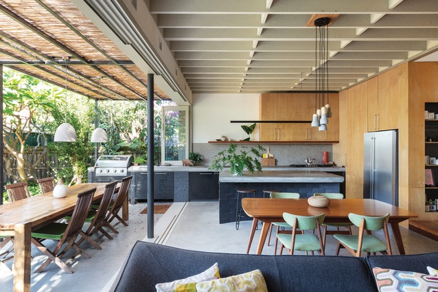
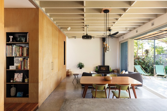
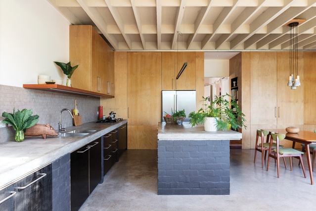
A money-saving strategy to expose structural beams provides depth and rhythm to the room.
A concrete island bench, cast in situ, sits atop painted bricks, curved to allow for seating.

Hoop pine ply cupboards and solid blackbutt shelving bring warmth to the kitchen.

The original house’s hallway was realigned to allow for a sightline from front to rear.
This efficient and effective extension by MI Architects makes the most of a fast-track approval process, unpretentious materials and a simple form to meet the clients’ brief and budget.
Simplicity can go a long way in architecture. This house in Marrickville, Sydney is a 1930s brick villa that had a simple lean-to at the rear. Now the lean-to is gone and a two-storey addition accommodates an open-plan kitchen and living area that extends into the garden, with a main bedroom and ensuite upstairs. It is a simple solution designed to create more living space and a parents’ retreat while keeping the budget as low as possible.
Andrew Macdonald of MI Architects designed the extension for his good friends and their two teenage foster children, taking advantage of the width of the site and its north-facing aspect. The addition is at the rear of the house, where the living spaces and parents’ retreat connect to the garden and enjoy the benefits of northern light.

“It’s a very simple diagram. It’s basically a box on a box,” Andrew says. “Nothing too fancy or clever for clever’s sake – all in order to keep the budget down.”
The building was approved through a fast-track approval process, with a Complying Development Certificate (CDC), which meant the envelope of the building was prescribed. Because the western wall of the ground-level addition is set at 900 millimetres from the boundary, its height could reach 4.5 metres. The fresh white lower volume maximizes this height in the north-west corner, gradually declining toward the north-east and south-west corners and breaking down the appearance of “a box on a box.”
This volume is clad in a lightweight external insulated wallboard that reduces the amount of structural steel required given the span of glass doors. The rendered finish extends over the parapet with a proprietary capless system that eliminates the need for traditional metal capping, creating a clean, crisp edge that stands out against the upper level and sky.
To meet CDC requirements, the first-storey addition is set in from the ground floor and its eastern wall, which is closer to the boundary, and steps in again to bring natural light into the bedroom. It is composed of the same insulated wallboard on a bulk-insulated timber frame to avoid the lightweight volume “cooking in summer.” Cedar cladding left to weather and grey is low maintenance and visually softens its boxiness.
The ground floor of the addition contains the kitchen, with an island bench, dining area and lounge facing a fireplace – the only heating system in the house. Exposing the structural beams of the ceiling (painted, laminated veneer lumber) was a money-saving strategy that has provided depth, dimension and rhythm to the room.

The kitchen bench extends along and beyond the length of the eastern wall, with the window pivoting open to create an uninterrupted, all-weather kitchen. Cast in situ, the concrete benches sit atop painted brick supports and black formply cupboards, and the brick front of the island has a concave curve to allow for seating.
Matt grey triangular mosaic tiles on the splashback look like etched concrete and the solid blackbutt timber shelves, with LED lighting underneath, add warm detail to the kitchen. BB hoop pine plywood stretches along the southern wall, concealing a large pantry next to the kitchen and a laundry under the stairs as well as providing shelving that frames the transition between the original house and the new extension.
Stacking the large timber-framed sliding glass doors opens the interior to the barbecue and outdoor dining area and burnished concrete flooring provides thermal mass in both spaces. Overhead, a clear corrugated polycarbonate canopy with UV protection provides shelter from the sun and rain and bamboo screens add texture and shade.
In the south-west corner, a side door provides a second entrance/exit to the house and a spotted gum staircase leads to the parents’ retreat upstairs. Accommodating the main bedroom, ensuite and potential study, the retreat is spacious and private, with views over the garden.
Clerestory windows allow natural light into the bedroom and draw hot air out of the house, and windows on both sides of the ensuite allow for cross-ventilation. Terrazzo tiles on the floor and walls of the ensuite add texture and detail, and the blackbutt trim and shelf bring warmth. Hoop pine plywood and black formply are repeated upstairs in the cupboards and drawers.
Back downstairs there are three bedrooms, a bathroom, a study and a music room in the original house. Little work was done here, other than realigning the hallway so as to enlarge the bathroom and allow direct passage and a sightline from the front of the house to the rear.
Using a fast approval process, unpretentious materials and a clear diagram to keep the form simple, Andrew has delivered an effective extension that meets the clients’ brief and budget. “It’s the most straightforward job we’ve done in a while and I’m really proud of the simplicity,” he says. “It feels calm and garners a positive response from those who visit.”
This article was first published in ArchitectureAU.com.


