Dutch courage
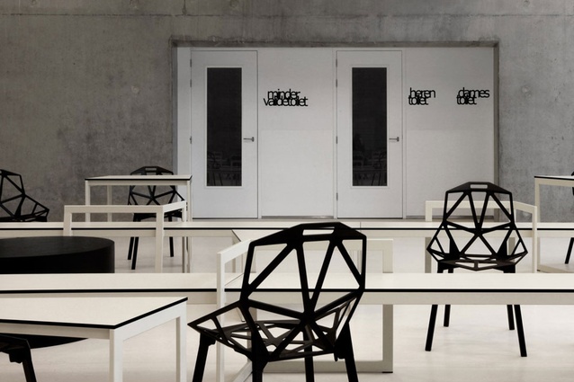
Panta Rhei School, in The Netherlands. The interior features a number of multi-purpose spaces.
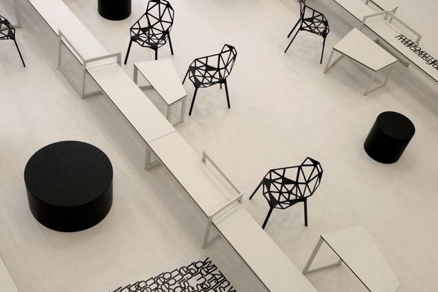
The designers say Konstantin Grcic’s Magis One chair was chosen because it matches the “technical aura” – urges students to think about the design and production process. The furniture is made to measure; the tables are designed in asymmetrical, angular shapes, which allow them to be linked in square, circular or star-shaped configurations.
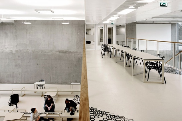
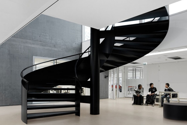
The school’s impressive circular stair.
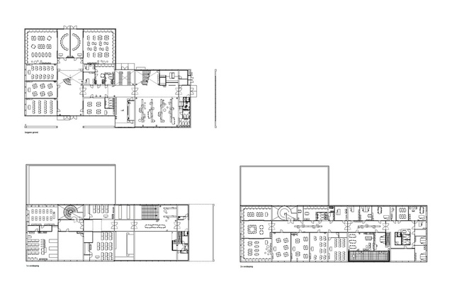
Panta Rhei, floor plans. Top left is ground; bottom left, level one; bottom right, level 2.
Gummo, an independent, full-service advertising agency in Amsterdam, was only going to be renting this office space for two years. The designers convinced it to embrace the mantra of “reduce, reuse, recycle” to create a stylish office that would impact as little as possible on the environment or the agency’s wallets.
Thanks to a coating of Krimpex, everything in the office conforms to the house style of white and grey. All the furniture was locally sourced via Marktplaats (the Dutch Trade Me or eBay), charity shops and whatever was left over at the old office.

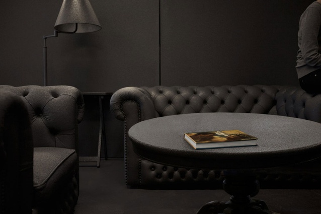
Herengracht, a gold-and-silver-appointed “power office” for an investment group.
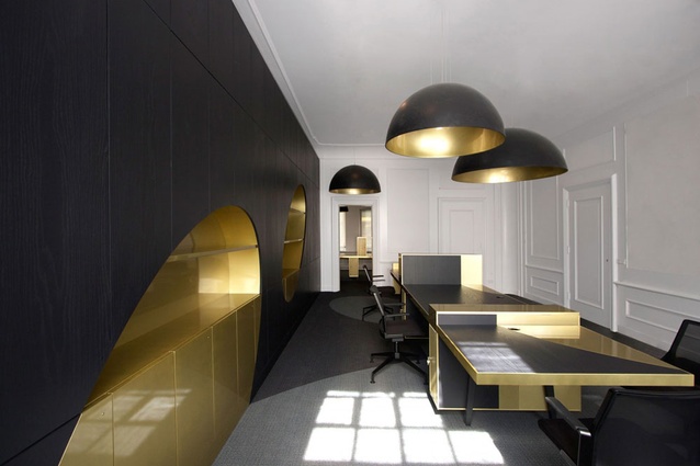
Herengracht office. “Golden and silver ovals shatter through the spaces like golden coins,” say the designers. Large round lampshades, spray-painted gold on the inside, seem to cast light and shadow oval marks throughout the whole space.
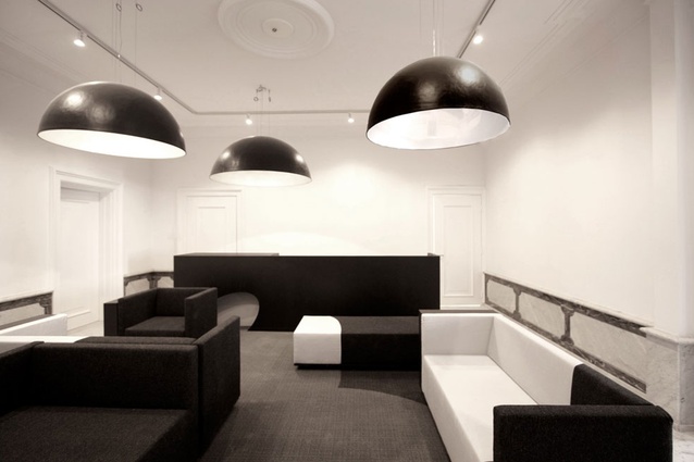
Herengracht office. All the interior’s existing ornaments and details are painted white.
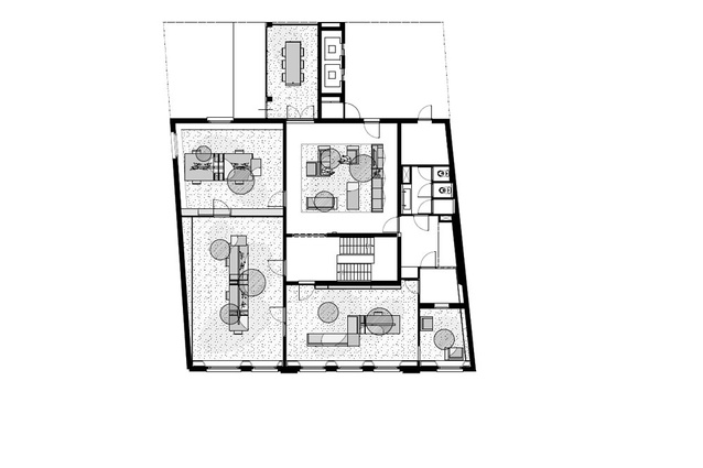
Herengracht office layout plan.
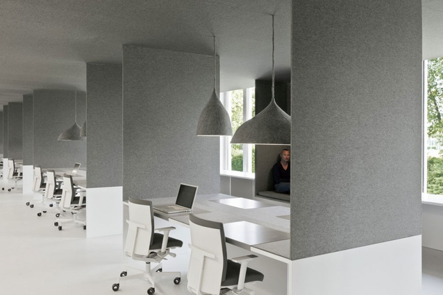
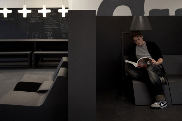
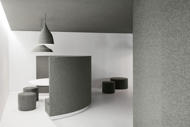
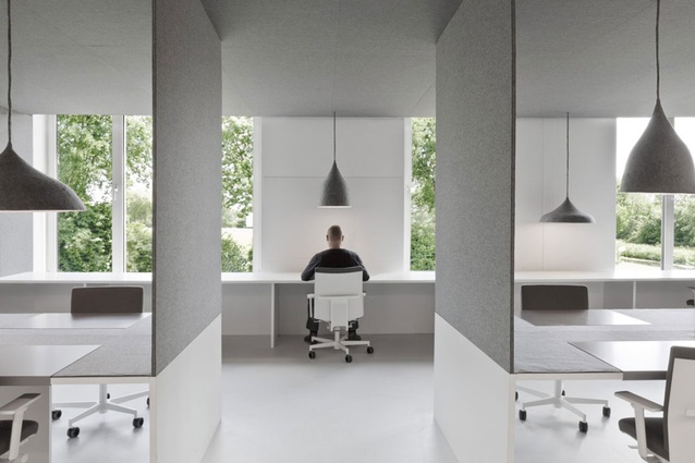
Felt on the ceilings, felt on the walls… on the lampshades, desks, ottomans and seats. At Tribal DDB, Amsterdam, a project that won the designers the 2011 Great Indoors Award, the acoustic properties of felt were clearly embraced. The material, say the designers, was also selected to hide any scars to the envelope of the building.
The designers say the concept for Tribal DDB, Amsterdam, had to friendly and playful but also professional and serious. i29 searched for solutions to various problems which could be addressed by one grand gesture.
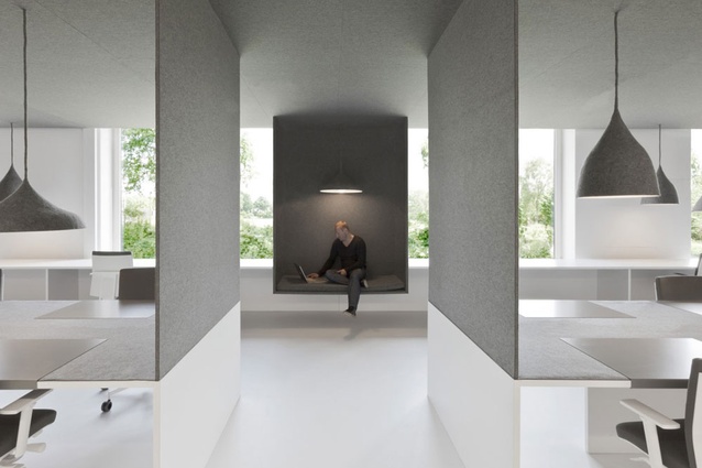
A niche break-out space at Tribal DDB, Amsterdam.
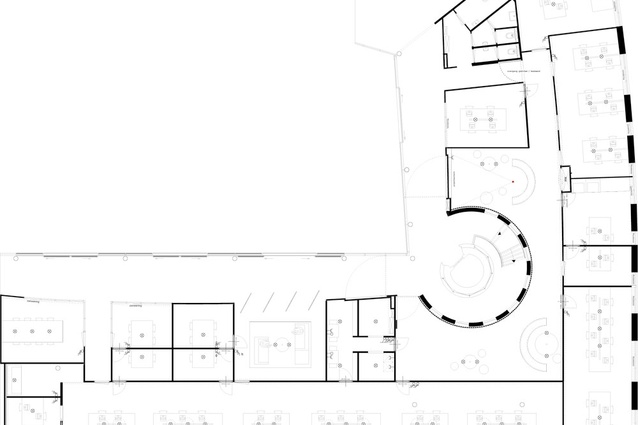
Tribal DDB, layout plan.
Grey felt never looked so good – Tribal DDB, Amsterdam.
Grey doesn’t have to mean boring and monochromes can be more than cool. Interior’s roving European correspondent, Simon Bush-King, catches up with Amsterdam’s i29, a winner at this year's Great Indoors Awards.
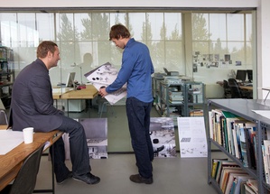
I29, a small Amsterdam-based firm of interior architects, has over the last few years developed a number of strong, clearly executed interiors with the ability to surprise. Founders Jasper Jansen and Jeroen Dellensen have a portfolio of work with a consistently minimalist appearance, an approach so favoured over the last decade for its ability to be all things to all people. However, it is i29’s all-encompassing manner, the way in which they confront a project, their continual refinement of problems down to a productive core and their graphic eye that gives their work a strong identity that retains the ability to surprise – not despite of its often minimalist appearance, but because of it.
At first glance many of their projects appear too good to be true – that once complete and with the magazine photographs taken, the clarity and cleanness that defined the space would breakdown. Coffee spills, health and safety posters, and pictures of people’s cats on desks would overwhelm, consigning the project to a long list of good looking photographs unable to deal with the messiness and unpredictability of regular life.
The grey felt, mono-clad offices of advertising agency Tribal DDB in Amsterdam, or Panta Rhei, a school with a black and white interior, are two projects that immediately beg such questions. I29, however, have honed an approach that seeks to combine their brief and pragmatics with a focus to make clear, legible spaces. Strategies that combine functions and maximise space, or where materials can fulfil wide performance criteria are sought after. This manner of working, while being inherently reductionist in approach, is through careful research and a close relationship with the client a very deliberate method where little is left to chance. An eye for a convincing graphic or opportunities to exploit identity are further tools in the design arsenal of i29 that reinforce their approach but are not substitutes for it.
Jansen and Dellensen began their practice building what they designed. As Jansen puts it, “We started with putting a lot of boxes in houses,” referring to the small interventions in existing Dutch houses that fuelled their early work. This experience taught them not only the importance of buildability in achieving a simple, clean result but also the value of building strategies – designing details and methods of construction that are economical and have the flexibility to work in a range of situations.
In the early years this manifested in finding ways to work with the existing fabric of old Dutch houses, while more recently in how to become inventive with material use and repetitive details on larger projects and tight budgets. The big move, or the unifying gesture, is a tactic many designers try to employ but it’s one in which Dutch designers are strongly identified – taking a single, strong element and using it as a creative catalyst for the project. If one were to paint in cultural generalisations, the conceptual melding of frugality, simplicity and practicality are an easy fit with a Dutch culture known for its practical approach to problems, simplicity in solutions and eye of a bargain. I29 attempts this with every project, trying to find a common element through which they design.
I29’s first foray into working with advertisers was with the Amsterdam-based Gummo. Taking their name from a Marx brother, Gummo aspires to project a playful professionalism to their work and appreciates a bold gesture. I29’s response was to recycle Gummo’s old furniture, while sourcing more from the Dutch equivalent of Trade Me. A short-term lease of the building encouraged a recycled approach that could be reconfigured in a new location. The furniture, along with the floor and walls, was painted in dark grey polyurea, a material more commonly found on the back of trucks, but perfect as a flexible 2–4 mm coating for the wide range of furniture. Gummo liked the grey so much it incoroprated it into its in-house style, as Dellensen puts it, “We advertised for them.”
The hot spray coating was solvent-free with sustainable credentials that matched the green aspirations of Gummo and the reuse, reduce, recycle mantra of the project. The furniture was arranged in grey bands of workspaces, meeting areas and social areas, while the building shell was left painted but untouched. By understanding the client’s desire for a strong image and accepting the short-term lease as a positive opportunity, i29 delivered an unexpected solution that won The Great Indoors Award in 2009.
The job to create a studio for Tribal DDB’s Amsterdam offices (winner a Great Indoors Award 2011) was unrelated to their work for Gummo, yet the execution was similarly inventive and singular. This time the desire of the ad agency for a creative reflection of their brand remained. Joining this, was a desire for multiple work areas constructed within a historic building, and a view to mitigate the worst aspects of open plan. Bring on the grey felt. Used in a similar manner to the grey hot spray in Gummo’s offices, the felt solved a different set of problems but with the same unifying result. The felt was sound-absorbent, strong enough to use across surfaces, and flexible enough to deal with a building shell that, like many older Dutch buildings, had few straight edges or consistent levels. I29 often work in collaboration with architects who, along with their clients, respect what they bring to the table.
“We are fresh blood,” says Dellensen referring to the fact that they often get involved at later stages of a project and bring an enthusiasm that the other parties may have lost over a long building process. Although they enjoy getting involved at any stage of a project and appreciate the benefits of being part of the team from day one – it is also testament to i29’s desire to turn the facts of the project as they receive it into an opportunity. Jansen and Dellensen are happy to work with what they have; creating out of the mix of desires, budgets and briefs, work that is playful, clear and resolved.