
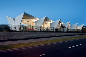
Fantails, Silverdale
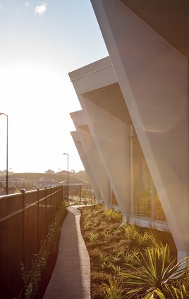
The roof form was conceived to appear as the abstraction of a fantail’s striking, splayed tail, when viewed from the southern road side and facing the main entrance.
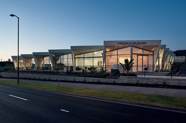
The roof form was conceived to appear as the abstraction of a fantail’s striking, splayed tail, when viewed from the southern road side and facing the main entrance.
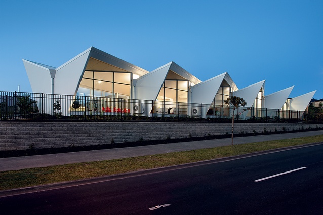
At opposite corners of its triangular plan, the form appears like overlapping sails: a fitting tribute to its location within the City of Sails.
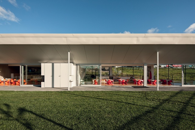
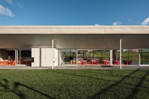
On the northern side of the site, classrooms open up into a landscaped children’s play area.
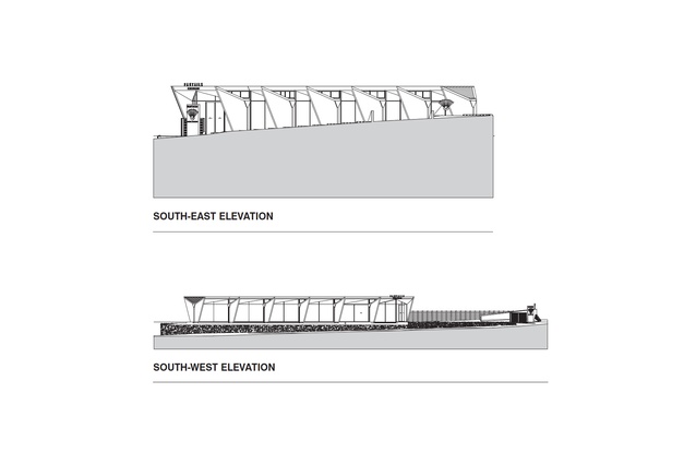
South east and west elevation.
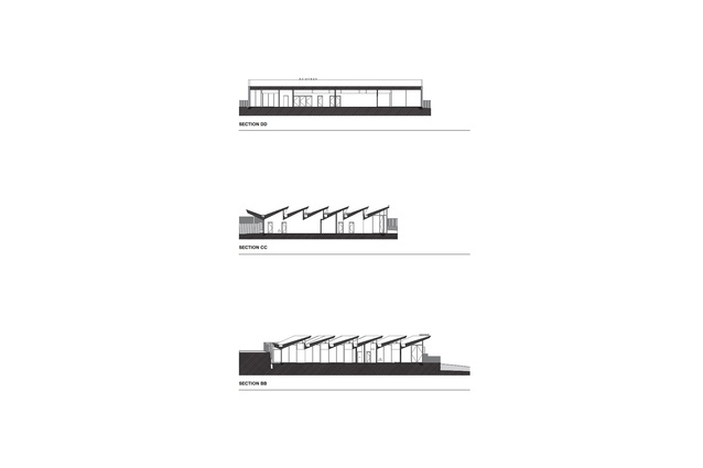
Section DD, CC and BB.
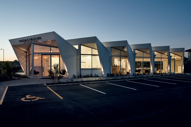
Sited on a prominent site within the burgeoning North Shore suburb of Silverdale, the Fantails building was intentionally designed to be a bold atypical statement, standing out among the neighbouring houses and commercial buildings.
Silverdale’s Sydney Opera House, I muse, hopefully, squinting furiously into the bright North Shore sun, overcome, you might suggest, by the higher levels of oxygen in this burgeoning Auckland suburb. The architect, Phil Smith, more humble, opts for a hint of sawtoothed warehouse.
Good call. I might toss in carapace, concertina or accordion, although Smith’s on record as favouring overlapping sails or an abstraction of a fantail’s tail. I detect a whiff of post-rationalisation about that last one, but you can’t dispute the triangularity, the layers and the folds, of this rhythmic and intriguing building.
So there we were, standing outside, contemplating the angularity, me trying to figure out how it all fits together, architect Phil Smith happily discussing the popularity of his project with client Jan Kiers. At the very least, this project is a great example of architecture as an advertisement – here, in Silverdale, client and architect have created a local landmark in a building typology more commonly associated with the relentless imposition of cheerfulness than it is with inventiveness. Unsurprisingly, it’s filling up fast.
Smith is the New Zealand arm of Collingridge And Smith Architects (CASA) based in Auckland. His business partner, Graham Collingridge, handles British affairs out of Stavely, Cumbria, in the north-west of England. Together, they trump the tyranny of distance with a smattering of easily accessible technology. Smith, to continue the biographical detail, has experience in firms large and small. He has interesting stories to impart about his time working at Norman Foster, but the novelty of working in an 800 to 1,000-strong firm eventually wore off and it was to New Zealand he came, where, in an interesting turn of events, he has carved a niche in a sector where few architects seem to work – early childhood education.
In one of those rare moments of architectural déjà vu, Smith had prior history on this 2,000m2 site. His first scheme, for another client, was L-shaped. It reached resource consent before becoming undone by a developer going bust. An L-shaped plan would have worked on this site but Smith’s new client wanted to avoid a narrow strip of play space down one side of the building, which would have been the result.
Smith would agree that it seems a bit mad to design a building with a triangular footprint, with all the inherent complexities that go along with it. On this site, it was undertaken to solve the riddle of space. Or, in other words, it was the client’s idea.
“It was actually the client that said, ‘Can we do a triangle?’” says Smith. “My first reaction was, ‘Oh god, not a triangle’. You know, how do you deal with a triangle? You can’t just do a standard roof form, you’ve got this awkward shape to deal with that makes the inside messy… but then I recalled a precedent in England: some classroom extensions I saw years ago and they really stuck in my head. “So I started playing around with this triangle, drawing things across it and looking at different forms and suddenly this idea came through and I thought, ‘Ah’. I started pulling it around. First of all, I faced all the closed profiles the other way but it didn’t work because they all slotted into each other: it’s got to be expanding and we were doing it the opposite way and it was recessing, so we ended up with these weird spaces at the end. It took me about a day, sitting there playing with it, until I finally got to the point where I flipped it around and then, suddenly, everything dropped into place.”
In reading the results of that game of pushme-pullme, you see a series of wedge-shaped concrete piers aligned north to south, with glazed panel inserts on an oblique angle in between. Monopitched roof forms, whose angles work well with the surrounding sea of tiled roofs, glide across unit widths of 3.6m. One unit connects with the next at a glazed perpendicular intersection, which allows natural light to softly wash through the depth of the interior.
At the building’s longest edge, on the northern side, the monopitched roof becomes dovetailed, and it kicks up and out as a shelter for the play space. On this side, the landscape is organised so that children with least mobility have the narrow end of the wedge. Older children have the luxury of space and, in their area, you’ll find a clever fort atop undulating ground and a narrow concrete path that leads onto an adventure-filled meander across a bridge-over-water feature, almost right around to the main entranceway.
Once inside, things start off compact. The reception is in an apex at the southernmost corner. Here, the reception desk is on theme, as in angular, and just past this you encounter a small corridor that leads you past a kitchen with plentiful natural ventilation and on to an intersection with the circulation spine of the building, which runs east to west. This corridor is reasonably tight but adequate for the numbers of children who access each of the four rooms.
These kids’ rooms, although muted in colour, are easily identifiable via vibrant seating. The rest of the furniture, walls, floors and ceilings are muted in tone. The reason for this subdued palette is that children, simply by being children, tend to be colourful enough; this environment, with its painted walls of simple white, and taupe-coloured acoustic textile-clad walls, recognises this. Almost all the furniture and joinery has a natural timber finish, and woollen carpets were chosen for both health reasons and their ability to wear well.
Smith has completed childcare centres in Kawakawa, Epsom, Beach Haven, Papamoa, Mangere, Henderson, Mt Wellington, Albany and Hamilton. His Kawakawa project, now a 6 Green Star-rated project, disproved the notion that you have to be from ‘here’ to successfully undertake projects with cultural imperatives. With respect to functionality, the architect says that, after each job he completes, he looks for feedback on ways that he can improve functionality. He has developed suites of interchangeable furniture, worked on ways to improve nappy-changing stations and designed into cabinetry things that would normally be attached to walls, such as gloves, wipes and soap. The lavatories, equally, are cleverly refined, with half-sized stalls and neat, trough-like sinks with full-width mirrors behind.
On these projects, Smith has bent, buried, stacked and folded exterior forms. At the same time, he’s found ways to maintain the simplicity or purity of the key concept. In his own way, this architect seems to be quietly reworking a typology without ever resorting to a ‘type’ of building.


