Future of Design: Seeing is believing
ArchitectureNow’s Future of Design series explores the changing face of technology in the architecture, engineering and design disciplines. In this second iteration, Maria Mingallon, who is the Advanced Computational Design Lead at Mott MacDonald, explores why data visualisation is a crucial skill for contemporary designers.
Data is the new black. Data is trending topic anywhere you go. It is such a nice buzzword; we all love using it. Every day we create 2.5 quintillion bytes of data globally. In accordance with Domo’s Data Never Sleeps reports, by 2020 each of us will generate 1.7 megabytes of data every second. That would be more than 140 gigabytes in a single day.
The figures are already mind blowing, and predictions by the above source indicate that they are only going to grow. However, even more impressive are the visualisations, insights and predictions we can obtain from well curated data. In this article, we will explore a few of the many avenues we, as designers, have for leveraging the power of our own design datasets.
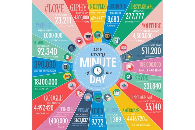
Figure 1: How much data is generated every minute? Source: Domo
Data is abundant, particularly in the times we live in. Its abundance means that most datasets are actually quite large and convoluted and not easily analysed by the human brain. We crave data, but we like it only when it is served on a nicely curated plate so we can digest it easily.
Data visualisation helps us detect patterns, trends, and outliers which may otherwise go unnoticed. Good visualizations place meaning into complicated datasets so that their message is clear and concise. They are also instrumental to any decision-making support tools you intend to build, including those that use machine learning. Figure 2 provides a high level overview of the mechanisms to transform raw data into intelligence, which can support decision making.
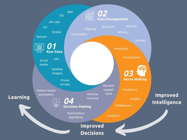
Figure 2: The workflow of data; from raw data to building tools for decision making. Source: Mott MacDonald
Before we jump into machine learning (which I plan to do in future articles of this series), I think it is important we discuss the benefits of using data visualisation in our work as designers. Data visualisation is a huge topic, which probably merits a handful of articles on its own. But, because we are designers and we work with 3D models of reality and proposed scenarios every day, the angle I am going to give this article is very different from what you might normally see on data visualisation blogs such as dataviz.com. I would recommend diving in to those with a full immersion mindset.
Unlike other professions, our work as designers normally requires us to construct physical and digital models of real and proposed scenarios to communicate our ideas to clients. This is an important differentiator in that data visualisation for designers is almost always (or should be) linked to three-dimensional, object-oriented, model-based technologies. Hang on, isn’t that what Building Information Modelling (BIM) is all about? While most people still confuse BIM with some sort of glorified 3D Computer Aided Design, the American Institute of Architects defines it as “a digital, three-dimensional model linked to a database of project information”, and considers it one of the most powerful tools supporting Integrated Project Delivery.
The ability to work with complex databases linked to three-dimensional models is an essential skill of a data-minded designer, and it opens up the opportunity to create powerful data visualisation tools like no other profession can. This is particularly relevant when we are dealing with complex analysis tasks, the results of which we plan to use to support the recommendations we are offering our clients.
Let me give you a few examples. Imagine you are designing a plaza, a park, or a community garden for the next residential/commercial development in Auckland. A key environmental aspect to consider, in particular in the ‘city of sails’, would be wind. How windy would it be and how comfortable would it be to walk, sit and stay in these areas?
High rise buildings can introduce high ground-level wind speeds, which can lead to uncomfortable and even dangerous conditions for people. To avoid unfavourable wind conditions, many urban authorities require these effects to be studied as part of their design process, one way to do this is with computational fluid dynamics (CFD).
In simple terms, CFD studies the behaviour of fluid flows: think about a race car or a plane as it moves through the air. CFD simulates how the particles will displace as the solid moves through them. You would think that the main purpose of CFD tools would then be to simplify the lives of those whose are interpreting the results. Far from ideal, traditional CFD tools struggle to connect with decision makers because they involve simulations which are computationally very expensive to run and produce visualisations that still require an expert to interpret.
Luckily, open source CFD tools such as OpenFoam and ParaView are in vogue among state-of-the-art building engineering scientists Tom Moyle and Neil Mackenzie who have paired the tool with their own Python scripts to power up the simulation runs and custom tune the visualisation of results.
OpenFoam is a free, open source, CFD analysis software. Its novelty is that it can be easily paired with online solver SimScale, taking full advantage of today’s multi-core processors and multi-processor cloud computing technology. In simple terms, this means that you can batch run several CFD simulations online via a remote machine from just a few lines of code. We can even connect directly to various GIS data sources via API calls to bring in terrain, buildings and meteorological data, streamlining the generation of 3D models for each of the scenarios we would like to test. Powerful, isn’t it?
Figure 3: Visualisation of pedestrian comfort in an urban environment using OpenFoam, SimScale and in-house Python scripts.
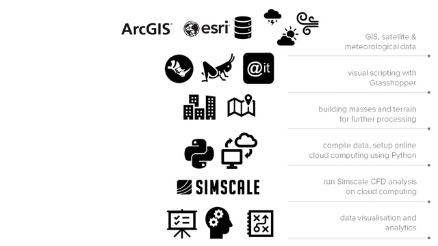
Figure 4: Data workflow to obtain the visualisation featured in Figure 3 above. Source: Mott MacDonald
Figure 5: Setting up the simulation model in SimScale’s online web application. Source: Mott MacDonald
Figure 6: Grasshopper script (visual script) to automate building of the 3D model directly from shapefiles obtained via GIS API calls. Source: Mott MacDonald
What about how comfortable we would feel inside a building when it comes to its environmental performance? The building envelope, and in particular any glazed areas in the façade, play a key role in the environmental performance of a building. There are, however, a myriad of issues to be considered such as solar heat gain, thermal heat loss, daylight, glare, condensation, fading and sound control.
Illustrating the performance of a glass façade requires being able to demonstrate the trade off between all of the above mentioned aspects: something that is not easy to do with static plots and traditional reports. Instead, wouldn’t it be great to create parametric plots featuring all the possible variables and combinations, so that we can easily compare different scenarios?
Luckily again, Python comes to the rescue offering open-source strategies to build an online web app, which we can tailor to feature an interactive glass performance dashboard such as the one shown in Figure 7.
Wondering how it works? The tool retrieves the datasets obtained from the analysis performed using IES Virtual Environment (IESVE). The web application is built using Dash. Dash is a Python framework written on top of Flask, Plotly.js, and React.js, with the last two being Javascript based. Dash facilitates the process of building an interactive web-based application as it abstracts away all of the technologies and protocols that are normally required to do so and does not require you to code in Javascript, unless you would like to create your own Dash components.
You can deploy your apps to servers and then share them through URLs with team members, clients and stakeholders. Since Dash apps are viewed in a web browser, they are inherently cross-platform and mobile ready which clients and decision makers absolutely love! If you are interested in trying Dash, this guide is a great way to start.
Figure 7: Interactive web app built in Python using open-source resources Dash, Flask and Plotly. Try the app here: http://mmdashapp.azurewebsites.net/. Source: Mott MacDonald
If this is what we can do with a few lines of Python, a couple of open-source data visualisation libraries and some data analytics, can you imagine just how much more we could achieve if we take data seriously?
Before I go, I would like to share with you an example of using the power of data to improve the lives of humans, which I find incredibly inspiring: a Hackathon born app named SafeStroll. Despite the efforts from transportation agencies and local councils, traffic fatalities and serious injuries continue to occur on a daily basis.
In September 2018, the city of Vancouver in Canada organised a three day Hackathon under the theme ‘VANquish collisions’ to engage residents, strategists, technologists and designers working together in developing ideas to help make Vancouver streets safer. With over 29,000 primary school children in Vancouver and each student travelling to and from school 180 days per year, there were 5.2 million opportunities to improve safety and encourage active travel for some of the city’s most vulnerable residents.
The VANquish collisions Hackathon saw the birth of SafeStroll, a web app to help parents and students find and plan a safe, walkable route to school. Using Mott MacDonald’s smart infrastructure platform, Moata, the app applies a route-finding algorithm that considers safe transportation features, such as crossing type, construction sites and sidewalk availability, to select the best and safest way to school, rather than simply finding the fastest and most direct route. The web app allows parents and students to visualise the best possible route information in real-time on their mobile devices.
Although SafeStroll did not win the Hackathon, it provides Vancouver’s city planners with valuable insights on its active transportation network, helping to prioritize infrastructure improvements and demonstrating progress toward its goal of zero traffic-related fatalities and injuries.
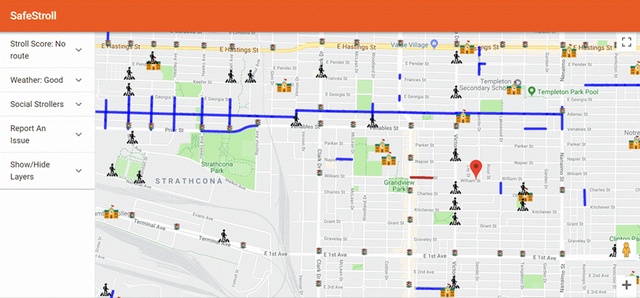
Figure 8: SafeStroll user interface for the City of Vancouver. Source: Mott MacDonald
Figure 9: SafeStroll user interface live demonstration. Source: Mott MacDonald
While I work on the next article of the series, which I am planning to dedicate to machine learning, I would like to leave you with a rather positive approach to how we can capitalise on data. Instead of thinking about “data as the new oil,” data-journalist and mind behind informationisbeautiful.net David McCandless proposes instead that “data is the new soil”: a fertile ground for new possibilities. See his full TED Talk below on a brighter approach to data visualisation, which I am hoping gives you, too, hope for the future of data.
Click here to read the first in the Future of Design series for an introduction to computational design and it’s applications for the built environment.
Special thanks to the following Mott MacDonald colleagues for their contribution to this article:
Jamie McIntyre, computational designer, principal structural engineer, bridges; Jon Robinson, computational designer and principal structural engineer, façades; Phil Evans, data scientist, water sector; Tom Moyle, computational designer, building sciences, built environment; Neil Mackenzie, technical director, building sciences, built environment; Benjamin Bleckly, building sciences engineer, building sciences, built environment; and Eugene Cullity, building sciences engineer, building sciences, built environment.