Haus proud
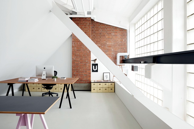
Designliga’s Munich office spans a massive 600m².
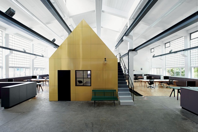
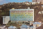
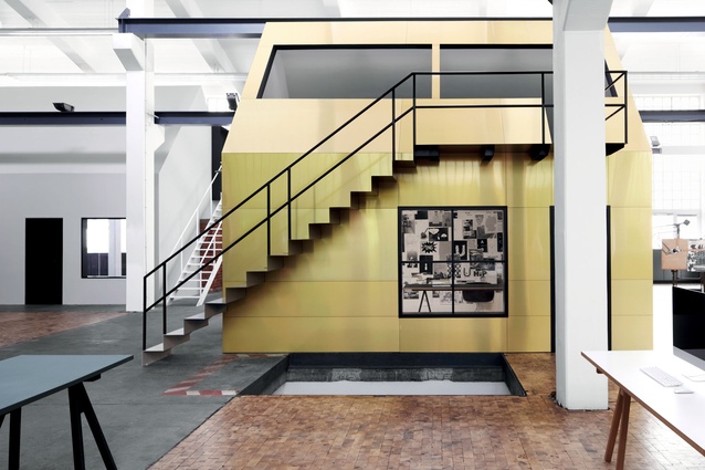
View of the Golden House with its allusions to quaint village architecture.
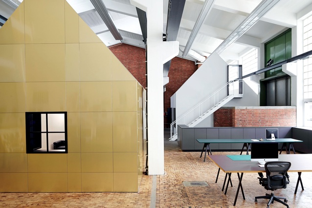
Two separate abodes within a former metal workshop redefine the space for multiple occupation.
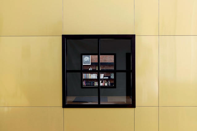
Details of the Golden House’s frontage allows a small peek into its stylised interior.
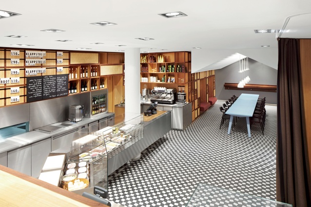
At Das Brot Designliga worked exclusively with craftsmen to achieve details such as timber treatments.
The White House’s interior uses pre-existing textures and patterns to create a sense of intimacy.
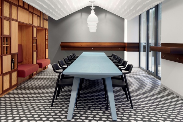
Das Brot features a pitched roof.
It’s been snowing in Munich as Christina Koepf Skypes in from Designliga’s newly renovated office. “It’s sad that summer is over and now it’s immediately winter,” she says. “There was no autumn. That’s Munich for you – six months of winter – but we like it here anyway!” Why the interior design manager likes this particular German city comes up in conversation often, mainly because a lot of creative offices are moving to Berlin. “Not us,” says Koepf. “We never wanted to and never will. You’re not another one in a million in Munich. There are good designers here – a nice creative scene – but you’re still special. There are also a lot of clients, so we don’t have problems finding work.” That work has recently included a radical redesign of Designliga’s own office, a huge 600m² space the company and its 12 fixed team members share with another business.
Interior: It must be a dream project: designers designing their own design office…
Christina Koepf: Realising our own space was great; we could do whatever we wanted. We share the building with another company – a strategic partner for internet programming – and have divided the interior into two houses: the White House and the Golden House.
Interior: What aspects of the project signal Designliga’s style?
CK: I wouldn’t say we have a ‘style’ – more a mentality. We started our office in the same way we would when working with an external client, by asking questions: What do you need? What expectations do you have? We’re not just out to make things look good – although we do that too, of course – but we have a strategy.
There’s a lot of brainstorming before any designing gets under way. We never start with potential realisations already in mind, so the outcome is always open.
Interior: You say you don’t have a style but the house theme appears in another of your recent projects, Das Brot…
CK: True, and I think it’s because we developed the designs alongside each other. I guess it led to some crossover!
Our office has huge doors we leave open in summer. It makes you feel as if you’re outside, so we brought the exterior in. It was the best solution for the space. The theme plays a different role in the Das Brot bakery – it’s more about the concept behind the brand. The company works only with regional produce and has an authentic, home-made mentality. Diners sit together under the roof and feel at home.
Interior: Why did Das Brot choose you?
CK: The bakery is located in the Autostadt, so the client is actually Volkswagen. That’s where the big factory is with around 60,000 employees. It feels like an amusement park filled with spaces by famous designers. It’s almost like someone is sitting there shopping for the best architects for the collection, saying: “I want a project by Zaha Hadid and, for this building, maybe Jean Nouvel”. For Das Brot they wanted to try working with a young agency for a change. I think someone there saw our work on another café – Das Neue Kubitscheck – so they asked us to submit a concept for the competition. We won that competition based on our draft, which shows the success of our process. We get to know a client so well that it’s easier to deliver exactly what they want.
Everything at Autostadt is so clean and perfect. They’re doing a lot of research into sustainable techniques and food, and make almost everything from scratch. They raise animals for meat, make ice cream, pasta – you name it. Bread was one of the only things missing so they wanted to do a bakery. This making-from-scratch mentality became key to our concept. We wanted to work with craftsmen whose handiwork is being replaced by machines to show a modern design could be executed using traditional techniques. People who used to mould ceilings in old buildings, for example, sculpted the pitched roof.
You can really understand the perfection only once you see it up close. That was important to us, since Volkswagen is the epitome of German engineering.
Interior: What was the client like for Das Neue Kubitscheck?
CK: The opposite of Volkswagen! Das Brot has a big company standing behind it and Kubitscheck is just one guy. He’s pretty famous in Munich’s gay scene – a flamboyant character. Everything that could be different between the two projects was different but, in the end the results are the same: the perfect solution for the client.
Interior: What did the client want?
CK: He always says he wants to `free the cake from grandma’s living room’, to update its image. His other motto is ‘Fuck the Backmischung’, which basically means ‘Fuck the cake mix’. These were the things he wanted us to communicate. People walk into the space and agree that it’s 100 per cent him: the colours, the quirky cubes growing out of the wall, the slight Alice in Wonderland-like feel.
Interior: What’s the idea behind the cubes?
CK: The door beneath them leads to the bakery. They’re meant to represent an explosion of flour coming out of the kitchen, while also showing off what’s happening in the bakery by displaying some of the creative cakes.
Interior: There is a similar aesthetic between these three projects, whereas the make-up studio you did for Luis Huber is so different…
CK: That’s because the owners are so different. People don’t call us because they want a café with white cubes coming out of the wall; they call us because they don’t really know what they want and they trust us to find the right solution. I really wish we’d taken photos of the clients standing in their spaces so you’d see how well the designs fit them.
Interior: How do you get to know your clients so well?
CK: I help them make a mood board of themselves. Often I’ll ask them to bring me their five favourite CDs or a fashion magazine they like. They have to be really open.
Interior: How would you translate someone’s favourite music into spatial qualities?
CK: Kubitscheck is a great example. One of my first questions to the client was what type of music he wanted to play in the café. Not necessarily what he liked but what atmosphere he wanted to create. He’s really into the party scene so I thought it might be easy for him to express what he wanted through music. You can’t ask someone who doesn’t know about furniture or colours whether they want this fabric or that shade. He ended up picking a CD of remixed classical music by composer Ennio Morricone. It was electronic remakes of pieces from old movies and that’s exactly what the concept is: a contemporary twist on a classic. He could never have expressed that in words or pictures, but the music brought it to life.