
Houses Revisited: Enclosure movement
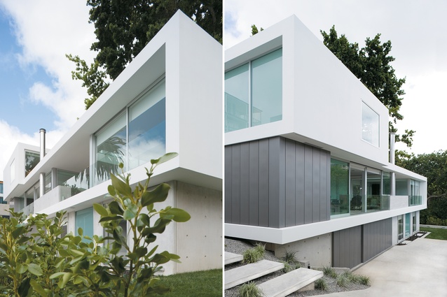
The house looking from the front gate; looking back at the house from the reserve on the eastern end of the site. The top two floors rest lightly on the heavier, plinth floor below.
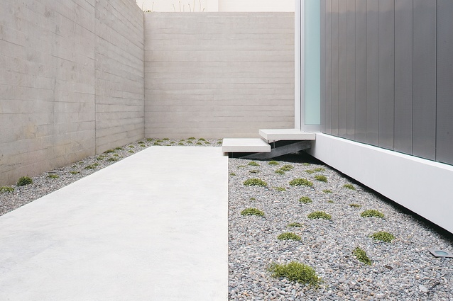
The minimalist entry path and front door of the Parnell house designed by David Ponting and Richard George.

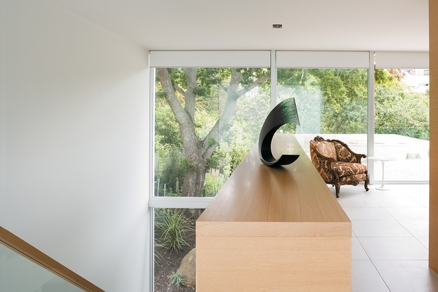
Looking into the garden and main living space from the entry hall.
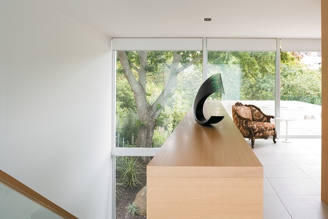
At the top of the stairs the master bedroom has an expansive view out onto the garden roof and leafy reserve.
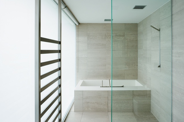
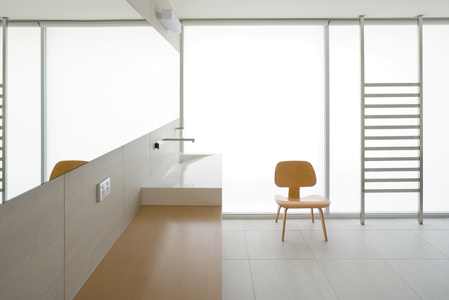
The bath and shower of the master en suite.

Looking into the en suite from the master bedroom. Opaque glass provides natural light and privacy.
First published in September 2007, David Ponting and Richard George opt for a fluid formalism in an old Auckland clerical suburb.
Parnell is one of Auckland’s oldest suburbs. The first land lots were sold in the early 1840s and quickly subdivided. It was the Auckland headquarters of the Anglican Church and a generous number of buildings were built to accommodate church activities. Some of the original buildings commissioned by Bishop Selwyn still exist, including his former residence on St Stephens Avenue. By the 1970s the area’s fortunes seemed to be fading, but it was only a temporary setback. These days Parnell is still, residually, a church suburb, but is more synonymous with secular pursuits – eating, drinking and shopping – and highly desirable real estate.
With such a long history and so many heritage buildings one might assume there would be tight restrictions on new housing. However, the eclectic mix of old, recent and new houses on some of Parnell’s historically more gracious streets clearly illustrates that planning regulations have not deterred development.
It is amongst this medley of styles that David Ponting designed a house that proudly expresses a modern sensibility. The client was not interested in adopting a local vernacular, Ponting says – the house was to be crisp, sleek and modern – but even if he had wanted to blend in with the neighbours it would have been difficult to decide what era or style to get in line with. Ponting had already prepared plans for previous owners of the site. When the current owner purchased the property he was happy to continue working from those plans but wanted to tailor them to better suit his brief.
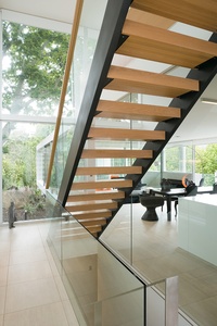
Ponting thought a fresh set of eyes would be useful in updating the plans and asked architect Richard George to join the project design team. George suggested working with the idea of the Mobius Strip: a surface with only one side and one edge, making a continuous loop without interruption. George presented the Mobius Strip in the design as an enclosing sculptural form that rigidly defined useable space. The internal spaces would be fluid within the exterior form. “The brief was about creating a sculpture that would accommodate flexibility of use,” Ponting says.
The site is down a long drive that passes the house on the front half of the sub-divided rectilinear property. Behind the metal entry gate is a path and pebble garden with concrete slab walls. The large opaque glass entry door opens to a double-height entry hall. From here you can look past open stairs to a glass wall framing the garden and an established oak tree. A second stairway leads down to internal garage access.
A bathroom is discreetly located behind a silver zinc wall that continues from the outside cladding that wraps around the end of the house like armour. Past the stairs, an open entryway leads into the main box shape of the plan, the large room encompassing the kitchen, dining and lounge area. The kitchen is a crisp white wall at the end of the room, with a white island bench. Appliances are located in a scullery behind a silver door.
The dining table is next to the kitchen and a lounge area lies further down the room with a large gas fireplace. From here glass doors open out onto an outdoor room; the open side faces, and catches a glimpse of the harbour. The three walls are all glass giving the inside rooms a strong natural light source and creating a transparent view from one end of the plan to the other. An internal view that cannot be interrupted is a smart way to counter an external view that is crowded by neighbours on three sides.
Upstairs, a bedroom looks out over the roof of the main floor, which has been made into a sculpture garden of pebbles and small rocks. The oak tree frames the left side of the roof garden and the reserve. The bedroom is open to the double-storey stair shaft (there is no entry door). This room has the best aspect of the house, offering a serene view of greenery. The en suite is behind the wardrobe that makes up the head of the bed. It continues the free-flowing ribbon plan with no door, just an L-shaped wall to contain the bath, shower and toilet. Light filters into the room through floor to ceiling opaque glass.
From the top bedroom, you can walk down to the main living area and along a glass-walled corridor behind the outdoor room into another, smaller living space. A third set of stairs runs from here to the lowest level: a ground floor that functions as a plinth upon which the top two floors sit lightly. Solid materials and darker floor tiles were used to convey a greater sense of solidity on this floor. The downstairs rooms are each small, light galleries when the panel sliding doors are shut; walls and ceilings are white, and the only natural light comes from glass doors in each room that open up onto the front lawn. The rooms lie on either side of another bathroom, accessed from both rooms with a second set of sliding white panel doors.
Past these rooms are a three-car internal garage, storage and laundry. Three spaces seem like a lot, but this arrangement serves to keep the cars off the driveway and hidden behind doors made of the same silver zinc used on the middle level. Concealed conveniences such as the garage and the scullery and bathroom on the floor above have prevented the clean lines of the house from being compromised with clutter.
This house is, intentionally, sculptural, and it could easily have worn impracticality as a badge of artistic honour, but it retains the ‘common sense’ and usability of places that might not have been designed with art in mind. That is, functionality has not been sacrificed to a single-minded formalism; habitation, therefore, should also be an enjoyable design experience.
Click here to see more Houses Revisited. And sign up to our email newsletters to receive Houses Revisited straight to your inbox.
Note: These are stories from our archives and, since the time of writing, some details may have changed including names, personnel of specific firms, registration status, etc.


