Colour Collab: Gerald Parsonson
In this colour collaboration with Resene, we caught up with this award-winning, Wellington-based architect to discuss colour, the built environment and the sweet spot where the two meet.
In a country where ‘black’ is a national badge of honour, how does colour fit in?
Gerald Parsonson (GP): People express themselves a lot more than with just their national colour. Over the different eras in our history, there have been different combinations of colour that have been popular. In the Victorian era, some quite strong colours were used. Colour isn’t for everyone and, currently, it’s easy to find new suburbs full of beige, creams and greys with maybe a brightly coloured door every now and then. Dark charcoal seems popular also. New Zealanders are also driven by practicality, which tends to mean lighter and plainer exterior colours, often with more richness and expression in the interiors. Colour expresses personality and freedom, and it is refreshing when people try something different.
In 2018, you won the Resene Total Colour Lifetime Achievement Award. At the same time, you were awarded both the Resene Total Colour Residential Interior Award and the Exterior Award for the same property (Te Horo Bach). How do the colours of that project reflect the occupants?

GP: The colours for the Te Horo Bach were chosen for clients who were open to something more playful, interesting and related to its setting. The subdivision in which the house sits had an agreed covenanted colour palette, which was made up of mainly soft, natural colours. We took the approach of dividing up the long east and west façades into vertical elements separated by vertical cream-coloured battens and used two colours from the covenanted colour palette in alternating vertical stripes between. On the sides of the battens (not visible at first) we painted brighter non-covenant colours drawn from our interpretation of studying the local environment. Interior colours were extensions of these exterior colours. We hoped we had understood the owners’ openness to colour and nervously presented the scheme, fully prepared for rejection, and they loved it.
What is your process for selecting interior colours, especially for projects where colour is a focal aspect?
GP: For us, colour selection is driven by the local environment, the architecture and the client. We spend a lot of time at the early stages of design listening to and testing ideas with clients to get a sense of where their preferences lie. We find it useful to understand this early on, as it allows us to run the architecture and colours together. In an interior that has a lot going on architecturally, it can be good to dial back the colour, or, alternatively, if there are simple boxy rooms, colour and interior design become more important.
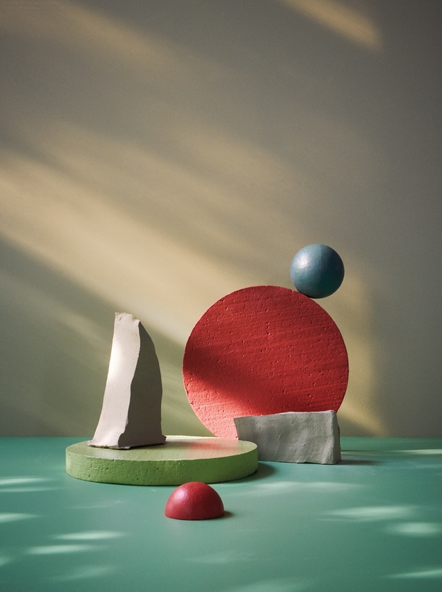
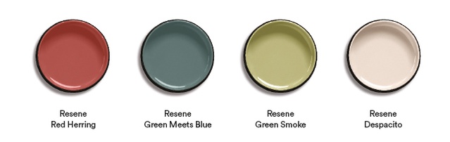
Tell us about the colour palette you have chosen for this interview/collaboration. What are the colours and why do you think they work well together?
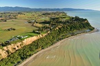
GP: The four colours for this collab were chosen from a photograph taken of the dunes at Riversdale Beach on the Wairarapa coast, with beach grasses and the dusty reds and soft greens of ice plants set against the rough sea. They are slightly unusual colours to put together, but I imagine them working well in a series of coloured elements on an exterior, set against much calmer colours, such as stained driftwood-coloured timber, soft greys or off-whites. They would also make very interesting interior room colours.
See more from the Resene Colour Collab series here.
ArchitectureNow works with a range of partners in the A&D supply sector to source appropriate content for the site. This article has been supported by Resene.