
Mackelvie Street Precinct
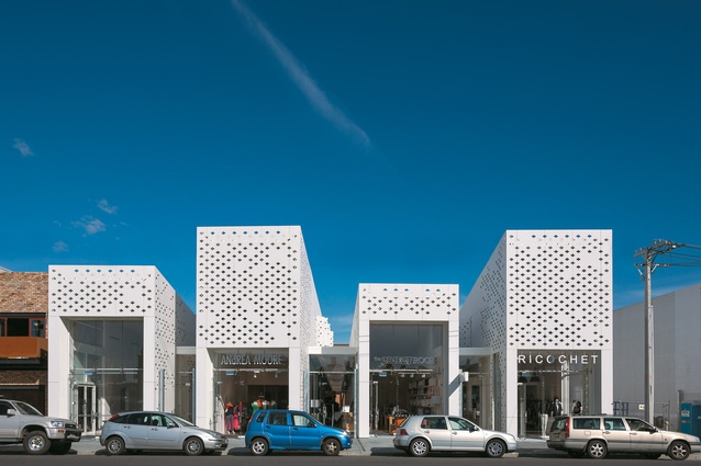
Seen from Mackelvie Street, the building’s staggered form consists of four dominant blocks.
Through-site linkages, via the spaces around the building, and how the building fits into its context are most important here.

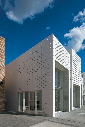
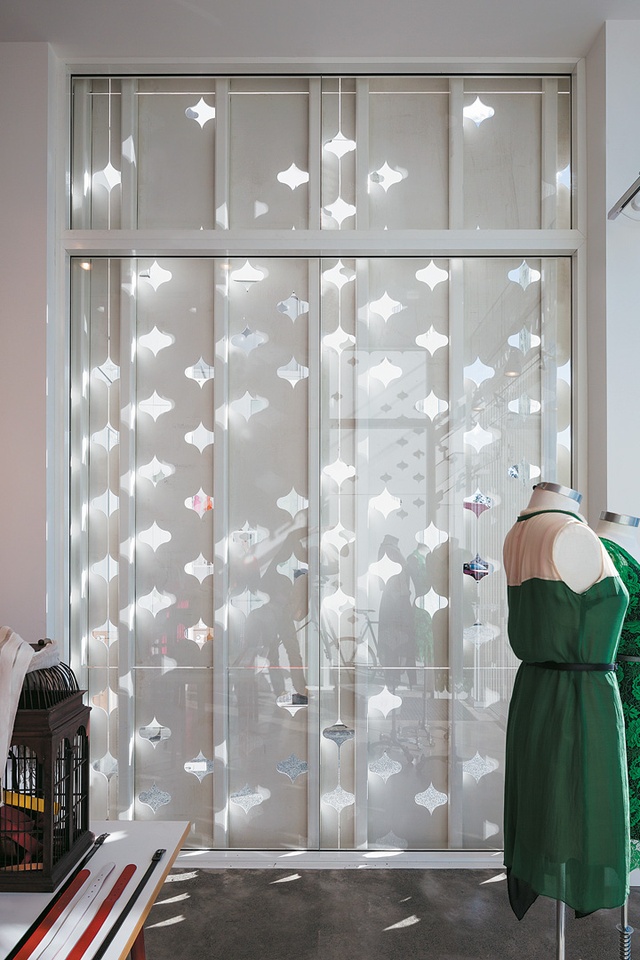
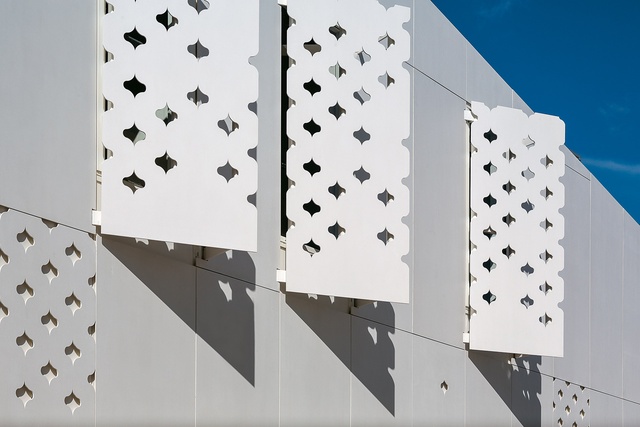
The ‘sweet, white icing’ skin features a waterjet cut-out pattern developed from an abstraction of a Victorian wallpaper design.
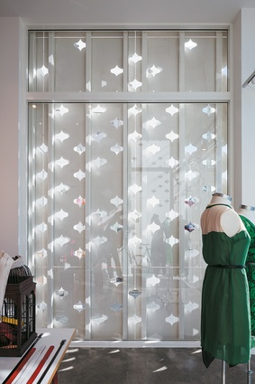
The perforated exterior creates dappled natural light throughout the double-ended retail spaces.
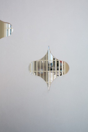
Seen through one of the patterned cut-outs on the skin, delicate powder-coated aluminium grating becomes a surprising soffit, framing the retail entrances.
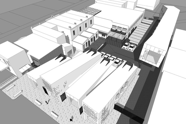
Overview of the precinct.
This building is a good ’un. I originally started this piece on RTA Studio’s Mackelvie Street Precinct in Auckland with some convoluted lyricism about watching the day-to-day progress of the build; I poetically described its white, perforated skin and wordily mapped out its urban connections. But, in re-reading, I realised I had missed out what was essential to understand about this building first and foremost: it’s good. Good in a way that is particularly difficult to achieve because it’s well-received by the gawking public and the fastidious architecture fraternity, as well as by those who paid for it and use it.
Understanding more about the design – the bird’s-eye linkages and the contextual diagrams – gives a richness to the building but, even without any more knowledge than that gained from a cursory glance, you see this is effective, appropriate, excellent – any number of synonyms for good. It reminds me of the Auckland Art Gallery: another building which, through a combination of a thoughtful interpretation of heritage, bold spatial plays and a simple but sculptural architectural motif (the timber pods there, the white perforations here), has overwhelmingly found favour with the masses as well as the critics. Tentatively, I hope that these show a maturing of New Zealand’s public and commercial architecture, giving us confidence to create bold buildings that are functional and well-liked.

What makes it good, then? Passing by the building, you can’t help but notice these white, staggered forms. ‘Head-turner’ is a phrase that springs to mind. Yet, while arresting, its decorative skin is almost the least important thing about it. The bigger picture is about urban connections: how this building fits within the grain and proportion of its context and how it activates the site on all edges.
But, before we get to the grainy fibre of the design, let’s just enjoy that sweet, white icing. As RTA Studio has done in similar ways with other projects, the façade has developed from an abstraction of a Victorian wallpaper design. A shape, like abutted parentheses, has been waterjet cut from white, high-density fibre cement board to make a perforated skin.
The architects’ original concept renders show the building at dusk, light glowing from these punctures. At this stage, they hadn’t entirely worked out how to create this effect. RTA Studio’s Richard Naish explains the difficulty: “The key thing was trying to get the cladding with enough space inside, so that the light could spill out through the holes because (otherwise) you end up having to build this massive structure that blocks out the ability of the light to penetrate through.” Their solution was to create a secondary layer of framing, so that the front façade hangs separately off a steel frame in front of glass walls, while ETFE pillows in the roof create the transparency required.
The edges of this building have been detailed with delicacy – powder-coated aluminium grating becomes a surprising soffit framing the retail entrances, for instance – but larger issues, concerning the edges of this building, were of interest to the architects. Spaces around the building – the courtyards and laneways – and how the building fits into its context are most important here.
The Precinct site sits between Pollen and Mackelvie Streets with frontages on Ponsonby Road. Indeed, this white block is but one of a series of insertions, regenerations and restorations happening here. The first was the renovation of the building RTA has taken on as its own office. This building is the second. Planning is under way for upgrades to the rear façades of the Ponsonby Road buildings – removing the non-heritage lean-tos and opening them to the back, as well as inserting a rain canopy over the Santos/Longroom courtyard.
A long, narrow building, running along the southern edge of the site, will reinforce the through-site connections and is the precinct’s final element. Ponsonby is a low-lying, sprawling ridge line. Bars, restaurants and retail dot the length of Ponsonby Road but that commerce hardly ever turns down side streets, with almost no layering of this activity in behind the spine; RTA diagrammed all of this in the research phase of this project. Mackelvie Street, however, is one of the few exceptions and is where some retail and cafés have migrated from Ponsonby Road, though its intensification is still sporadic and hesitant.
There were already the small beginnings of laneways here, with an alley running from Ponsonby Road in between Santos and Longroom and the private/public courtyard utilised by both of these tenancies. New, entirely separate developments in the surrounding blocks will further increase through-site linkages beyond the single spine of Ponsonby Road: Ponsonby Central, a new development alongside the Golden Dawn bar with a walkway leading to this site, and another new building where the Mini showroom was.
RTA’s design aimed to create multiple urban spaces, double-ended retail, buzzing alleys and active edges all around the building. As they did with the wallpaper to create the façade, distillation and abstraction have been used to generate the forms of the building. The existing heritage buildings on Ponsonby Road were analysed to find a typical tenancy space of 4.2m x 14.5m.This module was then used to mass up the building while, at the same time, the architects tried to create courtyard and laneway spaces to which the building would open up on multiple faces.
“We’d formed these two little courtyard spaces and a large courtyard space which we see as a potential urban spaces: four potential urban spaces within the block,” says Naish. Because of significant level changes over the site, creating these open urban spaces was more complicated than just leaving a bit of land empty. The ground plane was raised to provide consistency over the site and cobbled in high-quality finishes to ensure future flexibility of use.
The street elevations of the Ponsonby Road buildings were further examined to find that the two-storeyed tenancies have a typical ceiling line at 7.2m and a parapet at 9.5m, which then influenced the street scale of the new building. Explaining these diagrams that chart the proportions of the Victorian shop fronts, Richard Naish says, “We took those forms and distilled them down and pulled them apart. That’s given us our form, which just seems contextually right with the massing.”
The final design of the Mackelvie Street Precinct is a series of four dominant blocks of the same scale and size as the heritage bays on Ponsonby Road interspersed with more-recessive, narrower tenancies. Practically, this offers multiple retail spaces – larger street frontages with high, glass windows as well as smaller boutique spaces. Aesthetically, this offsetting of forms breaks up what could be a solid, impenetrable block. These offset spaces also set up the language of intermediary spaces – places to dwell, wait, walk through – which are further developed along the side laneway and back courtyards. And that is what is exciting about this building. The building part of it is lovely but this is only one element. The object is superseded by broader ideas of community and connection.


