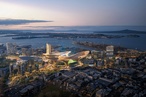
Massey University’s College of Creative Arts (CoCA)
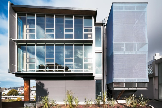
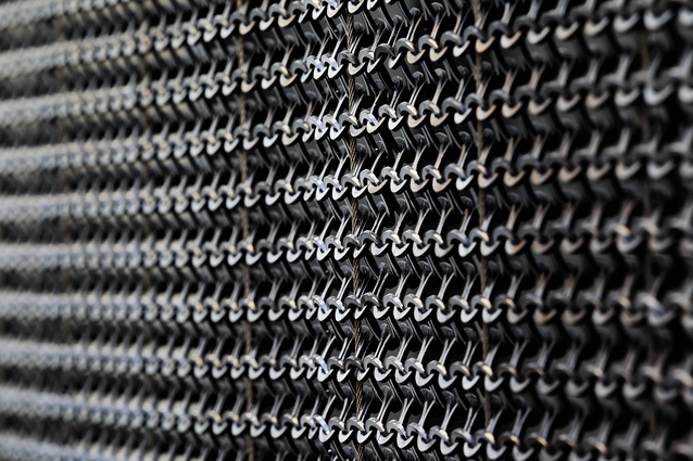
Image depicting stair and plastic chain-link used to wrap the stairwell.
Type-based artwork designed by Nick Kapica, a lecturer at the school.
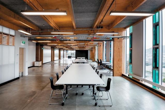
The 52.7m-long flexible studio with massive LVL beams on show.
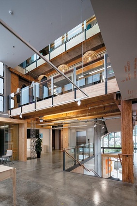
Atrium view.
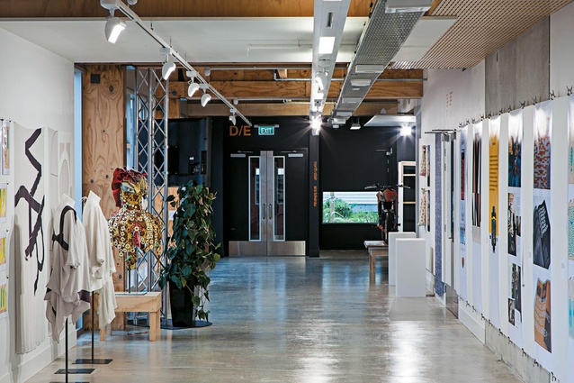
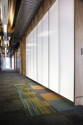
A wide corridor doubles as an exhibition space.
Dramatic shadows cast in the “Pit”, one of the building’s digital studios.
View from interior of stair.
The main circulation corridor opens directly onto the flexible studio.
The main circulation corridor.
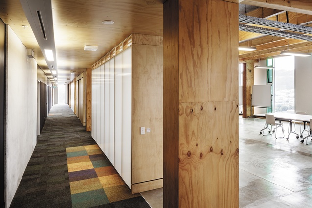
The main circulation corridor opens directly onto the flexible studio.
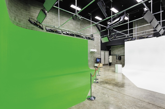
The ‘green and white’ room, another of the building’s studios.
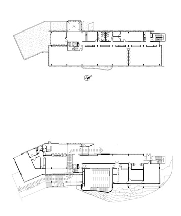
Floor plan.
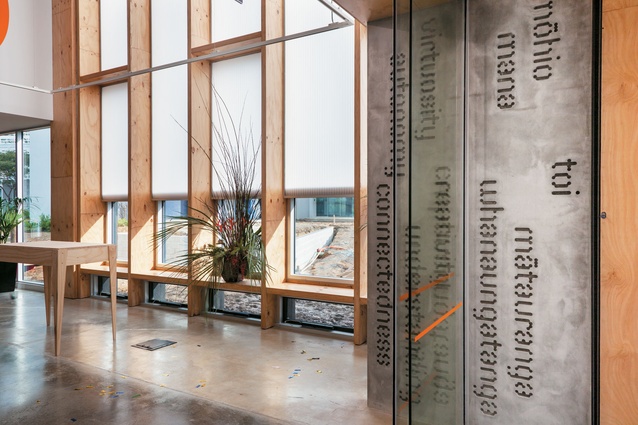
There has been a clearing of the decks to create the new College of Creative Arts at Massey University’s Mt Cook, Wellington Campus. Architectural designer and artist Jacob Scott says that is what he did when commissioned to design artwork for CoCA, Te Ara Hihiko. The name broadly means, pathway to creativity. Scott was given carte blanche and, in consultation with Athfield Architects, designed the ply interior carvings for acoustic ceiling panels and white Corian exterior panels that float in the main entrance above Te Kuratini marae.
“Because it is an art and design faculty, we went right back to te kore [the void] whakapapa-wise, the place of all beginnings; from there everything is possible,” says Scott. “You go back to te kore and from te kore through to te ao mārama, into the light and just get rid of the baggage. It’s a valid base for people to be able to clear the decks, have a rethink, and be open-minded about where they want to go.”
CoCA wanted students and staff to go to a flexible space that presented them with new challenges. They are no longer confined to inadequate facilities that dictated timetables, teaching and learning; Te Ara Hihiko is intended to stimulate the imagination and creative practice. “Up until now, the way people teach has been determined by the fact they have been in small rectangular classrooms that can accommodate 20 students,” said CoCA’s pro vice-chancellor, associate professor Claire Robinson.
“Timetables are based on moving people from one room to another so once you take those structures away then it becomes the content of an assignment that drives how you teach. At any stage of a six-week assignment, there may be moments when students have to come together, moments when they go apart, moments when they work together in groups. How they do that shouldn’t be determined by the size or the space available. So that throws the challenge back to teachers.”
The physical space used to be the former museum building, refurbished to cater for 900 CoCA students when Massey University and Wellington Polytechnic merged in 1999. But enrolments grew rapidly. In 2007, 1,700 students were scattered around campus and almost half of them were back in the old polytechnic prefabs, Robinson says. “That was contrary to the original intent to bring people together and didn’t gel with the statement to offer world-class facilities.”
Discussions about a new facility coincided with the arrival of Steve Maharey as vice-chancellor. Maharey “could see that CoCA was a jewel in the crown of the University,” says Robinson.
“What we were offering was the profile of art and design being major contributors to New Zealand.” Athfield Architects’ design proposed, she says, “a robust and characterful architectural framework to provide for a range of multi-purpose, flexible and adaptive spaces for the creative arts.”
The lower, largely concrete levels of the new 3,500m2 building, follow the contours of the land, stepping up from the lower campus and Tasman Street entrance into wide circulation spaces, the lighter wood, glass curtain walls and internal light wells/natural ventilation shafts of the two top-floor studios.
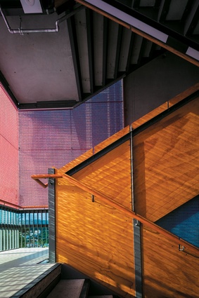
Beams and columns of the laminated veneer lumber (LVL) frame, visible throughout the building, are also part of the aesthetic. The use of LVL allows studios and other teaching spaces to be configured in many different ways. The timber frame is part of the Pres-Lam seismic structure, which allows the building to rock back and forth during an earthquake, then return to an upright position without significant structural damage.
“The advantage of timber is that it is a lot lighter,” says Athfield Architects’s Chris Winwood. “The reason we were keen to use it initially was its sustainability aspects but also the warmth, the robustness of it, and being able to hammer into it, and patch it and not be too precious about it as a surface; that is harder to do with concrete or steel.”
The lower levels are organised by two double-height black boxes. “They are the two rocks, if you like: the buried elements that dictate the flow. Fluid spaces are built around those two buried spaces.”
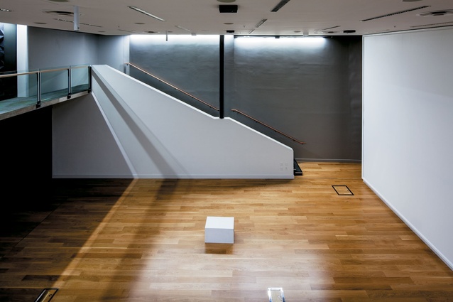
One, dubbed the “Pit” is a multi-purpose performance lecture theatre with retractable seating, white-screen walls and state-of-the-art audiovisual equipment. “You name it, they might do it,” says Winwood. The other is a green-and-white screen production space for film and photography respectively. These industry-standard facilities are expected to attract the CoCA’s many professional contacts to work on site with their students.
The building creates a new circulation link between the upper and lower campuses of the university. This is intended to maximise interaction between the general public, other campus users and the CoCA as well as neighbouring schools. On the upper campus reception level, fashion, industrial design and art exhibits give a hint as to how work might be displayed in the hub area. Through the rest of the building, corridors with plug-in spots can also become galleries.
Super-graphic orange numbers and bilingual type show ways around the building. Internal stairs, external stairs and a lift (the latter two encased with Kaynemaile) lead to the wider spaces of the studios. Generous spaces open out between levels and are designed to work harder than they would in a typical building. There are kitchens and lounges, places to meet, chat and work.
“The driver is to bring the students together in a community and say, ‘Hey we have provided some really good facilities. You don’t have to go home and sit in your cold flat and do your assignment – you can stay here’,” said Robinson.
In both studios, an expanse of glass faces west and north, selected panes covered with changeable blue and green film tie in to the tree line. A shift in pattern lends a different character to each floor. Computers line the windows; tables down the middle allow students to draw and move directly between media. The open-plan studios have retractable wall dividers and there are no doors along the corridors, allowing passers-by to see what is going on. At the time of the visit of Interior, just before the first influx of students, diagrams on a portion of wall painted with whiteboard paint explored how staff and students might utilise the space. Th eprospect of Te kore – the void and new beginnings – was exciting for some and terrifying for others says Robinson.
The orange graphics also caused a bit of a stir in some quarters. “With this one we didn’t think of it as being signage,” Robinson said. “It was part of the design [and artwork] of the building.” University signage guidelines prefer white type on a blue background she said. “We felt that the beautiful design of the building was going to be compromised if we had to think of attaching corporate brand identity to it. For a college of creative arts it seemed incredibly appropriate to be doing it ourselves and in a way that was in sync with the design of the building and not something that was just fixed at the end.”