
Matterhorn
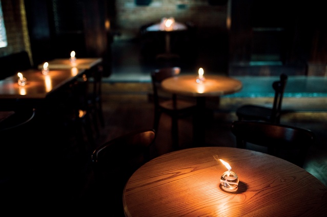
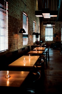
Matterhorn uses low lighting and a thought-out interior flow to reveal detailing and various spaces slowly.
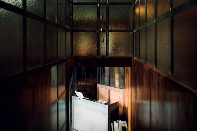
Stairs leading to the bar and covered outdoor area.

A raised, pod-like insertion subdivides the cavernous 400m2 while bespoke x-shaped, sculptural light-boxes dissect the overhead space into a grid.
Bespoke lamps and furniture maintain a connection to the original Wellington restaurant and the heritage building.
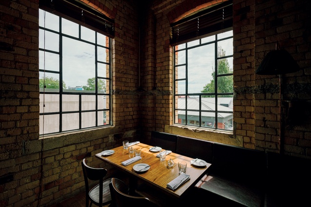
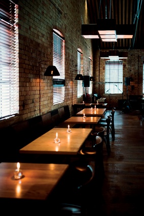
Multi-paned, industrial windows in the 1918 building provide a motif that is repeated throughout the interior design.

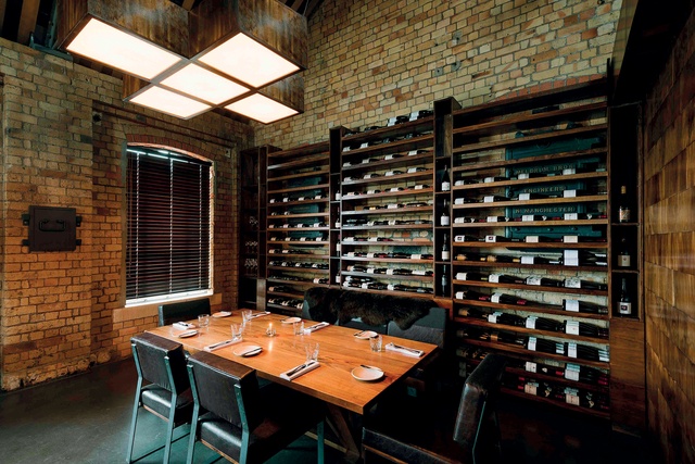
Private dining area with bespoke wine rack. The area can be configured into various iterations, thanks to sliding doors and seating made specifically for this purpose.
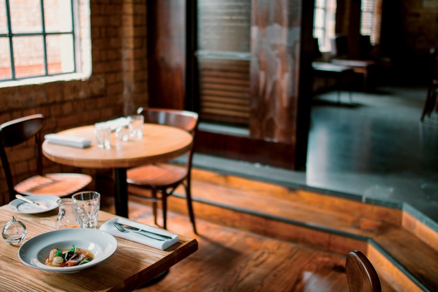
Materials were chosen to provide a warm, Swiss-chalet-like feel.
Entering the original, 52-year-old Matterhorn restaurant in Wellington always has been a bit of a puzzling experience. From Cuba Street, parallel to the Bucket Fountain and an ever-changing array of buskers, there is a narrow and long corridor. Bolted to its left wall is an equally elongated, wooden display unit where music and theatre posters compete for space with all manner of pamphlets, graffiti and brittle layers of urban archaeology.
An unassuming door at the end of this passageway leads into one of those unexpected, relaxed, yet intrinsically stylish nightlife interiors that the capital city is so fond of orchestrating.
“I liked the metaphor of great cover songs,” says Richard Keddell, the designer charged with crafting an interior for Auckland’s new iteration of the Matterhorn. “The message is the same but it’s presented in a new way, with new emotions. So people would walk in and love it, and get it, but the original would never be replaced or brought down by its latest version.”
The comparison is apt. As with any great cover song, Auckland’s Matterhorn – located on the Drake Street end of the Victoria Park Market – begins with a spatial intro that is different, yet faintly similar, to its original. A large glass door leads onto an interior divider made out of textured glass within square steel frames (echoing the heritage windows in the place). The Matterhorn logo has been drawn upon it in an attempt to emulate some of the urban textures of its surrounds.
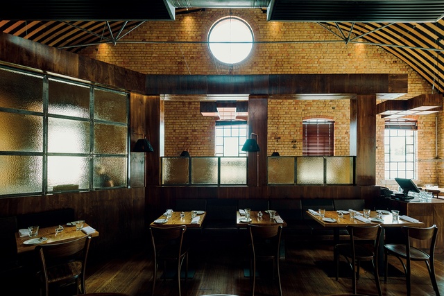
Keddell, who was asked to transpose the street culture vibe of Wellington’s Matterhorn, says he “went around taking hundreds of photos of Ponsonby and saw a theme of painting on windows for signage”. From this somewhat-interrupted entrance, a narrow dark corridor ebbs left, then right where – similar to Wellington – the interior opens up dramatically and unexpectedly into a double-height, luscious space of exposed brick and trusses, rich dark timbers, furs and copper conduits ending on shoulder-high, mounted lamps that are both street and domestic-like. There is moody, modulated light streaming in from the high, square windows and candles dotted around on the tabletops.
According to the designer: “The idea was to reveal things to people slowly, so when they get to the middle, the whole space opens and they have choices of where to go.”
Much like in the capital, the vast, open 400m2 space here is subdivided into various smaller experiences and all of them unravel from a central point (in Auckland’s case: the reception area, which doubles as a coffee-making station). The Wellington venue splits into a small, living-room-like alcove followed by a bar area, a dining section and the outdoor courtyard/gig venue. In Auckland, the space flows in a circular fashion past an open kitchen to dining booths, and into dining areas and a private dining room, or down a small set of stairs into a bar and an outdoor space with an unfinished, temporary urban grit still clinging to its walls.
“The space flows smoothly from one area to the next so that a customer can end up back where they started without going through the same room twice,” says Keddell, who explains how he originally planned the flow of the restaurant by using duct tape on the floor of the cavernous former city incinerator.
All of the materials and colours were chosen to complement this heritage building. The impressive brick structure (circa 1918) retains steel furnace doors, secret and somewhat-inconvenient rooms (some now used for storage), and all manner of nooks and crannies unsuitable for a modern hospitality venue. Some have been hidden while others – such as windows and trusses – have informed the geometries and motifs used on surfaces and acoustic and window framing.
One of the most impressive insertions (other than a raised floor that cleverly dissects the space and compartmentalises its usages) is a series of sculptural, x-shaped hanging light-boxes that retain the geometric motif running throughout the place. Keddell devised them to provide a “giant grid-like plane” and reduce the impersonal height of the building.
Sightlines were important also and planned thoroughly during the design phase. Keddell explains how he thought about what sitting patrons would be looking at from every angle of the restaurant (the backs of other patrons, the movement of those departing or arriving) and arranged seat heights and angles accordingly.
Part of the designer’s brief was to try and replicate one of most successful aspects of the original venue: its ability to make a wide range of patrons feel comfortable (“from old ladies to skateboarders”, according to Keddell). To accomplish this, and once again following the lead of its predecessor, the designer looked at alpine typologies and, for obvious reasons, at the
Swiss chalet.
“The large, dark-stained timber forms that run through the space are visual representations of the strength of these mountain chalets and the feeling of quality that comes with them. The sheepskins draped over the custom-designed booth seating are a nod to [them]”. What comes through is a relaxed sense of comfort.
“All of these design decisions were based on how I wanted people to feel in the space,” he continues. “I wanted them to feel excited about being in there, cool and good about themselves (a little uplifted): part of something that is a little hidden that they’ve discovered.”


