
Open and shut: Perimeter House
An inner sanctum offers protection – but not exclusion – from the urban environment.

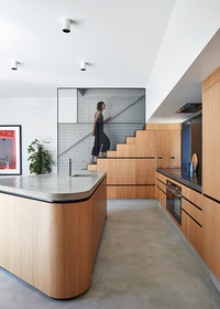
The efficiently designed kitchen includes a pantry beneath the stairs. Artwork: Mark Rothko (print).
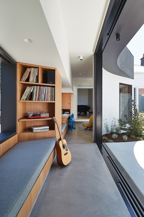
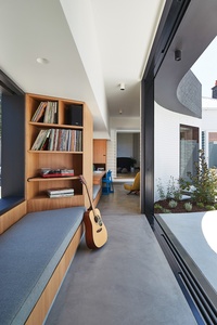
A multi-use corridor and living space connects the extension with the existing house.
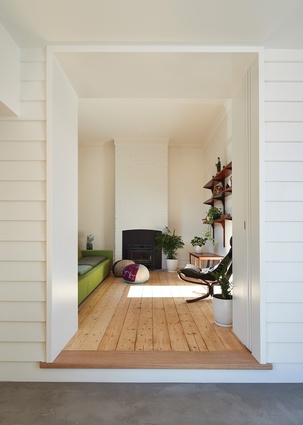
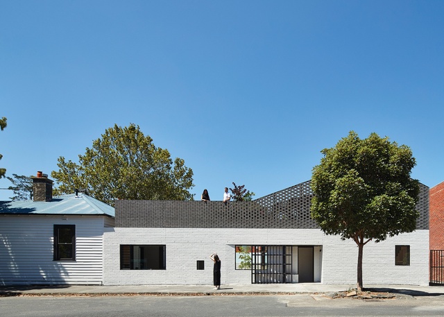
While considerable changes have been made to the existing home, its character remains intact.
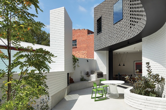
The brick facade draws on non-residential design to create opportunities for social exchange.

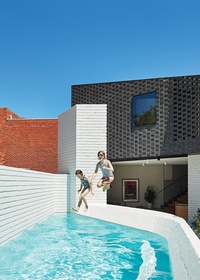
A resourceful solution to barrier regulations sees the pool edge double as a bar.
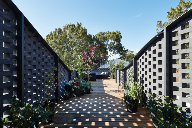
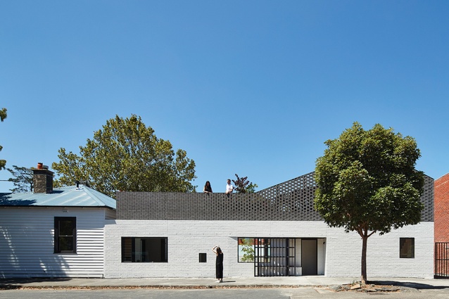
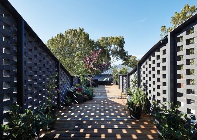
The roof terrace offers secluded areas, views of the city and a place to grow edible plants.
Make Architecture's addition to a two-bedroom house in Abbotsford reflects the area’s industrial aesthetic while working hard to offer sanctuary and suburban amenity.
Perimeter House is sited on the fringes of an industrial precinct in Melbourne’s Abbotsford, just a stone’s throw from both the hustle of Victoria Street and the lush Yarra River, and bordered by a carpark, a laneway and roads. The surrounding buildings are a fragmented mix of industrial, commercial and residential. This tricky junction doesn’t exactly exude domesticity and I can imagine that the existing 1900s house must have felt slightly out on a limb, enveloped over the past century by buildings of a more imposing scale.
Homeowners Antony and Nicole and their two daughters had resided in the existing two-bedroom period home for six years before seeking an addition that would accommodate another bedroom and a new kitchen and living space. They perhaps got more than they had bargained for, but the result is a unique home that they are proud of.
As it now stands, the house acts as a mediator, making sense of the surrounding incoherent building typologies. A new two-storey volume at the southern end of the site is connected to the existing dwelling by a narrow volume, curved in plan, with a garden terrace on top.
The overall effect is of a home that wraps around the boundaries of the site, protecting an inner sanctum complete with a pool. It’s a clever negotiation of competing requirements: to shield residents from the harsher realities of the urban environment but also to engage with the wider community. Such challenges suit Make Architecture’s modus operandi, and constraints were tackled opportunistically.
In its planning application, Make Architecture contextualized the addition in relation to the adjacent industrial brick building, so the design was not confined by the setbacks that one would usually have in residential zones.
The architects saw opportunities for social exchange in the facade alongside the footpath on the western edge of the site, and by taking cues from non-residential buildings such as cafes, this brick facade is “activated” in multiple ways. An alternative entry in the centre of this long edge encourages interaction with passers-by, and devices such as operable windows allow the girls to chat with their peers from inside the house.
The character of the family’s existing home has been treated respectfully. While a lot of work has been done to the original house – new walls and windows included – it doesn’t look like the architects have really been there. However, when standing at the threshold between the old and the new, the curvaceous extension unfolds. I wonder what inspired the sweeping form of the narrow volume, which runs from the existing house, circumnavigates the pool and connects to the new wing.
It’s a chicken-or-the-egg sort of question, as from this vantage point the pool appears to be the Yin to the building’s Yang. I’m told that the plan arose from the forces of the site, a desire to capture northern sunlight, to create a space that does more than connect the two main volumes and to retain the ability to see each member of the family from most spaces in the house. This proximity was a quality of the original dwelling that the clients were fond of. The volume works hard to achieve multiple outcomes – it’s a corridor, a music room, a homework space, a storage space and a place to sit.
A similar efficiency extends to other elements, including in the kitchen, where the pantry is housed under the recycled-cork and mesh-lined staircase, and at the pool, where balustrade regulations have been approached resourcefully and the pool edge doubles as a bar. As director Melissa Bright says, “Our job is to make it look like we didn’t have anything to comply with.”
The inclusion of a roof terrace is not always achievable, but here the neighbouring property is a carpark, so there were no issues with overlooking. The roof terrace provides a restful retreat. Hit-and-miss brickwork with graduated openings creates varying levels of opacity and depending on where you sit, this space can feel like you are right in the thick of it, with views to the city, or a secluded spot in the sun, among the treetops. The terrace was designed to hold an abundance of edible plants, and the bougainvillea will work its way over the ledge and spill out toward the street.
On this inner-urban site, the clients wanted to obtain a level of amenity that is similar to what they could get from a quarter-acre block in the suburbs. For Antony and Nicole it was important that the generous outdoor living area they had previously was retained. For Make Architecture, this was a design challenge that they had embraced before, with House Reduction, which provided a model for achieving suburban amenity on an urban block. Locating the bulk of the addition at the southern end of the site and connecting it with a narrow volume effectively doubled the outdoor amenity, with outdoor living at both ground and roof levels.
At various moments during my visit to Perimeter House I’m reminded of the manifesto-like objectives that popped up on Make Architecture’s website as I perused their projects. These demands, both modest and ambitious, form a consistent ideology across the practice’s oeuvre of work, and they came together in my mind to form a mental checklist: Make a place to read a book (tick); make it catch the sun (tick); make it engage with the street (tick); make it part of the city (tick).
This article was first published in ArchitectureAU.com.


