Rocking the shortlist
Much-maligned in its pre-build 'pumpkin' days, Wellington Airport's Rock has made a Cinderella-style comeback, winning a few local awards and now hitting an international interior awards shortlist.

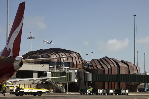
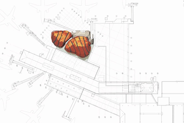
The Rock is the jewel in Wellington International Airport’s crown; it’s the tarmac tarrying Warren and Mahoney and Studio Pacific Architects collaboration which, when built, doubled the airport’s departure lounge capacity. In its pre-build “pumpkin” days you’d have been forgiven for thinking that this design was actually going to sink like a stone, such was the outpouring of scorn following the release of those initial (“it’s not really what it’s going to look like”) concept drawings, which inferred a certain luridness of orange and vaguely pumpkin-like countenance. Since then, of course, it’s actually turned out very nicely; clad in a copper skin, it’s not orange at all but a burnished brown – a colour that will develop with age. It’s actually rather sophisticated looking, quite sculptural, nothing like a pumpkin, more than a bit like a rock… and possibly quite a bit like an armadillo (if you get your squint just right. Metaphor – it’s a wondrous thing).
The Rock has also received vaildation in a number of local architecture, building and property awards programmes. And recently it made the Inside World Festival of Interiors shortlist, which makes the fairytale comeback international. Here is a building that certainly didn’t peak too early. If anything, there’s something to be said for having your nadir coincide with your opening gambit. The only way is up from there.
Warren and Mahoney describe the building thus: “Inspired by the environment around Wellington Airport, the angular forms of the terminal make a visual link with the rocks around the coast. The reference to local landform and the introduction of fissures and strata become features that have articulated the form, scale and massing of the design. Earth provides a counterpoint to air and flight, from which many airport terminals’ inspiration is drawn.”
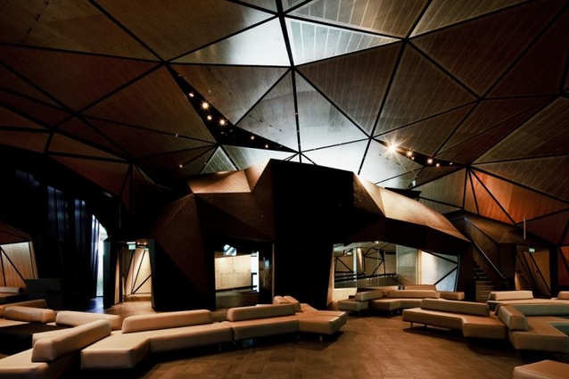
And, last word to the good folk at Studio Pacific: “In contrast to the bland, mall-like interiors that typify most international airports, the interior of the Rock exudes warmth and resounds with personality. Honey-coloured macrocarpa ply softens theatrical strata of dark-stained panels fissured with light. Spaces unfold on varying levels and exploration is welcomed, with journeys through the interior gently modulated by a series of ramps. Travellers are able to enjoy interior areas that are engaging and restful, impressive and intimate.
For more on the Rock, check out Tommy Honey’s story for Architecture New Zealand.


