
Sir Paul Reeves Building
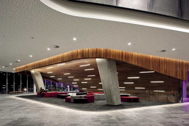
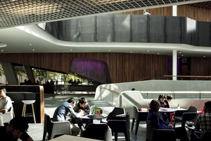
A cave-like space wrapped in cherry beech.
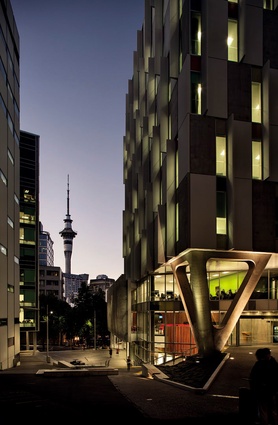
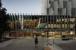
The building’s muscular triangular support is also a distinguishing landmark.
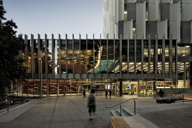
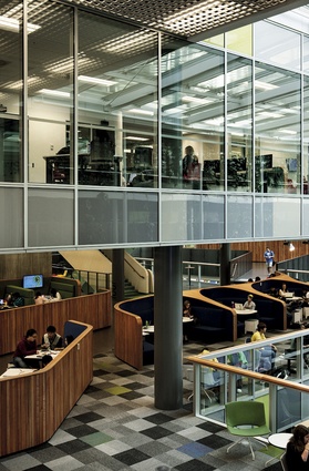
Exterior view showing distinct parts of the building, the tower, at right, under gridded ceiling form, the glass-roofed atrium, centre, and the lecture theatre core.

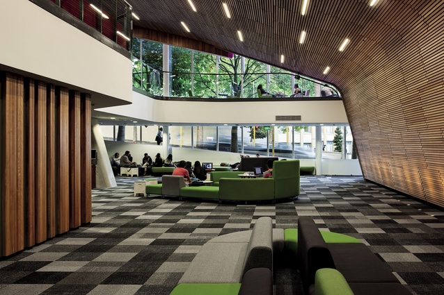
Rugged – “student-proof” – materials that permeate through the atrium spaces include gently curving black steel and concrete work.
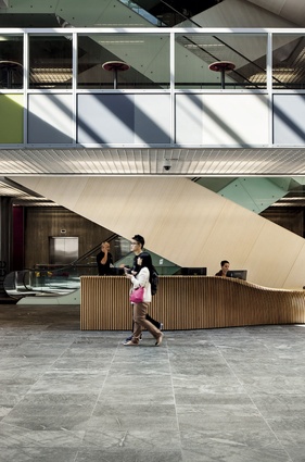
The building’s front desk, as well as a number of other furniture items, were designed by Jasmax.
An example of some of the collaborative seating options available in the building. These modules were designed by the architects.
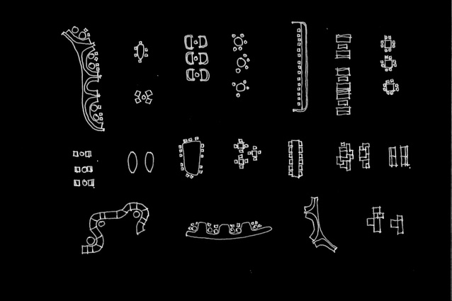
Hand-drawn illustrations of some of Jasmax’s collaborative seating concepts.
View through atrium to lecture theatre core.

The Sir Paul Reeves Building café on level four looking towards the lecture theatres.
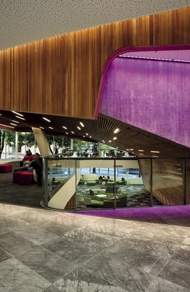
Example of the timber cloak (wrapped over a concrete core) worn by the lecture theatres, which provides a more cave-like experience at level three.
Flexible furniture arranged under a fold of the lecture theatre cloak.

Part of the Media Centre.
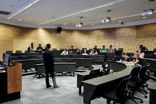
A smaller lecture room.
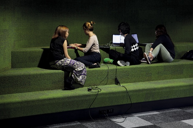
Carpeted bleachers in an area that can be curtained off to form an impromptu learning space.
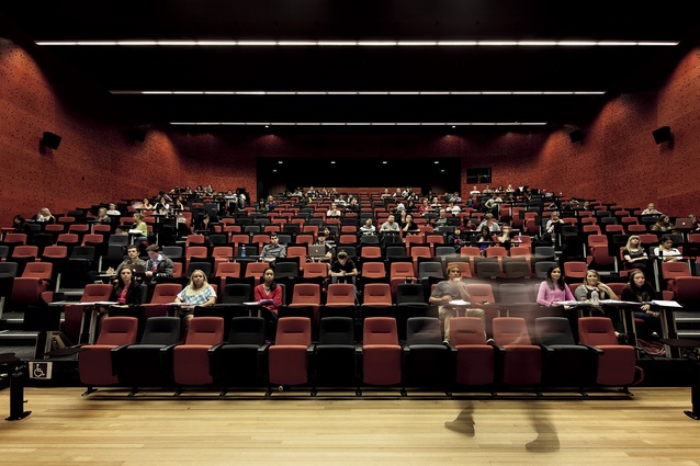
A large lecture theatre.
Twice now I’ve had the pleasure of visiting AUT’s newest centre for learning, the Sir Paul Reeves Building, named after the 15th Governor-General of New Zealand and first Chancellor of Auckland University of Technology. The first visit, as the building neared completion, was courtesy of Desna Jury, Pro Vice-Chancellor and Dean of the Faculty of Design and Creative Industries, who handily filled in some of the details of the building’s genesis, the years of planning and what sounded like a very interesting research tour to international schools, including the Walter Cronkite School of Journalism, the Colombia Business School, and others. Jury says that the research group was struck by the investment made offshore in state-of-the-art learning and research facilities and by the character of the different spaces – each reflecting the vision of the institutions in a unique way. In particular, she says that the social spaces and the interactive and flexible learning environments they observed were important in shaping views on how AUT might progress with its new precinct.
“Our research for the building was really comprehensive and multidisciplinary – we have been taking a look at the intersection between space, technology and pedagogy for several years, with the research embracing architecture, learning theory, student-focused needs analysis, technology-mediated learning and different learning and teaching delivery models. We visited universities in the UK, the United States and Australia in a formal way but, additionally, most staff have been on the look out for exemplars of best practice and new initiatives in their travels,” she explains.
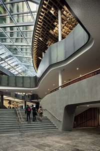
Back then, in December 2012, it was easy then to see the massive potential of the structure – its emphasis on internal connections via bridges and wide concourses, and the wonderful atrium, reminiscent of a gigantic winter garden, which pulls the building’s composite parts, along with adjacent library, together. The building, in a wider urban context, seems to solve the riddle of AUT; tapping into plazas and outdoor areas, connecting areas, creating sense and order around its axes. At that stage, however, seeing such a large structure as yet devoid of its student life force was eerie; at 20,000m2 the building is vast; there was an incredible amount of furniture not being sat in.
The second visit, post-completion, was with Jasmax’s Richard Harris and Chris Scott. With the building in use it looked clear that the finished product was everything those involved with the research and design might have hoped it to be. It was, you might say, humming: students everywhere, like ants, walking the sinuous bridges, sprawled out on variously assembled suites of furniture, plugged into gadgets and filling the café, the media centre, the lecture theatres, the radio stations and studios. Had I been born a decade or so earlier, I might have trained at this new precinct. Lamentably, I was a generation late.
This is high-tech architecture for an educational field that has gone high-tech. The name of the game today, says Richard Harris, is “convergence”. What might that word mean for budding journalists? I think it means being able to broadcast any which way, across all mediums. In the Media Centre, on level five, you can see that the kids are across everything in a space designed to help “break down the silos”.
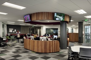
“That couldn’t happen in the old building,” says Harris. “There, every programme had its own work space, not necessarily by desire, although a number of people thought that it was an asset to have their own space. This idea of convergence [found focus] in the creation of the Media Centre on level five. It is a space that enables everything to happen. There is still a lot of learning to come from the school as to how to use that space, but the feedback we’ve had from the students, and everyone that is using the space, is that it’s made an amazing difference. The transformation is just phenomenal.”
And, while there are a number of specialist facilities, such as motion capture, chroma and green screen studios, Chris Norris says a philosophical change was seeing them as not owned by just one programme.
“All those spaces have a degree of multi-use about them, and anyone will be able to use them, so that idea of collaboration and convergence goes wider than just the School of Communications. Potentially, art and design students will also be able to come and use those spaces.
While this may be a high-tech building, it’s not the chromium architecture of someone like Hadid, fluid and metallic. It’s also quite dissimilar to the University of Auckland’s business school, which seems hard and mechanical in comparison. This piece of architecture is large, but there is a warmth to its palette which is evident in the wave-like forms of custom-designed furniture that Jasmax encouraged its architects to produce, with much of it also designed to promote multiple occupation, rather than that curious university phenomenon – ‘hogging’ of space.
The architects say that a key line of thinking was to put students first, and that seemingly obvious step, which from an educational point of view might be comparable to the difference between ‘teaching’ and ‘learning’ environments, influenced a number of design decisions. The muscular triangular support that anchors the building to Governor Fitzroy Place, for instance, flags this idea at the building’s front door.
“The building would have had columns coming down in the middle of the stair there,” points out Harris, as we perch on public seating on Governor Fitzroy Plaza. “We just said, well the students get priority and they won’t want to fight their way around columns. So we challenged the engineers and they said, ‘Yes, we can make it work’. So we put in a tri-column there, and its been designed very elegantly.”
Thematically, that support at the corner of the tower sets the scene for the interior’s vast column-free spaces, where there are few barriers to movement. But, let’s take a step back and break the building down into more easily digestible parts. Debatably, the most impressive area aesthetically is around the lecture theatres, which, to veer towards the florid, might be described as the architectural equivalent of the iron fist in a velvet glove. Here, the architects “draped” a concrete core with a cloak of cherry beech and then wrapped it over the top with a lattice-like, 600-ton ceiling form that was manipulated and finessed in Grasshopper, a graphical algorithm editor that is integrated with Rhino’s 3D modeling tools. There are cut-away parts to the cloak which form almost cave-like spaces. Inside the large lecture theatre you’ll find perforated timber panels under a blacked-out ceiling. Chris Scott remarks that they wanted to put the “theatre back in lecture theatre” – that has certainly been accomplished. The lecture theatre environs also push right out to the footpath of Mayoral Drive, and the glazed wall allows all the activity of the interior to show through.
“It’s the idea of the shop front, and that the interior is, in a way, actually the façade of the building – or the most important element of the outside of the building. It was really about transparency, and once you see through the trees and the sunscreen, you’re start seeing the life of the building. It comes through very strongly at night, but even during the day there is a very strong connection to the building’s interior.”
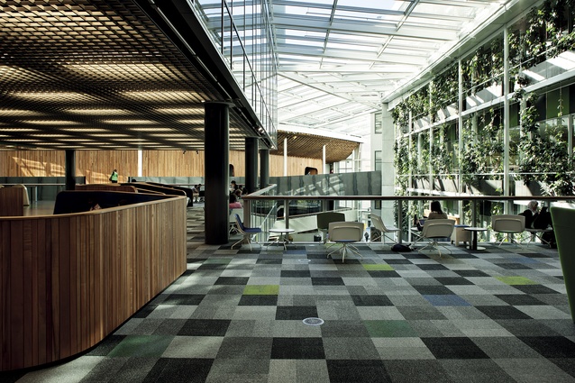
Another impressive piece of the Sir Paul Reeves building is the conservatory-like atrium, where greenery climbs up a lattice of steel columns. It’s an all-weather haven, it brings the light, but it’s also like connective tissue, bringing the campus library in under its glass embrace. It’s also a place to access the studio spaces, and there are suites suites of high-backed sofas that can be manipulated by students.
Finally, there’s the tower, which is easily discernible from the exterior thanks to its Magnagrid open-cell ceiling system, beyond which are hidden intense acoustic layers and lighting devices. Among the tower’s many amenities are the Media Centre at level five, flexible teaching spaces, places for staff, post-grad students, research and the like. At it’s upper levels, the tower’s design is quite inward-looking; it’s designed for concentration, the slotted windows allow in plenty of light but their vertical arrangements controls the view. A small detail on the tower’s concrete sun screens is a geometric patterning that references the facade of the AUT business school down the road. That detail is also a reminder that Jasmax has done plenty of work at this university. Richard Harris says a much earlier master plan indicated the site of the building and had an idea of how it might be integrated into the campus.
“In the late ’90s we had the concept that at level four there was going to be a racetrack, and so you could do a complete loop through. When we were doing the library, we had a vision that one day we’d connect it up in a circle with the buildings now. Our concept then was that there would be bridges over an open air courtyard. That was our original thinking – and the concept of that master plan has been durable for 15 years.”
The idea of the racetrack lives in the robust bridges that connect level four, says Scott.
“The steel balustrade, the shaping of that – and Richard talked a little bit about that master plan idea of the racetrack going around – was really to express that this is about movement and about connection. One thing about buildings of this size is that they can be confusing, you can get lost. But when you come in here you get a sense, almost straight away, of where everything is. And you understand that it’s about connection and circulation at level four, and that there are stairs and escalators there. You can see how you get up to it and it all becomes very easy.”


