Spice Island
Glass globe pendants echo the paper lanterns seen hanging in narrow streets in China.
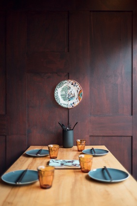
The original timber-panelled walls were retained and stained walnut, giving the space the sense of an ancient wooden box.
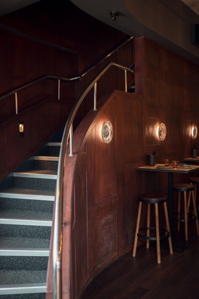
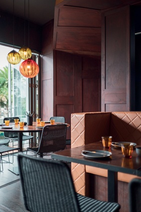
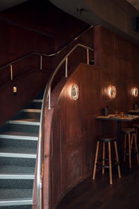
A gently-curving staircase leads to the upstairs level. Seating is casual in nature and raised to overlook the street.
Gold, timber, and spice tones, such as cinnamon and nutmeg, are evoked in the colour scheme.
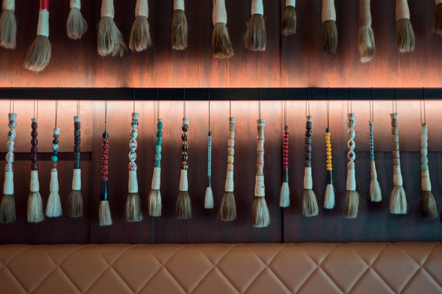
A display of calligraphy brushes adorns one wall.
Upstairs is a quieter space, intended for longer meals, with lower seats and tables and subtle colours.
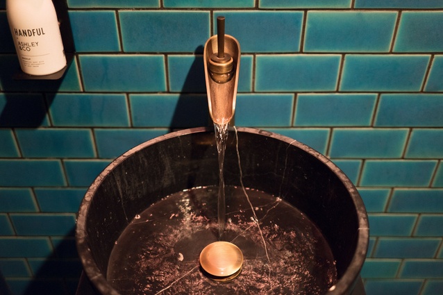
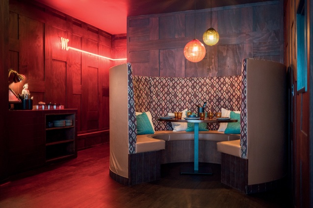
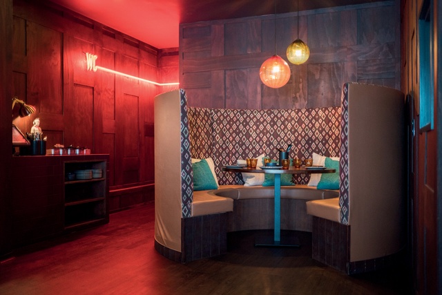
The bathroom features an aged-look blue tile and a circular basin that is reminiscent of a wishing well or pond.
Upstairs the seating is more comfortable and intimate.

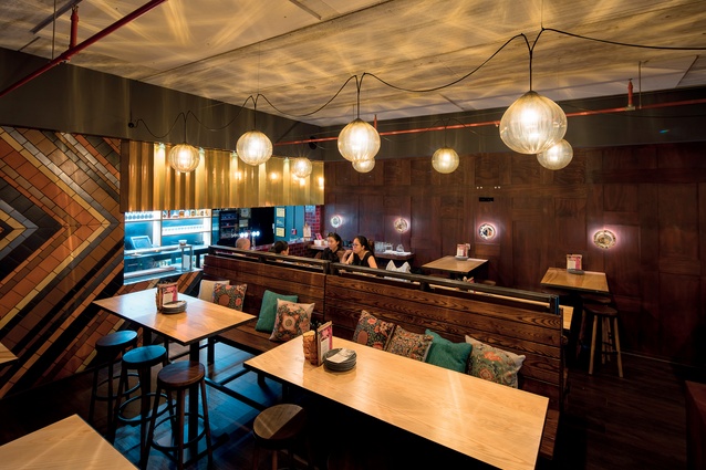
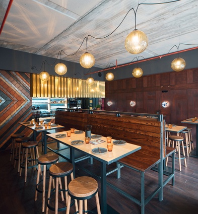
Luke Jacomb created the blown-glass lights, which are strung in a casual fashion over the downstairs space.
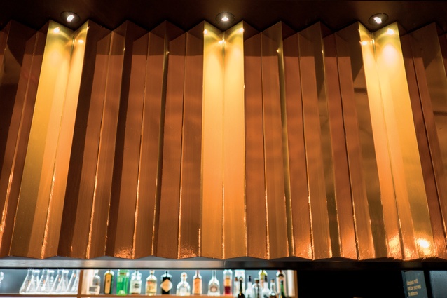
The bar is covered in an MDF panel wrapped in gold foil to look like folded brass.
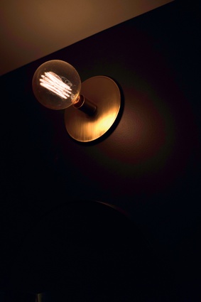
Several light sources provide atmosphere in the downstairs space.
ArtWok is a contemporary incarnation of the traditional Chinese restaurant. Kathleen Kinney met with designer Toni Brandso to talk about the building’s renovation and the new fit-out, which encompasses ideas of street dining with the colours of Asian spices.
Takapuna continues to evolve as a vibrant Auckland suburb, with an ever-increasing range of top-notch retail and hospitality options. Just a few minutes’ drive over the Harbour Bridge, Art-Wok (on Hurstmere Drive) lures city dwellers with its pared-back and locally sourced take on Chinese cuisine.

The fit-out, by Material Creative, employs thoughtful use of colour, lighting and accessories to tie together two distinct dining areas – including an exposed bar/servery on the lower level – in a mise en scéne that is unmistakably ‘Chinese restaurant’ but without the kitschy connotations that so often accompany that phrase.
The space previously had been a Thai restaurant (with even earlier incarnations as a ‘mermaid bar’ and a piano bar), and Toni Brandso of Material Creative says that although the floors throughout needed to be evened out and relaid, the existing timber wall panelling could be retained.
“I really wanted to spend money on the light fittings and the furniture. I knew that if we could salvage some things, and make them work, that would free up the budget to spend properly on the things that would make a real difference.” The timber panels were stained a warm, dark-brown tone, which is repeated in the high timber benches and round four-legged stools that comprise the lower-level seating.
Downstairs, as part of stripping out the old, the builders had to break into the lowered ceiling to see where the water pipes and service ducts were located. “When they said, ‘there’s a concrete ceiling up here’, I was so excited!” Brandso recalls. “The concrete was in great shape, and being able to incorporate that industrial material into the mix gave the space a little bit of an unexpected edge.”
On the left side of the rear wall, a floor-to-ceiling tile composition is visible from the front entrance and neatly encapsulates the entire colour palette. The chevron design is tipped on its side, directing attention toward the bar and servery. Brandso says she wanted to use ‘spice colours’, but to do it in a way that was unexpected.

She added touches of warm terracotta on the window sills and pale sisal floor mats, along with the industrial grey of the newly exposed ceiling and the glossy red brick tiles that surround the servery. A bulkhead panel above the servery appears to be made of folded brass and adds a touch of metallic gleam.
“It’s supposed to be folded brass – but it’s not,” Brandso admits with a laugh. “We simply didn’t have the budget for a bespoke panel, so we had the builders make this folded one out of MDF, and then the signwriters wrapped it in gold foil.”
The shining gold-toned panel is echoed by the two strings of oversized glass orbs overhead. These add a touch of delicacy to the interior, and reinforce the underlying visual theme of traditional-with-a-twist. “The whole idea was to have lanterns in the space, like you might see hanging above a narrow street in China. Luke Jacomb made these for us, and we strung them up simply so that the globes and the shadow play which they create are the real focal point here.”
A wide, gently-curving staircase leads to the upstairs level and visually recedes due to hard-wearing, dark-grey carpet and a simple handrail. “It’s fairly big, and right near the entrance, but it’s not important. Like the walls, I just wanted it to fade into the background,” Brandso explains.
Upstairs is a quieter space, intended for longer meals. The seats and tables are lower, the colours more subtle. Lighting is indirect, primarily coming from behind narrow horizontal wall panels. In front of these, long rows of suspended calligraphy brushes are the visual keynote. A few strategically-placed glass orbs echo those downstairs.
It’s no surprise that, from the outset, branding and signage figured in this comprehensive fit-out. Toni Brandso says, “The clients’ brief was about turning traditional Chinese food and colours into something different, and bringing them to New Zealand today, and but not in a butchered way. So, we used the teal, the gold and the red colour palette, and the warmth of the wood.
“We engaged Hannah Design to do the branding from the beginning and right through the concept. Together, we looked at the double-barrelled name – Art-Wok – and how the elements of that name would influence the interior. We presented to the clients together, so our interior fit-out and Hannah’s branding runs across everything – the menus, the signage, the dinnerware and the colours. Our intention was to have total consistency throughout.”
DESIGN SOLUTIONS
For the lower level of Art-Wok, Toni Brandso of Material Creative wanted to evoke the atmosphere of a narrow street in a Chinese city.
The dark-stained timber walls and exposed concrete ceiling both play a role in this impression, but the lighting scheme is the most essential element. Overhead, two rows of large amber globes are anchored to the ceiling by swags of black cord. Reminiscent of traditional Chinese paper lanterns, these seemingly delicate objects sway slightly, and produce an ever-changing play of light across the ceiling and walls.
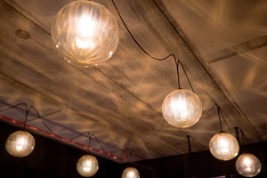
Avondale-based artisan, Luke Jacomb uses both cast glass and glass-blowing techniques to create the oversized orbs that can be found in many hospitality interiors in the Auckland area and further afield; and Brandso knew that his aesthetic would be ideal for the Art-Wok fit-out.
“We spoke, and Luke had a mould that he’d been wanting to use for ages, so he made us a few samples – and they were exactly what I wanted for the space,” Brandso says. The lanterns overhead are augmented by bespoke wall sconces made from more traditional painted plates.
Brandso explains, “The client had these plates and wanted to use them in some way, so we had the builders cut each one in half, and then we mis-matched them and glued them back together. Again, it’s a little bit unexpected and it’s interesting – without being a distraction from the beautiful lighting overhead, which is the real feature.”
ACOUSTICS
Art-Wok’s downstairs level has pedestrian traffic on the other side of a wide, often-open row of retractable windows. A working kitchen is visible through the servery on the back wall. During the fit-out and build, the decision was made to remove the existing low ceiling and expose the concrete above.
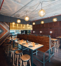
“Once we exposed the higher ceiling, we decided to make the seating higher too. It gives it more of a street-food vibe, and makes it a really active space. We had our joiner make all the tables and the high benches; and the stools are from Cintesi. The seating benches aren’t really moveable, but of course people can move the stools and the smaller tables if they need to.”
All these acoustic factors, in a space with timber floors and walls, led to concerns with the accumulated level of ambient noise. Two large Autex panels match the pale grey of the concrete ceiling and ensure that, in this high-energy space, the auditory environment stays on the right side of the line between lively background conversation and uncomfortable din.
Brandso says, “Visually, there’s no distraction. The panels fade into the concrete and you don’t even notice them. But acoustically? You would definitely notice the difference if they weren’t there!”