Supreme look
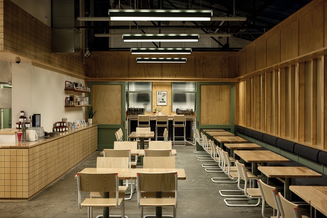
A grid motif throughout the interior helps unify the different spaces of the new facility.
The pale wood is reminiscent of the yellowed pages of an old accounting ledger found during the renovation, which served as an inspiration for the design.
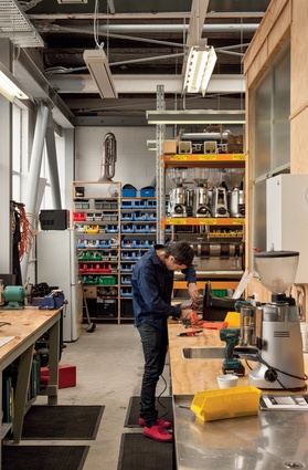
Behind the scenes, Supreme Supreme houses the company’s wholesale operations and client-training facilities.

Seafarers in the Britomart Precinct is the smallest Supreme café, and is designed to cater for walk-though traffic in a busy downtown destination.
Good One, in Ponsonby, is the oldest Supreme café. Jessica Barter designed this space as well as the new Supreme Supreme location.
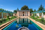
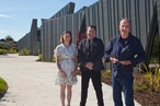
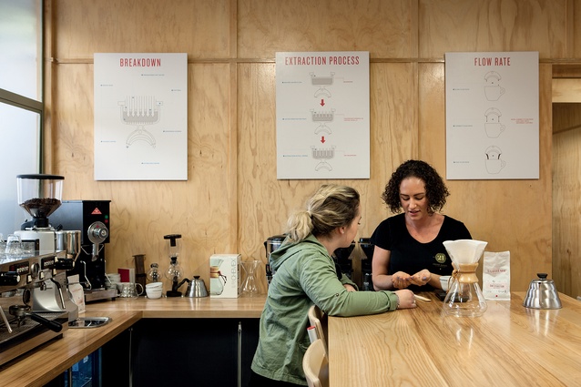
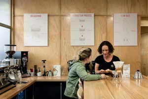
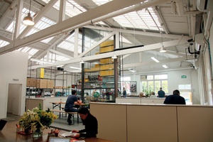
Nearly a decade after opening, Coffee Supreme Limited has created a South Island base for its expanding brand. More than just a café, Supreme Supreme in Christchurch is a headquarters for the wholesale team, a training and education facility for employees, baristas and clients (the numerous cafés across Australasia that serve Supreme coffee) and, of course, a destination for top-notch coffee and food.
Jessica Barter from Auckland-based Bureaux worked with Supreme on their Good One location and was called to lead this renovation. “Jess gets us,” says Supreme chief executive Al Keating. “We involved her, because we knew that Supreme Supreme would be the biggest thing we’ve done.”
As much as the design brief from Supreme was about accommodating the facility’s planned multifunctionality, it was also about honouring the heritage of the building. The Welles Street location was built originally as a Land Rover dealership; but, for the past few decades, it housed Chinese market Hop Yick Cheong. Originally located in a shop on nearby Madras Street, and in business since WWI, Hop Yick was a much-loved landmark. But faced with ongoing disruptions after the earthquakes, and without a ready successor, the owners elected to retire.
Realising the evocative history of the Welles Street property, Keating and Barter were determined to bridge the gap between new and old. The design solution was found in a skip.
“During the demo phase, we found a really old accounting ledger, filled with Chinese characters. It just struck a chord. I said to Jess ‘you have to work this into the design’,” says Keating.
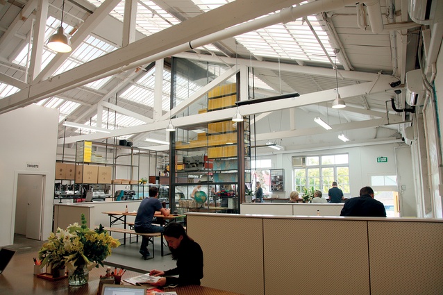
“The straight lines of the ledger, the colour of the pages and the blue and red lines, were the starting points for the interior concept,” says Barter. The ledger’s grid is referenced in the panels on the walls and floor, and the square tables, chairs and tiles.
It’s near-impossible to find a curve and this rigorous conceit unifies the various functions. Square glazing – like interior windows – provides a glimpse into the back-of-house.
“Our clients come here to have focused time for training. Glass doors separate the training rooms from the café, so there’s an awareness of that environment, but we’re removed from it, and concentrate on the educational aspect.”
Newbies might assume that the neon ‘Double Happy’ sign advertises a Supreme Supreme special coffee drink or blend. Keating says it’s another way of bringing the past into the future.
“A Double Happy is a firework so, for our local clients, it has a special significance. On Guy Fawkes Day, Hop Yick had the biggest and best fireworks sale. That sign, and the Chinese characters in the front window ensure the heritage of Hop Yick continues. The former owners come in frequently, and we even sell a Hop Yick hot sauce.”
“We feed people, we teach our clients and we store the coffee. Those are very distinct and different reasons for people to come to Supreme Supreme every day. But what we’ve created here fulfils all three objectives perfectly.”
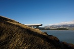
Seafarers – Britomart
Almost a complete about-face from Supreme Supreme, this downtown Auckland location is the smallest site. The Seafarers Building, between Tyler and Quay Streets, is home to retail outlets and eateries. Pared-back and almost miniature in scale, Supreme Seafarers is positioned almost as though it is the building’s reception concierge. Polished concrete floors and nautically inspired design features pay homage to the building’s unique heritage.
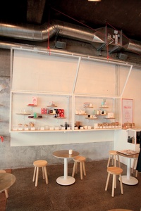
Fresh coffee? Of course – you can drink it here, take it away or take some beans home. And, of course, there are nice things to eat. But there’s also a selection of smaller items from many of the country’s noted fashion and homeware designers. So, if you’re stuck for a last-minute pressie, or just feel like treating yourself, Supreme Seafarers has that covered, too.
Good One - Ponsonby
When it was launched in 2008, the first Supreme café broke a lot of the traditional rules about cafés and coffee shops. Positioned down a narrow backstreet in Auckland’s Ponsonby neighbourhood, far away from high-density foot traffic, ample parking and adjacent retail spaces, Good One has always been a destination, or a serendipitous discovery, rather than a ‘we might as well stop here’ sort of place.
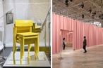
Good One’s signature bright-yellow accents owe as much to the industrial aesthetic of this former manufacturing facility as they do to the massive collection of National Geographic magazines. Good One was one of the earliest proponents of long, communal dining tables and single-origin beans. Thanks to social media and word of mouth, it quickly gained an enthusiastic following among brew-and-bean aficionados, world travellers looking for the ultimate New Zealand coffee experience and locals.