Urban colours: Park Avenue Prewar
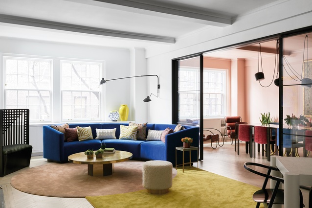
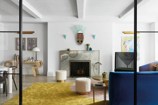
A circular custom sofa, designed by MKCA and upholstered in a blue textile from Maharam, curves around the living room.
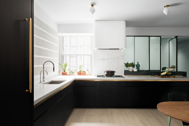
White marble countertops complement the kitchen’s lacquered and ebonised oak pantry.
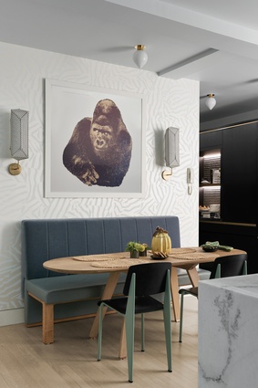
An Enzo Mari gorilla print, with sconces by Erich Ginder on either side, hangs above the kitchen table.
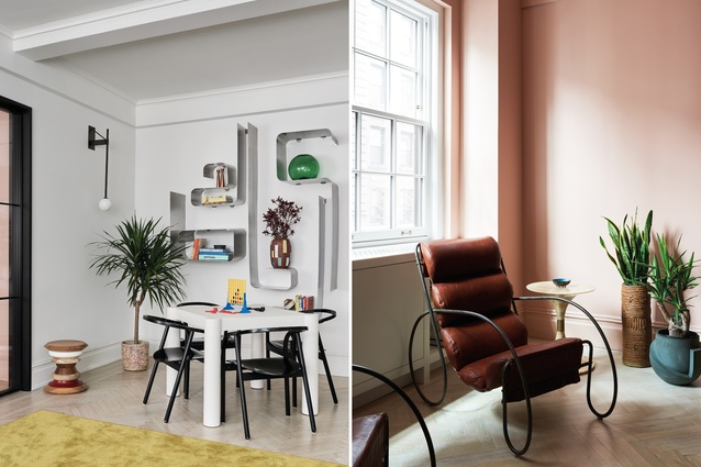
A stainless-steel shelving unit by François Monnet overlooks a linen-wrapped games table in the living room; MKCA chose furniture, finishes, and art and design objects with care.
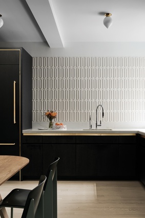
Glossy, moulded tiles by Ann Sacks pick up light in the kitchen.
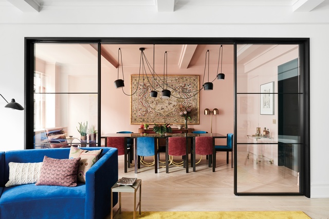
A glass sliding partition allows the dining room and living area to be separated.

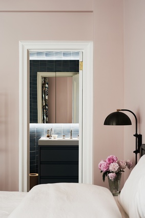
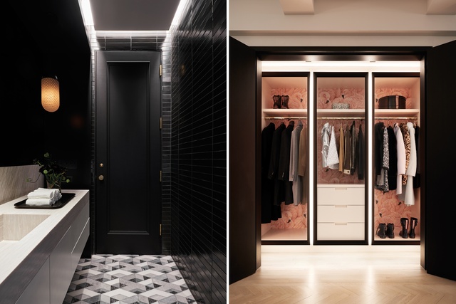
A powder room, lined with handmade metallic black tiles from Heath Ceramics, is a sleek new addition, as is the cloakroom, which features flamingo wallpaper and integrated LED lighting.

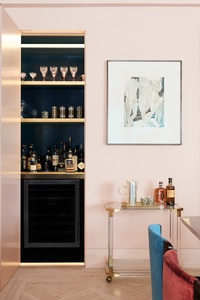
The dining room, painted in dusty pink, offers a gentle contrast to the living room’s colour palette.

“I have to admit there was a bit of apprehension,” says designer Michael Chen about the choice of pink for the dining room.
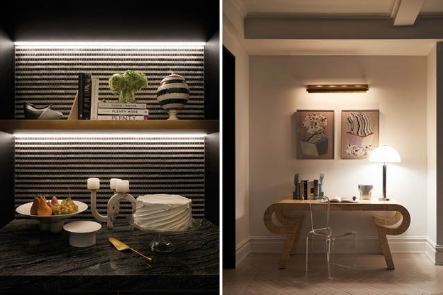
Chen says the studio chose materials “for their specific properties relative to light”; two drawings by Karin Haas hang above a desk adjacent to the fireplace.
Custom sconces by Allied Maker sit on vintage nightstands, designed by Luigi Caccia Dominioni for Azucena, in the master bedroom.
![“The apartment’s aesthetics were developed in close collaboration with [owners] Laura and Jason,” Chen notes.](https://cdn.architecturenow.co.nz/site_media/media/cache/31/b8/31b82e6ec43b0a6ff17d550b9558c60a.jpg)
“The apartment’s aesthetics were developed in close collaboration with [owners] Laura and Jason,” Chen notes.
This not-so-small apartment above Manhattan’s Park Avenue is a delightful example of the magic that colour can bring to a previously dark enclosure.
When renovating Manhattan apartments, most designers are confronted with the challenge of space: how to squeeze every square inch out of minuscule floor plans. Not so when Michael K Chen Architecture (MKCA) was enlisted by a young New York family for its pre-war apartment on Park Avenue. Built in an era associated with high ceilings, wide hallways and spacious foyers, the 260m2 space is almost four times the size of the average Manhattan apartment (around 68m2).
The residence is home to the Schwalbe family – Laura Farrell Schwalbe and Jason Schwalbe, and their two small children – whose main concerns, says Chen, were “addressing the lack of natural light in an intelligent way, creating a powder room, and ensuring that openness and a touch of formality were retained throughout”. To do so, the architecture team transformed what were once dark and claustrophobic storage and service areas into more-functional living elements. The couple’s coveted powder room, for instance, occupies a former closet.
A relatively fragmented layout led MKCA to enlarge various openings to create more circulation. One example is the replacement of a tiny aperture between the living and dining rooms with a sliding partition made from black metal and glass, which expands the space physically and visually.
Alongside MKCA’s spatial interventions, the studio’s choice of furniture, finishes, and art and design objects played a large part in answering the clients’ requests for playfulness, connectivity and lightness. “We selected most of the materials for their specific properties relative to light: glossiness, translucency, reflectivity and so on,” says Chen.
He points out the 3.35m-long custom dining-room table in high-gloss lacquer, steel and gold leaf from Detroit-based Alex Drew & No One, as well as three-dimensional tiles in the kitchen, which elicit a subtle play of light and shadow in a space with only one window. Meanwhile, the acid-etched partition in the laundry and service space beyond draws ambient natural and artificial light into the kitchen.
“When we work in dim spaces, we like visual contrast. Actually, I like contrast all of the time, but especially in dark spaces because I think it makes them so much livelier. If they were neutral, they would feel incredibly flat and dingy.”
It helped that the clients were interested in bold design choices. “The apartment’s aesthetics were developed in close collaboration with Laura and Jason,” says Chen. “We had a lot of conversations, spent a lot of time looking at things together, and sent a million text messages from travels, browsing and the like. They had a lovely sense of how they wanted to live. They were committed to living in the formal spaces, instead of reserving them for special occasions, and they wanted to have fun with the apartment but still preserve its historical charm.”
Chen describes the relationship as mutually motivating. One of MKCA’s propositions was a massive circular sofa, custom-designed by the architects. “It just made so much sense spatially and functionally.” “Spatially” refers to the bright-blue sofa becoming the centrepiece of the room, and “functionally” to its size – which allows the whole family to plonk down together – and to its ability to transition from an intimate conversation spot to the hub of a party.
MKCA also pushed for pink in the dining room, where Laura had requested a strong colour. “I have to admit there was a bit of apprehension,” says Chen, “but we collectively decided to go for it. And we all love the result of giving the room a thoroughly consistent and immersive colour scheme that coats all of the walls, mouldings and ceiling.”
The dining room is also home to one of Laura’s suggestions: the oriental screen, a flea-market find, which hangs above a mid-century console by designer Henry Glass. “A thrift store is just about the last place I would look for art,” says Chen, “but I think it looks great. The selection of that piece emerged straight from the paint scheme. The very best kinds of client collaborations are when we are asked to push the clients a little past their comfort zones, and when they do the same to us.”
This article first appeared in Urbis magazine.