
The warmth of wood

Strategy House, Christchurch.
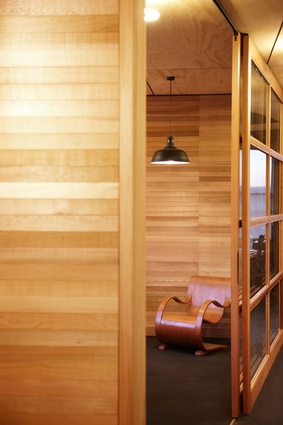
A classic Garth Chester Curvesse bent-ply chair, from the mid-1940s, takes pride of place in this office.
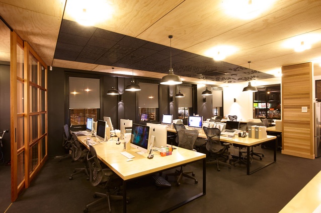
The open-plan workspace.
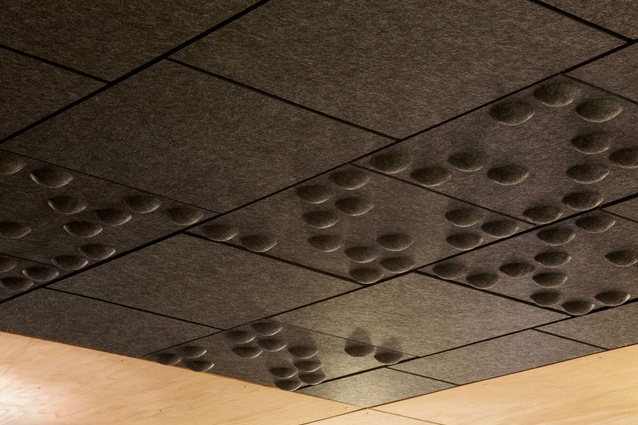
Detail of acoustic panel on ceiling.
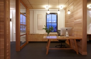
Reception area.
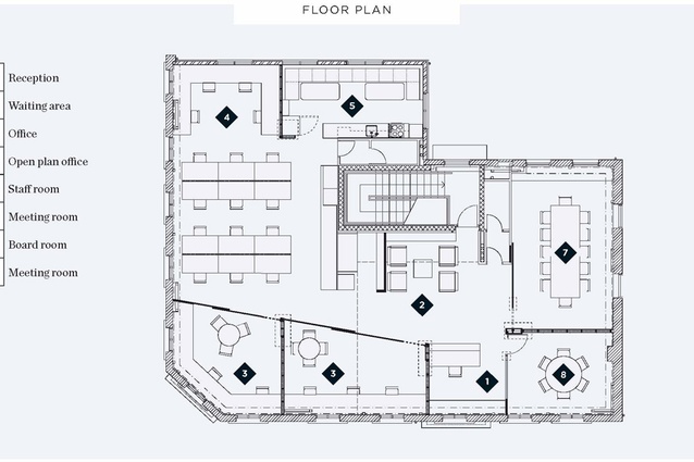
Floor plan.
The warming characteristics of the timber-lined interior indicate a Scandinavian- or Japanese-inspired modernism.
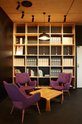
Strategy was able to salvage some of its collection of midcentury modern furniture from its demolished office, including these Grant Featherston-designed chairs.
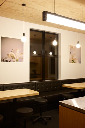
Lunch room.
A heart-warming wood-clad interior with Scandinavian and Japanese references – just the tonic for a busy Christchurch advertising company that needed to get back to business fast.
The effect is Tardis–like. Go into the historic 1877 Grosvenor Hotel, up the mysteriously dark nightclub-like stairwell for a palate-cleansing of the sensorium, and come out in the welcoming and modern Strategy Design & Advertising offices, relocated since the February 22 earthquake. One major benefit of the new location is that it is right next door to the Christchurch Polytechnic Institute of Technology (CPIT). Strategy employs many CPIT design graduates and consults on designing the course syllabus. It’s a positive step toward revitalising a part of the city that is rapidly becoming a creativity hub in the post-quake environment.
The new offices announce the company’s aesthetic as clearly as their portfolio. You can’t fake good taste. Strategy’s group creative director Guy Pask worked closely with Callum Pankhurst, director of interior design firm Crafted, to achieve a thoughtful space that precisely represents what Strategy is all about: “Proudly independent, we are not too small to be ignored — and not so big as to end up ignoring you.”
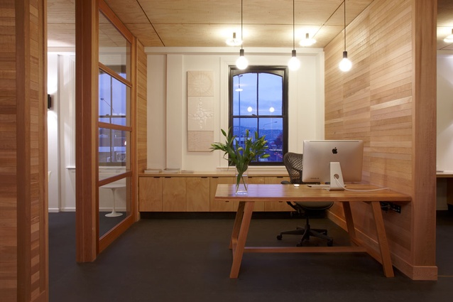
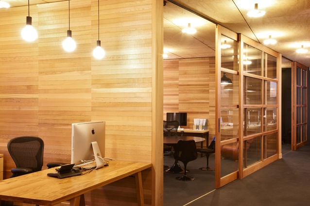
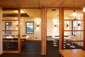
The layout is predominantly open plan, counterpointing warm, blond, bespoke gauge cedar with black highlights and industrial utility, resulting in an uncluttered, light, airy, relatively neutral but homely modernism reminiscent of both mid-century Japanese and Scandinavian design, blended with the original Victorian window mouldings and industrial elements. Wood is everywhere and keeps the whole from feeling too sparse or sterile. Indeed, the general attention to detail, texture and variation ensures that this insulated creative womb (not a cliché in this case) doesn’t resemble a generic, antiseptic, off-the-rack office space. The retail booms of the late 20th and early 21st centuries all too often betrayed design by making economic and superficial judgements about serious aesthetic matters. Strategy is deadly serious about its aesthetic because that is its business and it must look as sharp as its product. If it was a type font it would be Helvetica.

A quiet sort of theatre rules the space, carefully conducting the creative and social energy throughout a footprint around half the size of the previous offices. Generous desks and open meeting places foster an environment encouraging of collaboration and the exchange of ideas. Rubber gymnasium-like floor tiles, pinboard walls, and sculptural ceiling panels all combine to block the traffic noise from outside, and soften the bustle of the largely open plan interior to prevent it from becoming too distracting. Sliding glass partitions – a variation on the sh?ji partition screens in Japanese washitsu interior architecture, with a bold diagonal plan, prevent the efficiently articulated volumes of the space from being too fussily literal or rigidly rectilinear and boxy. The whiteboard wall in the boardroom is a nice touch, as are the Braille-like node-embossed black feature ceiling panels in the main space, reminiscent of an Anton Parsons sculpture. It is functional and utilitarian, but unarguably stylish and eye catching.
The Strategy team was able to salvage some of its magnificent collection of midcentury modernist furniture, and their selections of variations on Saarinen and Aalto chairs and elegant industrial light fixtures complement the overall aesthetic without becoming too distracting. There is a definite balanced homogeneity to the office palette, creating a sense of visual unity and easy flow. The various dynamic personalities and their creative territories are harnessed to a common, non-threatening sleekness and efficiency which is consciously projected. There is every sense that this is an ideas lab where important things happen, but not at the expense of quality of life and environment. Attention to detail and truth to materials, respect for tradition without aping it, harmony of details – the effect is timeless in this inviting, democratic space.


