110 Wrights Road
It is an office block in a Christchurch business park but, once inside, you are off to the races. This modest office building eventually reveals a more unusual and surprising context that provides the key to its architectural flourishes.
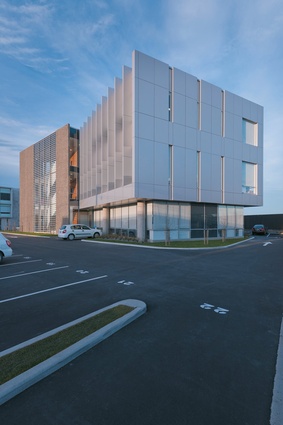
The 1,586m2, three-storey building sits behind a surface car park on a busy road south-west of the city centre. It was developed before the February earthquake as a speculative office block with no client in mind. The commercial risk paid off. After the February earthquake, office tenants displaced from the city centre migrated south-west to Addington and the building found itself in a suddenly thriving neighbourhood with government clients, the Department of Labour and Immigration New Zealand, as long-term tenants.
Jasper van der Lingen of Sheppard & Rout Architects took a pragmatic approach to designing an office that had to be flexible enough for any future client. The architect’s response was to keep the building ‘dead simple’. He created ‘a nice, clean rectangle of office space’ by placing the structural elements on the perimeter and the lifts, toilets and concrete core in a wedgeshaped structure on the front façade. The wedge breaks up the otherwise uniform street façade and is angled to run parallel with the road. The lift shaft is behind aggregate panelling that flutes at the top.

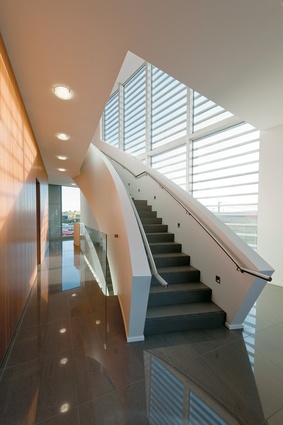
The concrete core provides the interior wall of the wedge and is clad in a Tasmanian blackwood veneer. The ceramic-tiled floor also keeps the space bright and airy. This wedge is where we encounter the first architectural flourish. Two flights of white stairs elegantly curve up through the wedge creating a modest atrium and a visual focal point.
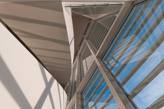
The stairs can be seen from the street through a large glass window with aluminium shades, where they glow pleasingly at night, animating the façade when the tenants have gone home. The angle of the curve on these stairs is the first clue to the building’s more unique urban context. Its secret is finally revealed when you leave the stairs and enter the first or second-floor office space in the main rectangular building.
Through the floor-to-ceiling glass on the opposite façade, you are immediately surprised by a commanding and panoramic view of the neighbours. Addington Raceway is laid out before you, like an exciting green oasis in this post-industrial landscape. The nearest corner of the racetrack sweeps right past the building, providing inspiration for the curve of the atrium stairs.
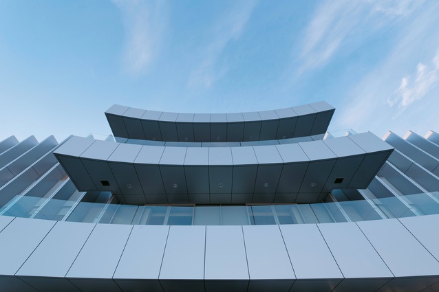
The curve of the racetrack is also reflected in the balconies on each of the upper office floors. The two wide balconies overlook the raceway and curve outwards at the same angle as is the corner. The architect designed these balconies, accessed by sliding glass doors, imagining a line of office workers gathering on them to watch the ‘cup day’ action.
They are a fun addition to the building and a thoughtful response to the urban context. The two balconies, when seen from the outside, help break the uniform pattern of the rear façade.
Both front and back façades are floor-to-ceiling glass with thin, aluminium shading fins running up the first and second storeys. The smaller, side façades are clad in aluminium with no glazing except for small, square feature windows in the corners.
The ground floor stands on round, concrete pillars with glass walls designed to make the base of the building appear transparent, with the more opaque office space floating above. However, an insensitive fit-out by a different architect has compromised this element of the design.
The ground floor has been roughly partitioned, blocking views through to the other side of the building. Sadly, the fit-out, commissioned by the government tenants, does not appear to have stretched to blinds for the ground-floor glazing. This means office workers have, rather unattractively, improvised their own blinds by taping flattened cardboard boxes to the windows. Luckily, these improvised blinds are round the back of the building and appear to be a temporary measure. They fail to undermine this smart and modest office building.
Sheppard & Rout Architects have pulled off a neat trick by giving hidden depths to what could have been another uninspiring speculative office building. It is a pragmatic, simple and understated building, with a subtle sense of place and just enough architectural flourish to get by.
What at first appears to be an unassuming commercial project, turns out to be a trackside ticket to the races.


