2015 Canterbury Architecture Awards
Twenty-five awards in this year’s Canterbury Architecture Awards were announced at the Christchurch Botanic Gardens Visitor Centre on Thursday 21 May.
The Christchurch rebuild featured highly amongst the winning projects with the public architecture category putting on a strong show.
Jury convenor Tim Nees, who is currently Architect in Residence at the University of Canterbury’s College of Engineering, said despite the slow process of renewal, there is reason for optimism about the rebuild.
“Architects in Christchurch have been challenged,” he said. “For them, as for many people trying to make things happen in Canterbury, opportunity has been partnered with frustration. But to call the amount of construction happening in Christchurch considerable is an understatement.”
Nees, who was joined on the awards jury by Wellington architect Stuart Gardyne, Christchurch architects Justin Leadbetter and Maria Chen, and Christchurch engineer Helen Trappitt, said that one thing that struck the jury was the number of projects that had been initiated prior to the earthquakes.
Full list of winners and jury citations are below.
Commercial Architecture:
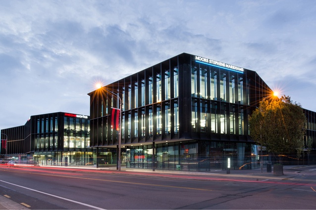
Three35 by Jasmax
Three35 demonstrates the benefits of giving preference to the public realm and diminishing the impact of car access and parking. Two restrained and well detailed three-level office buildings are positioned at the street edge, separated by a well-proportioned public courtyard. At certain places the plan inflects inwards, a playful gesture for what could have been a severe façade. A brise soleil of vertical fins provides shade and privacy to the tenants, and adds depth to the building mass. Smart, professional and considered, Three35 contributes an urbane identity to the emerging business character of Lincoln Road.
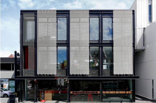
177 Victoria Street by MAP (Modern Architecture Partners)
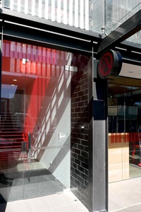
This small commercial rebuild project is a delightful and modest presence on Victoria Street. The architects have given much attention to the relationship between grain size and city texture. Although a simple block, the elevations have been enlivened by the addition of repetitive small-scale elements: glazed tiles, stainless wire mesh and slim gaps between masonry blocks. A small entrance is lifted by a bold pane of coloured glass. A tight stair leads to three floors of open-plan tenancy and through to the back of the building, where skillfully proportioned sliding windows frame horizontal views to the west, toward Hagley Park. To encounter these small surprises in a modest commercial development is proof of the skill and wit of the architects.
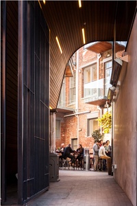
Stranges and Glendenning Hill Building replacement by Sheppard & Rout
One of the first commercial buildings constructed after the Canterbury earthquakes, this project demonstrates a commitment by a building owner to creating a vibrant and rich inner city development in a manner that goes beyond ordinary expectations. The building has been complexly planned to account for a sharp corner site, adjacent existing structures, and an outdoor laneway which provides shelter from Christchurch’s easterly wind. The resulting exterior is both jazzy and severe, soft and hard, curved and angular, black and brightly coloured. A knife-sharp corner prow dominates the High Street intersection, activating a neighbourhood largely demolished after the earthquakes.
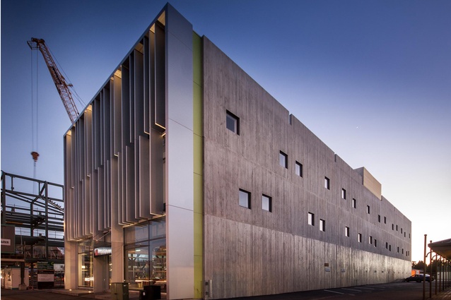
Young Hunter House by Sheppard & Rout
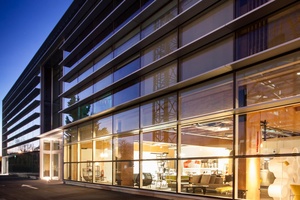
Young Hunter is one of the first buildings anywhere to use the PRESS pre-stressed laminated timber technology in multi-storey construction. Although the structure is a direct generator of the form of the building, the architecture also engages in ideas of face and flank, economy and flexibility. In the busy redeveloped streetscape of Victoria Street, Young Hunter is surprisingly sober. It possesses a four-square quality, a direct robustness that plants its toe on the edge of the pavement with assurance. Each face responds to orientation and circumstance. Inside, the laminated timber structure is evident but does not dominate. A plain plywood stair speaks honestly of budget constraints, but overall, an economy of means has resulted in a virtuous outcome.
Christchurch Eye Surgery Clinic by Wilson & Hill Architects
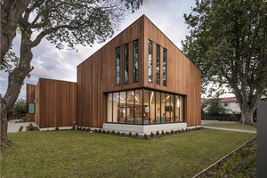
This building is the exemplary result of a post-earthquake collaboration between ten medical professionals who previously practiced from separate consulting rooms. The state-of-the-art medical facility, in Merivale, is quite different in appearance to the older residential villas which are prevalent in the neighbourhood. Although assertive in form, the clinic engages positively with its setting. The simple, strong building shapes are uniformly clad in red cedar weatherboards, giving the building a natural feel, and the architectural detailing is simple, crisp and sophisticated, inside and out.
Education Award:
Whareora (Science and Wellbeing Facility), CPIT by Athfield Architects

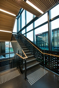
Whareora, a science and wellbeing facility, is a significant addition to the CPIT campus. Confidently designed, planned, and detailed, the building contains a variety of learning spaces, collaborative working environments and sports facilities. Simply planned around a double-level circulation route, the spaces are animated by use of materials, colour and natural light, and are furnished to encourage interaction. This building demonstrates how cost-effective, rational, and functional architecture can still be welcoming and exciting.
Resene Colour Award:
Bold colour has been used throughout the building to mark circulation and transitional spaces. Deep blue, burnt orange and avocado green are broadly applied to wall surfaces in effective contrast to natural steel, timber and concrete finishes.
Kidsfirst Diamond Harbour by Opus Architecture
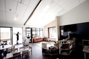
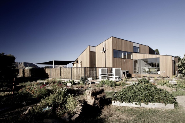
A dense programme has been cleverly resolved in this cedar-clad childcare facility. A kink in the otherwise linear floor plate provides two independent learning areas that are visible from carefully situated staff areas. The outdoor space is almost more significant. Engineered timber portal frames cantilever past the north façade covering a broad veranda. This space is vital to ideas of flexible learning, where ease of transitioning between interior and exterior environments is as fluid as the surrounding rolling landscapes. Through the intelligent use of space, light and texture, the architects have crafted special spaces for children and adults alike.
Te Kete Ika – Dining Hall & Kitchen redevelopment by Sheppard & Rout
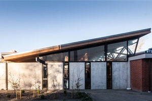
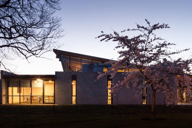
A significant addition to the Lincoln University campus, Te Kete Ika is a robust singular form referencing the industrialscaled agricultural buildings common to the area. The large sloping roof of the main dining space is supported by a simply detailed, splayed-steel structure. The roof appears to float above the walls – a strip of glass neatly detailed behind the struts allows views of adjacent trees and the sky – producing a diffused, naturally lit atmosphere throughout the space. The design of the new building makes strong reference to the adjacent Landscape Architecture building, also designed by Sheppard and Rout, successfully uniting the two buildings in a similar architectural language appropriate to a campus environment.
Enduring Architecture Award:
Munro House (1968) by Warren and Mahoney
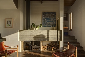
The Munro house exterior is beautifully proportioned: the size, shape and arrangement of the three windows on the north elevation is close to perfect and the materials and detailing on the outside are absolutely consistent with Warren and Mahoney houses of this era. The ground floor living spaces meander and flow down from entry level, contrasting tight corners with double-height spaces and a broad view out to the north. Throughout, there is a ‘lightness of touch’ clearly evident in project architect Nicholas Kennedy’s drawings and in the design elements on which he contributed. Kennedy died in his early thirties but showed incredible architectural talent. Over the past five years the owners have painstakingly restored the Munro House, bringing it back to original condition.
Heritage Award:
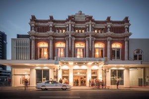
Isaac Theatre Royal by Warren and Mahoney
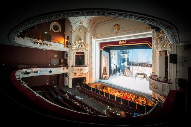
The restoration and rebuild of the Grade-A heritage-listed Isaac Theatre Royal, the only surviving Edwardian-style theatre in the country, has proven the darling project in the city’s earthquake recovery process. The architect’s laudable approach to heritage architecture is respectful and skillful, with many key heritage features of the existing building – including the elaborate façade, marble staircase and the famous 1908 handpainted canvas ceiling dome – painstaking restored. Structural strengthening has been concealed with precision, the new pitch of the seating circle provides a better viewing angle, and the contemporary additions have been designed with clarity and functionality. The heritage value of this project is priceless and its undeniably charming presence in the city will be enjoyed by generations to come.
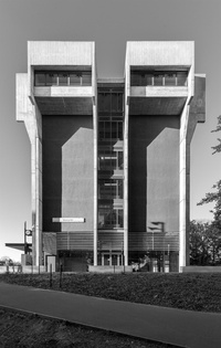
Matariki, University of Canterbury by Warren and Mahoney
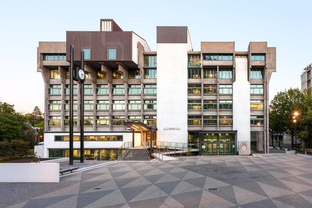
Designed in 1974 by Hall and McKenzie, Matariki – the registry building at the University of Canterbury’s Ilam Campus – was once intended as a bastion, a defense against student protest. Today, it has been opened up to welcome students instead of keeping them at bay. Warren and Mahoney’s repairs and alterations transform the ground floor entry levels without compromising the brutalist aesthetic of the original building. New canopies have been added, an exhibition area opened up, yet the weighty mass of the building has been maintained. Impressively, within the Council Chamber on the top floor, the original timber ceiling has been removed, restored, and replaced using a slightly modified pattern with a more pronounced texture that seems entirely appropriate to the character of the building.
Secondary Data Centre Refurbishment – University of Canterbury by Warren and Mahoney
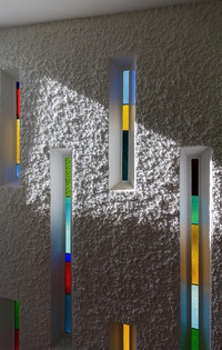
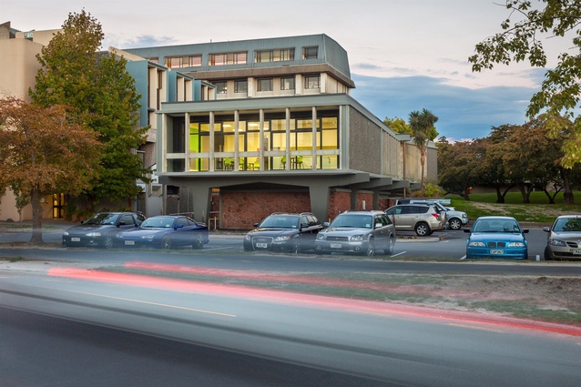
Another of Hall and McKenzie’s university buildings, the Data Centre was designed in 1966 as the telephone exchange, in a streamlined modernist style not unlike the buildings of Lúcio Costa and Oscar Niemeyer in Brazil. The building has now been structurally upgraded and altered to meet compliance standards, as well as retrofitted with the requisite communications technologies in order to house the university’s data functions. This has been professionally achieved without affecting the building’s distinctive style and the way the upper floor appears to float weightlessly above the grass berm.
Hospitality and Retail Award:
Merivale Retail by Thom Craig Architects
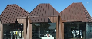
The arrival of these three small shops – an early rebuild on Papanui Road in Merivale – was a surprise and source of intrigue for many in the neighbourhood. Cloaked in copper, the outer envelope has been folded and faceted in the manner of a garment, a concept entirely appropriate to Merivale’s reputation as a fashion destination. The buildings sit nimbly on a corner site, in scale with the surroundings yet obviously contemporary and somehow slightly strange, like much new fashion when it first arrives. Each building is a variation on the other, with different spatial volumes within. This trio of shops is a sophisticated piece of form making and a charming work of architecture.
Housing Award:
Villa Close by Thom Craig Architects
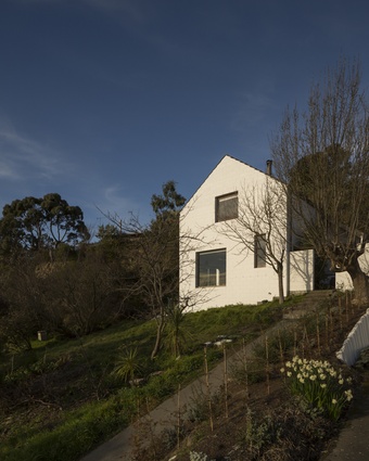
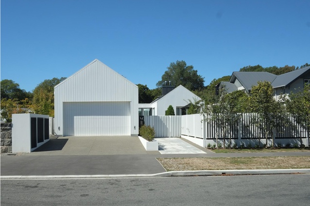
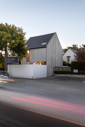
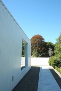
Four gabled pavilions are positioned to create two outdoor living courtyards – one sheltered from the easterly and the other from the nor’west wind. The modest exterior disguises a thoroughly sophisticated and generously scaled house. The white-painted, cedar-clad forms have a spare simplicity which suggests a Scandinavian influence, but which also refers to Canterbury’s colonial and modernist residential heritage. Each pavilion is linked by a glazed walkway, synthesising the home’s requirements for light, privacy, outlook and ventilation, and providing an eventful journey through the house. The result is a relaxed and comfortable house that is well planned and detailed.
Housing Alterations and Additions Award:
Loudon Homestead alteration and extension by Sheppard & Rout

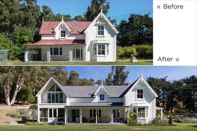
The Loudon Homestead is one of an ensemble of buildings that form a gracious residence. The arrival sequence, past agricultural sheds and through an arbour walkway, has been expertly planned, with entry between what appears to be a colonial cottage and a square farmhouse. The original picturesque cottage has been meticulously refurbished and extended, while the farm house structure has been gutted to create a large library room lined with books that, despite its large volume, still manages to feel cosy thanks to the warm timbered ceiling, central lantern skylight, and rustic fireplace.
Housing Multi Unit Award:
Cashel Street Townhouses by Athfield Architects
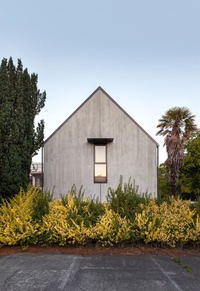
High-density residential developments are often shoehorned onto a site with regrettable consequences. However, these houses have been skillfully arranged to complement and improve the character of the street. The simple gable forms belong to a longstanding architectural tradition of pitched roofs and clipped eaves in Canterbury. This gives these buildings a sense of familiarity, but in this case the architectural language is especially imaginative and refreshing. Despite the materials selected for this project being robust – off-the-shutter, pre-cast concrete panels, chunky painted steel and an industrial roller shutter door – there is a distinct lightness of touch in the design and execution.
Public Architecture Award:
Hagley Oval Pavilion by Athfield Architects

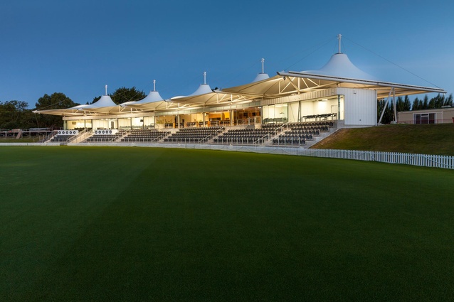
Hagley Oval is a striking new cricket venue for Christchurch. Commissioned before the earthquakes, the pavilion unashamedly draws on precedent: tensile roof membranes have been used extensively on sports structures around the world, and the form instantly distinguishes this as a cricket venue. What gives the type credence here is the straightforward yet graceful handling of materials and details, which gives the structure an expressive profile and a luminous interior. Yet the building remains modest. Secondary building elements have been designed without fuss, and the spaces are small, but practical. The pavilion therefore remains in scale with other buildings around the green, and maintains the focus on the cricket oval itself.
Twizel Public Toilets by DLA Architects
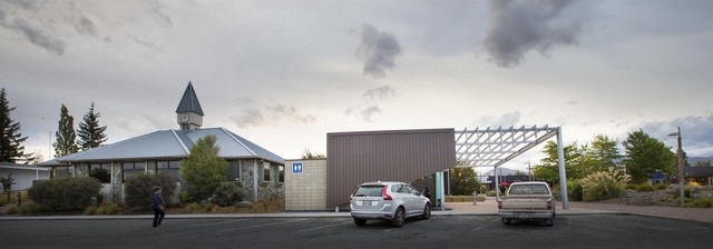
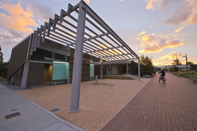
A confident addition to the well-used Twizel Market Place, these public toilets have been designed with the robustness necessary for Twizel’s often harsh alpine environment. The building’s form is inspired by pump houses and industrial structures associated with the South Canterbury hydro dams, yet is also sympathetic to the local landscape. The rich mixture of materials and colours are reminiscent of the lake surfaces, dry hills and mountains that surround. A noteworthy attribute is the tough steel canopy that defines a public forecourt and connects this modest building to Twizel’s urban realm.
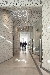
Christchurch Botanic Gardens Visitors Centre by Patterson Associates
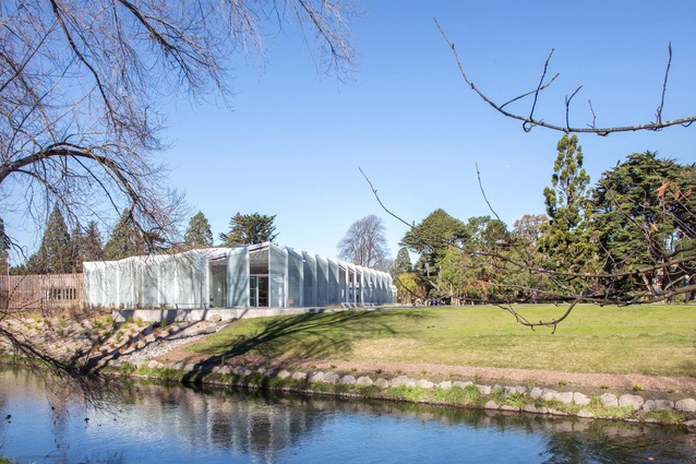
The Christchurch Botanic Garden Visitors Centre is a thoroughly contemporary building that strongly connects with the typology of traditional garden glasshouse buildings. The structure’s long form is an almost ethereal presence within the greenery of the gardens. True to type, everything has been painted white. Yet by adapting a commercial glazed greenhouse system, the repeated angular bays and serrated roof profile have been affordably achieved with elegance and meaning. Appropriately, botanic themes inform other elements: the patterned precast concrete is dappled leaf shadow, and the carpet pattern comprises blown-up plant microbes. The result is a thoroughly integrated work of architecture.
Ruataniwha Civic Centre Kaiapoi by Warren and Mahoney
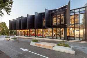
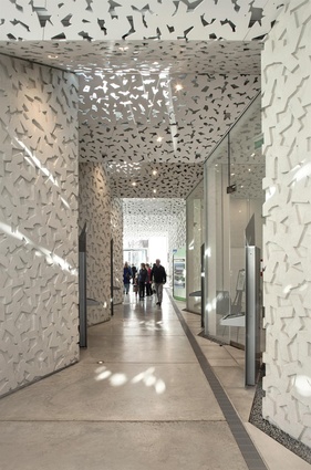
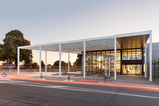
This distinctive and inviting civic building provides a much-needed boost to Kaiapoi, one of the areas most affected by the earthquakes. More than just a library, the centre presents an impressive range of learning and recreational facilities, including a double-height display area and an array of much-needed community meeting space. Movement is a key theme. Raised over a generous atea space and main entry, a delicate white-steel canopy provides a sense of identity without overwhelming the streetscape. Facing the river, bold oversized screens cradle the interior from direct sun while opening up views of the river. This valuable civic amenity has transformed the township of Kaiapoi. Ruataniwha Civic Centre Kaiapoi Warren and Mahoney.
Resene Colour Award:
A black and white exterior gives little indication of the sophisticated application of colour within, where blues, reds and greys animate the otherwise predominantly white interior.
Lincoln Library and Service Centre by Warren and Mahoney

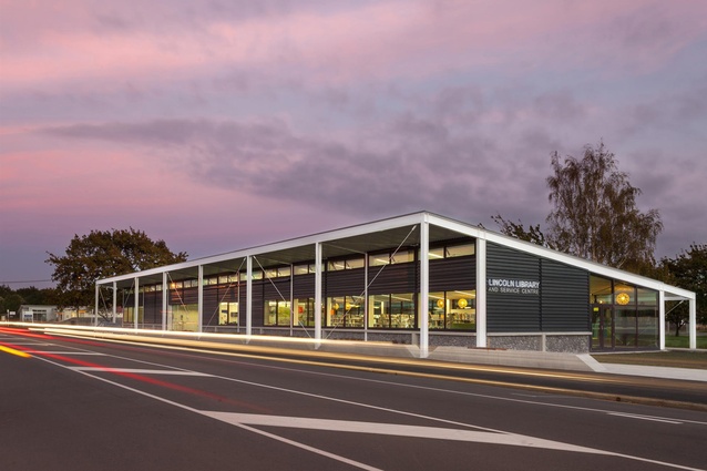
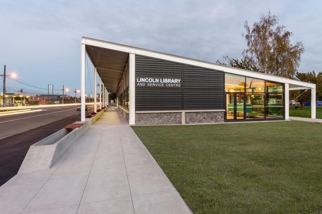
A principal achievement of Lincoln Library is its integration with the public realm – a generous gesture to the main street on one side and a direct connection to community courtyards on the other. The building consists of a repetitive portal-frame structure, with a colonnade-cum-veranda covering the footpath. The regular bays allowed for a flexible approach during the planning phase, and the open plan interior now meets ever-changing community needs. The architects have achieved crisp, elegant detailing, with well-resolved steel junctions and connections. The interior is neat and efficient, yet adaptable, and well inhabited by staff and users.

Knox Presbyterian Church rebuild by Wilkie + Bruce Architects
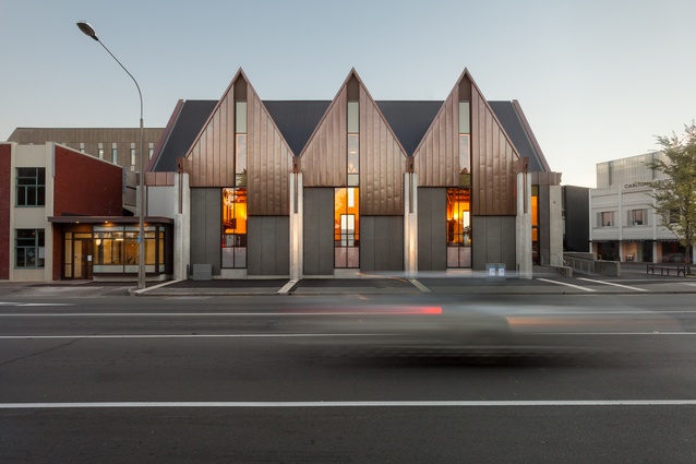
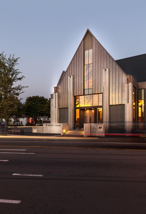
Following the collapse of Knox Church’s exterior walls in the February 2011 earthquake, the painstaking retention of the original roof structure and other interior components is to be celebrated in a city with so few examples of its kind remaining. Instead of creating a pastiche replica, the architects have designed a strong concrete and copper shell informed by the Gothic original but refusing to be subordinate to it. The contemporary treatment of the new gables allows more light into the Church and provides better views into and out of the building, reflecting the congregation’s desire to connect more with the community.
Small Project Architecture Award:
Lyttelton Studio Retreat by Bull O’Sullivan Architecture
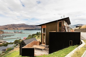
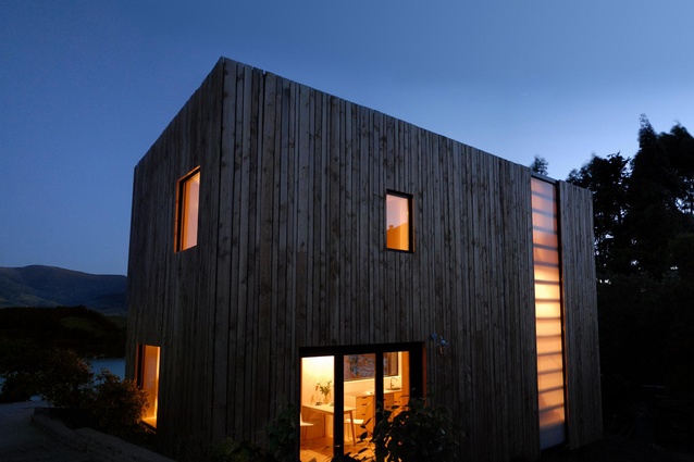
Modest in form yet ambitious in detail, this tiny retreat is a very personal statement by a talented architect. The exterior is robust – anodised aluminium cladding, recycled bridge timber car deck – and built to weather severe natural events, while the interior is highly crafted, comfortable, cosy. The full-height flush-glazing of the upper studio space captures breathtaking panoramic views of Lyttleton and the harbour. Undulating ceiling battens enliven the long space and reinforce the focus to the view. The lower level resembles a ship’s quarters, with a quirky kitchen, simple sleeping spaces for visiting staff, and a beautifully detailed bathroom. Lyttelton Studio Retreat Bull O’Sullivan Architecture.
Resene Colour Award:
Colour in this small studio is an integral part of the materials and detailing. From the bronze anodised exterior cladding to the stained timber ceilings, colour enriches our experience of the architecture.
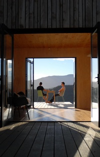
Warrander Studio by First Light Studio and Makers of Architecture in association
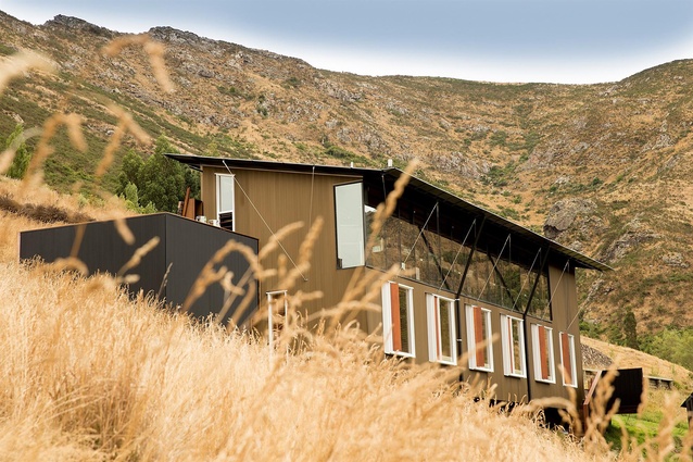
A first of its kind in New Zealand, the Warrander Studio is a transitional home overlooking Lyttleton Harbour. A labour of love by two architecture students of VUW, their tutor, and their client, the compact, digitally designed building punches well above its weight. Impressively, it took only three days for students and friends to erect the structure on site. Despite the precision of the fabrication process and the speed of design and erection, the building is humanist in every respect. The interior is warm and inviting, a testament to the virtue of sufficiency. It is exciting to see young architecture graduates think outside the square and challenge themselves in this way. Their efforts are admirable, and successful.
Brooklands Lagoon Public Toilet by Opus Architecture

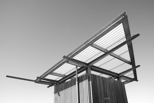
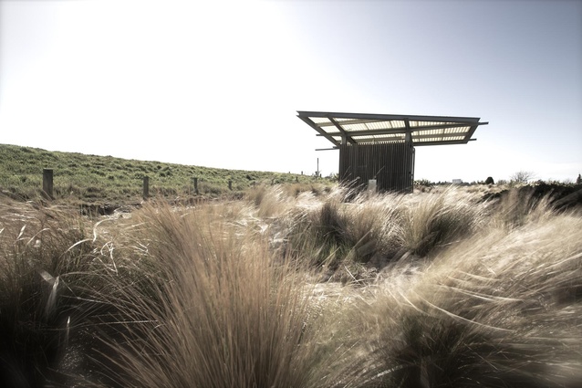
Located at the Styx rivermouth, this toilet, shower and change facility is stage one of a project that was to have included landscaping and a viewing platform. The earthquakes halted the bigger plan, and now this modest structure continues to stand alone. Although the building is in many ways rudimentary, thoughtful detailing complement the forms, materials and meanings inherent in this project. Perched over a concrete block and timber cube, the cantilevered sail-shaped roof is a powerful presence that demonstrates how modest materials and construction methods can be elevated to become poetic. An extended rainwater spout reinforces the symbolic identity this small structure possesses.

