2016 Wellington Architecture Awards
The 2016 Wellington Architecture Awards were announced at the National Library Wellington on the evening of Wednesday 4 May, with 31 awards being handed out to a wide range of successful projects.
The sensitive restoration and strengthening of a number of heritage buildings, alongside innovative fitouts of existing buildings, were several highlights of this year’s awards. Pukeahu National War Memorial Park also won big on the night, receiving a public architecture award and the sole planning and urban design award.
Architect Geoff Fletcher, the convenor of the awards jury, said the winning entries set the standard for good architecture in Wellington and nearby regions.
“These successful projects illustrate the rewards of close collaboration between clients, architects, engineers and builders,” Fletcher said. “In many instances, smart decisions were made very early on, and this provided a platform for achieving excellent results despite the complexities and challenges of many of the award-winning projects.”
Full list of winners with jury citations below.
COMMERCIAL ARCHITECTURE AWARDS:

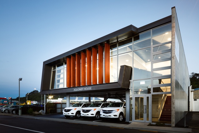
Armstrong Downes Commercial Head Office by Designgroup Stapleton Elliott
The challenging brief for this prominent corner site involved combining a comfortable office space with a ‘showroom’ aspect. The varied materials employed allow visiting clients an opportunity to interact with a range of products. The strong, folded form does a great job of advertising the building and parking and equipment storage is discreetly handled below. Commendably, the clients kindly allow community use of some of their spaces.
Matt Barker Orthodontist by atelierworkshop
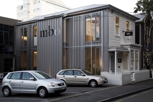
This totally reworked and extended heritage cottage cleverly maintains its street presence while subtly housing its high tech use. A new metal wall with growing frames for a scented vine is particularly engaging, the sky-lit stairway brings soft natural light to many spaces, and much thought has been given to public-private relationships, especially around the entry and exit. This tightly planned and modest-sized building is action packed.
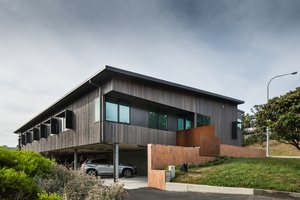
Onslow Medical Centre by Tennent+Brown Architects
A curving brick plinth distinguishes this prominent Johnsonville corner, the site for a timber medical centre building which is, with its one level, quietly accommodating. This is a very cost-effective and efficient use of an old residential site. Deliberately planned, with parking and services unobtrusively handled below, the structure is comfortably in scale with its neighbours. Interiors have great family-friendly colours, while photo murals and photovoltaics, as well as sun and ventilation controls, ensure the building is energy efficient. The clients report a sharp increase in community interest – and use – of the centre over their previous accommodation.
EDUCATION AWARDS:

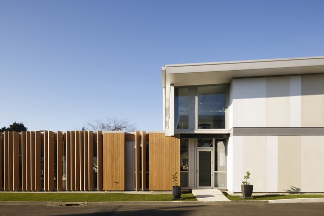
Hutt International Boys School Mathematics Block by Designgroup Stapleton Elliott
Four classrooms on each of this new block’s two new levels are organised around a refreshing layout. Lower classrooms break out onto a wide veranda and grassed courtyard, while upper classrooms extend out into a wide, multi-use corridor with deliberately modulated plan shapes. In underpinning the divide between learning and relaxing, the courtyard of grass and timber fins to the senior common room are particularly successful. The clients should be commended for supporting this different and advanced learning environment.

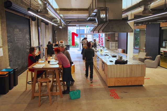
Te Whare Pūkākā, Massey University College of Creative Arts Workspace by Athfield Architects
This is an expression of a very different philosophy to the traditional academic workplace. By removing the separation between students and faculty members, learning takes place in a very different way than in the past. Instead of a formal reception there is a hospitality centre and although deliberately limited, the palette of colours and shapes throughout the building is vibrant. Transparent meeting rooms and curtained-off quiet spaces add an interesting utility to what is, all in all, a great adaptation of an existing building.
ENDURING ARCHITECTURE AWARDS:
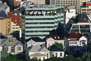
Telecom House (1989) by Athfield Architects
This building has made a huge contribution to Wellington’s cityscape for over a quarter of a century. The ziggurat form (in plan) offers a very human scale to the streetscape, which is further softened by the apartments and canopies which relate more directly to the street (previously Manners Mall). Throughout, the design is consistent in its intentions and detail. The roofscape enlivens the more distant views and, for those in the more immediate vicinity, the inspiring colours of the tiled building and plastered apartments generate an enviable warmth of character in relation to the city.
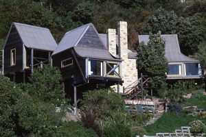
Elder House (1976) by Athfield Architects
This house is composed of a series of strong forms that ‘tumble’ down a steep site. Twin, high-brick chimneys punctuate the design with their famous gesture to the city, and provide a focus and counterpoint to the arrangement of buildings. Embedded within the consistency of forms and the dark colouring is an atmosphere of peace. Within the house, each room is enshrined in a separate form, which has led to an exciting and intriguing place to occupy. This is an important part of Athfield Architects’ enduring legacy.
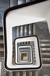
HERITAGE AWARDS:
Hope Gibbons Building by Tennent+Brown Architects
The success of this project is the result of great collaboration between owners, architects and structural engineers. The crowning achievement is that you almost can’t tell anything has happened at all. The architects have certainly managed to steer their way through what could have been ruinous legislation (balustrade heights and types, for instance) and the overall restructuring is a logistic tour de force within a staggered strengthening regime. The very desirable heritage tenancies that are the result of the reworking will ensure a lasting role for this building in Wellington’s future.

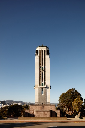
National War Memorial Projects by Studio of Pacific Architecture
An illustration of the rewards of close collaboration between client, architect and structural engineers and builders, with very smart early decisions consistently followed throughout the course of the project. Strengthened more or less from the exterior, the Hall of Memories is braced with tiers of subterranean ground beams, concrete and steel strengthening. The careful restoration of the Carillon, strengthened from the inside and impeccably finished with new plaster, has resulted in almost imperceptible changes to the original structure – a testament to the skill of all those involved.
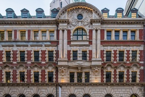
Public Trust Building by Warren and Mahoney Architects
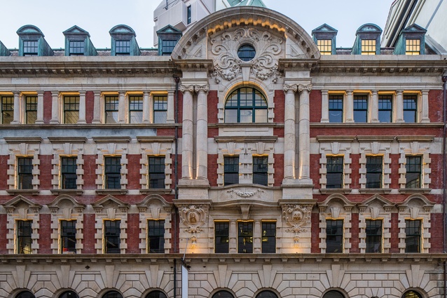
Due to the extent of the strengthening required on this Category 1 historic building, which was completed in 1908, some structural elements are necessarily visible, including major, coupled shearwalls at each end of the long, slim building. The design, however, very successfully preserves the character of the building and creates a very attractive offering of mixed-use tenancies. The key to success here was the ability of the client, architect and engineer to collaborate – the resulting strengthening works have been integrated into the building with great guile.
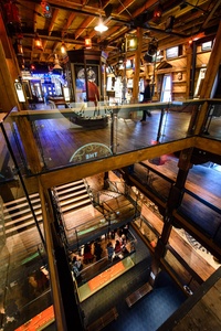
Wellington Museum – The Attic by Athfield Architects
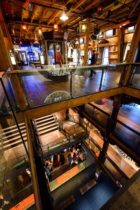
Although much has been added in the process of renovation of one of Wellington’s cherished buildings, the interventions are seamless and subtle, and sometimes disguised as parts of the old building, or even as a part of an exhibition set. For instance, return air is hidden in a central circular element which doubles as a ‘spacecraft’ hovering over the story of ‘official’ Wellington UFO sightings. The architects have done an impressive job in visually and physically connecting the attic to the levels below, creating a museum-standard environment without losing existing character. The entry, through the upper levels of a 1998 egress stair designed by the same pratice, is a tasteful “palate cleanser” between levels.
HOSPITALITY AND RETAIL AWARD:
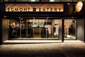
Egmont Street Eatery by Foundation Architects
This clever reuse of part of a commercial basement garage followed a difficult consenting process. The tight and long skinny space is divided lengthways into service and public areas, and floor-level differences between parking and street were turned into advantages in plan: entry at middle height, down for dining, up for bar action. A limited but fashionable colour palette, and the simple shapes employed, is fresh and welcoming. This is a busy, action-packed space with a charming breakout of seating onto the edge of the lane.
HOUSING AWARDS:
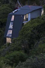
45 Degree House by Ballara Bulman Chin | bbc architects
A truly gutsy architectural and structural concept that takes an exceptionally challenging site and makes great use of the city location and views it offers. The design of this house essentially rotates the plane of support, and the consistently clever planning maximises every available space and provides every room with a view. Although outwardly quiet and comfortable in its bush setting, this is an exhilarating approach to the design of a family home.
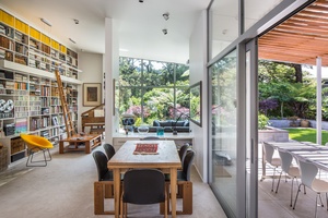
Craig House by Craig and Coltart Architects
Quietly assured against a beech forest backdrop, this home’s long, slow roofline sits atop an L-shape dwelling that uses a courtyard plan to great effect. Inside, a sequence of compression and expansion sees living spaces open up towards views and bedrooms more enclosed. The house is bright and white throughout with splashes of rich materiality, with all parts carefully composed to accommodate a lifetime of books, furniture and art.
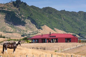
Nohoroa by Crosson Architects
Elements of traditional farm buildings are combined into this thoroughly modern interpretation of a courtyard country homestead. Although modern, the house sits comfortably within its hilly site, with its forms providing echoes of the colours, materials and shapes of vernacular farm buildings. Nohoroa means a place to stay for a long length of time, and this house, with its open and desirable views and welcoming, wind-sheltered courtyard and fireplace, would be a wonderful place to do just that.

Peka Peka House II by Herriot + Melhuish: Architecture (HMA)
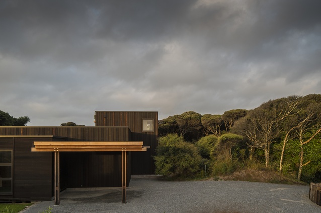
Using just two simple beach house volumes (main house and sleep out), nearby sand dunes and the surrounding kānuka forest, a clever, casual and very private courtyard has been formed. The layered clerestory windows and pergolas play with light and shade, enhancing indoor and courtyard spaces, while the beautifully consistent and controlled detailing completes what is a very pleasant picture.
HOUSING ALTS & ADDS AWARDS:

Palliser Road House by John Mills Architects
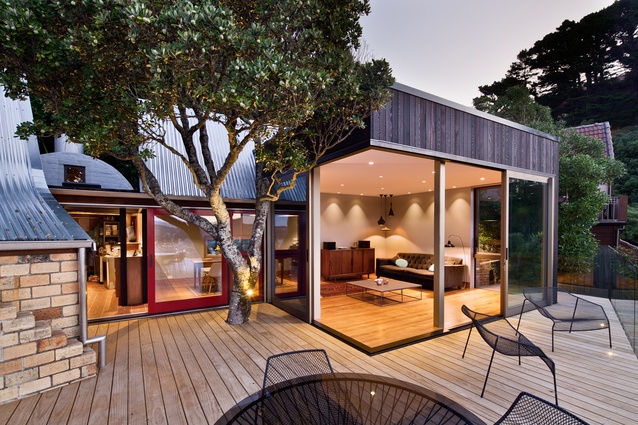
An unapologetically modern intervention to a classic Athfield Architects-designed house achieves the best of both worlds: liveability is brought up to date while the ‘old’ is faithfully preserved. Comfort for new occupants is ensured through (overcode) insulation and double-glazing in new windows, which have been unobtrusively installed to create surprising new views and connections with the existing building. Under the moniker of the Elder House [a reference to the commissioning owners], this house also received an Enduring Architecture Award this year, further acknowledgment of the quality of integration between old and new. This is a house with a great past and a great future.
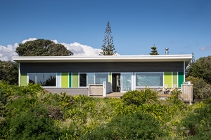
Field Way Bach by Parsonson Architects
This playful, low-key and relaxed alteration of a two-storey Waikanae beach house retains the spirit of the ‘bach’. The extremely discreet makeover sees the addition of a ‘bridge’ floor that links to new ground-floor storage spaces. The upper floor is long and slim, with glass on two sides forming relationships to sea and sheltered decks. The opening under the ‘bridge’ provides vibrancy to the quiet forms, as do the brilliant colour choices which contrast with a soft and peaceful plywood-clad interior.
Resene Colour Award:
The clever use of fresh, ‘beachy’ colours is particularly appealing when contrasted with the more reserved, stained weatherboards of the exterior, or the warm, varnished-ply interior. In a very sophisticated way, this colour scheme recalls, and keeps faith with, the essence of the Kiwi bach.

HOUSING - MULTI-UNIT AWARDS:
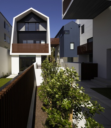
Zavos Corner by Parsonson Architects
After a difficult consenting process a very sculptural breakaway from the multi-unit norm has been achieved. There is an element of visual deception at play here, and that is a large part of Zavos Corner’s charm. These are mostly one-level units – but your eye tells you otherwise. The clever use of scale and geometries allows the building to form very agreeable relationships with neighbouring properties. In all, this is a brilliantly composed and realised complex and a visual asset for the city.
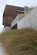
Nevay Townhouses by Craig and Coltart Architects
This is quality ‘spec’ housing that goes well beyond the usual benchmark for such buildings. Rugged natural materials stand up strongly against Wellington’s weather, including corten steel fins that control solar gain and maintain privacy to the road. Fantastic sea views have been capitalised upon and a generosity of spirit can be seen in the deliberate gap left between the townhouses, which allows a neighbour to retain a sea view.
INTERIOR ARCHITECTURE AWARDS:
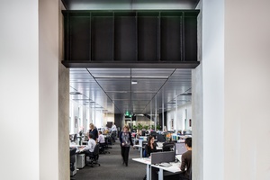
Ministry of Culture and Heritage by Warren and Mahoney Architects
This high quality fitout has great detailing throughout. Workspaces are organised around an interconnecting stair that links four floors. A perforated-metal suspended ceiling conceals all the services required of a contemporary office, and in a nod to the base buildings heritage, these ceilings have been set back from the outer walls to celebrate, and not obscure, the tall arched heritage windows. Existing rooms with heritage qualities have been reimagined for the modern workplace, with the ‘rotunda’ rooms are particularly successful. Re-using furniture is unusual, but here it has been worked in seamlessly.

Ministry of Education by Warren and Mahoney Architects
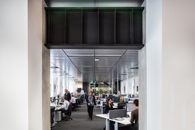
An unapologetically up-to-the-second entranceway provides an indication of what to expect within this smart office project. The publicly accessible open planned ground and first floors illustrate new ideas about dealing with reception and meeting points. The twelve working levels are connected via generous multilevel staircases and mezzanines – huge all-in-one spaces that enhance the feeling of being in a hub, rather than scattered through several buildings, which was the Ministry’s previous arrangement. Unnoticeable strengthening work has also been undertaken, and great Wellington views have been harnessed within the curving edges of the old building.

New Zealand Post House by Jasmax

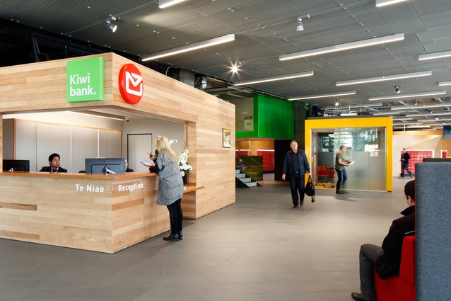
This highly original makeover of New Zealand Post House is based around an internal street, between north and south entranceways. This lovely space gives the public an interior alternative to gusty Waterloo Quay. The public invitation has been reinforced by the addition of a café and the positioning of private mail boxes at the heart of the floor. Upstairs the ’60s staircases are preserved but lead to very modern work centre floors, with entertaining social and meeting spaces – ‘village green’ kiosk kitchens, grandstand meeting areas – collected around the northern core. This design shows fresh thinking that is extremely well realised.
NZ Funds Wellington by James Fenton Architect
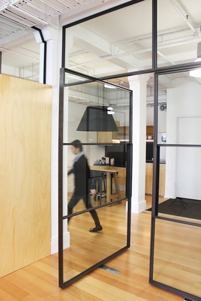
A cleverly limited material palette and exquisite detailing achieves the client’s space requirements in a very elegant way. The L-shaped space is defined by a central colonnade, the organisational backbone of the space, and the ‘New York loft’ aesthetic is helped along its way through spectacular pivoting doors, which also act as space dividers. The theme here is: anything touching the ground is timber or black; anything “from above” is white. The design exudes both grace and – through the client’s collection of contemporary photography – good humour.
NZX Office Fitout, Wellington by Herriot + Melhuish: Architecture (HMA)

Great detailing and great decisions underlie this work, a fitout undertaken in lockstep with a change in office culture. A subtle yet careful delineation between guest and staff areas has been effected. The reception is formal, although there is transparency and casualness to the flow between work and relaxing spaces, and there are many crisply crafted, dark and timber finishes to tie into the understated maritime theming. The use of dark timber could have been oppressive in lesser hands, but here, thanks to the extensive glass connections to the outdoors, the atmosphere retains a commendable lightness. The lofty main workspace, with delightful old timber at the edges, is particularly spectacular.
PLANNING & URBAN DESIGN AWARD:

Pukeahu National War Memorial Park by Wraight Athfield Landscape + Architecture joint venture
This comprehensive and brilliantly realised piece of city stitching manages to be very clear and quietly dramatic in its sculptural and landscaping intent without being pompous or overbearing. The well-orchestrated space is loose enough to allow almost any activity and the car-less transformation of the upper area is particularly welcome. This urban repair work, which balances heritage values with a key piece of urban infrastructure, is a deft piece of place making for Wellington.
PUBLIC ARCHITECTURE AWARD:

Walter Nash Centre, Taita by Warren and Mahoney Architects
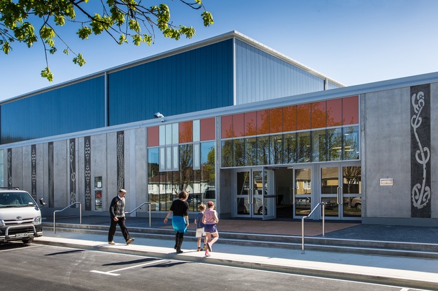
This is a great example of a council-architect collaboration and has resulted in a successful and obviously well-used community facility. Careful, pragmatic and well-planned – to make best use of hard-earned funding – the building is also infused with fresh thinking. The sports stadium, for instance, is open to the entry foyer ‘street’ and forms a very positive relationship to the library. A large round ‘pod’ in the middle of the public area provides a soft counterpoint to the large, cuboid spaces, while very clear planning allows all spatial interactions to have a welcoming aspect.
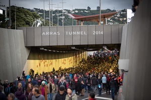
Pukeahu National War Memorial Park by Wraight Athfield Landscape + Architecture joint venture
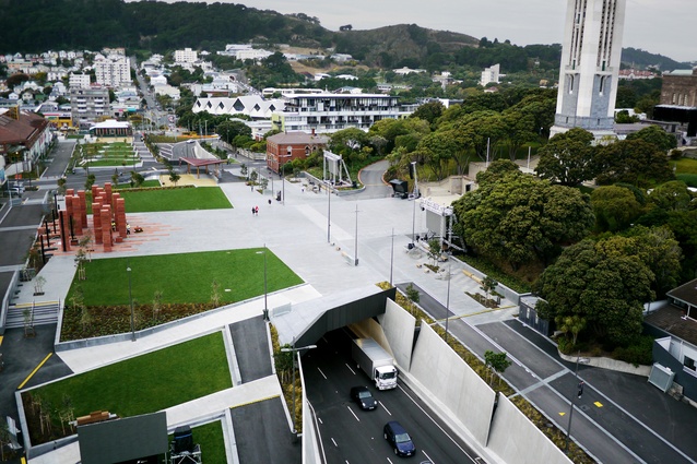
The layering and melding of a new underground tunnel with an overhead public park is a very welcome alternative to what was once a simple road. Vehicles and pedestrians are so well separated that when you are in the park, the tunnel is non-existent, although when you are driving through the tunnel, the experience is improved by visual connections to the park. The sculptural arrangement of layered-concrete panels lifts the tunnel aesthetic, and this layering is echoed on the park through subtle terracing. Two “portals”, adjacent to both Tory and Taranaki Streets, create a strong Pacific presence. These uplifting shapes and intricate worked-timber ceilings are very powerful when lit at night. These magnificent grounds finally provide the National War Museum with a setting that is appropriate to its significance.
SMALL PROJECT ARCHITECTURE AWARDS:
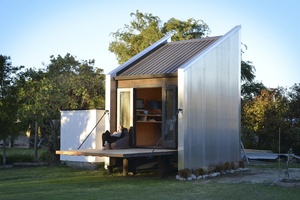
Martinborough Artist Studio by Aonui Architecture
The sloping roof line and corrugated aluminium cladding of this very charming artist studio and sleepout give just a hint of farm vernacular. Within the box, plywood cladding softens and warms. A ‘drawbridge’ extends the useable space of this prefabricated structure, but when the owners are away it can be raised for security. Interestingly, when down, it opens at just the right height to form an outdoor bar! A loft bed extends the studio’s 10 square metres area, providing room for a play space or occasional guest.
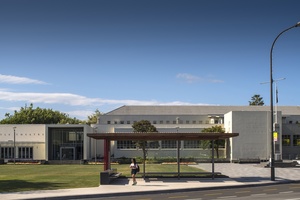
Hutt City Council ANZAC Shelter by Herriot + Melhuish: Architecture (HMA)
Subtly lit and beautifully detailed – a mini symphony in timber, glass and granite – this shelter is designed to relate to future plans for the landscaping of Hutt City’s ANZAC lawn. Spaces are evoked in a special way, rather than being fully formed or totally obvious: a granite wall anchors the structure to the land, while a cedar slatted pergola provides welcome sun or rain protection over long timber seats.
Porirua CBD Kiosk by Isthmus Group
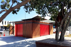
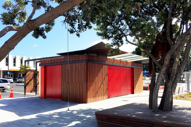
The building accommodates two small food and beverage outlets as well as public bathrooms; amenities which are not typically closely coupled, within a compact footprint. However, through clever planning and screening this finely crafted ‘object’ works. Timber, glass and metal combine to create a very robust yet welcoming facility in what has been a challenging area. Through the deployment of simple patterns and bright colour, a subtle Pacifica theme is evoked, especially when shadows from the glass canopy fall across the structure’s timber skin.
All winners of the 2016 Wellington Architecture Awards are eligible for shortlisting in the New Zealand Architecture Awards, which will be decided later in the year, and announced in November.

