2017 Auckland Architecture Awards: winners
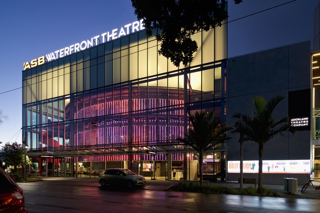
43 diverse projects, ranging from a large, contemporary Tongan building to an innovative, artistic gateway structure on Waiheke Island, were rewarded at the 2017 Auckland Architecture Awards, held at the ASB Waterfront Theatre on the evening of 26 April.
Jury convenor, architect Lynda Simmons, said that the winning works in the peer-reviewed awards programme set a high standard for architecture in Auckland and Northland.
“In an ideal world, we would have liked to have kept giving,” said Simmons. “The work submitted and the buildings we were warmly invited into were of a very high standard. But there are limits, which we had great difficulty in imposing.”
“It was encouraging to see successful public and educational buildings that show how good architecture can be a type of social ‘glue’, strengthening existing communities and playing a significant role in the establishment of new ones.”
The jury for the 2017 awards comprised Simmons, Hamish Monk, Murali Bhaskar and Raukura Turei, all architects, and lay juror Desna Jury, pro vice-chancellor at AUT University.

Full list of winners and jury citations below:
COMMERCIAL ARCHITECTURE AWARDS:
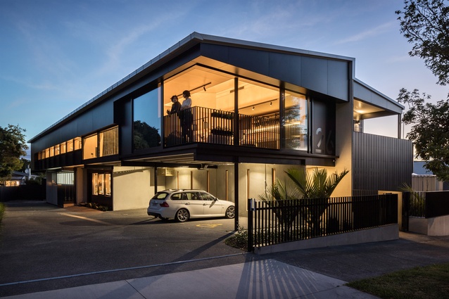
SGA Workshop and Offices by SGA – Strachan Group Architects
A commercial enterprise which expresses the core values of SGA in its design and construction: a commitment to technical experimentation and prefabrication techniques, sustainability, the education of architects via workshops, and community engagement. The generous space for staff and visitors demonstrates the underlying spirit of the practice – a rare and valuable approach to the practice of architecture. The opened corner balcony to the street addresses the building’s suburban context.
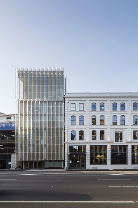
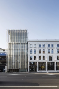
Kauri Timber Building by Fearon Hay Architects
This vertically-proportioned insertion on a sliver of land, alongside the retained historical Kauri Timber Building, enlivens a city district dominated by the car and
horizontal space. Delicate and robust at the same time, the building’s lightweight veil is deceptively industrial.
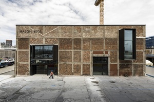
Mason Bros. by Warren and Mahoney
Delicate materials and proportions are combined with existing concrete and brickwork with rigour and precision, providing a sense of the precious in an industrial context. A floating gold-glass box sits over a generous public offering of an internal street alongside a laneway, reinforcing the mix of precious and urban.
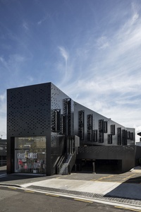

Pollen Street Office by RTA Studio
The well-sited and elegant proportions of the long, linear form establish an edge to a wider urban block. At each end, the building retains historic retail proportions typical to the context as it links across the site to established street frontages. The black veil complements the first stage of this long-term block development, while avoiding simple repetition through its relationship to the ground, and to the scale and function of the building.
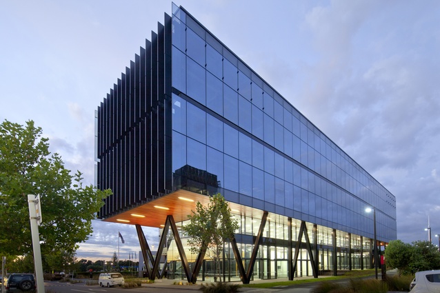
Quad 7 by Warren and Mahoney
This floating, black, glazed box is a slick and smooth addition to a growing commercial and retail district near Auckland Airport. Open at both ends, and without a back, the elegant yet unapologetically commercial building is spatially generous to both users and pedestrians, and detailed with precision.
EDUCATION AWARDS:
AUT Manu Hauora (MH) Building by Jasmax
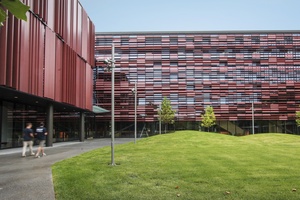
The deep reds held by the pleated and fluttering façades frame the green illuminated plane of the grassed courtyard, a welcome use of colour that enlivens AUT’s newly-established campus in south Auckland. A collection of generous spaces clearly privileges students and student life: ‘crush space’ areas double as event sites; circulation spreads into student ‘living’ areas; and lecture theatres are flexible and relaxed in layout. The loose orthogonal logic cleverly frees the building, and the institution it serves, from an overly authoritative reading.
Resene Colour Award:
Deep red cladding panels complement the grassy green of the manicured lawn courtyard space. Internally, niches of brightly-lit colour sit alongside strong colour ranges, enlivening student living spaces and demarcating circulation areas. Subtle colour differences between main learning spaces, student areas and lecture theatre zones moderate the institutional atmosphere and contribute to a serious but relaxed learning environment.

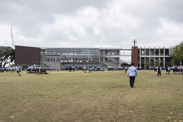
St Peter’s College Outhwaite Building by Architectus

The siting of the Outhwaite Building completes an urban edge for the existing Middle School campus, while framing the sports fields. This addition is a seamless extension to a previous stage in the overall development of St Peters College. Raw materials are assembled with a formal elegance.
ENDURING ARCHITECTURE AWARDS:
151 Queen Street (1992) by Peddle Thorp Aitken
Designed in the mid-1980s at the height of the ‘greedy’ decade and completed in 1992, the bronze tower on Auckland’s main street has mellowed with age in terms of its reputation. Slender, elegant proportions are emphasised with a simple formal manipulation of the end façades and higher levels, and the building’s bronze glass cladding provides class and colour alongside its now-many neighbouring towers. The massive cantilevers and suspended glazing system were technically experimental and brave for their time.
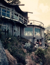
Thompson House, Little Munro Bay (1974) by Graeme North
An inclination to technological experiment and a pronounced environmental sensibility resulted in a house roofed in draped-form concrete over a post and beam structure, radiating from a rear existing rock wall. The presence of the rock wall – a feature no longer possible under current building legislation – is felt throughout the many levels of this cliffside dwelling. The house is an architectural testament to a particular epoch in New Zealand’s history.
HERITAGE AWARDS:
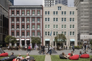
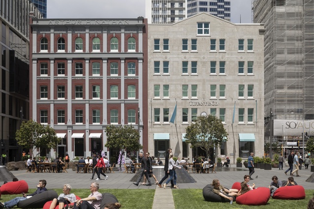
Australis Nathan by Peddle Thorp
The brave use of scraffito on a heritage building in the Britomart precinct has made for an excellent outcome. ‘Drawing’ onto a blank face of an existing historic building to provide historical reference makes a contemporary contribution to an ongoing discussion around heritage attitudes. Enormous care has been taken to restore the intricate plasterwork of the building’s elaborate Victorian façade on Customs Street, and the re-orientation of the building to Takutai Square makes an excellent contribution to Britomart’s urban space.
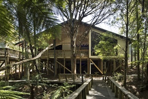
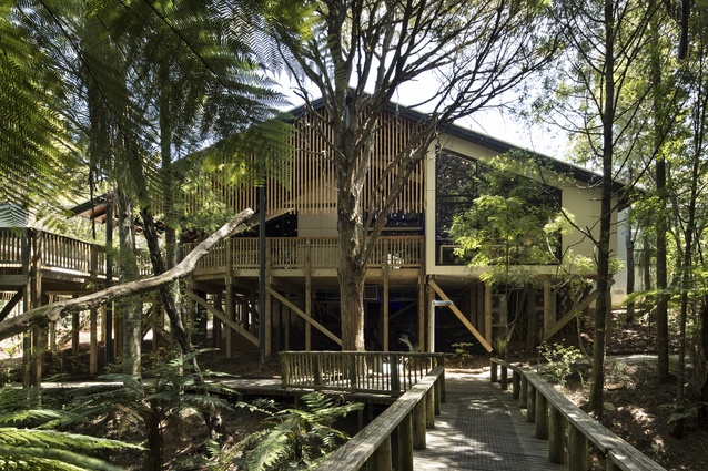
Waitangi Visitor Centre by Harris Butt Architecture
This alteration to a nationally important building is cleverly understated, and continues John Scott’s elegant proportional system with seamless transition. Original details and materials of the 1983 design are retained and enhanced, and the revision of the original John Scott walkway canopy provides a quirky sense of delight alongside its functional updating. From the interior, the gaze can now extend beyond the glazed end wall to the foliage beyond and the pathway leading to the Treaty grounds.
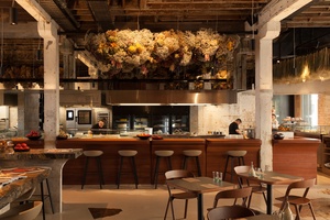
HOSPITALITY & RETAIL AWARD:
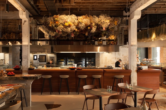
Amano by McKinney + Windeatt Architects
Architectural control is evident in all aspects of this sumptuous interior, from scale shifts to crafted details and the use of subtle planning devices. The large single volume restaurant and adjacent bakery – visually and spatially busy, yet never overdone – cleverly combines a range of dining experiences, complemented by a rich and various material palette. The consistent architectural hand has meant that such variety is rewarding rather than overwhelming.
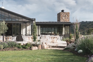
Tantalus Estate by Cheshire Architects
The extent of the differing and rich interiors of this winery, restaurant, brewery and tasting room is revealed slowly and can be experienced from several orientations. The incredible attention to detail in every moment is therefore revealed in layers, enabling the easy digestion of complexity. Experimental in style and attitude, this project bridges seriousness and playfulness, yet always maintains the highest quality.
HOUSING AWARDS:

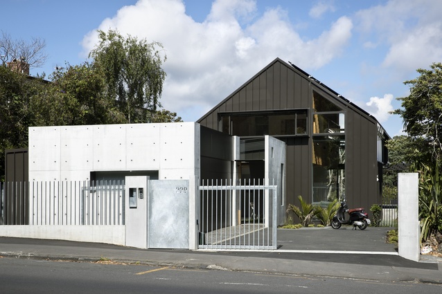
339 by SGA – Strachan Group Architects
Spatial complexity is handled with ease and classic planning devices, such as indoor / outdoor flow and open plan living areas, are disrupted in this house which blurs the definition between indoors and out. Generous to the passing public, yet providing private space for an extended family, this oasis in one of Auckland’s busiest streets offers a textured layering of space as it transitions between street and garden.
Bethells Bach by Herbst Architects
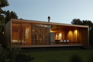
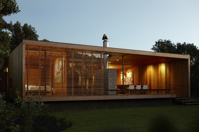
This small holiday home displays the well-honed skills of a practice that completely understands how to create simple yet excellent spatial experiences. Interior space is reduced to allow outdoor spaces to provide balance and alternative experiences. Glazing lines are set away from external skins, creating shadows under an apparently eave-less form, and giving the appearance of a continuously open structure. This expertly crafted pavilion references American West Coast houses of the 1960s with its crazy paving, compact planning and circular steel columns; at the same time, it is a distinctly contemporary addition to Herbst Architects’ body of work.

Davis House by Mercer & Mercer Architects
The entire house is centred on an overscaled single volume, well-suited to clients who spend their working time in yachting hangars. Such opulence of space is countered by the use of raw materials, lack of linings and unfussy detailing. A collection of intimately-scaled rooms is cloistered around the main interior volume, providing views across and through this space at a variety of heights and angles. The outdoor room, with its oversized fireplace and huge steel French doors, complements the massive interior.
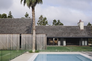
Forest House by Fearon Hay Architects

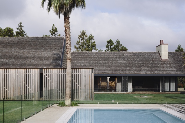
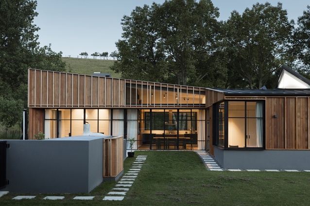
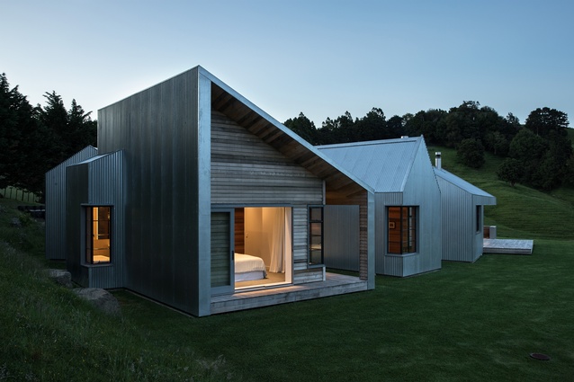
In this working farmhouse the refined Fearon Hay palette meets a robust ‘Westie’ aesthetic. The result is a sturdy, open and multi-directional collection of gable forms, balanced by refined details which soften the resilient structure. Steel soffits calm and control the overhead light at the hardy thresholds. One of the three barn forms is an alteration to an existing Lockwood building, and here the expert handling of the exterior has yielded the elegant proportions used throughout the project.
Inland House by Gerrad Hall Architects
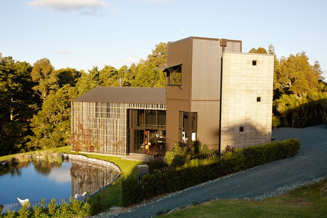
The playful and nostalgic mix of classic barn and vertical forms is arranged with the landscape, rather than on it. Slow reveals and vistas have been crafted from an experiential understanding of moving across and through the site. Inside, layers of darkness and illumination provide deeply personal spaces alongside shared areas, an experience enhanced by the selection of materials.
Lods House by Rosso Design
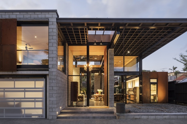
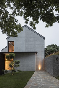
Vernacular barn forms have come to town in this double gable house – an exhibition of precision in concrete and steel. Expertly handled natural light across precast and in-situ concrete creates a warm and bold interior. Intense attention to European-influenced detailing has created a controlled and defined home of very high quality. Clever planning has reduced the large kitchen and scullery areas typical of houses of this type, ensuring an appropriate scale is maintained.
Matakana House by Glamuzina Architects and PAC – Paterson Architecture Collective in association

This holiday home has possibly one of the most architecturally exciting handlings of a corner seen in many years: the sculptural ease of the northern corner as it turns to the east is masterful both inside and out. There is a subtle nod to the high timber screens over the entry of John Scott’s Futuna Chapel, and this re-visiting of 1960s architecture reveals itself in other places throughout the building. The engagement of the architect is evident throughout, from the control of light to the testing of material limits and the privileging of children’s spaces in the planning.
Oneroa House by Vaughn McQuarrie
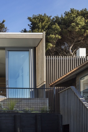
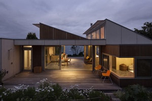
The entire experience of this 100 square metre house is concentrated in the interior, which is designed with simplicity and warmth and a simple palette. Long views to the sea and intimate views into the garden are both accessible from inside the house. The house is a nod to the history of beachside living, and its calm spaces prove that small can be enough.
Point Chevalier House by Guy Tarrant Architects
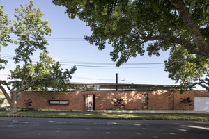
This walled courtyard house departs from New Zealand residential traditions to provide a rapidly-intensifying suburb with a powerful yet restrained housing model. Building close to the two street boundaries has allowed for the arrangement of living spaces around a courtyard, a strategy discouraged by New Zealand’s residential planning laws. The use of red brick alludes to the local State Houses of the 1950s, yet more strongly describes small-scale community buildings, again reinforcing the area’s new urban edge. The simplicity of the diagram has not been overcomplicated with programme, resulting in a modest yet texturally rich home.
Resene Colour Award:
The red brickwork of the main element to this courtyard house sets the palette for the entire project, both outside and in. Against this background, a composition of unusual and well-considered colours is introduced. Obvious tonal matches are eschewed, but all elements work perfectly together to produce a delightful surprise.
Point Wells Gables by PAC – Paterson Architecture Collective, Steven Lloyd Architecture and Glamuzina Architects in association
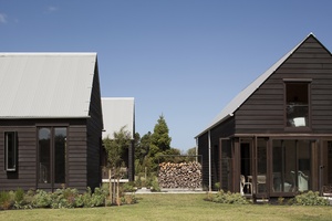
Privacy and intimacy are created throughout the interior and exterior spaces of this home. The scale and arrangement of three barn forms evokes a village-like intimacy in its series of internal yet outdoor courtyards and boardwalks. Layers of interior darkness are nestled alongside these courtyards, creating rich views towards the light. The simple structural expression is enhanced with a range of timbers, detailed with unexpected delight.
Pukapuka Road House by Belinda George Architects

An earthy and warm interior contrasts with carefully selected and framed vistas out to the working rural landscape. Light floods in at the gaps between the obliquely arranged barn forms, emphasising the richness of the river timbers used in each contained and calm living area – timbers which are detailed and installed with exceptional craftsmanship. The thoughtful use of materials, combined with a variety of spatial proportions, creates a charming and soulful home and workplace.
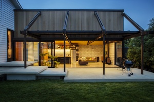
HOUSING ALTS & ADDS AWARDS:
Carrie St by Dorrington Atcheson Architects
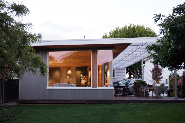
Drawing from 1970s New Zealand architecture, the architects have designed a radical addition to an existing bungalow that invites the whole of the back yard inside. The clients have planted their desired jungle, which will form the edges to this exterior experience when viewed from indoors. Selectively placed screens and built-in furniture assist the knitting together of two opposing residential building types at the threshold of old and new.
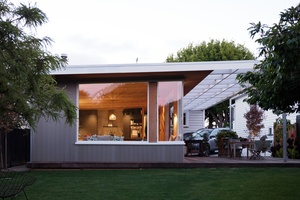
Johnstone Family Home Additions by Bull O’Sullivan Architecture

Modest but magical: the simple gesture of this addition has changed a family’s life and the use of their home. What began as a laundry addition became a musing on domestic work and the role it has played in New Zealand’s history. Great care has been taken in the selection of utilitarian materials, which are playfully inverted from their usual use, with the cladding in aluminium and joinery in timber. This addition is a contemporary reading of 1960s details exercised with simplicity and soul.
Langs Retreat by Wendy Shacklock Architects
This confident and restrained, yet very small intervention, has had an enormous impact on a holiday home designed by Lillian Chrystall in the early 1990s. It has opened previously unused aspects of the site, bringing a sense of the theatrical to daily tasks. The addition is an assemblage of three inverted spaces, packed tightly but each with an orientation independent of the other. With “their backs to each other”, the spaces each provide an elevated platform. This atypical planning approach provides delight and awe, proving that, when done well, minor intervention can be as powerful as over-scaling.
Tree Villa by Matter
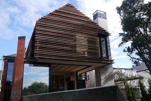
This is a deliberately disruptive addition to an inner-city, heritage-protected villa, disturbing not the villa itself but the typical villa extension approach of establishing an uninterrupted flow from kitchen / dining / living to backyard. This brave and complex addition instead breaks the single floor level into high and low half-levels, creating some abrupt spatial terminations which are not always successful but in places are superb. Some areas are treated with humour, others with seriousness. This award celebrates architectural experimentation, and a daring move by an architect on his own home.
HOUSING – MULTI-UNIT AWARDS:

55 Symonds Street by Ashton Mitchell
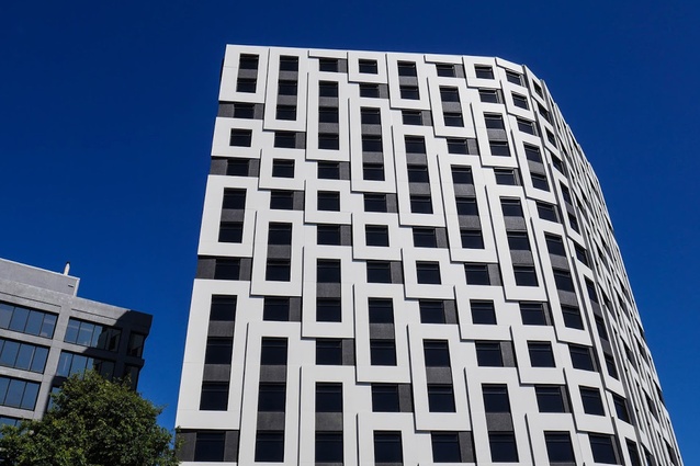
Design opportunities to benefit the building’s users and pedestrians have been found within the tight, restrictive business model generally used for student accommodation. Generous social spaces across two ground levels on the sloping site provide innovation within a typology that has much room for improvement. Views through the building from Symonds Street to the urban valley beyond enhance the pedestrian experience as well as establishing a connection for the students and the city they may be new to. The building “turns the corner well”, with the expressed structural exoskeleton providing an overall aesthetic as well as serving as a space-saving device.
Kāinga Tuatahi by Stevens Lawson Architects

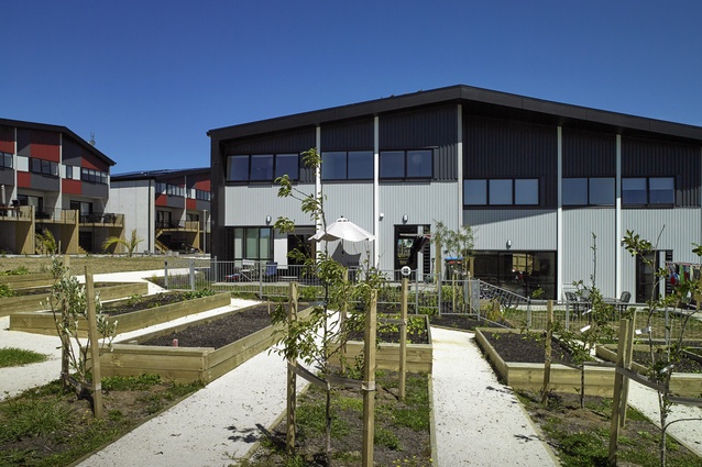
An adapted townhouse typology has been designed to suit a well-established community and aid its efforts to repatriate dispersed iwi members. Alternative financial structures for land ownership and lending have had a positive impact on this affordable housing project and enabled a high quality result. Spatially generous in the main daily use areas and in the provision of areas with flexible programming, the designs allow for extended family use. True “ownership” of the entire project remains with the community, who were highly engaged from the initial stages.
Verto Apartments by Warren and Mahoney Architects
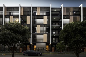
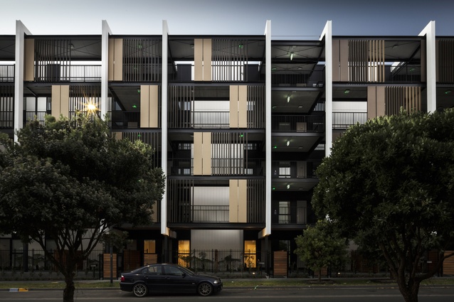
The clarity of the relationship between shared circulation, apartments and vertical core provides spatial generosity for the building’s inhabitants. The vertical core spaces are designed with natural light and high-quality materials, despite the affordable-cost apartment budget. This provides informal social spaces for developing a sense of community and creates a sense of ownership of the shared spaces beyond each individual apartment, a vital element to the success of apartment living. The typical breezeway layout is challenged, with some success. Previous similar projects have enabled this architectural practice to use the low-cost apartment typology as a “learning ground” for future improvement.
INTERIOR ARCHITECTURE AWARDS:
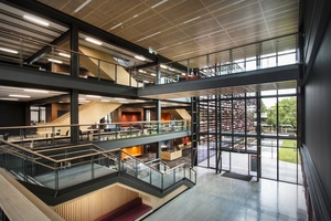
AUT Manu Hauora (MH) Building by Jasmax
The institutional approach to education is avoided through the provision of generous “living room” spaces at various scales along the circulation routes. Student break-out areas are privileged over structured teaching spaces, gaining optimum daylight, views, sun and orientation. Materials are hardy yet homely in this building that seems to embrace spontaneity rather than suppress or control it.
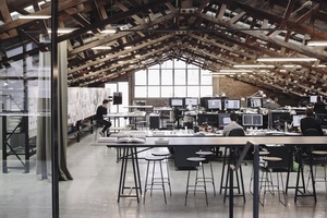
Faraday Street Studio by Fearon Hay Architects
This architectural office relocation maintains and enhances the original character of the building, playfully using the exposed existing, haphazard struts of the original American prefabricated trusses, which become decorative elements in an otherwise restrained interior. The well-considered layout appears effortless, with a raised quiet space and long pin-up wall creating a screen for the bathroom and kitchen areas. The fine detailing and use of high quality metals make this project a showcase for the refined work of this practice.
Pou Maumahara – WW1 Research Centre by Pearson and Associates Architects and Jasmax in association

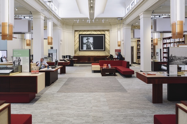
This is an understated yet intensely resolved interior fitout to a major public building, which looks and feels contemporary yet fits so well that it seems it could have been in place for many years. The design builds on the spirit of the display, rather than using thematic or referential devices. Furniture, display and lighting configurations blur softly together as complete compositions. The overall sense is one of intimacy, an intention of the exhibition where the users of this space connect with those who lost their lives at war as individuals, rather than anonymous ‘others’.
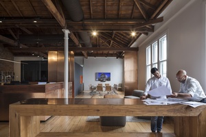
Peddle Thorp Offices by Peddle Thorp
The sensitive occupation of the heritage Seafarers Building has complemented a brave re-branding of a large, long established architectural practice. The use of a simple palette of excellent and sumptuous materials, including copper and demolition jarrah, brings a contemporary feel to the revitalised space. The triple-layered open planning hints at casual yet ordered behaviour, while the whole interior is enhanced with natural light and ventilation, allowing in the salty breezes of the waterfront.
Warren and Mahoney Auckland Studio by Warren and Mahoney Architects
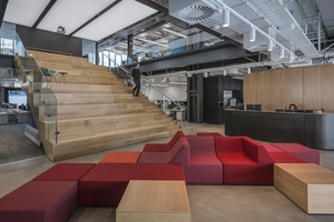
An opportunity to use an office relocation as a means of re-focusing an architectural practice has been seized, with the visibility and connectivity between practice and the public a key design driver. The creation of a semi-public realm in the overall building design has been extended via large sliding wall sections that expose work spaces to public view. Placing the staff kitchen area at the front door is another bold move to connect with the public, given that this typically back-room space is where the real conversations happen. The overflow from office into the internal street allows informal and semi-formal meetings to take place alongside the general lunchtime crowd. The vertical connection created by the event staircase offers views into and out from deeper office areas.
PLANNING & URBAN DESIGN AWARD:
Mackelvie Precinct by RTA Studio

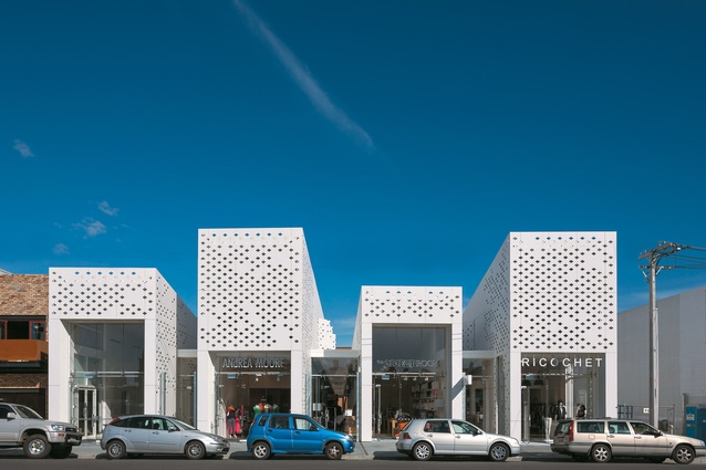
This Ponsonby block has undergone staged works over many years, a strategy that acknowledges that design for thriving inner-city communities works well when “ownership” of left-over space is claimed in an unprescribed manner. The design cleverly incorporates “incompleteness” in small scale interventions; connections through the site are made at various scales, and the fine grain of existing heritage and new retail fabric buildings has been retained. Seismic upgrading has been undertaken alongside new building work, ensuring minimal disruption to a lively precinct. In future, the car-dominated rear areas may be occupied by retail “backs” and courtyard activities. Sustainable practices are integrated into the project, as has become standard for this development team.
PUBLIC ARCHITECTURE AWARDS:
ASB Waterfront Theatre by Moller Architects® and BVN in association
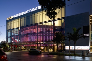
After two decades of transience, Auckland Theatre Company has a new home in a tight urban site in the lively Wynyard Quarter. This relatively small building uses the language of its surrounding commercial district to continue the fabric of its context. By day, the street level walls peel back to engage with passing public and at night the theatre becomes lantern-lit to signify the theatrics within. The intimate design approach to the 670-seat theatre means it feels smaller than its capacity; the scale of some public areas have been deliberately downsized in accordance with this strategy. The technically competent backstage and support areas will facilitate high-quality productions in the theatre.
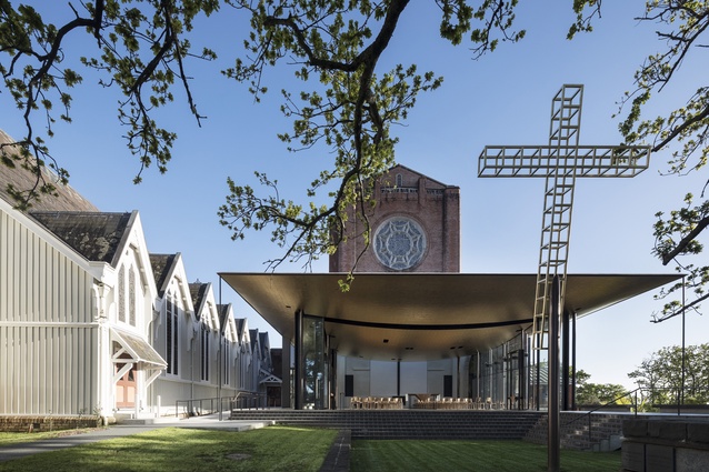
Bishop Selwyn Chapel by Fearon Hay Architects

Seamless in planning and structure, this pavilion wth its floating, delicate gold ceiling appears to be held lightly against Charles Towle’s existing brickwork cathedral, avoiding its touch. In fact, the structure is cleverly dissolved and layered, then distributed across the space as if by chance. The spatial boundaries of the chapel extend beyond its glazing to the garden designed by Jackie Bowring and the cladding of neighbouring St Mary’s. In contrast to the delicate gesture of gold, the ground condition is well articulated and firm, descending to the cross placed in a lowered courtyard before the garden; the tilt on the cross appears to acknowledge the rose window of the cathedral. This pavilion chapel is of excellent standard throughout, unfailing in its poetry and grace.
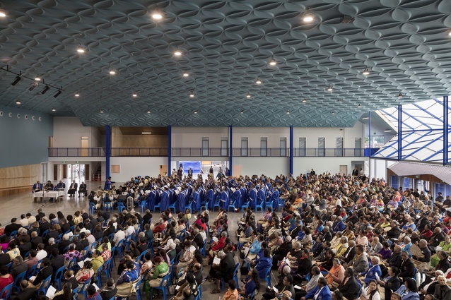
Lesieli Tonga Auditorium by Bull O’Sullivan Architecture

This poetic and robust building challenges the industry on the issue of engagement over commerce. The extraordinarily scaled, contemporary Tongan building has established a new building typology for New Zealand: a vast community space so large yet most aptly described as a “living room”. The single volume space, which provides a focus for the Tongan community both in New Zealand and abroad, acts as the main house of a village, hosting events from the highly formal to the casual, all united under a highly textured ceiling which is highly appropriate, but not imitative or directly referential.
Resene Colour Award:
The use of colour in this project, from the soft blue of the blanketed ceiling to the powerful royal blue of the Free Wesleyan Church of Tonga, is meaningful and aesthetically sensitive. The overall effect is never overbearing, and leaves plenty of scope for the colourful and vibrant inhabitation of the space by the community it serves.
Manukau Precinct Project by Architectus and Rewi Thompson in association
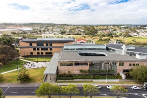
The Manukau District Court upgrade involved a re-rationalisation of the existing Auckland Architecture Award-winning building designed by Noel Lane and Architects New Zealand. The original entry courtyard has been revived as an inner relaxed space in an otherwise stressful environment, via the repositioning of the main entry and simplification of the security layers. Landscaped elements of the courtyard are repeated in the ātea area to the repositioned entry, work which gives the building new life and which bears the sensitive hand of the late Rewi Thompson, in one of his last projects. The new courts express the separate circulation route of the judiciary externally with a glass-block ribbon across existing and new forms; the judges are temporarily suspended in a cloud-like light before confronting the reality of the cases in front of them.
Te Oro by Archimedia Group
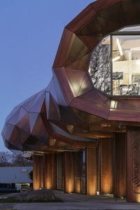
The success of this public project lies in its recognition of valuable, real and ongoing community engagement from the start. Relevant design strategies, such as multiple entry points, transparency at ground level, flexibility of spaces, integration of sound sites, and the understanding of the use of space between buildings, have allowed this community building to be adopted enthusiastically by locals. Performance spaces open from the building into the street and retail district, the carpark and the connection between Te Oro and Ruapotaka Marae. This landmark building provides a bold intervention into an otherwise neglected town centre.
SMALL PROJECT ARCHITECTURE AWARD:
Waiheke Gateway Pavilion by Stevens Lawson Architects
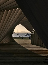
This previously unrealised concept for a temporary pavilion was designed in 2009, and has finally been built through an education programme for Unitec engineering, construction and architecture students. The changing nature of the beautifully controlled form mesmerised many visitors to the 2017 Headland Sculpture on the Gulf exhibition, where it was sited on low flat ground in Matiatia Bay. From certain distant aspects, the pavilion commanded the bay as if it were a dissolving wharenui; from others it appeared to be a landscape itself. Movement lines across the elevations of the pavilion flow with grace and ease, while jagged lines can appear violent from some oblique views. This theoretical proposal has lost nothing in its realisation; in fact, the gains have been enormous.
All winners of the 2017 Auckland Architecture Awards are eligible for shortlisting in the New Zealand Architecture Awards, which will be decided later in the year, and announced in November.

