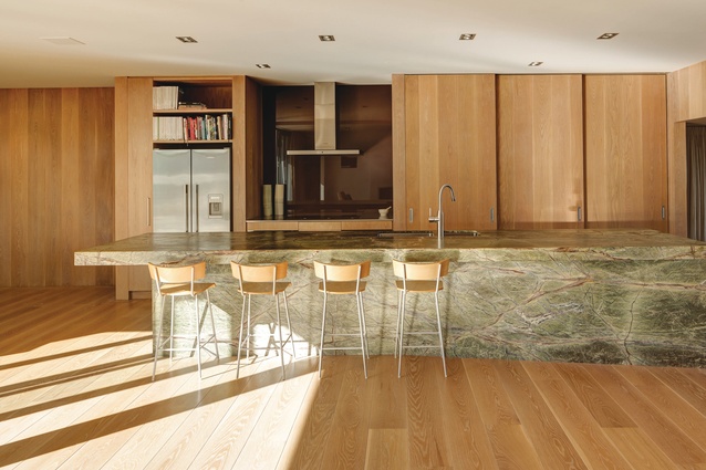
2019 Kitchen focus: case studies
We look at four New Zealand kitchens that show off the latest trends sweeping the country.
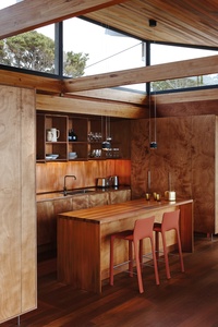
Rich, lively tones
“This kitchen [in the Tutukaka House] sits within an open-plan living area, with a living room on one side and a stacked kitchen and dining area on the other. It is a horseshoe shape, with cabinetry rising to the clerestory windows and cupboards to the side screening the kitchen from the living area. Sitting on stainless-steel tubular legs, these cupboards appear to float above the spotted gum floor. The rich, lively gaboon ply is complemented by a copper splashback running along the generous back bench and copper down each side of the island bench. The open cupboards are clashed with solid spotted gum and the rangehood is faced with black steel, picking up on the other fire elements in the house. With all of the services at the back, the island bench is a simple set of drawers and a breakfast bar. Lighting above the island can be raised and lowered with a touch and hidden LEDs under the shelving provide a beautiful wash to the copper as well as task lighting.”
— Nicola Herbst, Herbst Architects
Of this earth
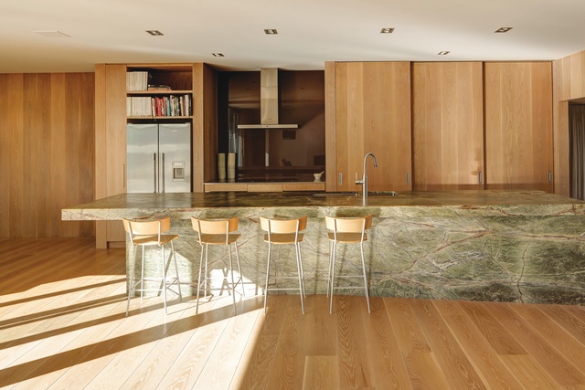
“This kitchen sits within a simple courtyard-based house for a young family, which is clad with a zinc aluminium magnesium skin that you would find on American Midwest silos. The house is based on the same principles as those of the Palm Springs aesthetic of Richard Neutra’s Kaufmann House and Albert Frey’s work.
Your arrival at the kitchen represents a careful unlayering of a series of moments and what you find is in total contrast to the rest of the house. The intent of the island is that it comes from the centre of the earth and acts as an anchor. I have been obsessed with marble for a long time, which is why I chose this opulent green forest marble from Italy, sourced locally from Italian Stone. The kitchen is all about this object that stands in the middle of the space and looks as though it shouldn’t be there.
Beside the island, you step down to a 5x3m daybed area, sitting under the pōhutakawa canopy as it drops away to the Waitematā.”
— Michael O’Sullivan, Bull O’Sullivan Architecture
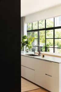
Fresh and light filled
“This kitchen is in a beautiful family villa, which was renovated throughout by Jose Gutierrez Architecture. He situated the kitchen in the centre of a large, rectangular, open-plan living space, with free-standing tall cabinetry creating the separation between bedroom areas and kitchen, dining and family areas. This eliminated the need for a traditional hallway. The client wanted a Swedish look and feel so the walls are Resene Black White and the cabinetry is American oak with a black oil finish. The island surface is a leathered natural stone – fantasy white granite from SCE Stone – with an American ash bench on the seating side with a white oil finish. We used a Mirotone polyurethane satin finish on the cupboards and drawers to match the walls. The north-facing space gets a lot of sun and has a high ceiling, with black steel joinery doors and windows that open to the garden.”
— Morgan Cronin, Cronin Kitchens
Sleek sophistication
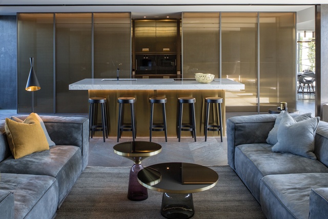
“We designed the Italian Arclinea kitchen for this luxury apartment in collaboration with Maria Pomeroy from Matisse. It has a walk-in scullery to the left and right of the two ovens in the centre. The oven and island cabinetry has a champagne-coloured PVD stainless-steel finish and the benchtops and island top are Carrara marble by Artisan Stone.
The fixed glass doors, which conceal the scullery and mirror the small den at the other end of the room, are by Rimadesio. They are made up of a laminated Rete Bronzo glass with Piombo Spazzolato aluminium frames and are fixed into place by a built-in ceiling track. There is no bottom track so the floor flows seamlessly throughout. Appliances are all by Gaggenau and the floor is oak, stained grey, by Swinard Wooden Floors. The two Classicon Bell tables with hand-blown glass bases were chosen to complement the colour scheme.”
— Philippa Diver and Jane Dewe of JP Design and +MAP Architects
This article first appeared in Houses magazine.


