2019 Kitchen focus: international trends
The kitchen, as the heart of the home, has undergone reinvention after reinvention. It has been subject to trends that have either stood the test of time or, thankfully, disappeared from view, never to emerge again. While current trends are distinct in their aesthetics, we’re also witnessing stylistic mash-ups where designers and architects pick and choose the very best of what’s gone before, along with what’s popular now.
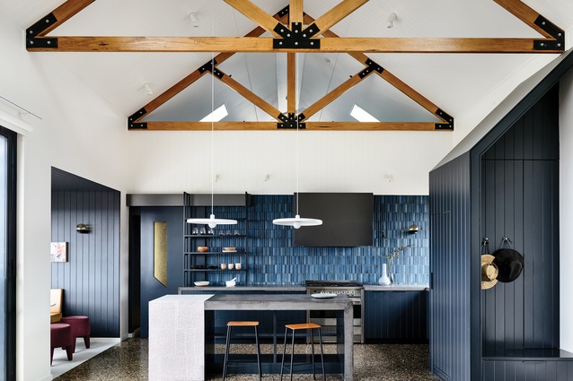
Doherty Design Studio’s Beechworth Residence kitchen, for example, is an exquisite study in handmade finishes and features, yet it also brings the drama via a striking material palette and structural elements. And the kitchen of Function Walls by Lookofsky Architecture may be a colour-saturated dream but it’s also restrained in materiality and arrangement. The thing that unifies today’s kitchens is an aversion to sterility; above all else, each of them has character and tonnes of soul.
This just goes to show that designers and architects are creating kitchens with their clients very much in mind; the best outcome is the one that reflects those who use it on a daily basis. Functionality is, therefore, just as important as are aesthetics and, whether it’s open plan or not, small or large, gaining the most from this most social of domestic spaces remains a priority. This may mean the introduction of a butler’s pantry or an oversized island, more shelving or hidden storage tucked away in unlikely places.

Regardless, most would argue that the best part of any kitchen is its inherent messiness: the theatricality created when cooking for family or friends and the dirty dishes left on countertops in the breakfast rush. A well-designed kitchen provides the framework for everyday life and the most successful are as hard-working as they are good looking.
Artistic
Artistry in the kitchen isn’t just about prints or paintings on the walls. Rather, it’s a combination of bespoke furnishings, lush materials and delicious colours that all come together in a celebration of creative expression and personality.
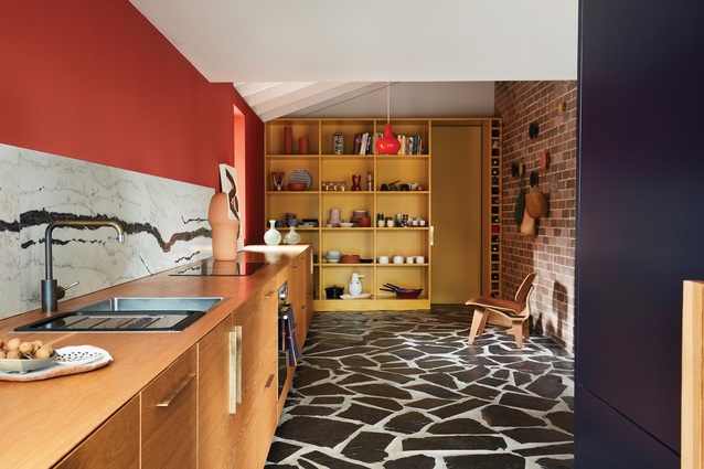
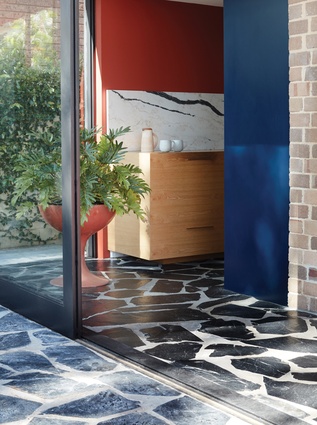
The transformation of a 1960s’ house by Amber Road in Sydney’s Cronulla features a kitchen that’s lively and energetic in composition and styling. Bold colour and textured surfaces add visual interest and open storage makes it look comfortably lived in.
Colour-rich

From deep grey and green to bright yellow and pink, colour is back in the kitchen in a very bold way. Accents never go out of fashion but taking colour to new levels of saturation is most certainly on the rise.
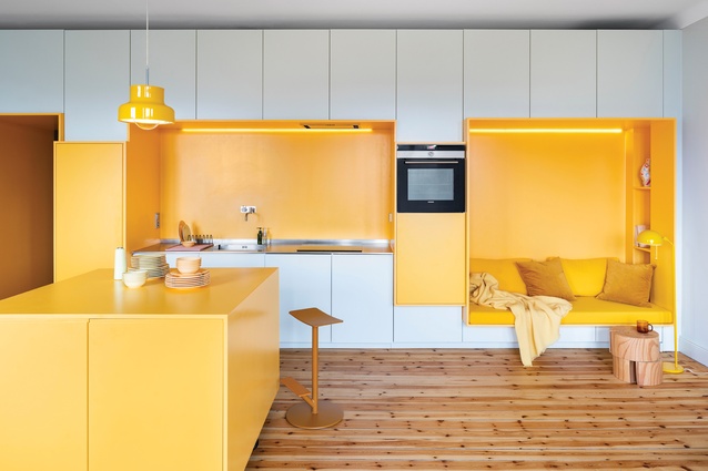
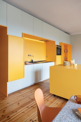
Egg-yolk-yellow finishes on the recessed seating alcove, bench and island unify the kitchen and dining space in a home by Lookofsky Architecture in Stockholm. It’s bright and cheerful: carefully tempered by white joinery and honey-coloured timber flooring.
Minimalist
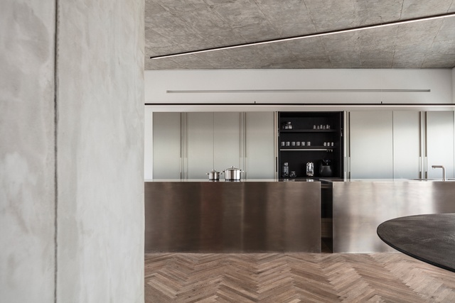
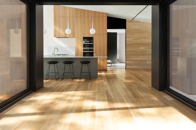
Today’s minimalist kitchen isn’t sterile or whitewashed and, while its arrangement is still pared back, with clean lines and uncomplicated styling, the material palette is warmer with judiciously introduced accents that offer vignettes of visual interest.
A kitchen by architectural practice yh2 in a three-pavilion home in Wentworth-Nord, Canada, expresses today’s minimalism perfectly. The lines are clean and the arrangement is uncluttered, while timber flooring and joinery add warmth.
Dramatic
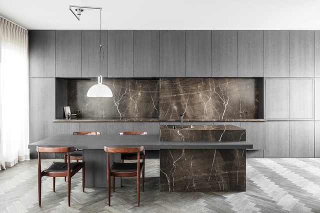
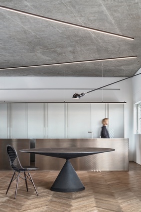
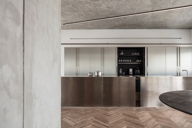
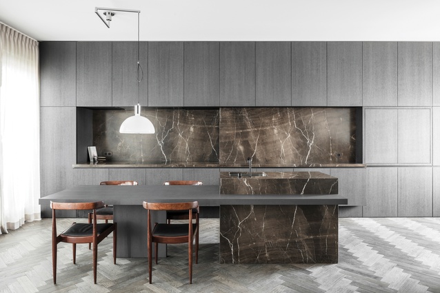
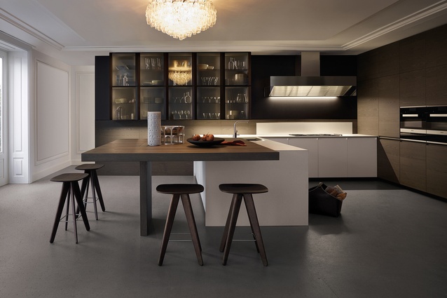
This is a strong trend that came to attention at EuroCucina 2018. Featuring dark colours, sculptural forms and distinctly patterned finishes, this look is a backlash to the all-white kitchen and doesn’t appear to be passing any time soon. Dark colours, striking light fittings and robust materiality define a kitchen in Tel Aviv and Axelrod Architects has made the scheme appear all the more dramatic by keeping it relatively pared back and minimally furnished.
Handcrafted
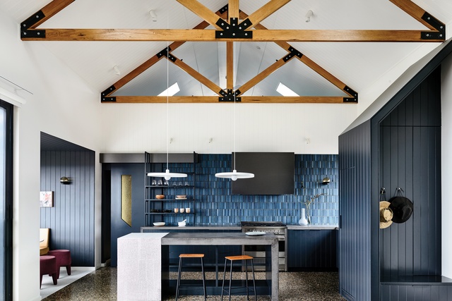
The hand of the designer or architect defines this trend, which emphasises craftsmanship and artisanal skills. It manifests in handmade finishes and bespoke elements, which make the kitchen all the more inviting.
Beechworth Residence’s kitchen in Melbourne by Doherty Design Studio is inspired by the simplicity of Japanese design and the idea of quality over quantity. It features handmade elements, including Japanese tiles and poured concrete benchtops.
Local angle
Over recent years, the kitchen has evolved to become so much more than simply a place to cook meals. It is now the entertainment hub of the home: a space which promises action and, more importantly, social interaction. It’s the room in which people come together at the start of the day and, again, as it draws to a close.
Today, there’s a real drive for kitchens to reflect individual tastes and lifestyles. We’re no longer interested in the traditional look; instead, either we want our kitchen to blend in seamlessly with the style of the rest of our house or we want it to stand out, with a series of bright, bold statements.
This increased sense of individuality calls for customised and contrasting detailing, and designers and manufacturers are happy to be creative. They can customise colours, surfaces, handles and trims on cabinetry and appliances in every conceivable hue and material finish, from beautiful mint greens and bright reds to opulent marbles and etched glass.
Our passion for natural, raw materials endures, as we seek to connect further with nature; wood, honed natural stone, shiplap and jute all create a pared-back sense of calmness and light. In contrast, copper, brass and marble lend an understated opulence to the more dramatic kitchen.
And our obsession with stainless steel continues, providing a utilitarian, industrial edge in what is, at its core, a functional space.
Matte black continues to dominate, partnering beautifully with wood, marble and stainless steel but look out for the predicted emergence of hunter and olive greens for a fresh twist on the classic muted black.

Not surprisingly, size has become an important consideration in today’s kitchen. While some homes may have the luxury of space, the kitchens found in those houses with smaller footprints and in medium to high-density dwellings call for smaller, more-compact appliances, and those that can be integrated, where possible. Ovens and other service areas are often concealed behind sliding doors, dishwasher drawers take up minimal space under island benches and storage is maximised with clever, discreet solutions.
When so much time is spent in the kitchen, the most important thing is that we feel right at home in it. As British food writer Mina Holland points out, it’s where most of waking life happens. “Practically and symbolically, the kitchen has transcended straightforward culinary utility: it is the nucleus of the home”… which is exactly the way we like it.

Creative Kitchen Spaces
Auckland-based Studio Italia’s Joanna Hoeft says an informal dining area at the kitchen island often features in the studio’s designs.
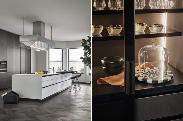
“Our style direction for the kitchen is definitely influenced by Poliform and what it is doing in Italy. We offer packages for clients to customise their kitchens completely.
The majority of our designs include more than one door finish and a combination of finishes and textures. This creates an interesting palette while also being carefully considered and harmonious.
There’s a lot of interest in dark timbers (black elm and spessart oak), mid-tone walnut and a new petrified oak finish. Stainless-steel doors and the new 6mm-thick stainless benchtops are enjoying a resurgence, as are bronze and titanium-coloured metal lacquer finishes. Natural stone benches and splashbacks are still popular but etched glass benchtops and Dekton ceramic surfaces are gaining momentum. There’s also more lighting in both our wall units and our drawers.
Most of our designs still include generous scullery spaces and large, informal dining areas around islands – where whole families can congregate.”
This article first appeared in Houses magazine.


