4 luxe kitchens
Fresh from the autumn issue of Houses, we feature four sleek and elegant kitchens, each with a story to tell.
Ponsonby Kitchen by Jessop Architects
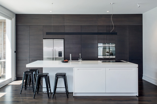
Kitchens in open-plan living spaces look great in magazines. The cleaner’s been, the stylists have done their stuff, and the photographer’s picked a perfect day for the shoot. But how does it look on a rainy night in July? – Well, this one looks pretty good.
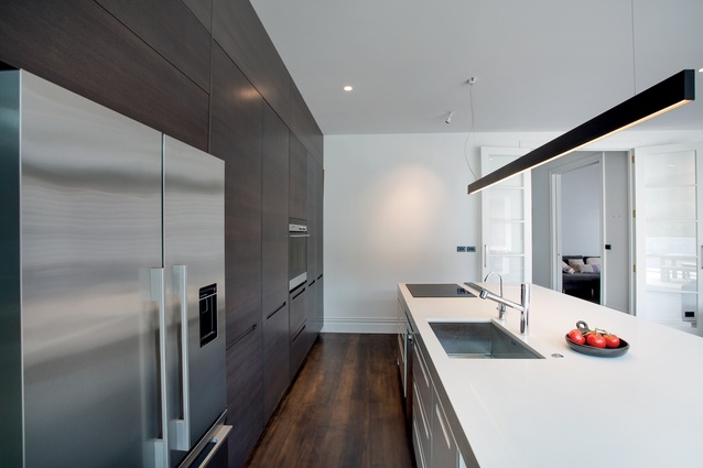
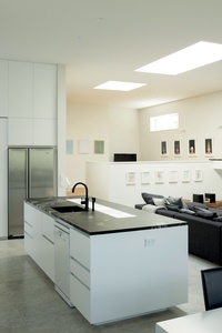
The key, according to architect Darren Jessop, is that ‘all the things you don’t want to see, or need to see’ sit behind a wall of floor-to-ceiling joinery that has been designed to look like a large piece of furniture. The pulls for the drawers and cupboards have been milled into the doors, adding to the furniture look and giving a Scandinavian feel to the space.
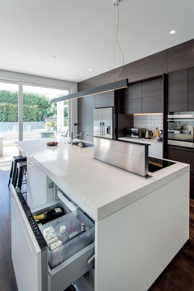
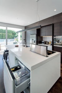
“All the operational stuff sits on the island,” says Jessop. “Normally, I wouldn’t put a hob on the island, but the clients wanted it there. To deal with the cooking odours, we installed a pop-up down-draught extractor into the island, and that works really well.”
The extra-deep island (1400mm) accommodates a large sink as well as the hob. It’s also double-sided, in that there’s a pull-out drinks fridge on the lounge side, so you don’t need to go into the kitchen for a top-up. There’s ample seating for four at one end as well, making it a very social space to hang out.
A sleek LED strip light over the island adds an elegant finishing touch to this kitchen. It’s practical too, as it has two modes – full-on task lighting when needed, or a softer mood light that automatically comes on as you enter the room.
Mt Eden Kitchen by Rowe Baetens Architecture
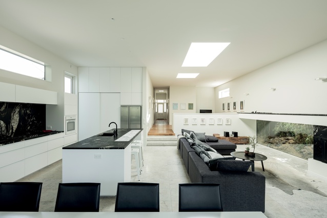
In a living space that’s been carefully crafted and curated, it’s important that the kitchen doesn’t compete with its surroundings, rather it enhances them. In this respect, architect Tom Rowe had a very clear vision of the look and functionality of this sleek kitchen.
“The design of the kitchen is conceived as a machine where everything is concealed – kind of the complete opposite of a French country kitchen. It’s a city kitchen, where you want cleanliness and utility, but not stainless steel,” says Rowe.
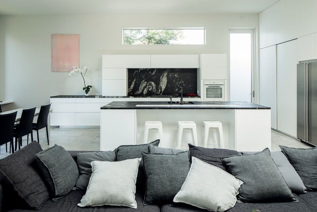
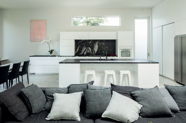
The solitary ‘feature’ in this kitchen, in an otherwise white landscape, is the Titanium Black Granite splashback and benchtops. “We chose each of the slabs very carefully,” says Rowe. “We didn’t want too much movement in the pattern on the benchtops, although on the splashback we wanted more colour and life.”
In keeping with the architect’s goal of keeping the space simple, there are no reflective surfaces in the kitchen. The cabinetry is matt and the granite, honed – finishes that are serviceable and forgiving of children’s fingermarks. Even the tap and sink on the island are coordinated to blend in with the benchtop. And there are no handles on the cabinetry – only slots and push-catches.
This simplicity has not been gained at the expense of functionality, however. All the usual appliances are here, and there’s a large pantry and small-appliances area hidden behind two large sliding doors next to the fridge.
Being a new build, Rowe was able to also make decisions on the size, shape and position of windows and doors. Apart from the huge aperture at the end of the space, he inserted a wide, narrow-height window above the cabinetry on the back wall and an extra-tall outside door to its side. “Both allow light and shadow into the house, but still remain private,” he says.
Artificial light is achieved through direct, narrow-beam spots recessed high into the ceiling directly above the island benchtop, casting light only onto work surfaces and carefully placed to avoid shadow.
Emerald Hill Kitchen by German Kitchens
Space was not an issue with this kitchen. The challenge designer Damian Hannah faced here was satisfying his client’s long wish list. In effect, they wanted two kitchens, and the finished item had to be a ‘masterpiece’ that was both elegant and embracing of its surroundings.
“We started off by building a spine wall between what was to become the main kitchen and the scullery, leaving it open at each end for access,” says Hannah. “The two spaces mirror each other and have galley-style layouts.”
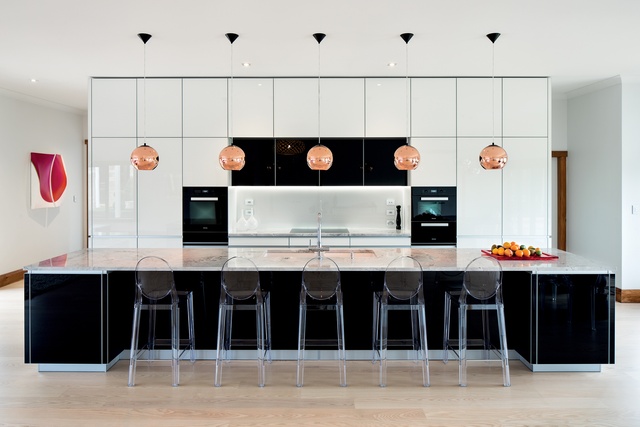
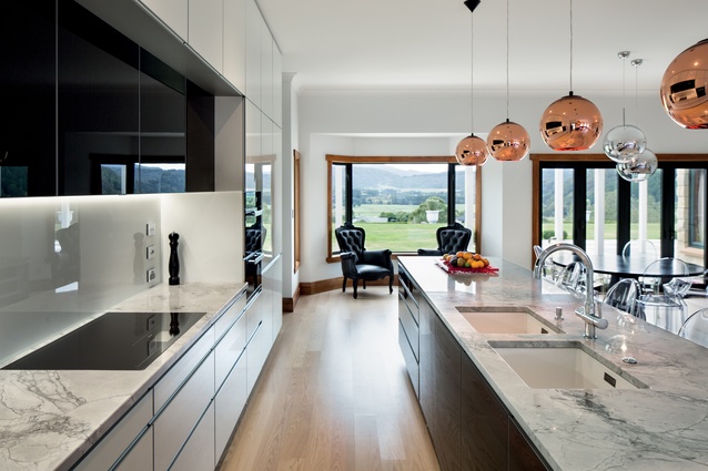
For the cabinetry fronts and island in the main kitchen, the designer chose a back-painted glass, in contrasting black and white, with aluminium edging. “Glass gives a far purer finish than lacquer and, with the protective aluminium edging, is extremely hard-wearing” says Hannah. “It’s also highly reflective, so it perfectly mirrored the surrounding countryside – something the homeowners had requested.”

Back-painted glass was also chosen for the splashback, which was then edge-lit by an LED strip light. This has the effect of illuminating the glass from the inside, giving the whole wall a glow. Picking up on the black-and-white tones of the cabinetry, Hannah chose a dark-veined, Brazilian Quartzite for the benchtops. “Quartzite is granite with quartz veining, and it’s much stronger than plain granite,” he says.
The scullery is effectively a stand-alone, working kitchen that sits directly behind the wall of cabinetry in the main kitchen. In fact, it has more functionality and more storage than the one out on show. “There’s a large French-door fridge-freezer, a separate freezer, a six-burner gas hob, a 90cm oven, a dishwasher, a microwave, as well as a 350-bottle wine fridge,” says Hannah. “It’s had a better fit-out than most New Zealand kitchens.”
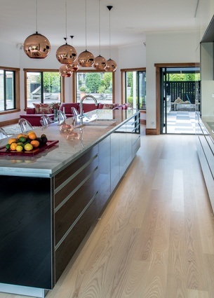
Back out in the main kitchen, the symmetry of the cabinetry design is enhanced by the placement of the five, copper-coloured Tom Dixon pendants over the island and a set of Philippe Starck Ghost Chairs.
Corunna Kitchen by Daniel Marshall Architects
Building a new home on a tight site requires many of the interior spaces to have multiple functions. In the case of this home, by architect Daniel Marshall, the kitchen shares its environment with other elements in the open-plan living area in terms of access and utility.
“It’s essentially an L-shaped galley kitchen that twists its way around the central core of the house,” says Marshall. “It also acts as the accessway through to the laundry, which is by the back door.”

The central core is the main circulation space for the house and contains two flights of stairs, as well as substantial storage. “Although it looks like an homogenous block of plywood panels, there’s a great deal going on inside,” says Marshall.
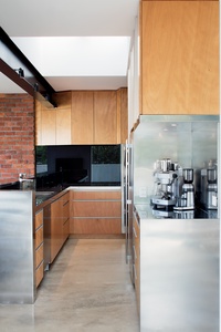
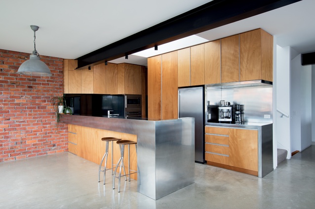
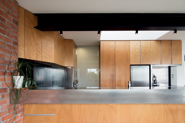
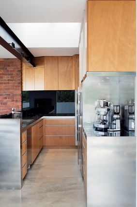
The architect explains that he always likes to add a sculptural element to his work, and in this case it’s a single piece of stainless steel that folds its way around the peninsula, forming the main working surfaces of the kitchen.
In terms of materiality, the plywood cabinetry softens the hardness of the polished concrete floor and the stainless-steel elements. “The feature wall of recycled brick from the house that used to be on this site provides texture to the palette… and a bit of colour,” says the architect.
Between the working part of the kitchen and the prep area, Marshall installed a pocket sliding door, made from frosted glass. This allows the area to be closed off from guests, but still lets available light into the rear of the kitchen and laundry.
A finishing touch was the coffee station – something the clients had requested. This is found right at the entrance to the kitchen, to make it easily accessible to the living and dining areas. To link it to the rest of the kitchen, it has taken on the sculptural form of the stainless-steel work surfaces opposite.

