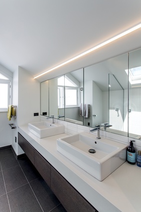
6 inspirational bathrooms
Ranging from stark minimalism to 'simple elegance', these six bathrooms from the March issue of Houses are sure to delight and inspire.
Parnell Bathroom by Du Bois Design
With time spent between their house in the country and travelling for business, this busy couple wanted something simple yet luxurious for their pied-à-terre in the city. Award-winning designer Natalie Du Bois was brought on board at the early stages of the home’s design to create some magic in the ensuite, guest bathroom and powder room.
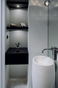
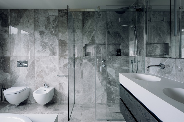
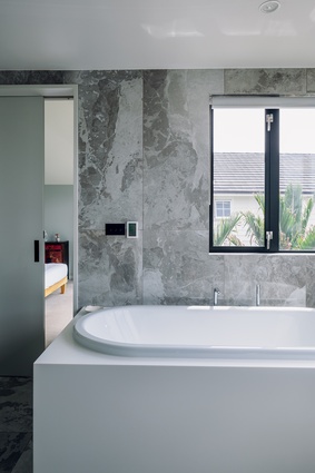
The designer’s immediate suggestion with the bathtub was to install a sculptural, freestanding model, but her clients wanted it built in, to make it easier to clean. “Working with this request, I tried to achieve a freestanding sculptural look by inserting a large, double-ended bathtub into a custom-made seamless white Corian bath surround, to contrast the stone-look tiles on the walls and floor” says, Du Bois.
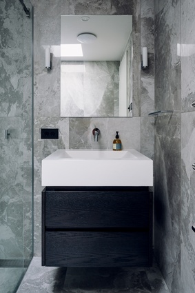
On the adjacent wall, Du Bois chose an all-in-one double vanity, moulded from a single piece of stone composite. “Again, this was a simple solution for my clients, and easy to keep clean,” she says. The sinks sit on a custom oak vanity, stained black and cantilevered off the wall.
Referencing the natural stone found in the rest of the house, Du Bois chose a porcelain tile for all the bathrooms. “Porcelain tiles have come a long way in recent years, to the extent that they now look almost exactly like natural stone,” she says.
Mt Eden Bathroom by Rowe Baetens Architecture
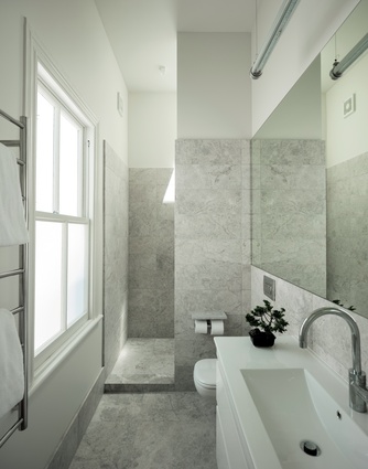
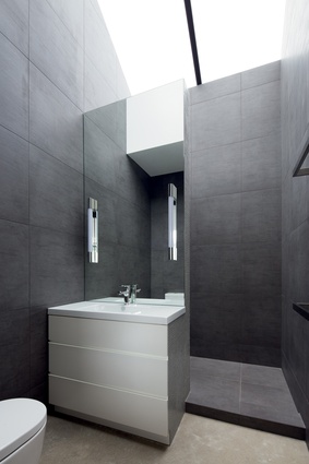
When we asked architect Tom Rowe what the inspiration was behind these twin bathrooms, he smiled and came back with a quote from one of New Zealand’s favourite sons, Ernest Rutherford: “We didn’t have much money, so we had to think.”
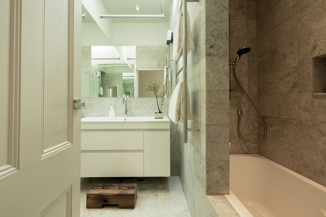
The problem facing Rowe was finding a cost-effective way of getting light and ventilation into these two tiny bathrooms within the constraints of a 100-year-old villa.

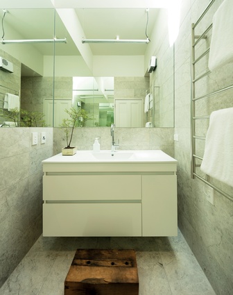
His solution was to use a single automated skylight to service both rooms and to create a mise en abyme – a term derived from French heraldry, which literally translates into ‘placed into the abyss’. In a physical sense, the term describes the visual experience of standing between two mirrors, then seeing as a result an infinite reproduction of one’s own image.
Large mirrors in both bathrooms give the rooms more width visually, and the toilets and vanities are all wall-hung, adding to the illusion of space. In the family bathroom, Rowe has even managed to squeeze in a bathtub, with a shower above. Both areas are clad in a type of marble that Rowe had seen on his travels – in one of Turkey’s oldest bathhouses, in Bursa.
Corunna Bathroom by Daniel Marshall
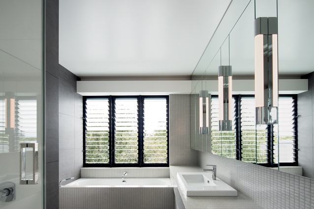
Here, architect Daniel Marshall has designed a tranquil, functional bathroom within a compact footprint of around 6m2. Remarkably, for a relatively small room, it contains all the elements expected in a formal ensuite – bathtub, twin vanities, walk-in shower, toilet – yet doesn’t feel cramped.
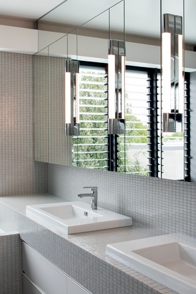
This has as much to do with the simple material palette as it does with the layout. The architect’s choice of large porcelain tiles, coupled with glass mosaics in a similar tone, make the space feel larger that it actually is.

Positioning the lowest element, the double-ended bathtub, under the window allowed for a bigger window to be used. The window visually enhances the space, and the glass louvres control the available light and, just as important, the ventilation.
On the opposite wall, a full-width vanity is integrated into the design, forming a distinctive L-shape with the bathtub surround. This sculptural insert has then been tiled in glass mosaics, and eco-style light tubes are spaced evenly along the mirrored wall to provide task lighting.
Warkworth Bathroom by Celia Visser Design
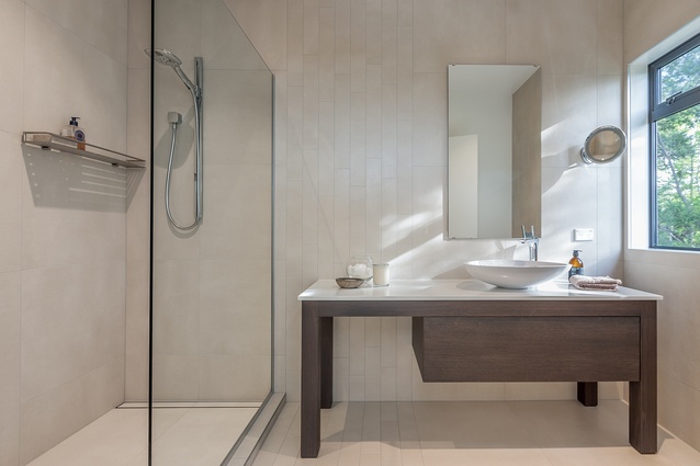
The essence of this renovated master ensuite can be summed up in two words – elegance and simplicity. And, the basic forms of a rectangle, a square and an oval provided the inspiration. As you enter the room, the focal point is a custom-designed timber vanity that emulates a simple table.
The asymmetrical drawer was designed with the left side open to create a sense of space and also to highlight the rows of rectangular feature tiles that run from the doorway across the horizontal plane of the floor and up the adjacent vertical wall. Square tiles, in the same finish, were chosen for the remainder of the bathroom. This has the effect of drawing your eye in and up, opening the space without overpowering the room.
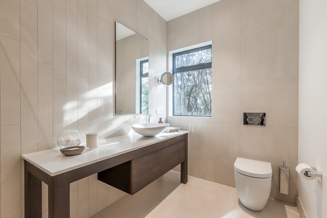
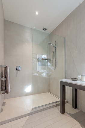
The elliptical basin and sculptural tapware were chosen to further emphasise the asymmetrical form of the vanity, also making a statement piece on top of the table-like form. A large walk-in shower was designed to one side of the bathroom, with a single glass panel dividing the shower from the rest of the room. This adds to the uncluttered feel and increases the sense of space and openness.
St Marys Bay Bathroom by Von Sturmer’s - Kitchens and Living
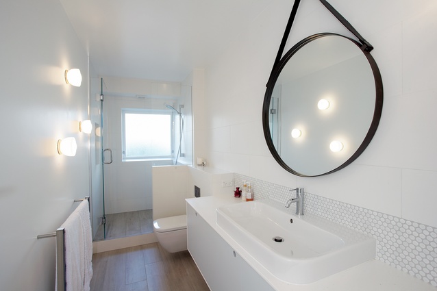
Bathroom renovations in apartments are inherently complicated. In this case, designer Leonie von Sturmer was faced with a confined, narrow footprint, where the existing pipework was strapped to the wall, which meant minimal changes could be made repositioning the whiteware.
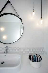
“The vanity was at the end of the room, facing the only window, so you couldn’t have a mirror in front of you,” says von Sturmer. “Along the wall, was the toilet, a bathtub and the laundry appliances. The whole room felt extremely cramped and dysfunctional.”
Von Sturmer felt that a shower was more appropriate in a small apartment than a full bathtub. To maximise its size, by using the full width of the room, the shower was located at the end of the room, replacing the vanity. A half-wall was added to give privacy from the adjacent toilet – the one item that couldn’t be moved.
The only compromise that had to be made was with the lighting. “As we weren’t allowed to ‘chase out’ the concrete block wall to install electrical wiring for mirror lighting, we had to come up with a different solution,” says von Sturmer. “Two hand-blown glass lamps were hung from the ceiling and three original frosted-glass sconces were fixed to the opposite wall, which were in keeping with the apartment’s heritage.”
Ponsonby Bathroom by Jessop Architects
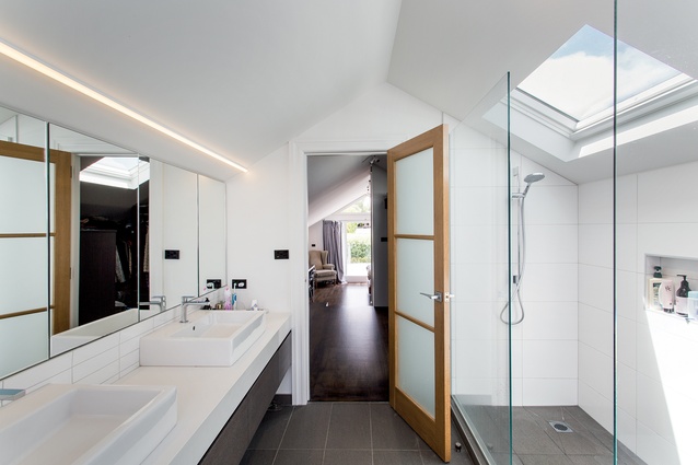
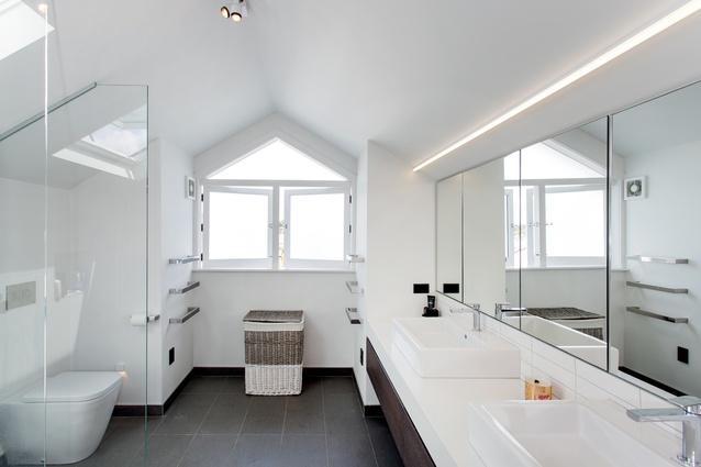
Part of a complete renovation of a double-bay villa in Auckland, this top-floor bathroom is a new addition, and forms one third of the owners’ new master suite – the other two elements being a walk-through wardrobe and the bedroom.
The suite occupies the full length of the house, with the bathroom facing the street, above the front door, and the bedroom at the back, overlooking the garden. “This linear layout offers a very practical solution to how to accommodate a large, parents’ retreat into a tight roof space,” says architect Darren Jessop.

Although the space is narrow, the architect was able to fit a large walk-in shower along one wall and a generous vanity, with his and hers sinks, along the other. The toilet is situated at the end of the room, under the window. “To give the impression of space, we put a full-width mirror along one wall,” says Jessop. “We also hung the vanity off the wall, which helps make the floor area seem larger.”
Nothing has gone to waste in this bathroom. To further maximise the available space, the heated mirrors feature push-catches, which reveal hidden cupboards that extend back into the roof cavity. Light was also an important factor. Because available light was restricted to a small window at the end of the room, Jessop installed a large skylight above the shower, which allows natural daylight to stream in.

