A cloud within a cloud
"This school has never not made a deadline."
Tom Whelan’s sincere words that Friday morning sank to the floor of The Cloud. To hear doubt from the guy who can make anything happen made us all pause – for half a second. No matter how grounded in reality, our overworked team of four was too focused to listen to doubts, even from Tom. Ten minutes later as I painstakingly counted rows and columns from the worn drawing in my hand, I got a call from Tony Van Raat, head of Unitec’s Architecture Department; he assured me he had no doubts. I thanked him for his confidence, dropped the rust stained drawing, and started texting. Our deadline was 7 hours away as I put out our third call to arms; we needed one last army of student volunteers to get us through to Urbis Design Day 2012.
The project began in December after a meeting with Van, who has a way of presenting a ‘design opportunity’ like a dish of chocolates. He gave me the contact information for Maddy Simpson from Hewlett Packard, our industry partner for the event. In Urbis Design Days past, students creatively displayed their own work, and HP chose and rewarded a best of show student. However, the volume and spectacle of our venue, The Cloud on Queen’s Wharf, dictated the scale of the installation as well as demanded a new level of intensity.
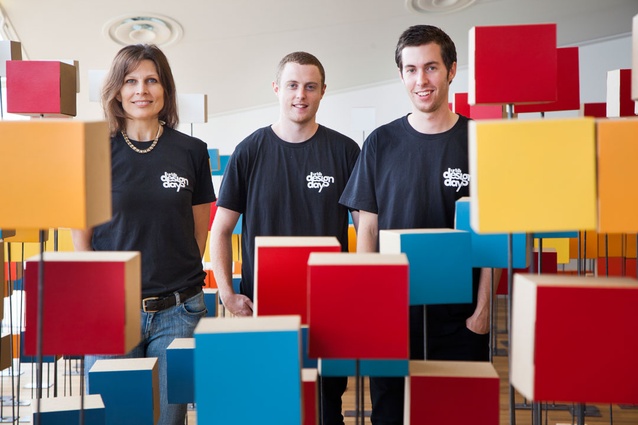
I knew from experience choosing the correct design team would determine the potential of the project. Particularly in a fast paced design build process like this [10 weeks], it’s not just how much skill and talent each designer brings individually, but how well he or she respects and works with their team that leads to success. Finding four or five talented, hard working, collaborative students who were simultaneously in Auckland during the summer break and unemployed took two precious weeks. My dedicated team of four: Scott Manning, Anna Teo, Warren Nicholson, and Nick Parkes started research the beginning of January.
The students took a cue from HP and began to look at binary code and inevitably data in general. The availability of information in this contemporary world is prolific and overwhelming. In one aspect, architects are curators of information. We gather data of site, program, budget, regulations, codes, materials, and organize them as a physical response. The students were familiar with aspects of collecting data and how data could inform design decisions; I had to convince them the data and the relationships between sets of data could become the design itself through abstraction and reinterpretation. I took this idea of the curatorial role and an interest in materializing data to the students and challenged them to look at the information available involving the site. We needed a design, now in 8 weeks, to communicate HP’s computing industry through a physical experience created from a detailed dialogue with the site data for an audience of 2500 design peers. No pressure.
The precedent study began with installation architecture. For decades architects have been designing temporary projects for speculative investigation, to intervene, disrupt and transform site, to question, explore and broaden what architecture means. We do not experience our built environment in static terms; our perceptions of length, width, and volume shift in relationship to gathering, pausing, moving through, or standing alone in spaces. The installation medium offers a unique opportunity for the architect to experiment with this qualitative and dynamic side of architecture, altering the experience of an environment and engaging the body through spatial components.
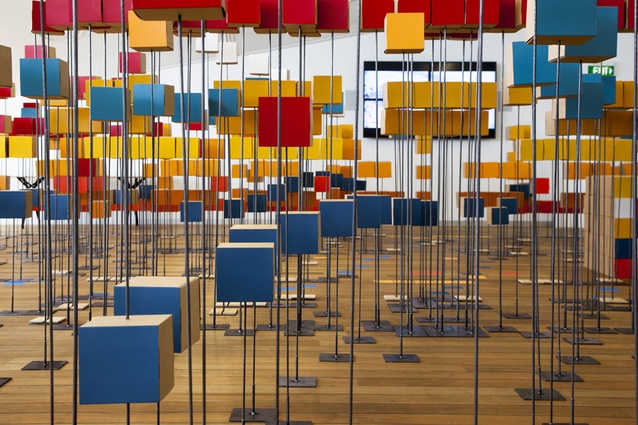
After studying installations, the students realized these aspects and prioritized spatial qualities and a participatory nature as core ideals for the installation. They narrowed down the massive amounts of data they had gathered to focus on the activity in the water – a very unique aspect of this unusual site. The team correlated information on tides and moon phases, ferries, cruise ships, and shipping vessels. Individual units of data took shape as different sized white cubed boxes in response to the team’s binary research [yes, no/open, closed/solid, void]. The nature of the cube led to the formation of a grid. We established an X and Y coordinate system in plan combined with a Z dimension in elevation, and acknowledged the need for the data streams [as we began to call them] to share a datum developed through consistent connection with at least one of the coordinate values. This datum allowed relationships between the data to emerge and create visual accessibility for the public. The columns in the X direction became days of the month, beginning in January [when the students started their research] and ending in March at the culmination of Urbis Design Day. Each row in the Y direction represented an hour in a 24-hour day.
We had dynamic, interrelated data streams and the beginnings of an effective grid, HP was excited about the emerging design, but the students were still skeptical – at what point would their personal creativity influence the design? How could they manipulate the data to suit their desires? How could data in and of itself result in something spatial let alone provocative? Eventually the Z dimension would take on a life of it’s own responding to each data streams’ unique qualities.
However, amidst the interesting movement happening in the grid, the banal white boxes [despite a variation in size] over-blended visually, becoming indistinguishable. We overreached our initial intention of demonstrating the flow of data as a conglomerate of individual activity. It needed colour; a innocent riot of colour in a white cloud. If we painted one side of each box, individual streams could co-exist in relationship to other streams while the opposite side, still monochromatic, could communicate the unity of the water-based movement taking place.
The surprisingly organic nature of the design’s development provided the students with some designer satisfaction, and as more decisions were finalized we realized the experience lacked the spatiality and participatory nature core to its success as an architectural exploration. We discussed a path through the data as a crucial spatial consideration. Beyond architectural construct, the path offered a re-immersion in the banal world of shipping docks and ferry routes as expressed in rhythm, repetition, and pattern. Children ran through the path, enjoying its maze like quality, while adults circumnavigated the edge gauging widths and directions before venturing inside. The path also revealed the organization of the gird through laser etched wooden plaques at the base of various stands that listed date, time, wharf, frequency, or even meters above mean sea level. If one followed the plaques, patterns in information immerged to reveal the format of the grid.
Early on in the preliminary design phase the team had decided to use materials derived from recycled content or materials with high recyclable value [not subject to down-cycling]. We wanted to highlight our local steel industry and contacted Christine Wilkinson from New Zealand Steel. She put us in touch with Vulcan Steel and Eagle Wire who agreed to help us with our project. The original white card boxes became unbleached, recyclable, New Zealand made, cardboard boxes from Quick Brown Box.
Not surprisingly, architecture students make excellent guerilla marketers; while Nick and Warren got manufacturers on board, Anna persuaded student volunteers we deserved their help. The team coordinated deliveries and staging areas, explained difficult to understand drawings [yet another lesson learned] to volunteers, and managed to have everyone working simultaneously as a well-oiled machine. During the construction/installation phase we painted and folded over 1300 boxes, hauled upstairs and then laid down steel base after steel base, sorted and inserted more than 1300 wires in over 200 different lengths, and became experts on the fine distinctions between Resene’s California, Spotlight, Supernova, and Wildthing yellows, all in over 47 hours.
In six years of teaching architecture I have never been involved with, nor heard of such an intense architectural experience for students. They acted as designers, drafters, and specifiers, project managers, foremen, and labourers. They communicated with a real client, and made tough decisions based on a small budget and a tight deadline, while constantly under the pressure of their first highly visible design open to public critique. I watched a quiet student find a confident voice as a team leader during the installation, and a potential micromanager gain trust in others, delegating tasks to upwards of 30 student volunteers at a time. At one point, a student on the design team, whom I considered inexhaustible, questioned if architecture was the right career path for him. At that moment I knew they had experienced the anxiety and exhaustion only a project you are passionate about can put you through.
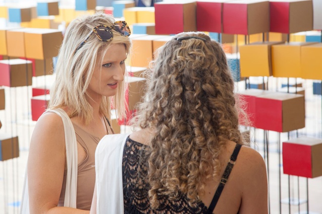
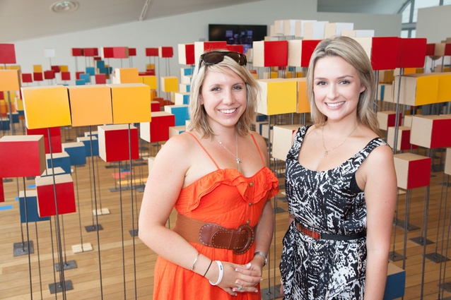
On Designday we enjoyed playing tour guides and occasionally found ourselves in the role of observers. We watched as people reacted to our design, walking through it, lingering, questioning, and then sharing their ahah moment with others in their group. Initially we followed the women with big purses, straightening the boxes their bag hit each time they turned to point, and the children running renegade from parents as they designed new paths through the grid. We soon settled, and just gave thanks alcohol wasn’t served at our venue. One visitor asked if the cruise ship she had come in on was represented in our installation. One of the design students walked her over to the exact day, time, and ship. He explained the colour of the box indicated the particular cruise line and the height at which it was installed indicated its wharf. She was overjoyed and I assumed the look on his face as he retold the story meant she, and the rest of the visitors we encountered that day answered his questioned about becoming an architect for him.
It only took six of us a little over five hours to pack away 1300 boxes and 1.8 tons of steel that covered almost 13 square meters. And thanks to a very supportive Waterfront Authority, it resides in less than 2 square meters in a Cloud storage unit awaiting its next destination. To their credit, both HP and the Department of Architecture extended a lot of trust and support throughout the design and build. And without the help of dozens of energetic student volunteers the design simply would not have materialized.


