Air New Zealand’s Clothes Hangar
Air New Zealand staff are kitted out in Trelise Cooper-designed apparel in a purpose-built and metaphorically correct facility.
Some of you might be wondering what exactly a Clothes Hangar is. When searching for a comparable concept, one thing that came to mind was an army’s quartermaster, you know, where troops head for goods and provisions. At Clothes Hangar there’s not much in the way of khaki, and you don’t handed a canteen or spade. Here, rather, Air New Zealand staff get a full-service head-to-toe styling and grooming experience, which sounds infinitely more enjoyable.
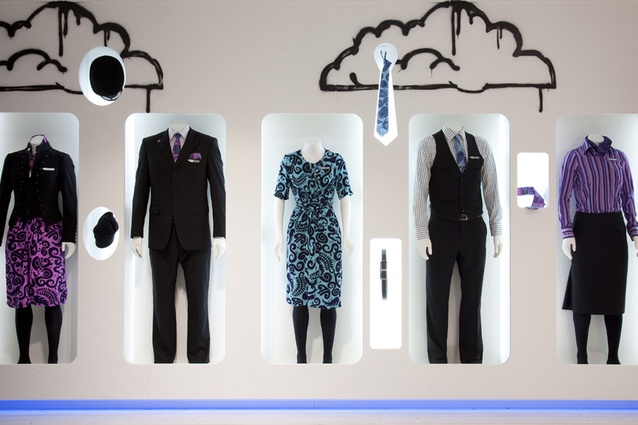
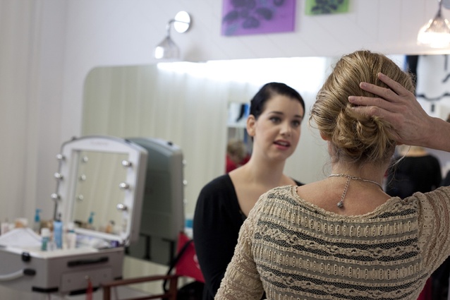
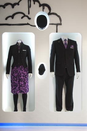
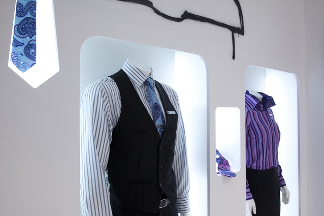
Here’s how it works: staff enter a bright space and are greeted by stylist and given an opportunity to see how the new uniform pieces work together by watching a video or checking out the mannequins on display in purpose-built wall cavities. After that it’s fitting time, a stylist conducts a body shape analysis, various garments are tried on to work out which combinations work best, then it’s time for a trip to a styling room where beauty consultants demonstrate hair and make-up applications to complement the new uniform colours and the individual.
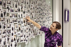
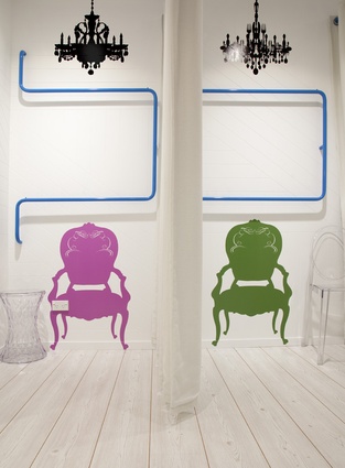
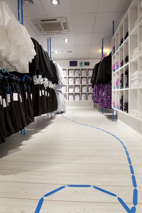
Air New Zealand’s brief, say the designers, from Gascoigne Associates, was to create a space that embodied Trelise Cooper’s uniform design direction and the Air NZ brand. The solution is “a nod to a swept-up eclectic Kiwi bach”. The designers consulted with Saatchi Design Worldwide to ensure the concept tied-in with other sub-branding ideas — the wall decals, wallpaper and other accessories. Design features include walls with random patterned ‘V’ grooved panelling, washed-oak laminate floors, blue-tube racking that ‘taxis’ around the space reflecting the ‘common thread’ theme of the Clothes Hangar sub brand, Kartell furniture, prints extracted from the back of the men’s waistcoat design, and a ‘check-out’ area highlighted with a bright pink counter and graffiti-style designs printed on textured wallpaper.

