Houses Revisited: Montreal Street house
Situated in the heart of Christchurch, this distinctive barn-red house is very hard to miss. First published in 2018.
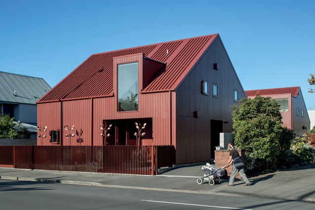
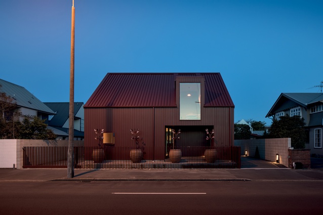
Despite being a new build with a contemporary aesthetic, this house on a busy inner-city street in Christchurch fits snuggly with its older neighbours. This is thanks, in part, to its form and size, with the roofline following a similar angle to that of the surrounding houses, and also to its material palette, with cedar weatherboards presenting a traditional profile to the street.
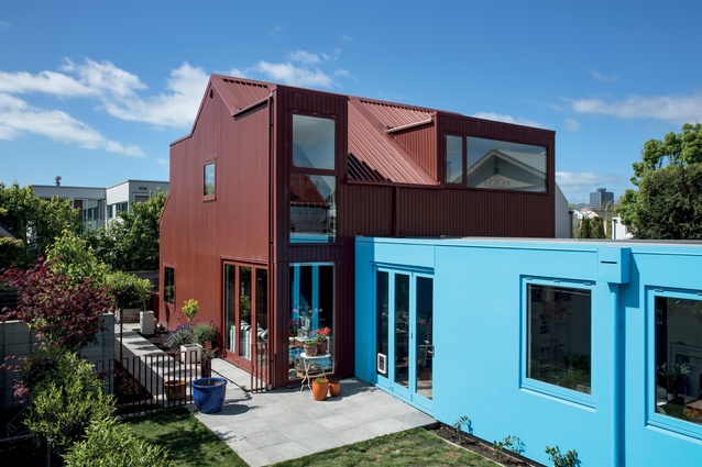
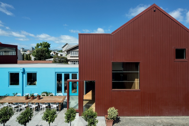
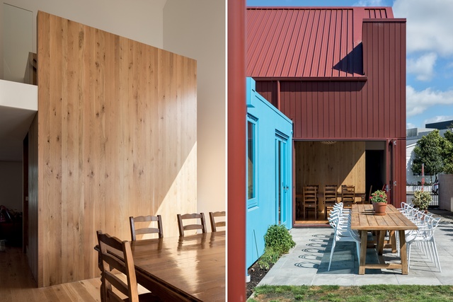
The interest though, if you look more closely, is in the details and the use of colour. Barn red stretches from the roofing down to the fencing and the sculptural trees that line the street edge, and this is offset down the driveway by an electric-blue, single-storeyed form in the centre of the property.

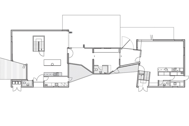
“The blue link is the main vehicle,” says architect Charlie Nott, who created the design with project architect Annabel Cropper. “This separates the two pavilions, which are slightly skewed and offset from each other.”
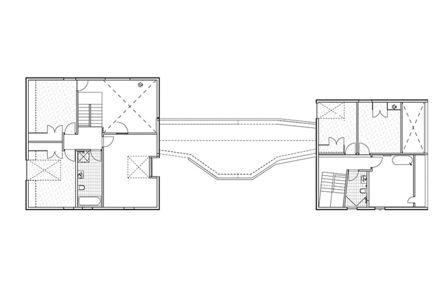
Built to replace a sprawling 1890s’ home, which collapsed in the 2011 earthquakes because of a central brick wall, the structure is divided into three sections: a family home at the front, an office in the centre and another house at the rear. While these are joined together at the moment, with the office used by the homeowner, Julie Pascoe, and the rear house inhabited by her mother, they are designed to be able to operate separately, if needed in the future.
“As there are no windows facing the driveway, my mother is able to have her privacy and come and go as she pleases without us knowing,” says Pascoe. “Originally the three forms were going to be separate but it made sense to join them together so we could use it as one big house.”
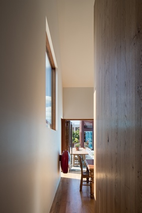
The street-front façade is interrupted by a dormer window, which is both modern in terms of size and traditional in terms of style, explains Nott. “The dormers enabled us to inhabit the roof spaces while reflecting the traditional language of early cottages. Throughout, windows are positioned to ensure privacy while letting in maximum light.”
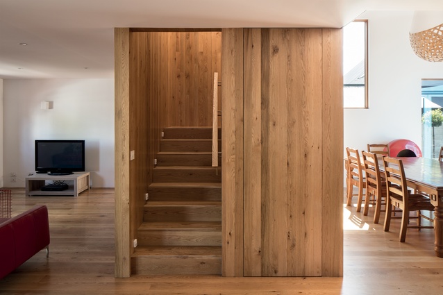
The front house is bathed in daylight, with a staircase creating a sculptural object in its centre. Made from timber, this creates some division between the living space and dining area and also provides some softness in terms of colour and texture. It also houses storage on the ground floor.

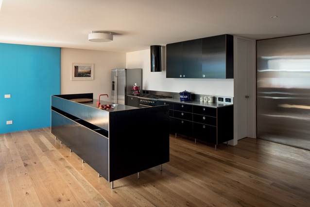
The bedrooms are located above the living room and kitchen, while the dining room enjoys a double-height ceiling, allowing light to flow into the spaces from above. The master bedroom has an operable window that looks over the dining area. The kitchen island floats above the solid oak floors, and matte-black, birch-plywood cabinetry, brushed stainless-steel benchtops and circular handles give this working space a sleek, modern look.
Since building was completed, the homeowner’s sons have opted to move back home: perhaps a testament to the success of the design. Other significant testaments include the Housing Award and Resene Colour Award given to Nott Architects for this house at the 2017 Canterbury NZIA Awards.
Material Selector

Architect Charlie Nott discusses the materials used to create the Montreal Street House.
Why did you use the red cladding and roofing ‘all over’?
The site is in an historic area and we wanted to relate the houses to the existing context. We also wanted to offset the strong geometry of the houses with a textural cladding. The centres of the vertical weatherboards matched the centres of the ribs in the profile of the roof cladding.
Weatherboards are a traditional material, but, here, they are used in a contemporary way. The red is a heritage colour that references not only the local historic cottages but also the monolithic red houses of American architect Steven Holl. It is an injection of warmth into an area increasingly dominated by white and black buildings.
Why did you choose this particular profile?
The geometry of the building is maintained but overlaid with the vertical shadow lines of the weatherboards. A wider board is used for the larger house at the front of the site and a scaled-down, narrower board size is used for the smaller house at the rear. It gives the houses a sense of priority and hierarchy on site.
Click here to see more Houses Revisited. And sign up to our email newsletters to receive Houses Revisited straight to your inbox.
Note: These are stories from our archives and, since the time of writing, some details may have changed including names, personnel of specific firms, registration status, etc.

