A house of two halves
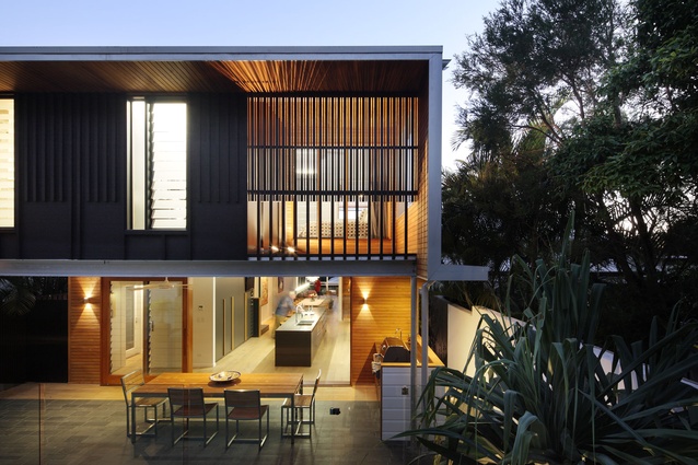
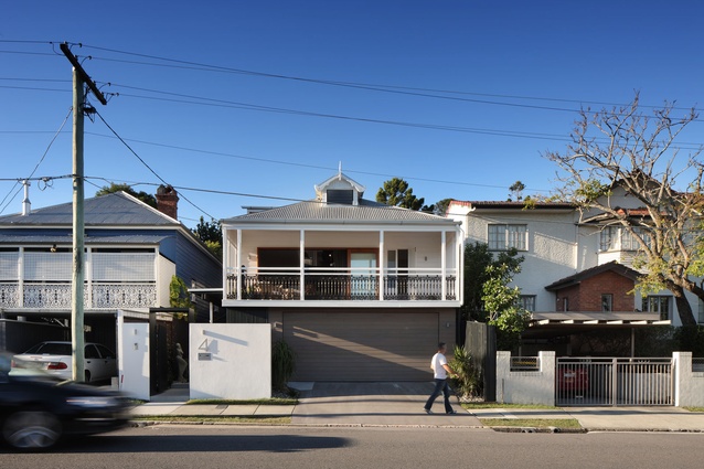
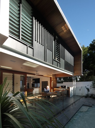
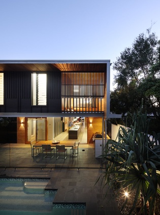
The two parts of this Australian home could not be more different. While the front of the house retains its charm with a full-width verandah and other architectural nods to the original 1920s’ worker’s cottage on the site, the interior and rear of the property speak a contemporary language of volume, space and unique lines.
It was a conscious decision, to play off the new and the old, and one that was made by owners Ann and John Hutchinson and their architect Shaun Lockyer. The owners had spent a number of years looking for a property in New Farm, one of Brisbane’s most sought-after inner-city suburbs, and had unsuccessfully tried to purchase two other properties in the area at auction; both had been renovated by Lockyer so the couple decided that they wanted him to redesign anything they eventually managed to buy.
“I went in and immediately could see it. I waved my arms around here and there, signalling what we could do, change and knock out,” explains Lockyer, who often works with pre-1946, protected properties like this one. “The house that is there now is basically a realisation of those original ideas. In its final outcome, it feels completely seamless through the old and the new parts, and does so by design. There is a discussion between the old and new parts of the house but it is not a black-and-white opposition.”
The architect saw the potential to create space and volume in the dwelling by removing parts of a previous addition and linking the new upstairs rooms with parts of the cottage and the extension of the lower level. The main entrance was moved from its original position in the centre of the front verandah, a common position in Queenslanders, to the side of the property, at the junction between the old and new parts of the house. It’s now a bridge between the past and the future.
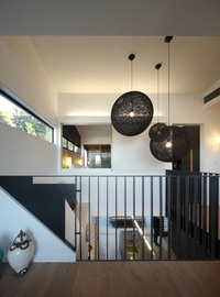
Although Lockyer’s renovation saw everything on the lower level gutted, including the old cottage, original features were reinstated where possible, including architraves, cornices and the batten-and-board walls, which are a defining characteristic of Queenslanders.
“The fabric of the building was there when we started. The extension was there but the previous owners had executed a DIY-type operation to construct the addition, which, along with the original cottage, was in a complete state of disarray. It wasn’t really liveable,” says Lockyer. “By virtue of the poor condition of the house when we started, there was no logic in retaining detail as there was simply nothing worthwhile left.”
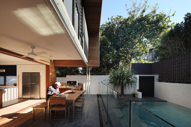
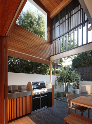
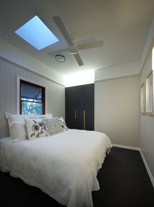
Underneath the original elevated cottage, garaging and a storage area are now tucked away. The first level houses two bedrooms, a bathroom, a living/dining area and a kitchen which leads to a generous, semi-covered outdoor entertaining and barbecue area.
“I love the kitchen/living and dining space in particular as it is transparent, open at both ends and, volumetrically, a total surprise. It is also totally relaxed,” says Lockyer.
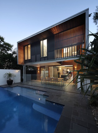
The use of Pacific Teak timber in the barbecue and pool area gives the exterior a sense of depth and texture. The property’s northern boundary is framed by a large pool.
“It aspires to a resort feel rather than an urban one,” says John Hutchinson. “It is about warmth and comfort and an escape from the city.”
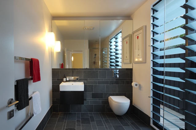
Wire-brushed Brazilian slate in the pool area links it to the downstairs bathroom, extended outdoor area and main entranceway, where the material is utilised also. To differentiate the master bedroom’s ensuite, travertine marble tiles were incorporated into the design, creating a lighter space. An office area, which could be converted to a fourth bedroom if necessary, incorporates a unique, hydraulically operated window that opens the space up completely from about waist height to expose the cityscape below. The master bedroom has panoramic views of the Story Bridge and the winding Brisbane River.
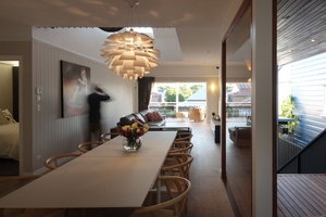
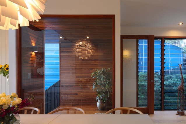
Light, textual, pre-finished timber floorboards feature throughout the property. It was difficult to match the floorboards with kitchen cabinetry so it is finished in a mix of white and Black Japan Floor Finish, instead.
Creating a sense of volume was important too, says Lockyer: “There were quasi-loft spaces, which we cut away to create voids and volume in the double-height spaces to achieve a mezzanine-type feel.”
For Ann, 64, and John, 66, the home came together surprisingly well. “The lines are amazing in all areas of the house. From the downstairs living room, for example, you can sit and look up into one of the voids where there is a skylight,” says Hutchinson. “It’s as though you are looking directly up into the sky.”

