A matter of contrasts
This classic apartment in The Hague proves that even a small, urban, rental property can be turned into a special and very personable home.
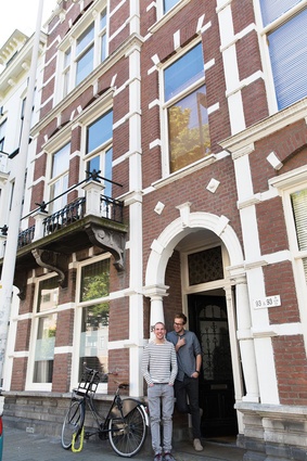
After two years in their first ‘together home’ in downtown The Hague, the architect and graphic designer couple of Jelle and Theo-Bert was ready for something new. Their priorities were simple: more space, a fun neighbourhood and proximity to the beach. As luck would have it, the first house they looked at was, unanimously, ‘the one’.
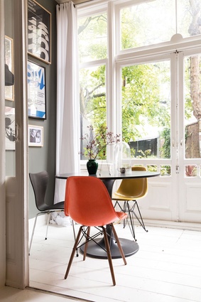
“We walked in and looked at each other. We loved the enormous living room, en suite, the substantial yard and the location: perfectly situated between downtown and the ocean. It wouldn’t get any better than this,” says Theo-Bert. “The character of the home was appealing too,” adds Jelle.
“This was a home that was lived in. Everything was proof of previous tenants. The white wooden floor was really a subfloor, the ornaments were not in perfect condition and some marble tiles were cracked. The agent even said: ‘You’ll have to replace the floor in the hallway!’ but we thought all the imperfections were beautiful.”
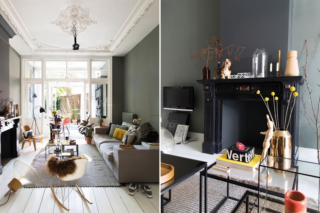
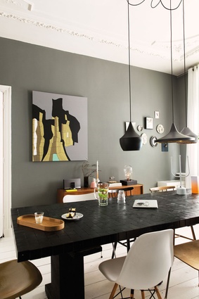
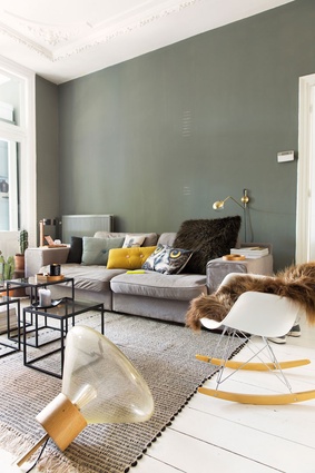
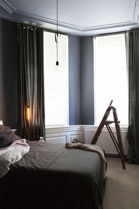
Instead, Theo-Bert and Jelle painted the whole house in dark tones. The living room became dark grey-green, the bedroom coal blue and the kitchen black. “We had practised with these colours in our previous home, our test home,” smiles Jelle. “We experimented with darker and darker paint and discovered that everything in one colour creates a more calm atmosphere than painting just one accent wall. In American and French homes, you see this a lot too.”
“The advantage of this house is that the ceilings are high and the floor is all white wood,” says Theo-Bert, “which compensates nicely. If everything were dark, it would be a bit too much. Now it is perfectly balanced.”
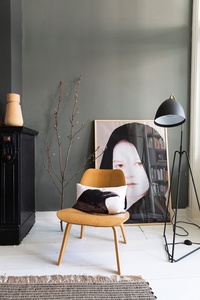
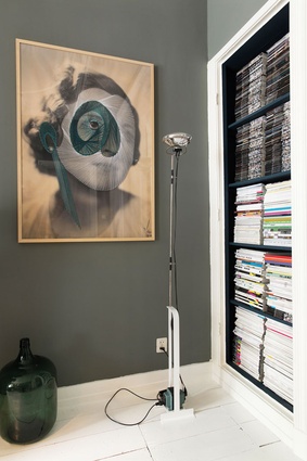
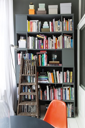
The sober tints create a calm foundation against which to display all the beautiful things the couple has collected in the past years. The pair loves collecting things and this habit becomes apparent in the home’s interior. Wherever you look, something is ‘happening’: a wall with graphic prints, hairy cushions, colourful vintage design chairs, a remarkable painting.
“By creating a few empty spaces, the interior doesn’t seem busy – some walls are purposefully quite bare,” explains Theo-Bert. “But we don’t think about it too much; a lot happens intuitively or unintentionally. Too much styling is not our thing; instead, we buy things we love. And when you really love something, it will fit the interior. If not, we change it. ‘When in doubt, do it!’ is what we always say.”
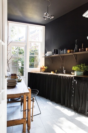
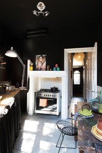
The couple found an ingenious solution for the kitchen: a space that wasn’t very considered when they first moved in. The old cabinets were replaced by a simple shelf above the counter and black curtains below it. The walls and ceiling were painted black.
“When people hear about that, they often wince: ‘Don’t those dark walls feel claustrophobic?’ But, if they see it, they hardly notice it; the effect is subtle. With a black background, you can shift the attention; what is black falls away and other things pop out. That’s why jewels are often presented on a black base.”
And it is true. All the attention goes to the tableware on the shelf, the white marble floor and the garden, which enters the kitchen with a bang thanks to the white wooden window frames. “The only disadvantage is that we have to paint everything white again when we move out!”
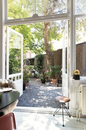
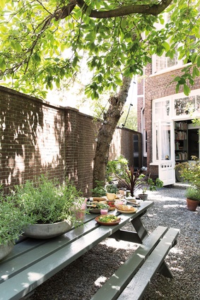
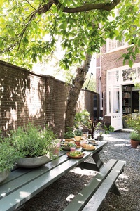
The yard received a substantial makeover as well. Instead of grass and flower beds, the couple chose pebbles and large pots. “Grass doesn’t grow here because of the [shadows cast by the] two high trees. Plus, pebbles keep the cats away!” laughs Theo-Bert. “And the fun part of pots is that you can change the yard easily – we like that. Besides, plants and pots add a lot of atmosphere to the yard in a low-maintenance sort of way.”
The garden shed in the back was turned into an open ‘garden house’ where, after dinner on cool summer nights, the pair likes to light a bonfire. The black and grey tones are found here too. “One day, we’d like to build a new garden house with a glass façade and turn that into a small bed and breakfast. No idea if we can do that but it’s something we dream of.”

