A people person: Marcel Wanders
Rufus Knight catches up with product and interior designer Marcel Wanders, best known as co-founder of design label Moooi.
Rufus Knight (RK): You’ve said that “nothing ages faster than the new” and that your designs “build off old metaphors”; this increases their longevity because they already feel somewhat familiar. Is this becoming easier or harder as we live more design-conscious lives?
Marcel Wanders (MW): In general, creating designs that feel familiar is getting harder as there are so many new mediums for us to design within. To me, something can be considered design if it creates meaningful connections with people. It must resonate with humanity and introduce people to something unique and surprising.
We are living in a faster world where instant gratification has made people seek the next new thing sooner. Therefore, it is becoming increasingly difficult to have longevity with older metaphors as things age even more quickly.
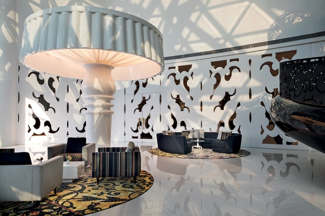
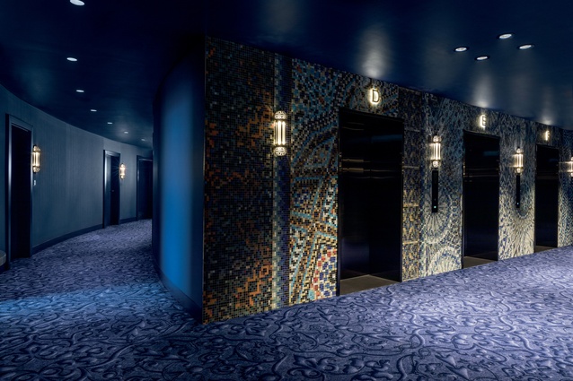
RK: Your hotels are always credited with having a unique sense of place embedded into their designs; how do you immerse yourself in local culture when starting a new hotel project? And how do you filter this through your own design lens or are the interiors an escape?
MW: Much of a designer’s output comes from his or her input. What have they seen? What have they experienced that they can bring to their work? My goal is always to be open to new cultures.
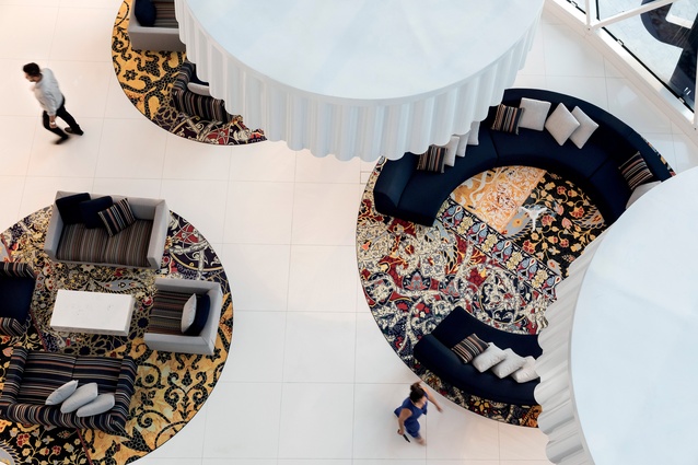
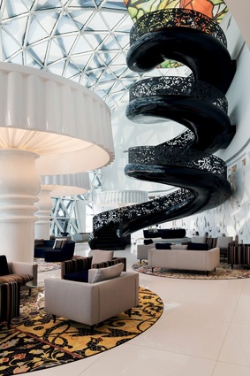
When I am starting a project, I talk to as many local people as I can. I try to gain a sense of their customs. I study their language and their history. I invest a great amount of time in investigating local patterns, architecture, colours and natural settings. I take this all in and marry it to my design style, finding ways to juxtapose regional elements to create surprise in my work.

RK: Since 2006, your studio has been located in the vibrant Jordaan neighbourhood in Amsterdam, alongside the Moooi showroom – what kind of influence has this had on your design thinking and studio culture?
MW: The Jordaan district is the perfect setting for our studio. It was designed for creativity to flourish. It has been the foundation for making a multidisciplinary studio where ideas develop, businesses grow and relationships evolve.
Our building has an amazing view of the historical Westerkerk church and the whole Jordaan district. The result is a forward-thinking, collaborative and joyous culture that permeates the entire property. It’s the perfect environment in which to learn, share ideas and be creative.
RK: From early on in your career, you have been branded as ‘rebellious’ – why is that?
MW: While attending the Design Academy Eindhoven, I didn’t necessarily agree with what my teachers felt was right or wrong in design. I have always been one to ask as many questions as possible and I directed myself towards experimentation, allowing for a lot of mistakes, and to explore creativity as widely as possible and take risks. That wish to experiment was considered rebellious and it got me expelled. I am still that way. I suppose my insatiable drive to break new ground, challenge expectations and push boundaries is seen by many as being defiant.
RK: You have described traditional Dutch design as very dogmatic – can you elaborate on this and on the kinds of conscious decision you made to free yourself from it?
MW: Early in my career, I decided that there is nothing new. However, through experimentation, I realised there can be infinite combinations of concepts and materials. This led me, increasingly, to seek collaboration and to champion a multidisciplinary approach to design.
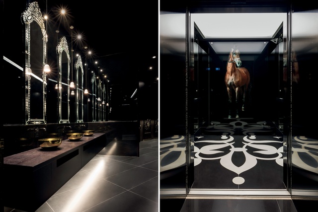
My vision from early on was to bring the human touch back to design. To do this properly meant being in a position to replace the coldness of industrialism with the poetry, fantasy and romance of different ages, and vividly bring my own designs to life. I decided that what delivers the most surprise, and what is truly new, arrives through juxtaposition. Also, throughout my career, I have consciously decided to embrace technology and I often allow it to lead the design concept.
RK: Given those strong associations with fantasy within your interiors, has your studio had any experience with designing for Virtual Reality or Augmented Reality?
MW: Yes, with Virtual Interiors (2013 – present), we created these virtual places that are devoid of human beings and are designed with a juxtaposition of serenity, mystique, wonder and magic. They emerge exactly from the disappointment about the durability of reality, trading reality for eternity. Their undefined structures envelop visitors in the idyllic and strange.
As a way to overcome inevitable decay, these locations exist without physical reality. Everything is perfect in these virtual interiors. These works are born from designers’ deep understanding of how power needs beauty and beauty needs power.

RK: Do you think digital design tools create an aesthetic leaning towards ornamentation?
MW: No, in fact, I think it is just the opposite. Ornamentation, to me, refers to things that adorn an environment without bringing substance to the experience. Much of the digital design we have employed has furthered our concepts and delivered a richer experience and deeper levels of connection. The tools that we work with introduce us to new mediums that allow us to create new and surprising experiences.
RK: Your work is often referred to as ‘romantic’ or ‘humanist’ and you’ve said that, in design, “the truth doesn’t make things exciting” and that designers “have to tell valuable lies”. How do you infuse such broad ideas into your work?
MW: The philosophical ideas I bring to my designs are grounded in the purpose of creating meaningful connection with those who experience them. The thought of a ‘valuable lie’ is derived from my goal to allow people to find their own truths in the design they are experiencing. I want them to make that emotional leap to connect with the work on their terms.
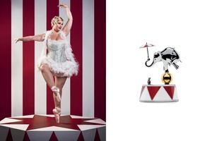
Some of the interiors and objects that I create are abstract or driven by fantasy and are to be interpreted by those who are present in the environment. To design in a manner that gives people everything or tells them something too directly removes them from the creative equation, and that is never exciting.
RK: Do you then find minimalism boring?
MW: I’m not sure I would say it’s boring, exactly. I do think, however, that my style leans towards the bold, exciting, surprising and poetic. So, I think I would say there is an opportunity missed with a minimalist approach. There is such a wonderful spectrum of colours and shapes and patterns at our disposal in the world. I love bringing anything that is vibrant and grand to my design and this results in very bold, festive and luxurious items.
RK: The studio’s client list is stylistically so broad – from Bisazza to Boffi – why do you think your approach has such wide-ranging enquiry? How much of your client’s identity informs your approach to each commission?
MW: We do our best to be open to working with clients of all types. This methodology stretches our creative muscles and keeps things interesting. The clients that truly understand form, function, material and craftsmanship, and, most importantly, the connection with the human spirit are the ones we work with exceptionally well. I would say a large amount of the client’s brand, identity and passion becomes part of our approach.
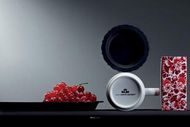
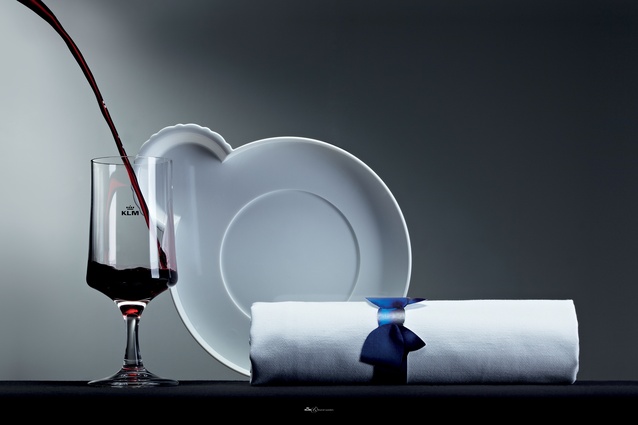
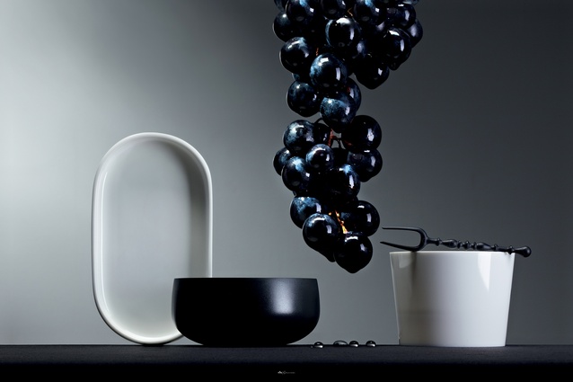
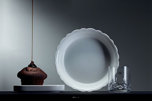
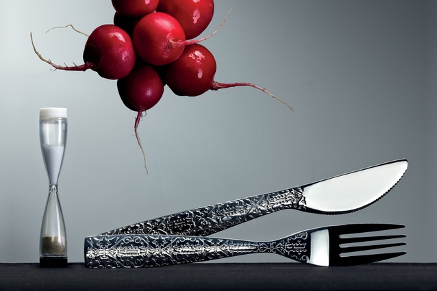
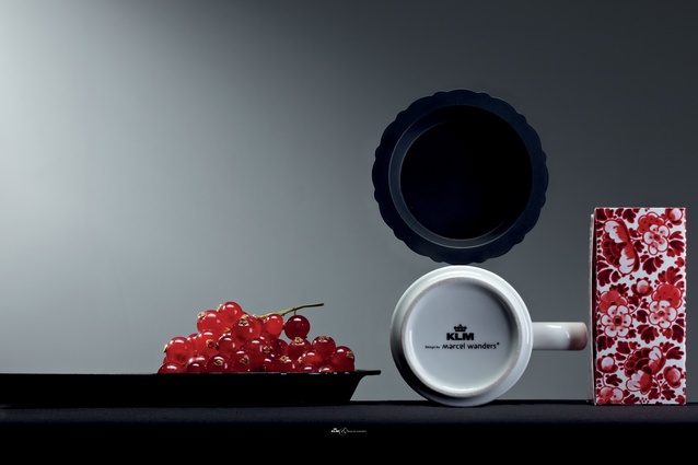
RK: Your studio works across so many different scales – from tableware for KLM to an 850m2 private residence in Spain. What creates coherency in your design?
MW: Whether we are designing an interior space, objects, tableware or homes, we never waver from our core desire to create something that is exceptional. To that end, my philosophy of design starts and ends with people. I will always gravitate towards working in a space or with materials that allow for design and those who experience it to connect in the most meaningful ways.
My purpose is to create a delightful harmony of extraordinary wonder that builds to a crescendo of emotional connection that strikes at people’s hearts. When each instrument of the ensemble, be it colour, texture, shape or arrangement, is in accord with the others, then the pieces can work together. My philosophy guides me to collaborate and deeply connect, and all of our work reflects design that is more personal, more romantic and less sterile.

