A space odyssey
In the past year, Techne Architects has emerged as one of Melbourne’s pre-eminent architecture practices. Renowned for its dynamic hospitality environments (the bold designer strokes of which are strikingly evident in the re-imagined Prahran Hotel restaurant and bar), the firm has produced a number of impressive residential schemes to add to its growing repertoire.
“Hospitality projects influence our residential work because they encourage very close scrutiny of how spatial and experiential design affects the way people interact and perceive a space,” says Techne’s co-director Justin Northrop. “However, it’s quite different designing a home for oneself.”
The renovation of Northrop’s own home in Melbourne’s inner suburb of Flemington proved complicated: “Aside from the complexity associated with being the architect and client, the real challenge was settling on a design that worked for my family and satisfied my desire for self-expression.”
Northrop and his wife, Mia Northrop (a web designer), 39, came across the modest 140m², double-fronted Edwardian home in 2008, days before departing on a scheduled two-year work sojourn in New York. They knew that they’d found the perfect abode – one that ticked the boxes in terms of space, light, amenity and siting.
“It needed a significant amount of work but we liked the area, the corner plot, the leafy backyard and the tree-lined street,” says Northrop, 42. “There was also no town planning approval process required for the renovation [a detail that cannot be overestimated in a city known for restrictive planning controls].”
The pair bought before leaving, rented out the weatherboard house whilst abroad and moved in on their return. Northrop then spent two years working out what he wanted to do. He tried many schemes (admittedly, often unpractical and over budget) before coming to a conclusion.
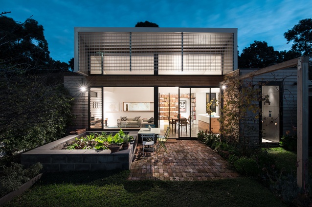
“We wanted to get a feel for the house and playing architect-client had almost paralysed me with choice!” says Northrop. “Ironically, the brief was quite one dimensional. We wanted to create an open-plan living area for our young family of four, which integrated well with the garden. Atmospherically, we sought a fresh, uncluttered space filled with natural light and a pervading sense of calm.”
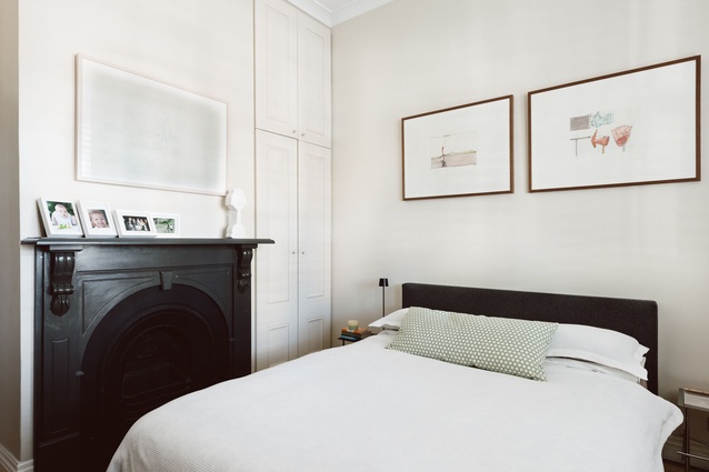
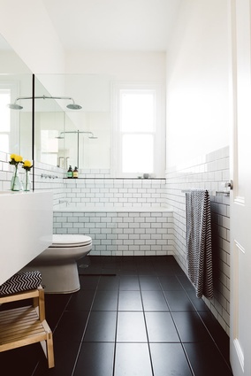
Eventually, the only material changes made to the street-facing wing of the house was the conversion of one of the four existing bedrooms into a bathroom and walk-in wardrobe and the addition of a master ensuite. Northrop stripped the rear of the dwelling of all the unwanted elements, creating a blank canvas for the kitchen, dining area and living room and an unfettered relationship to the garden.
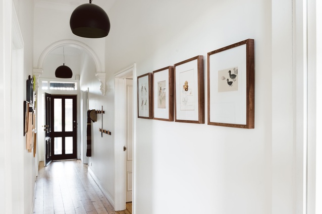
“Our first challenge was to resolve the transition between the bedrooms, the central passage and the living zone,” explains Northrop, referring to the spatial conundrum common in terrace houses. His solution involved the artful insertion of a small vestibule, screening the traditional central corridor from the living space.
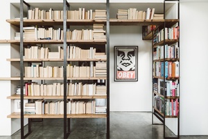
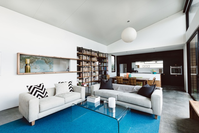
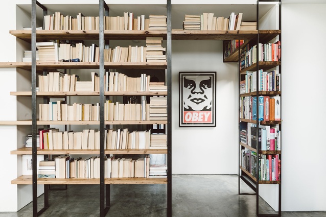
“I used an open shelving unit across the space to slightly alter the path of travel and allow the eye to adjust to the brightness of the sunlit living space,” Northrop adds. The cypress pine and welded metal installation – its many shelves heaving with books and collectables and their children’s artwork – also sets the scene for the duo’s creative home.
“The bookshelf was initially designed as a more complex steel matrix,” says Northrop. “I had decided – for reasons of thrift and curiosity – to build it myself but, after some initial welding experiments, the design was dramatically simplified to make it achievable. It feels as if the material guided me towards the best result.”
It’s a sentiment that sums up the pragmatic approach Northrop has employed throughout the rear extension.
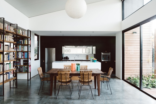
“The proportions of the contemporary addition were designed to have an equal relationship with the old section of the house, neither dominating nor subservient to it,” explains Northrop. His 65m² open-plan living space sits under a new north-facing skillion roof, the angle of which leverages winter sun penetration, whilst the overhang and fixed louvres prevent heat gain in the hotter months. The roof itself is self-supporting, composed of pre-finished sandwich panels. A generous expanse of window – with a low timber sill that doubles as a child-friendly workbench – orients the room towards the garden, a vegie patch, Northrop’s shed (fitted out with his grandfather’s carpentry tools) and a Fuji apple tree.
The architect assisted with the structural framing of the extension and the construction of the living-room benches and shelving. “An approach that’s not necessarily cheaper or quicker but definitely good for the soul,” adds Northrop, whose parents (veteran home-builders) were heavily involved with the construction and landscaping of the house.
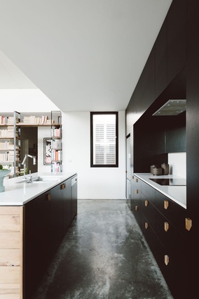
Inside, the palette is neutral, natural and limited, but partially experimental, the architect taking the opportunity to try out a variety of off-the-shelf construction materials like Bondor sandwich panel and Hi-Light aluminium screen. Honey-hued Cypress pine has been used for all the external cladding and internally for the joinery material – “I love that Cypress pine is laden with features and ages well,” says Northrop – and black, waxed mild steel details provide definition for the interior, along with black window frames, flashings and trims, and black laminate kitchen cupboards.
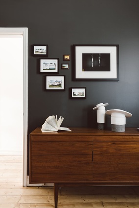
Stylistically, the interior furnishings are edited down to a select few treasured pieces, like the dining chairs, precious souvenirs from the pair’s New York years. Says Northrop: “Essentially, we wanted the home to reflect us and our uncomplicated lifestyle.”

