Alt Group
It’s fairly unassuming from the exterior – just two levels, white, clean and rectangular, some louvres, nice set back from the road. Alt, an Auckland-based design studio has new offices on the upper floor of this simple structure and, in some respects, this place reminds me of another office, a world away, with a similarly unadorned exterior. The Copenhagen architecture firm Big is also located in a city fringe suburb; it has as its main signage feature a logo printed on a piece of A4, attached to a grubby stairwell wall. It reeked, figuratively (and a little literally, too), of transience, of being too busy to worry about smaller considerations when there are more imporatant things to be getting on with. In that instance, as in this one, there is a ‘big reveal’ to follow muted expectations. From its stairwell, Big’s office opens into a kitchen and, from there, you progress through a gallery of Lego building models: works in progress.
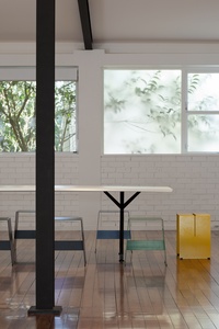
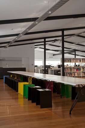
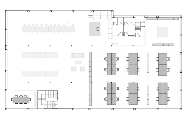
Similarly, at Alt, the exit from the stairwell reveals, front and centre, a kitchen. “Put upfront what’s most important,” says Dean Poole, one of the firm’s directors, “and that’s when it comes to a brand or a campaign, or a foyer in a building.” Poole is referring to the social importance of the firm’s food culture. If an army marches on its stomach, you might say that a team of graphic designers thinks with theirs. Visitors fortunate enough to strike a lunchtime meeting can too enjoy the sociable scenario of a sit-down at the extra-long dining table surrounded by colourful furniture. The size of the space means plenty of room for client functions; it’s doubly handy if, like this firm, you’ve got a major whiteware company on your client roster.
Ben Corban, Alt’s other director, explains that they didn’t really want to do anything to the outside of the building. “We ignored it. We like the idea that we’re in an unbranded building, on the fringe rather than in the centre; it’s always been our style… we always laugh that we’re a design studio without a brand.”
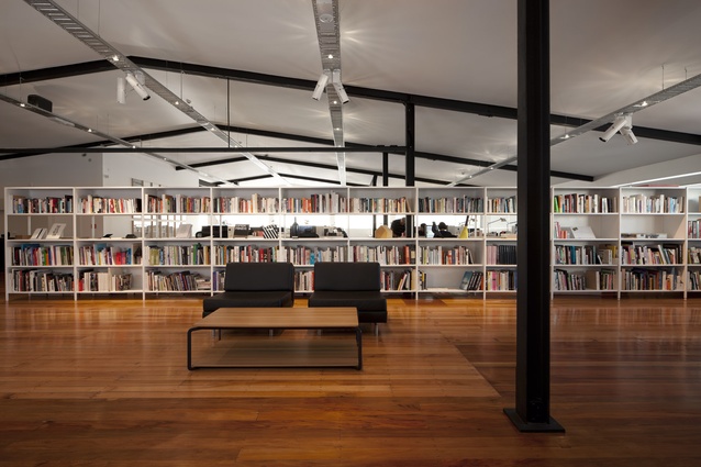
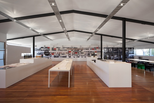
The rest of the interior, which really is just one massive room, is clearly demarcated. A large gallery space with examples from previous and ongoing projects occupies a good part of the floor space, and a 20m-long magnetic display wall runs across the width of this end of the room, acting as an ever-changing artwork as projects change in and out. The opposite end of the building, tucked away behind a long white bookcase, is the engine room, where pods of designers are organised into working teams.
All in all, the space is voluminous, lit naturally for the most part and naturally ventilated. It was also quite hard to find. Poole and Corban initially rejected the building as, even for those in the game of ideas, it was hard to visualise a rabbit warren of small cubicles with a low, false ceiling as anything but a bad ’70s’ workspace. Eventually, however, something stuck with them. They eventually returned, requested that everything be stripped out of the building, and signed up.
As Corban puts it, the result is a “1960s’ warehouse shell space that’s had the ceiling insulated and relined and the floors polyurethaned. And it’s got furniture in it.”
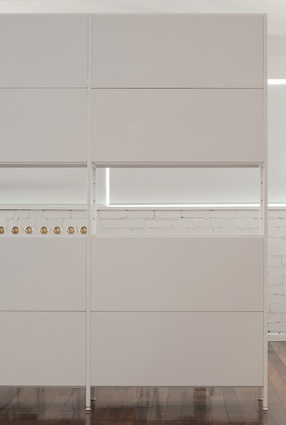
Behind that understatement, however, lies an interesting idea about investing in furniture rather than walls. Poole jokes that the office is an ode to the New Zealand furniture design company IMO. Everything in the building is IMO, concurs Corban, “the kitchen, workstations, shelving, tables, magnetic walls – basically, this is a shell space with IMO furniture in it.”
“The furniture is the fit-out. Even the kitchen can be shipped into a new space if necessary. It’s a different way of thinking about a fit-out. If everything is portable, then a workspace is just the number of square metres you need. The shell space itself has less of an effect on how you work and the environment you work in. Everything is modular and portable – if we grow out of this building or the function of what we do changes, if we want more mess space, or whatever, then we just put it where we want. It’s a more nomadic approach.”
Another benefit of this approach, aside from less waste from a hard fit-out, is that the net cost of the fit-out can be spread wider. “You don’t have those huge spikes in cost, plus [the improvements] are on your balance sheet, rather than on the building’s.”
In terms of its own client base, Alt couldn’t have chosen better when it came to learning about workplace organisation. It helped write the book on focused and collaborative workplaces for Formway when the company released Hum, its workplace desking system. Here, with its own office, Alt had an opportunity to test those findings on its own people.
The first thing on its wish list was a single floor plate, an “open space where everyone could see everyone else”. That, of course, brought fears of excessive noise, but Poole says they were committed to the concept of “making ideas visible” and, what the literature suggested, was that people would self-regulate noise if they could see that others were busy, and that actually happened.
“In effect, if you take down the walls, the volume goes down, because people can see what people are working on.”
“People talk about ideas in an ephemeral way, but it’s the physicality of ideas that matters. You can actually see them, people can input on them. They walk into the room and they know what you’re working on. It’s a very open environment.”
Ultimately, says Poole, the building is split into two modes. “These types of simple thresholds work well,” he says. “You’re either on or off: either you’re working, you’re in the library researching, or you’re socialising. It’s just focus work and collaborative work. When you approach a 20m-long wall that’s covered in work, you look pretty silly when you’re walking up and down it by yourself. You’re like a caged animal. So, naturally, it says this for group reviewing.”
Poole says that when it came to layout of people, the idea of pods – in a two by two and four by four – made sense. “People collaborate to their right and left, and then with the people behind them who can see their screens. When people are back to back they swing and meet. Keeping a really simple system and keeping the sight lines open is a flexible way of working.”

