Slick extension for Auckland villa
From this central Auckland street front it’s no surprise to see a line-up of fairly traditional villa and bungalow style homes sitting side-by-side in both directions. Frances Lynch’s house is no exception. Its covered verandah framed by pretty traditional fretwork and neat-as-a-pin rows of box hedged gardens give no clue to what lies within.
After a long and arduous search for the perfect renovation project, Lynch, an interior designer for both Moller architects and her own private clients, says “the position was ideal, the site is elevated but still flat, and the house set back a good proportion from the road. The morning sun filters gently in to the kitchen and master bedroom, while the living areas and outdoors are bathed in soft afternoon light.” Home to the previous owners for some 40 years meant it was mostly untouched, and stripping back multiple layers of Tapa cloth from the walls revealed original scrim, while threadbare floral carpet disguised the solid kauri floors underneath.
Retaining its traditional villa bones, the original part of the house makes up the front half of the home, and has been gently modernised with soft white walls in ‘Powdered Wig’ by Aalto, partnering with whitewashed floorboards inspired by a somewhat simplistic style. “I’m against painting anything in colour, I would much rather create interest through layers of texture,” explains Lynch.
The rear half of the house is a newly built pavilion. It has replaced what was a basic lean-to and deck at the rear of the old villa, which dropped away to an uneven and neglected backyard housing a wash house and a skyline garage.
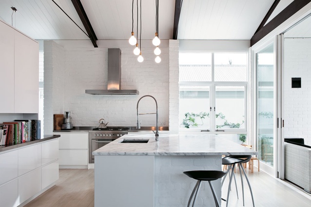
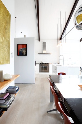
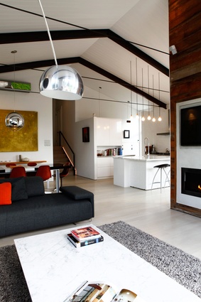
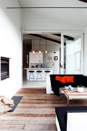
In the new pavilion Lynch wanted to create a single all-encompassing space that was congruous with the rest of the house, but with a warehouse aesthetic. Achieved through the lofty stud height, exposed steel trusses and tension rods, and painted brick, this design also made sense from an interior perspective allowing Lynch the generous space required to accommodate her large-scale furniture and art collections. Repurposing what materials she could has not only given the pavilion a sustainable focus, but has gently connected the old with the new. Weatherboards removed from the northwestern face of the house now make up the internal fireplace wall – reversed to expose band-sawn kauri – its irregularity and rough surface providing a stark contrast to the otherwise smooth white interior landscape. Original chimney bricks have been reused for the pavilion walls. “I wanted the extension to feel like it had always been there,” says Lynch.
A look of paired-back elegance with touches of exuberance, the result is a fine balancing act. Having warmed her otherwise minimalist style, she knows when to be brave and bold and when to offer respite. The look is immensely livable and not too precious. With a two-year-old daughter, India, there’s no alternative, and it allows her to add and subtract as her home evolves.


