An eye-catching new café becomes a community hub
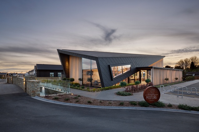
The recently completed Tamahere Country Club Café by award-winning Cambridge-based practice Turner Road Architecture offers pride of place and a new meeting hub for a country community in the Waikato.
Tamahere Country Club is a luxury retirement village on the outskirts of Hamilton, located in a former farming community now characterised by intensive horticultural and lifestyle blocks with distinctive country living characteristics.
Developers Sanderson Group approached Turner Road Architecture to design a striking, visually arresting café with the vision of creating a distinct social hub separate to the retirement village. The space would encourage interaction between residents, neighbours, family, friends, work colleagues and anyone who was passing through the area.
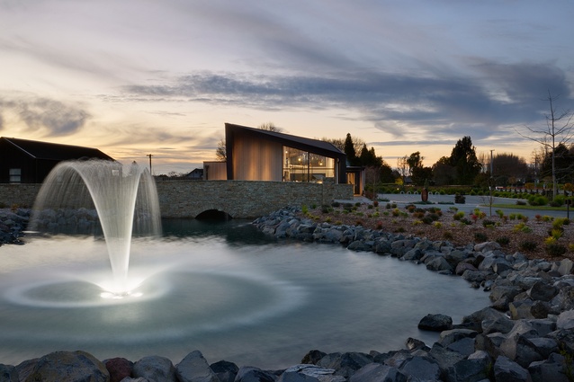
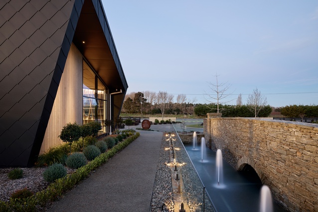
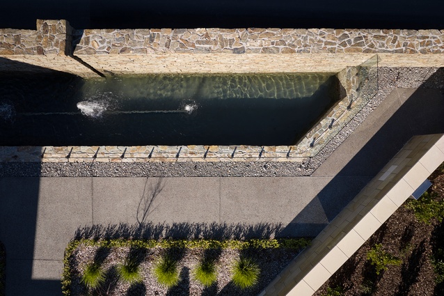
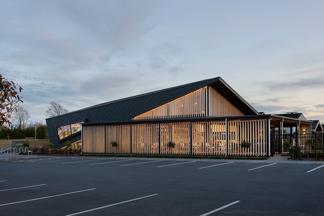
Visible from Tamahere Drive, the building’s strong diagonals are complemented by picturesque landscaping, including a schist stone bridge and pool — also by Turner Road Architecture — that adds prestige and creates a distinguished formal entry point to the Country Club.

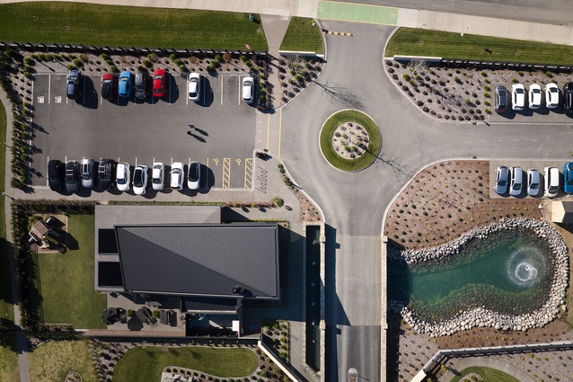
The arched schist bridge and surrounding waterway and fountains, which extend along the southern boundary, can be admired from a large, angular window and also from the walkway between the bridge and building. The exterior grounds are finished off with a fully landscaped area to the north — providing a tranquil spot for residents and their families to relax.
Says designer Lee Turner of the café’s design: “The angular form, which we coin ‘the tilt’, is a striking shape that immediately draws your eye to it from the exterior and almost calls you into the building because of these curious angles. We continued this form into the interior space to provide real interest and a talking point for the occupants.”
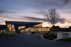
The complex shape of distinctive angles and tilted ridgeline presented challenges for both the internal and external works, which needed to flow through seamlessly. Exceptional understanding and coordination were pivotal between all parties involved to execute and achieve the technical and aesthetic aspects of the design. This has resulted in what the studio describes as a “contemporary design aesthetic and flawless exterior and interior finish”.
A special feature of the exterior is the scale-like cladding, comprised of textured metal PREFA tiles in a soft matte grey. This material is made up of 87% recycled aluminium and is produced using 100% renewable energy. Balancing the composition of the architecture is expansive glazing and the use of warm, natural timbers.
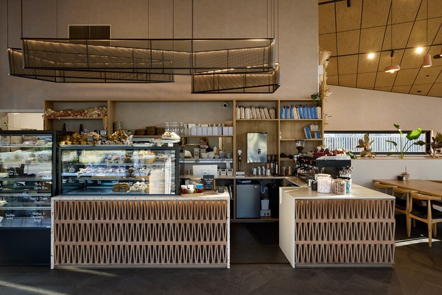
Sally Lines’ Urban Lounge Interiors was commissioned to design the interior of the building and, together with interior designer Michelle Layne, the interiors team focused on creating a space that was welcoming, comfortable and aligned with the overall design aesthetic of the architecture.
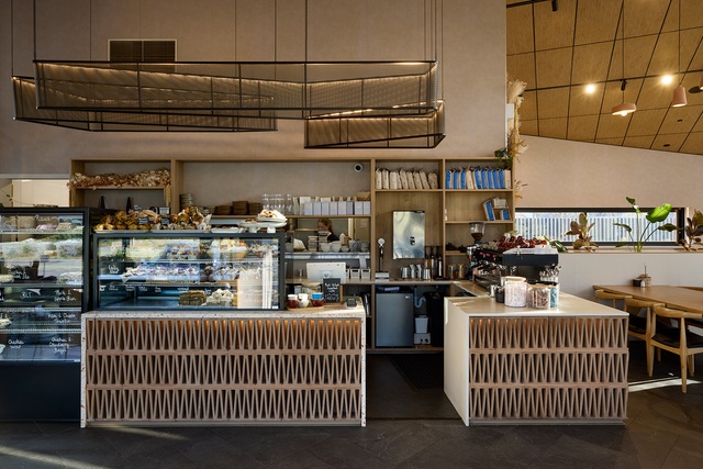
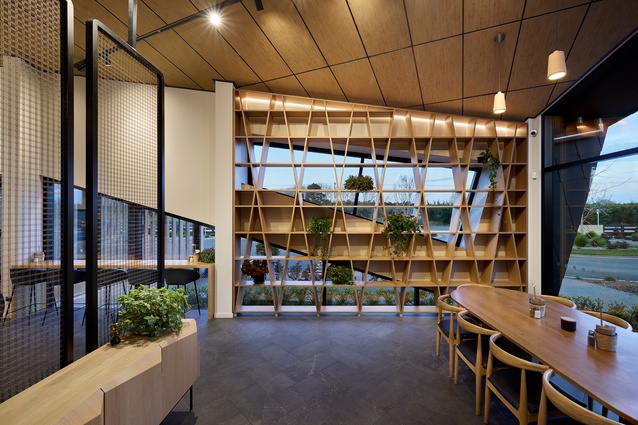
Designed to accomodate 100 people, the 235m2 café interior is light and airy due to the expansive glazing and a high, acoustic-tiled angular ceiling.
To combat noise in the lofty space and to be considerate of the surrounding village, when designing the building the designers knew it not only had to be fit and functional for the users, but also for the residents. By incorporating Autex Acoustics ceiling and wall panels, noise disruption was minimised for the café clientele and nearby neighbours. “With its products and operations balanced to Carbon Zero, Autex is a brilliant sustainable product,” says Turner.
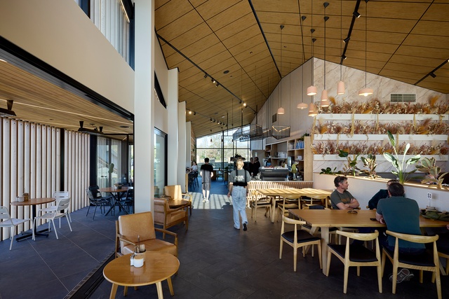
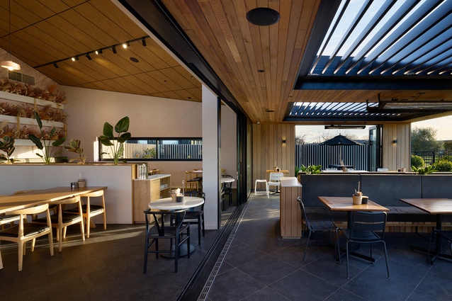
Warmth has been added to the interior with the use of timber and a muted, neutral colour scheme. Bespoke terracotta pendant lights hanging in the atrium and a rust-shade marble-look feature wall with dried flower arrangement add to the warm and inviting atmosphere.

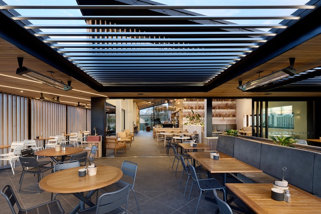
A further 120m² of outdoor seating covered by a cedar-lined ceiling provides for alfresco dining. The ceiling also features adjustable louvres, allowing the roof to open-up for patrons to enjoy the sun when weather permits. This covered outdoor living area looks onto a landscaped area, which can be used for picnics and also encompasses a children’s play area.
The building was designed to maximise sunlight and provide passive ventilation while minimising internal overheating and reducing the need for reliance on mechanical ventilation. Sustainably grown vertical cedar louvres were used over the northen and western glazing to maximise sun ingress while also providing shading to the internal spaces to reduce solar gain. These vertical louvres were also used along the outer seating area to create a visual barrier while allowing natural cross-flow ventilation into the building, through the large stacking doors and into the internal spaces.
“Working alongside Nathan [Sanderson] and the Sanderson Group team was an excellent collaborative experience,” says Turner. “From the the outset, we were given the creative license (and trust) to come up with a design that was a social hub for the residents of Tamahere Country Club and the general public but also a stand-out piece of architecture in its own right. The whole project team worked seamlessly to bring this complex structure together and we think the collaborative approach really paid off in the final outcome.”

