ANZ Centre
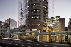
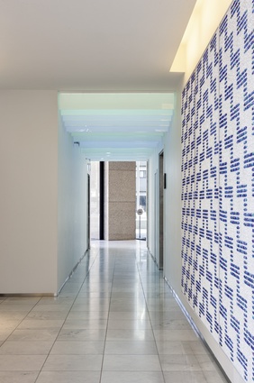
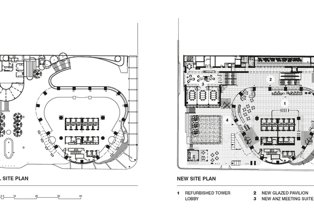
Step into the ANZ Centre tower in downtown Auckland and you could be walking into the lobby of a posh international hotel, rather than a bank. Low-slung, curvaceous couches hug limestone-clad colonnades, a busy café hums at one end, lines of smartly dressed people enter and exit the gleaming steel lifts, vibrant artworks adorn the walls and receptionists greet you with their cheery smiles. And anyone can now enter this elegant grand lobby, since an underused pathway, running the length of the site from Albert Street to Federal Street, has been replaced with a new public pavilion. Behind the tower, opposite St Patrick’s Square, a landscaped plaza and café kiosk further enhances its civic aspirations.
ANZ Centre was the tallest tower in Auckland at the time it was designed in the late-1980s by HASSELL and, for its recent revitalisation, the Australian firm has designed the fit-out with Warren and Mahoney (WaM), with WaM acting as the main architects of the project. It was originally known as Robert Jones Tower and some will remember that Bob Jones was mythologised at the time because he sued regarding the final payment, based on a dispute over the height of the windows. Currently owned by Precinct Properties, the ANZ bank is the long-term anchor tenant and has played a key role in briefing the architects. ANZ occupies 22 floors of the 30-storeyed tower, while other professional firms fill spaces on the remaining floors.
The unusual heart-shaped plan has the core pushed to the south of the building, maximising the north floorplate, offering 14m of clear span and two triangular spaces adjacent to the core. Panoramic views across Auckland can be seen from practically all directions on the upper floors and staff must enjoy a fair amount of daydreaming from their designer lunch rooms.
The tower’s curvy, honest form contrasts its neighbours and is striking for its simple elegance in a city that, let’s be honest, could do with a little more class. This is particularly well achieved at the building’s base, where it cleanly meets the ground, rather than sitting up on a podium. The only formal change to the form of the building is the way it’s topped out; reducing up from a truncated equilateral triangle to a circular plan. At the top of the building, a geodesic dome on the roof houses communications equipment.
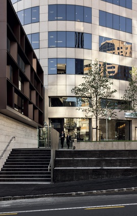
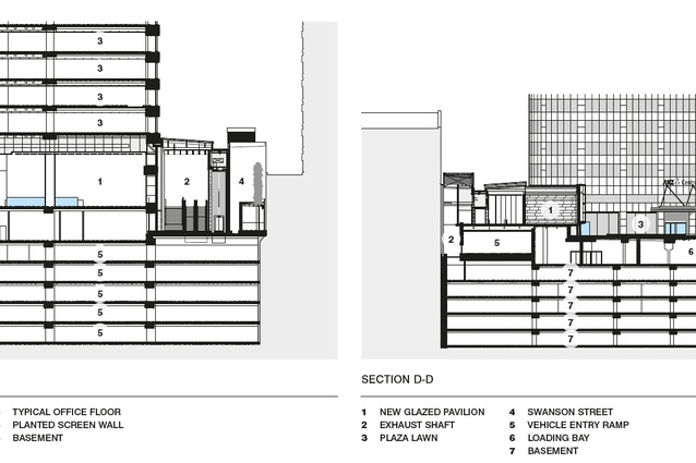
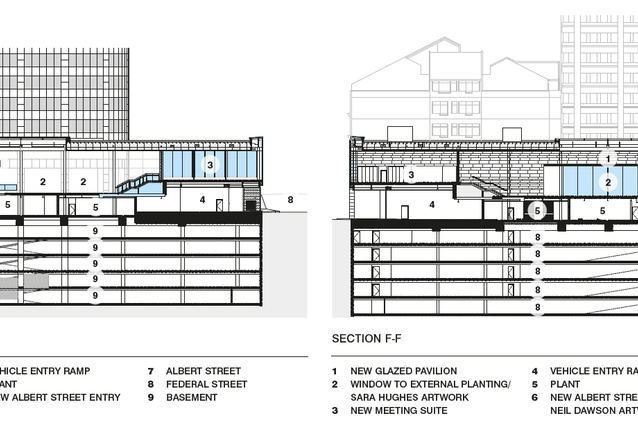
Warren and Mahoney has effectively maintained the clarity of the original scheme whilst remedying the challenging areas. Surrounding the tower, which retains the rosy flush of its 1980s Rosso Porrino granite exterior, are multiple glass entrances off the street. The main entry on Albert Street is a 10m-high lantern that draws visitors up an escalator into a light-filled public pavilion while, at the other end of this public street, another opening leads into the landscaped plaza; two other entries, on the curved corners on Swanson Street, take staff and visitors directly into the lift core. While they have a certain lightness, these two entrance shades are the least successful elements for me, for want of a retractable or ‘almost invisible’ solution!
Throughout the building, a limited palette of locally inspired colours and materials provides a neutral background to the life in the building. In the lobby and the public pavilion/pathway, this has the effect of emphasising the circular colonnade around the perimeter and light, created by clerestory windows and gaps in the pavilion’s continuous-spanning ceiling, plays out across the glossy granite floors. On the lobby ceiling, a diagonal grid mimics some of the geometry around the building, incorporating services, enlivening the interior space and creating a legible element from the outside. A row of stainless steel lifts is an unexpected highlight, with its slick elongated proportions and clean typography.
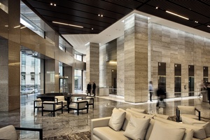
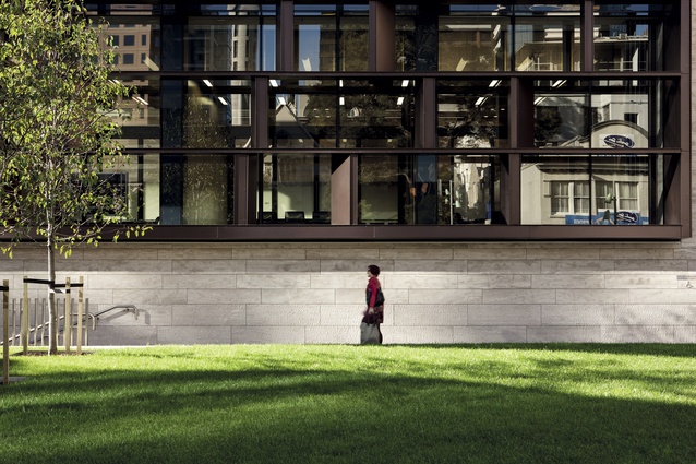
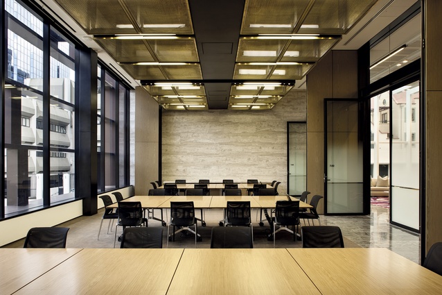
Originally, the lobby of the building was designed for circulation and lift access, so pushing the perimeter out by 4m has opened it up. Conceptually, this new public pavilion is a bold linear gesture, travelling across the entire block and stepping up via a wide staircase into a new private extension, which contains dedicated meeting spaces away from the bank’s everyday core business. It is large enough to cater for 300 people or can be partitioned with dividers to suit small gatherings of people. Two really successful features are the way the structure and fixings are expressed in this area and, in particular, the brass cages hanging off the ceiling, which hold services and drop-down AV equipment; along with the changes in height, from the 5m-high doors in the reception area of the meeting room pavilion to the 12m-high stud in the public pavilion; these add drama and movement through the space. Externally, the façade forms a series of frames high enough to ensure that the public in the plaza don’t feel looked down upon by the meeting room occupants. The adjacent landscaped plaza intentionally speaks to its neighbour, St Patrick’s Square, while a small pavilion café bridges the two. This is a key urban move, pulling the adjacent square into the ANZ’s backyard and, while its not a busy thoroughfare, Swanson Street would certainly benefit from one of the council’s shared-space schemes to make it a truly civic address.
Banks around the world typically carry hugely significant art collections – running art prizes, sponsoring the big international art fairs and the like – so it is no surprise that ANZ has invested extensively in a heavyweight collection. Fine art consultant Paul Baragwanath has thoughtfully considered the artwork here, not only for each piece’s creativity but, as architectural devices that help to define each space. American artist Winston Roeth’s distinctive series of gold-framed, colour block paintings can be seen from across the foyer. Along one wall of the public pavilion, New Zealand artist Sara Hughes’ vinyl leaf shapes are strewn across both layers of double-glazing while, in behind, real plants creep slowly up a firewall; the effect will, no doubt, increase in impact over time, accompanying the striking reflection it creates on the floor, which constantly moves and extends itself out into the pavilion.
Clearly, security is crucial for a bank and a new and efficient destination-control lift system incorporates a bank of 18 lifts (three banks of six lifts). There was also a mechanical ‘re-lifing’ of the building with the introduction of on-floor plant, which has brought more works into the core, plus non-secure lines were created for goods and services.

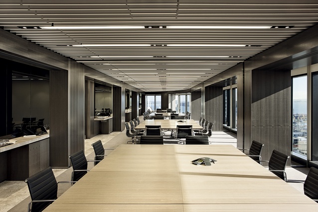
One thousand ANZ employees have been decanted from multiple buildings into this tower, which hosts offices, a trading floor, executive suites, meeting rooms and hotel-style bathrooms, alongside the services and plant. Employees were moved from floor to floor as construction progressed and they were, no doubt, fairly patient, since the major structural move was the cutting of a continuous hole for new stairs up through the tower. This connects ANZ’s two stacks of floors, which are interrupted by a stack of tenanted floors in the middle. You can imagine that this process, with two or three floors cut at a time, was a design and structural engineering challenge, not to mention the logistical headache of delivering it within a tenanted building.
The neutrality of the tower’s interior only serves to enhance the incredibly intimate, yet panoramic, views created by the curved perimeter and the core being kept off the façade. By not being sited in a densely packed urban environment, up high the building enjoys a relationship with the distant landscape. The Waitakeres can be seen to the west and Auckland Harbour to the north, while even some of the banal towers nearby appear somewhat improved from above. There is little need for artworks or decoration up here and the enhancement of these views, in all areas of the design, is absolutely key. Warren and Mahoney and HASSELL have understood this well, delivering new elements and an interior that reflects this dynamic with vision and context. It is exciting to see one of Auckland’s buildings – from an era that, let’s fact it, has a few architectural eyesores – revitalised with such care and attention.

