ANZ Head Office
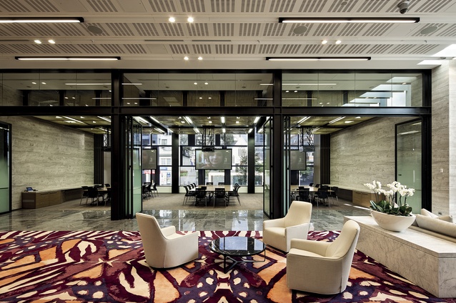
Some of you may recall the last issue of Interior (issue 8, Jun–Aug 2013), in which Warren and Mahoney architects John Coop and Richard Archbold took us on a jaunt through the revamped and art-filled lobby of the ANZ Centre. Well, we’re back, this time to investigate what’s been happening in the tower’s upper levels and its ground floor pavilion meeting suite, which was integrated with the refurbished tower lobby and plaza at 31 Albert Street.
Warren and Mahoney has been working on this part of the project in association with the Australian practice Hassell, who, in a twist of fate, was the original architect of the building back in the late 1980s. Hassell also has history with ANZ; a recent significant project for the bank was the new ANZ Centre in Melbourne’s Docklands. That building, a vast, horizontal, 130,000m2 slab of a structure is home to around 6,500 employees. It is an inward-focused building organised around urban design principles (plazas, streets, etc) to promote collaboration.
Following on from this work for ANZ in Australia, Hannah Beveridge, from Hassell, says the firm was engaged to work with Warren and Mahoney on the workspace design, client meeting and private bank meeting facilities for ANZ in Auckland. DEGW was also called in to help develop a strategic brief and a series of workplace objectives.
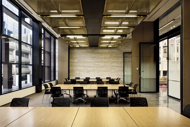
In comparison to Docklands, ANZ Auckland was, structurally, a different proposition. The 20-year-old tower is a working home to around 1,000 staff. Within the tower, the top floor of which is level 39 (the lobby is level 7, and the first office floor is level 8), ANZ occupies two stacks, levels 8-13 and levels 16-31. Each separate stack is connected with a new internal stair.
Despite the obvious physical differences between a tower and the horizontal style of the Docklands building, Beveridge says that there is a consistency between the respective projects, with some of the planning principles applied at Docklands translated to Auckland.
Hassell has completed many workspace projects for ANZ, all with their own opportunities and challenges,” she says. “The execution of these principles and objectives varies between all sites, however the basic planning principles remain.”
Such principles include creating visual and physical connectivity, contiguous workspace with maximised access to natural daylight and views, a variety of distributed formal and informal support spaces and work settings, and centralised client meeting facilities.
There was also ANZ’s objective, says Richard Archbold, to achieve a design response that recognises both its global and local brand identities, and a response that enabled their ANZ Centre workspaces and client areas to be consistent with the international experience of other ANZ centres – yet unique to the locale. The locale, one notices from the upper floors of the building, is a panorama that stretches from east to west (or vice versa) and encompasses the entire Waitemata harbour. This is certainly a view that you cannot beat into submission with overt design gestures – and in its design, the position of the building’s core to the south emphasises views to the north.
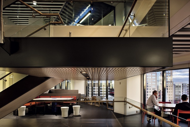
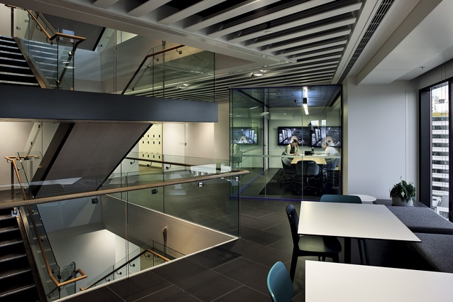
As this was a consolidation project (a theme of “woven unity” was established, as a reminder that a goal of the works was to unify and connect staff in the building) the designers needed a device to generate interaction. From an organisational aspect, the key manoeuvre was the implementation of a new internal link stair. The location of this stair, says Beveridge, was critical for planning of the floors, “to encourage staff to transition between floors while also allowing for maximum contiguous workspace to the northern side of the floor plate.”
Despite eating into the available floor space of the building – each floor in the tower has just under 1000m2 of net lettable area, which leaves approximately 850m2 of useable space – the stair works as an organisational tool, with “hub” areas, in a variety of meeting and social configurations, planned around these areas of vertical exchange where the stair intersects with the floorplate.
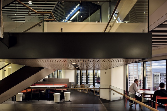
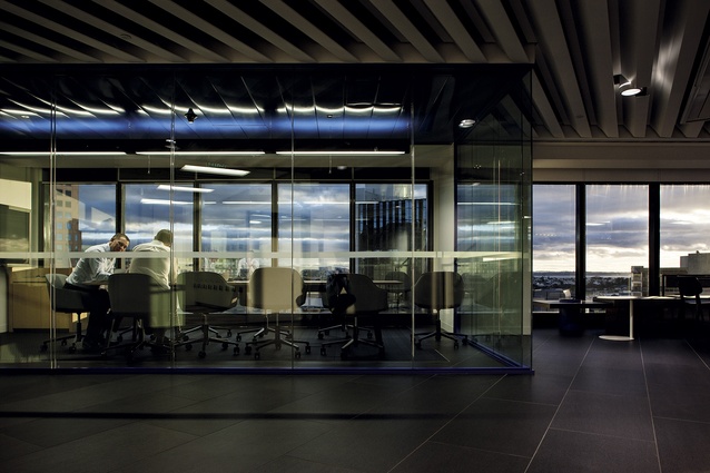
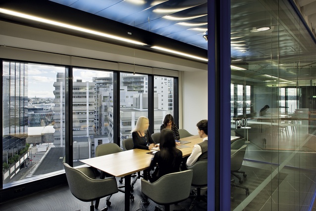
“The hub area on each workspace level is situated to take advantage of the views across the harbour, as is the open waiting/lounge area within the client meeting suite,” says Beveridge. “On the upper levels of the tower the entire workspace and client meeting facilities have the advantage of these spectacular views. By locating any enclosed meeting rooms and offices within the centre of the floorplate, access to these views is provided for all staff within the open workspace located on the perimeter.”
Unsurprisingly, inserting the stair provided construction challenges; it was designed to be transported in separate components and assembled on-floor. To reduce labour and install time, and therefore disruption to other tenants (whom Archbold descibes as the “unsung heroes of the project” across the two years of building), prefabrication was used frequently, for the tower’s bespoke ceilings, the stair perimeter bulkheads and for the interconnecting stair itself and to reduce “shop drawing time”, these items were 3D CAD modelled to a high level of detail, says Archbold.
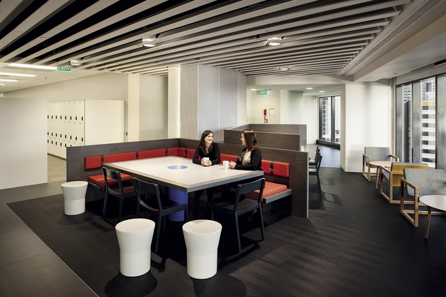
Throughout the ANZ’s 22 floors, the material palette expressed is influenced by the landscape and the contrast of materials from east to west. The workspace floors have a dark material palette for the hub areas and a lighter palette for the open workspace areas, an idea that “stemmed from exploring the contrast between the volcanic coastline and the white sand beaches”, explains Beveridge.

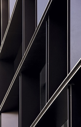
Throughout the interior, there is an expression of bevelled forms and bespoke extruded ‘z’ fin details that are a response to the building architecture and structure. These forms were observed in the building’s original concrete structural beams and columns, and in the detailing they address the various geometries of the building. The bevelled forms, says Archbold, were derived from seeing where the structural elements sit on corbels that project out and generate that bevel detail: “That idea was then run through much of the detailing of the seating, the partition walls and the columns, which have been packed around and articulated.”
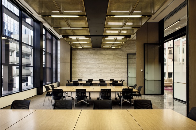
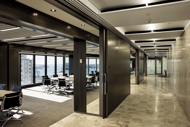
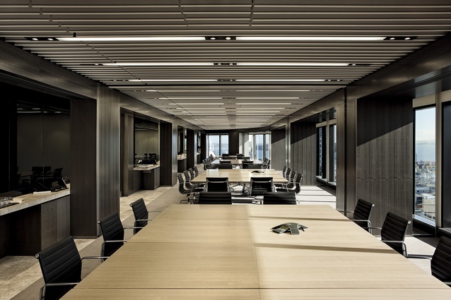
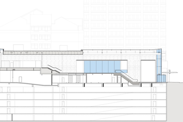
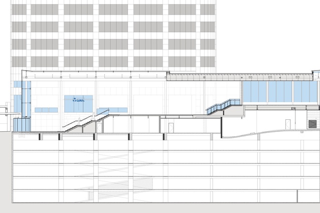
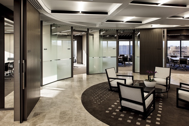
Overall, the interiors are refined, simple and elegant with natural tones and evocative materials. There are some real design highlights in the suite of meeting rooms integrated with the lobby, and in the suite of client meeting floor on level 30. In the meeting suite pavilion, there is a generosity of flexible space in this series of rooms that can be separated to create one large space. The room, which sits behind louvres to provide a controlled view onto the new landscaped plaza has services cleverly concealed in brass-coloured cages. On the client meeting room, the finishes are rich, with a permanent feel. Again, there is an incredible amount of flexibility to the floor’s meeting rooms and a real fineness to the material expression… which you might notice, if you could peel your eyes away from the incredible vista.

