Architects in Profile: Assembly Architects
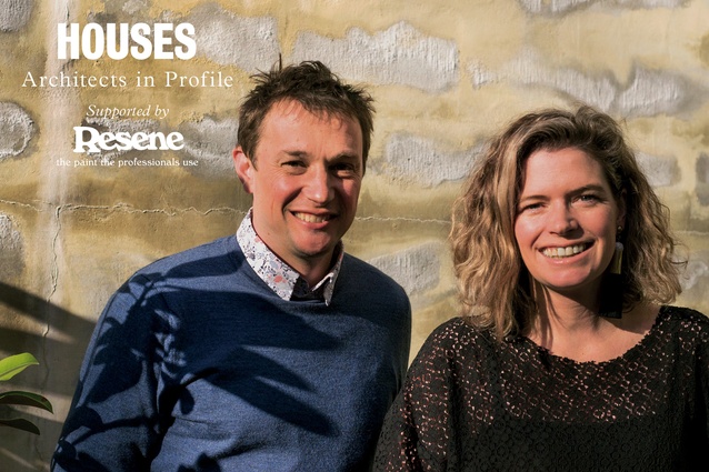
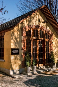
Tucked away behind the historic Arrowtown shops, Justin and Louise Wright have built a successful and busy practice with a focus on alpine-specific design – all while raising a family.
Arrowtown-based studio Assembly Architects has a portfolio of award-winning, creatively designed houses that respond to the often-harsh environments of their mountain locations. Camille Khouri met with husband-and-wife directors Justin and Louise Wright to talk about the firm’s beginnings and their design process.
Camille Khouri (CK): You met while studying architecture at Victoria University of Wellington. How did you come to form Assembly and was working together always the plan?
Justin Wright (JW): We graduated two years apart: me in 1999 and Louise in 2001. We worked separately for a few years. I was at New Work Studio and gained great experience there. I started Assembly at the end of 2005 with an exciting major project. Louise was working at Athfield Architects and she was doing really well there; she was Ath’s right-hand person. But I got busy and the project was our collective focus, so we decided she would come and use her skills for us.
Louise Wright (LW): You had a lot on your plate. That first project that Assembly won was in Wellington and it was massive: a 750m2 house of absolute top quality. That was a couple of years of work and then we started having kids. Sabina was born in 2007 and the twins in 2009.
CK: And you were based in Wellington at that point?
JW: Yes but we were doing projects all over the country. We had the Waipātiki Beach House, north of Hawke’s Bay. We always had projects going on in Queenstown. We worked on the Britomart pavilion project with Nat Cheshire and, then, there was a bunch of prefab buildings that were put on trucks and sent out to many remote marae in the central North Island.
CK: That’s interesting.
JW: Yes. It was a really good learning experience being on the cost and contractor side, as well as understanding, on the collaborative side, how to put stuff together. There was a lot of on-site establishment work so we moved the office and our family up to Kākahi (near Taumarunui) in January 2012 and based ourselves there for about nine months.
After that, the idea of going back to Wellington didn’t appeal: the idea of being halfway in a city. I grew up in Mount Cook, Wellington, so the city was my playground. I’d be down in Courtenay Place in five minutes on my skateboard.
LW: We decided to skip Wellington altogether and go straight to Queenstown Lakes – we’d dreamed about doing that for many years and, after Kākahi, the time seemed right.
JW: So we bypassed Wellington and came down to Arrowtown. We’d chased the snow here in Queenstown and around North America and we wanted to have the mountain environment as part of our lifestyle.
CK: Do you think the change in location affected your architecture?
LW: Massively. There’s what you don’t see as well as what is more obvious. We always put a lot of value on views and siting in a project. Down here, you have high, mountain views. Thermally, the ways in which we detail buildings have changed massively since moving here: the awareness of comfort and health, during both the summer and the winter months.
JW: Yeah, the environmental conditions of this area are different from those anywhere else in the country. We have a lot of discussion around thermal performance, cold-bridge detailing and insulation values, and how to maintain all those aspects. There is quite a lot of cost involved but it can reduce your energy bills by a third if you do it right – and that ongoing impact for the environment and personal well-being is huge.
CK: How do you work around covenants?
LW: It’s quite a challenge, actually. It’s becoming rarer to find a site that doesn’t have covenants and, certainly in this basin, it has resulted in quite a ‘Queenstown look’ that is not particularly exciting. We’re becoming more confident in challenging covenants now. We designed a house in Jack’s Point, which took us nine months to get through the design review board process to do a low, mono-pitched roof. We just really crafted the argument as to why it was better than the alternative result, and we got there, but it was a lot of extra time for the client.
CK: How do you balance life and work as a husband-and-wife team?
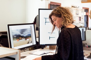
LW: It’s something everyone finds fascinating.
JW: I think it’s because a lot of people (this is going to sound terrible) don’t know how to get along; they don’t have any communication. But, for us, it’s not a problem. We complement each other’s strengths and weaknesses very well in the way that we deliver and work in the practice. I am slightly dyslexic so can’t write but Louise is great with communication. She’s really good at understanding the legislative environment and I’m really good at understanding the construction stuff. And we both have really good mutual respect for each other’s design abilities and qualities.
LW: Yeah, we work better together than we would separately.
CK: Do you have a ‘don’t take work home’ rule?
JW: Oh, you never stop working, really. That’s the nature of the business but I also think, being in architecture, sometimes it doesn’t even feel like work. But, other times, when it’s stressful, you need to say, “Look, I need to stop talking about this. We need to turn off from that.”
CK: At least you can talk it out with someone.
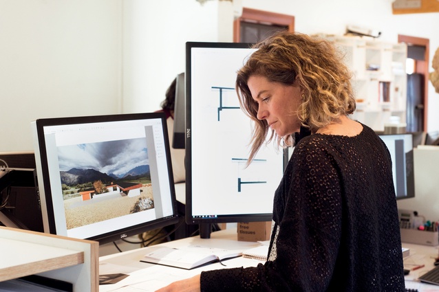
LW: Yes, and especially if it’s a design problem, we want to work on it. So, we’ll work on the weekend, sketching at home at the dining table. Our kids love drawing so, quite often, we’ll sit at the dining table, and they’re doing their drawings and we’re doing ours. It’s good – especially at the early planning stage when you’re trying to see how something works – if you keep drawing and refining it.
***
Rammed-earth House
Wanaka

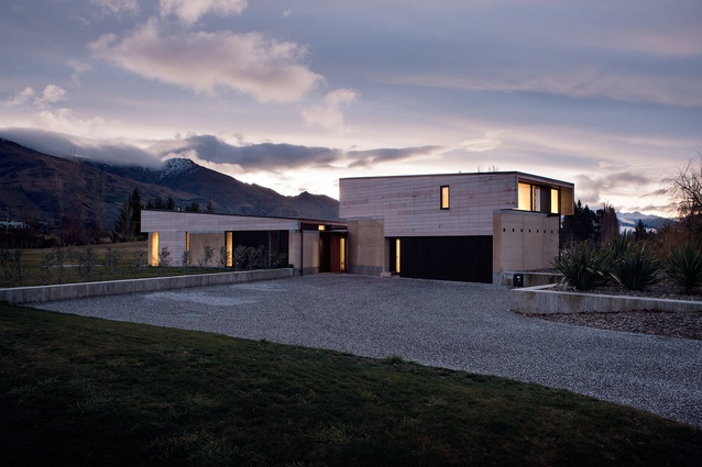
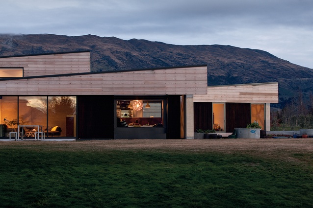
This Wanaka home was Assembly’s first rammed-earth house. Completed in 2015 for a young family, the house is arranged in three distinct wings oriented to the sun and views. “We spent a lot of time with the owner finding the views and figuring out where the rooms would be placed to take them in, literally going out with poles and chairs and ladders and measuring heights and distances on site,” says Justin. Using these views as reference points, the house was designed to fit around them, using landscape walls to ‘push’ the house down and meet height requirements.
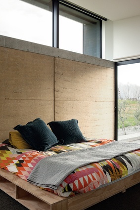
“The landscape walls continue through the house as foundation walls and, then, the rammed-earth walls sit on top of those so the house feels as though it is bedded into the garden,” says Louise.
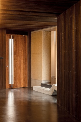
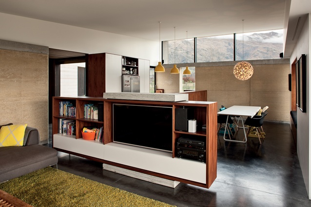
An angular entrance foyer creates the axis around which the living room wing, family bedroom wing and guest/garage wing extend, each with its own vistas and landscaped courtyard. To provide some contrast, the house also includes wide-format, rusticated cedar and thin, vertical shiplapped weatherboards – but the rammed earth is the dominant material. “You have to be comfortable with the rawness but, when the light hits it, it just looks awesome with all that texture and the mottled elements. It’s a really nice idea to be building with earth,” says Justin.
Cox Estate House
Gibbston Valley

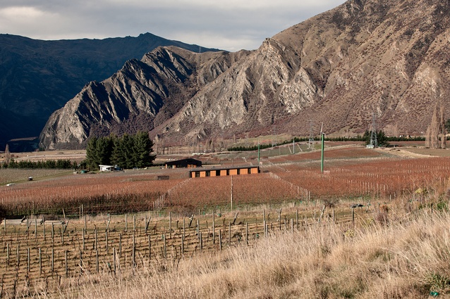
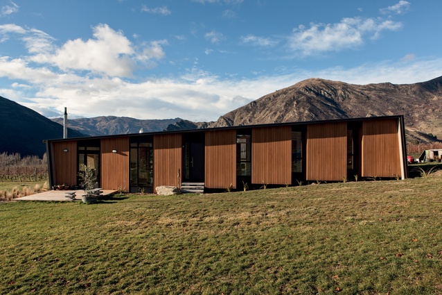
Located on a windswept site in the Gibbston Valley, Central Otago, this house follows the slope of the land and is raised on piles to take in the views of the surrounding grapevines. The decision to follow the slope rather than run across it was governed by the environment, explains Louise. “You have this constant wind coming from the west. If you weren’t familiar with the site, you would have set up the whole house facing north; instead, the house creates a lee on the eastern side, which is totally sheltered for outdoor living.”
Internally, the slope carries through into a series of steps that move through the house, creating an interesting dynamic in the interior spaces. Repetition is key to the design, both externally and internally, and allowed the architects to stay within the limited budget.
“We have kept the form really simple, with one structure going all the way up the site. And because it’s a light, timber-framed construction, a small carpentry crew could construct it without the need for visits from different contractors,” says Louise.
The mono-pitched metal roof folds down at each end, where expressed window boxes allow sunny spots from which to take in the landscape.
Sawtooth House
Queenstown
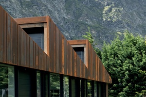
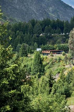
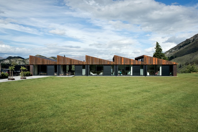
Repetition is also key to the Sawtooth House. After living in a dark house previously, the home-owners requested a light-filled home. The architects identified several ridge-line and mountain-peak views at high levels, which together determined the distinctive design of the roof.
“They have this amazing big view to the east, then the sun to the north, the river on one side of the site and a constructed landscape, their garden, on the other,” explains Justin. “To take advantage of all of this, we ran the house the maximum length to gain the river views to the east and, then, the sawtooth allows sun to penetrate deep into the house.”
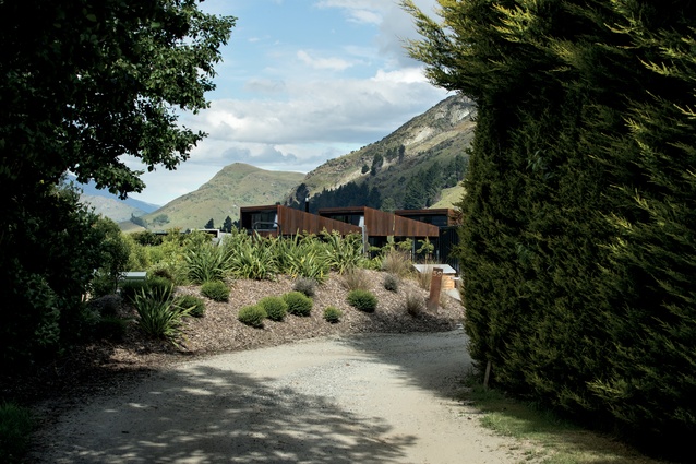
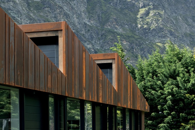
The Corten steel panels provide a rusticated look that suits the rugged nature of the landscape. Obviously, the surrounding, jagged ridge-lines are also reflected in the form of the house.
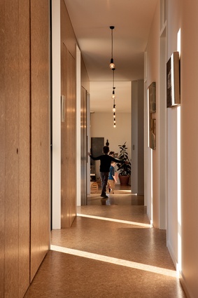
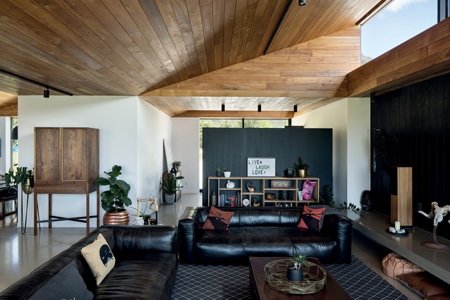
An extensive art collection informed the use of white walls that create a band around the internal spaces underneath a timber-lined ceiling. The home-owners have a close-knit family and the plan reflects this with a central corridor that links children’s and parents’ bedrooms and an open-plan living/kitchen/dining room area that spills into the outdoors.
Binoculars
Queenstown
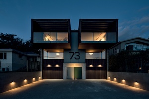
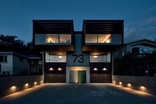
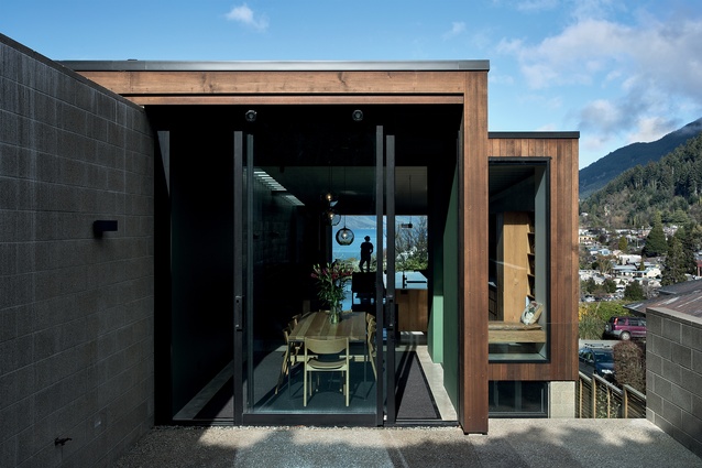
With its bold, cantilevered and framed twin balconies, this aptly named set of duplex apartments is a literal head-turner on its prominent site on Queenstown Hill. The building contains two mirrored apartments, each over three levels, with garaging below, bedrooms on the ground level, and a large, open-plan living area placed on the upper floor to take in the big views of Lake Wakatipu.
“We pushed the building back from the street so we could fit a couple of car parks in front,” says Justin. “Then we wanted to have this pretty dramatic living space framing the view out front, which inspired the cantilevered balconies.” At the rear of these living spaces, a less-public, sheltered outdoor courtyard is nestled into the hillside.
These have a gate between them so the two apartments can be linked if the residents wish to do so. Aside from this, though, each of the two apartments have a sense of independence, with the dividing wall and light-wells over the stairs providing separation between the two living areas.
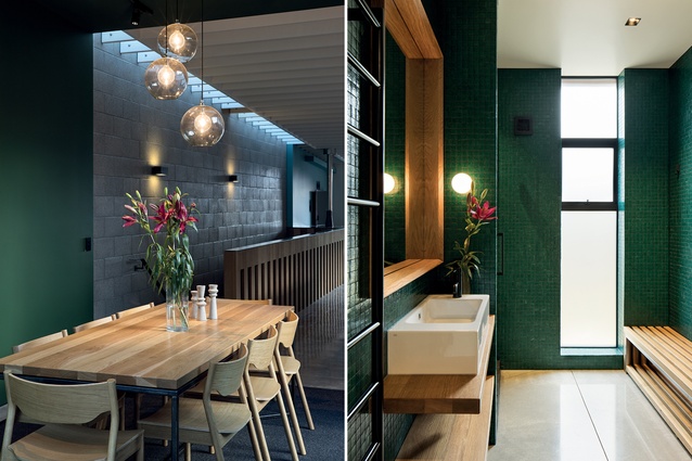
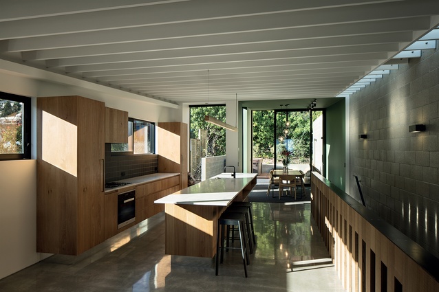
Materials are modest but used to their maximum effectiveness. From the street below, cedar ceilings can be spied through the bedroom windows, where they appear to roll through the interiors to the external cedar cladding. Blockwork walls provide solidness and a sense of urbanity that suits the apartment aesthetic.
Wright House
Queenstown
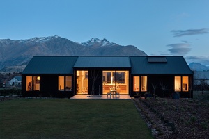
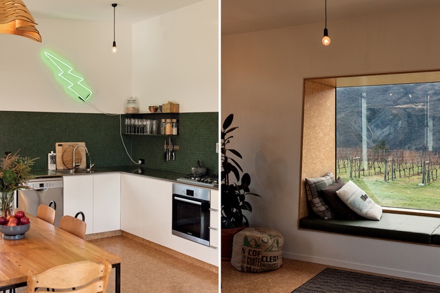
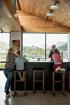
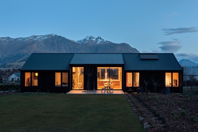
The architects’ own home is situated at Butel Park to the west of Arrowtown. The Wright House is refined and simple in form and structure, with the extensive garden and mountain vistas lending colour and drama. The designers were required to work within a strict set of covenants and, also, to a short time frame with a limited budget. The resulting house is similar to the Cox Estate House in that it is set on piles and was designed to be constructed easily by a carpentry team.
Air-sealed with Intello wrap and with extensive underfloor insulation, the house exceeds minimum insulation standards by 2.5 to 3 times. The open-plan living and kitchen space, with its grand views of the Remarkables to the south, is bookended by the parents’ and kids’ areas. The roofline hitches up above the central living space, opening the house to the garden.
Some interesting features add character to the interiors, such as using materials that reflect the rustic nature of Arrowtown’s history. Boxing timber is used to create inverted boxes cut out of the ceiling; those boxes contain lights and a skylight. In the bathroom, a pre-cast concrete sewer pipe has been clad in tiles and formed into a fun, knee-height shower and bath container.
This article first appeared in Houses magazine.


