Architects in Profile: Athfield Architects
Founded in Wellington in 1968, this provocative practice now works across the country on a range of projects, from houses to large public schemes, from its Wellington, Christchurch and Auckland studios.
Athfield Architects has a currency now, which seems to have grown again in recent years, not for its aesthetic but for the ways in which it deals with work and living, with transition and with the spaces in between.
Amanda Harkness (AH):How would you describe the design philosophy of the studio?
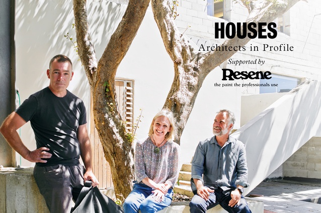
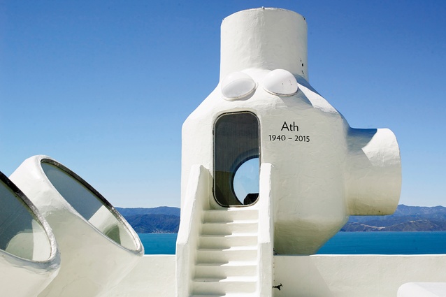
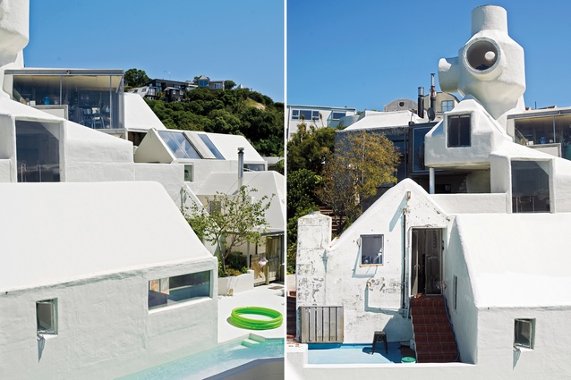
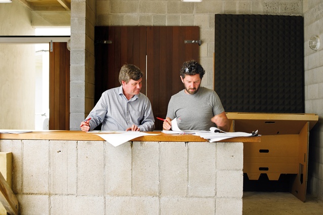
John Hardwick-Smith (JHS): The office has always been interested in community. Although Ath’s early works were often small projects, they were conceived within much larger contexts. Community continues to be very central to our way of working and our design approach, for projects of any size and type.

Zac Athfield (ZA): The studio’s early work was also pretty provocative; these guys were carving a niche. There was definitely a reaction to modernism and a conscious contextual relationship with colonial architecture. We test environments, designing as we go, sometimes making a few mistakes along the way. There is a ‘no bullshit’ ethos and rigour that continues today across all the studios.
It’s also always been about people. Many of the houses come out of the relationship that you form, and projecting beyond one person to the family that they may have, or the next generation, or the preceding generation. It’s multi-generational thinking. We have some clients who have been with us for two or three generations.
Sophie Vial (SV): From the earliest projects, each of the overlapping spaces has had such a strong sense of humanity and of how people relate. These houses were really testing those relationships, having rooms for almost every type of activity. The arrangement of these rooms created vistas and framed views, and, even when you are alone in a room, there is always a sense of connection.
JHS: Preconceptions of inside and out have always been tested. With our Wellington studio, the pathways and spaces between are used as much as is anywhere else. This way of thinking is relevant for much of the work we are doing now. Landscape and interior space overlap – sometimes making interior landscapes or exterior rooms.
SV: And our hierarchy in the office has always been fairly flat. So, our graduates have opportunities to contribute to and challenge design thinking and the conversations we have, testing ideas within and between the studios.
AH:What sorts of houses are you designing today and for whom?
JHS: The houses we are doing are seldom stand-alone objects on their sites; they’re often more about collections of spaces and happenings, with particular relationships to one another and to their sites. They are seldom finite projects but, often, ongoing conversations, with the next moves on the sites (or on the neighbours’ sites) loosely mapped out. Our house clients are often friends, clients from other projects or design colleagues, where the design conversation is not starting from scratch. The process is collaborative, following a ‘first principles’ approach, uncovering cues to essential design narratives from the site, and the circumstances and interests of the household. Sometimes the outcomes are surprising to all of us…
AH: You work on a range of residential projects – stand-alone, townhouses, multi-unit dwellings. Are we heading in the right direction with regard to mixed-used residential, looking at the Nightingale model?
JHS: There are some really interesting wider discussions now happening in these areas. It is prompting a change in thinking about land ownership, existing development models, multi-generational living and community, which is familiar territory for many of our projects. The Auckland studio is currently engaging with a co-housing group, and the Christchurch office is working through a series of housing infill projects in the city and build-to-rent housing.
AH: Is there a move to more-communal, encampment-type dwellings, where you might share a property with parents or friends?
Pippa Ensor (PE): There have probably never been ‘generic’ households and maybe we’ve attracted projects that have responded to or enabled different ways of living and working together and apart. Economic necessity has become a greater factor in that. Often the response is about where to prioritise first moves, and to enable future transition and growth as circumstances change.
AH: Talking affordability, Ath was known for using cost-effective, honest raw materials. Do you still follow that ethos?
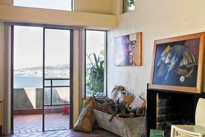
ZA: Cost structures and regulations have changed things but the ethos remains. Homebush is a great recent example of integrating recycled materials but this is more about respecting and cherishing what was valuable and holding it in memory.
SV: We’re quite considered in terms of how we use materials. We look at the inherent attributes of the materials – like timber, concrete, plaster and brick (salvaged or not) – to draw out how we can use and apply them. We often balance these with more-contemporary finishes.
AH: What is the future for your office in terms of residential work?
JHS: While we now work across all scales and typologies, the design thinking and craft in houses inform our bigger projects and vice versa, so they remain a vital part of our work.
ZA: We’re now involved with some interesting technologies emerging for prefab and systemised construction, but we’re also always mindful of how these can be ‘tweaked’ to ground them meaningfully in a specific site or neighbourhood.
Homebush
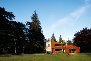
Home to several generations of the same family since the mid-19th century, the previous homestead on this Canterbury farm station was felled by the earthquake of September 2010.
The brief for the new dwelling was to respect the history of the site and the previous house, and marry a language of new elements with those salvaged from demolition, while looking to the future.
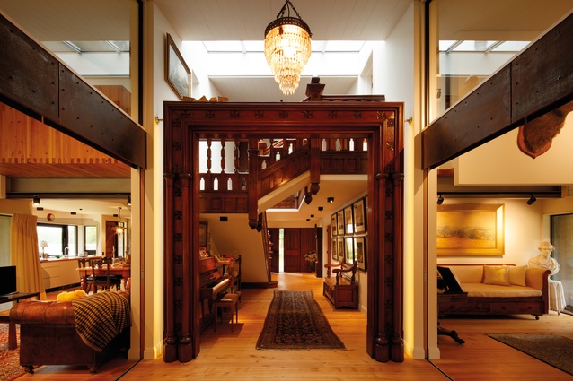
Set away from the footprint of the former house, the symmetrical floor plan is aligned with the axis of the brick stables further south. Salvaged timber stringers and balustrades have been pieced together to rebuild the original stair under a rooflight, framed by the restored architrave freestanding in the central hall. Interlinked rooms are separated by sliding doors and joinery, with ground-floor living spaces opening to the hall. Douglas fir felled on site was milled for framing, timber-panelled doors were restored and various native timbers from the existing house were reused for laminated flooring, lining and joinery.
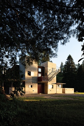
Exterior materials draw upon the agricultural and industrial history of the site’s built environment. Paired in-situ concrete towers punctuated with black windows and galvanised-metal shutters enclose service spaces and extend as landscaping walls for courtyard gardens. Living areas are sheltered by a weathering steel skin, under a corrugated steel roof, and are bookended by steel fireboxes lined internally with salvaged bricks.
Takapuna House

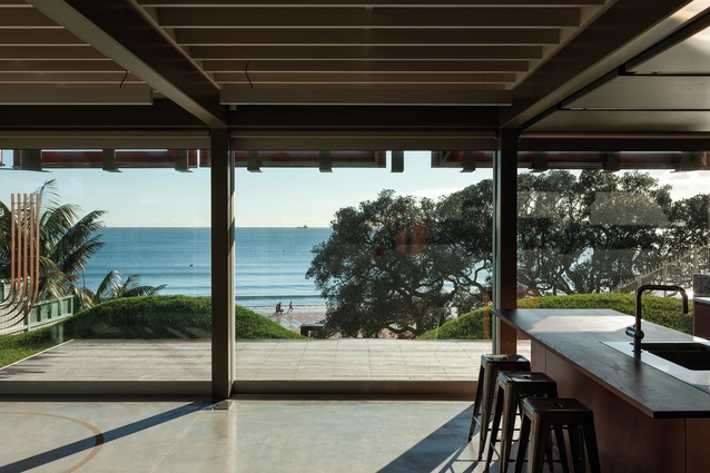
The design of these new houses called for retention of the original ‘bach era’ landscape, linking the buildings on the two sites, respecting the local scale and treating them as a small collection of vessels or containers.
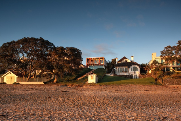
This long, narrow beachfront site is one of the few sections that opens generously onto the public domain. Existing lawn and mature trees were retained and a simple axial stepped path extends from the main house to the beach.
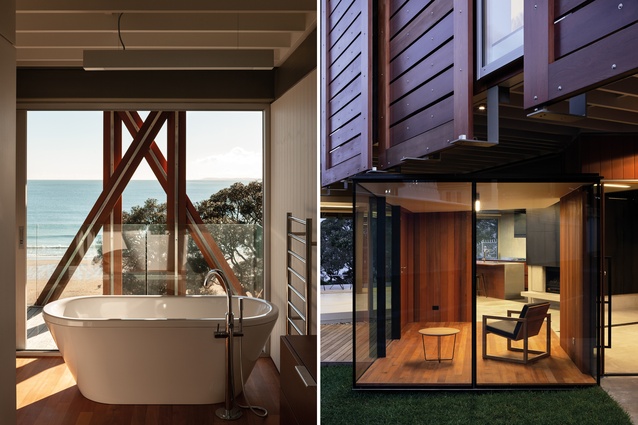
The three new buildings comprise a main dwelling and two guest houses. The houses have been arranged so that the robust cladding on the outside edges conceals the content from the more public approaches, and the ‘interiors’ (outdoor and indoor) are revealed gradually as one moves through the site. This is developed further with the provision of folding and sliding openings that can be manipulated to suit the requirements of the inhabitants.
The three discrete house forms share a common platform, with a combined plan area that is similar to that of the two pre-existing dwellings, which were removed. All are simply clad in robust, weathered hardwood panelling, on a concrete base, referenced from the existing landscape, the foreshore and the neighbourhood. The minor dwelling, or ‘gatehouse’, on the adjacent section is also partially clad in naturally weathering brass panels. The interiors of all three houses share a limited palette of materials, with cedar tongue-and-groove panelling, folded metal stairways, concrete and glass.
Connew Griffiths Karekare House
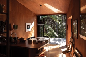
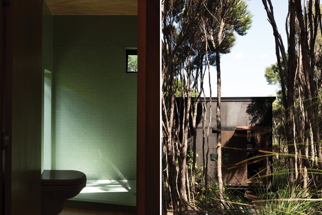
This cluster of lightweight structures hunkering down within the ka-nuka canopy on a Karekare hillside was a collaboration between Athfield Architects and an artist duo “who led the way, from design conception to realisation”.
Two wedge-shaped buildings provide separate and distinctive studio spaces for the photographer and designer/typographer/artist owners. Although they are similar in form, the differing orientation and bias of windows, and solid versus translucent walls within each wedge, create quite distinctive spaces, each with an opposite perspective.
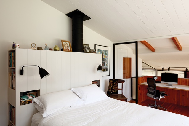
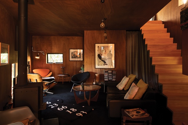
Nearby, through the bush, is the house: a single-volume structure, with a living floor and sleeping mezzanine above. Formally, it is like a composite of the two studios, providing common ground where things come together at the end of the working day. A separate converted container at the end of the driveway provides storage and archive space.
The buildings are carefully positioned in relation to one another. They are arranged in a loose vortex down the bushy hillside, from the storage container at the end of the drive, down to the house, with glimpses to and from each, and a meandering pathway that manipulates the distance and shapes experienced between. Openings and windows offer dappled light and intimate glimpses rather than expansive views, and the level of enclosure in the depths of the living spaces provides a respite from the uncontainable bush.

Clyde Quay Wharf
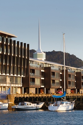
Redevelopment of this prominent Wellington site called for an integrated response that carefully balanced residential community with public space, while acknowledging the existing heritage wharf and building.
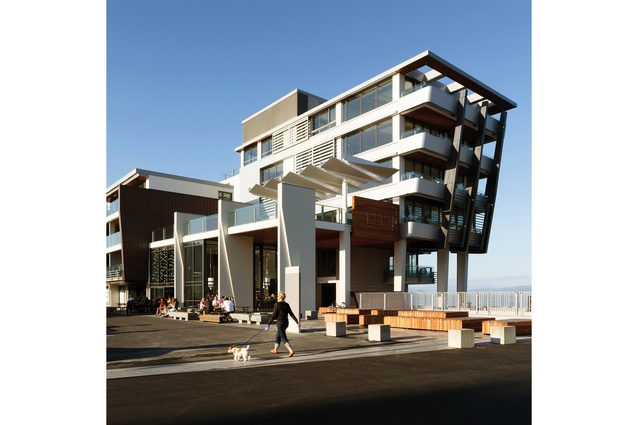
The 260m-long mixed-use urban waterfront development houses residential apartments, along with retail, food, office and other amenity. The design accentuates and strengthens the gestures established by the underlying Overseas Passenger Terminal structure, creating urban-scaled gateways to the harbour and the city, with an architecture informed by historical and nautical references from the original building.
The 76 apartments are broken into neighbourly clusters, providing a sense of address and local community, and shared facilities, such as a gymnasium, a theatrette, a BBQ and living decks, which have been incorporated along the length of the building.
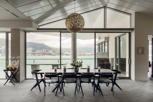
Each apartment engages directly with its surroundings, with its layout determined by the views and the position on the wharf, while specific purchaser engagement resulted in bespoke design outcomes for each of the apartment owners.
This article first appeared in Houses magazine.


![Director John Hardwick-Smith says, "Although [Athfield's] early works were often small projects, they were conceived within much larger contexts."](https://cdn.architecturenow.co.nz/site_media/media/cache/64/e6/64e6d29f75e7c948d3f3da046a69ad6c.jpg)


