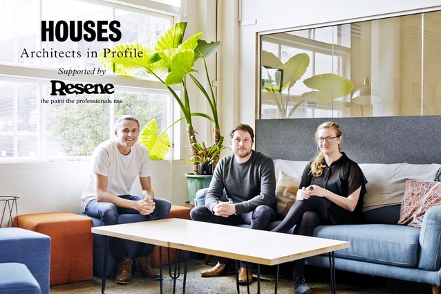
Architects in Profile: First Light Studio
Born from a project in which four university students designed and built a home for an international competition, First Light Studio was formed three years later and has been making waves ever since.
Having first come together 10 years ago for a university project, the team is older and wiser now but still passionate about prefabricated design with a small footprint.
Ashley Cusick (AC): How did you come to enter the U.S. Department of Energy Solar Decathlon?
Ben Jagersma (BJ): We were all in university and a lecturer put us together because we were doing individual research based around sustainable building. So, it started out as a mock project where we created a competition entry to the Solar Decathlon.
Anna Farrow (AF): The university was a bit excited about it and said we should try to enter it for real so we put together a proposal.
BJ: From there, our First Light House was short-listed as one of the 20 competition finalists and we were given 18 months and US$100,000 from the Department of Energy to deliver a zero-energy home to the National Mall in Washington, DC. We were the first team from the southern hemisphere to have entered.
AC: Did the competition require the house to be prefabricated?
AF: Part of the competition was that you had to construct the project within seven days on site so it had to be mostly prefabricated. Because we were coming from New Zealand, we had the added constraints of shipping dimensions so we had to modularise ours.
AC: How did the studio come out of that competition entry?
BJ: What was unique and maybe made the project a success was how well the four of us worked together as a design team, playing off each other’s strengths. The house did really well; it came third overall in the competition. And, before we went to the States, it was set up in Wellington’s Frank Kitts Park; so, there was a lot of publicity and it was the perfect launching platform from which we could create a business. We wanted to try to do those things that made the first house so successful but bring it into a commercial setting. A lot of that was around the research and development of prefabrication, and how we could build more quickly and more efficiently.
Nick Officer (NO): We had 20,000 people look at the house on the waterfront; some of them left their names, and we thought it could be hard but let’s give it a go. People want what we have done.
BJ: At that point there was, and still is now, a lot of talk about the housing crisis in New Zealand and talk about sustainability as well; we had developed all of these technologies and methodologies for building quickly as a result of the competition. Our initial driver was to find ways to translate that into a model for design or building which could be replicated on a larger scale. How can we go about bringing more design to more people in New Zealand for less money and bringing architecture to everyone? So, that was kind of where we started out: with a question. How are we going to do that?
AC: Does the design of that first project, the First Light House, still inform the work you do today?
NO: One hundred per cent. It’s part of who we are.
BJ: It embodies everything that we’re about: small footprint, high performance, connection to the outdoors, natural materials and efficient use of space.
NO: And flexible use of space as well. The house we built was only 70m2 but it could sleep seven people.
AC: Is there more cost up front to build sustainably? Do you have to work to bring your clients on board with that?
NO: There are so many things architects can do before cost becomes an issue: things that can really make a difference to a build – orientation, materials, windows, construction details. Then there are things that can add extra money: the more active technologies like solar. They definitely do add cost.
BJ: There is certainly a financial cost but, on the flip side, there is actually an environmental cost to not doing these things, and that is part of the story that we want to tell. We’re lucky that the clients that come to us are like-minded people and already have those base philosophies embedded within their approach. There is a much bigger picture in terms of climate change and we, as architects, have a big role to play in that; the construction industry is a pretty big contributor to the problem.
AF: Potentially, the capital cost is higher at the outset but the operational cost is much lower over time.
AC: Given that you started as a studio of graduates, do you find yourself taking on more students and younger designers than other firms might?
NO: It’s definitely a conscious move. When we started, we didn’t have any preconceived ideas of what the industry was. We hadn’t worked for someone else for a long period and fallen into that pattern of how architecture is meant to be. So, we’re kind of paving our own way and doing it differently, and part of that is being young.

AF: We also came straight from university, so our relationship with Victoria [University of Wellington] is strong. We always have a summer scholar and we like to keep that link between practice and academia.
BJ: That’s how we were able to do that original project; it was a project that was born in the university but made real through the sponsorship and involvement of the profession. Bringing the two together to talk to each other is pretty important.
AC: Do you mostly try and design small spaces?
NO: I think we actually lost a job once because we suggested it be smaller but probably 90 per cent of our work is less than 140m2. A big part of what we do as a practice is to challenge our clients on that. Part of making a house small is that you can spend money on higher-quality materials and finishes and joinery.
BJ: If you are designing small, you do need to be smarter with how you use the space that is available because you still need storage, places to sit and relax, and to read. Things like built-in joinery become really important.
NO: Circulation is a huge one: not having it or using it multi-purposely. If you use your hallway as the laundry cupboard, you’re not just using it as a hallway to move from one place to another. So, you would see that, in most of our projects, circulation is dramatically reduced. And then volume is always important.
AC: What is the design process like when you have new work?
BJ: When it was just four of us, we started every project with all of us around the table; then we would go away to create a concept ourselves, come together and talk about it, and so on. It was very collaborative but not really sustainable as we grew. We do try and take that collaborative mentality into all our projects, especially at the early stages.
NO: We have quite a flat hierarchy across the studio. We value everyone’s opinion and autonomy is important for everybody.
AC: Do you see prefabrication as the way forward or do you think there will always be a need for onsite construction?
BJ: It’s been interesting how we’ve approached prefabrication as we’ve grown. We started out thinking this is the way of the future so let’s do it. We went through a period of realising that the industry was not set up for us to be able to do that yet, and the number of people who could actually build the way we wanted to was very few. Now, there are a lot more operations who have the capability to build off site and we’re seeing it become more feasible, especially as we start to move towards working on larger-scale projects.
AC: Looking back, have those original ideals from the First Light House project evolved as you’ve grown older?
AF: Perhaps we’re less fresh-faced and idealistic but I think they have strengthened if anything.
BJ: I’ve probably become even more frustrated with the existing architectural system that we work within so it’s probably enhanced our drive to push for change and to make a difference.
AF: We just have to keep at it.
***
Governors Bay Home

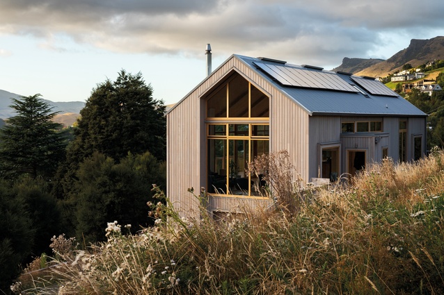
This well-crafted 205m2 family home is nestled into the Port Hills, overlooking Lyttelton Harbour.
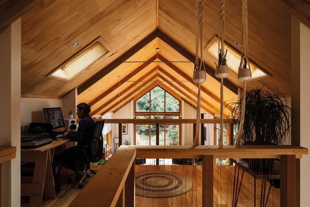
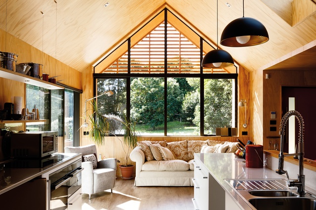
The challenge was to maximise the space within the small building envelope through efficient planning. The key to achieving this was the gable form, which made the most of the space available within the void formed by the roof structure, providing all of the amenity required within a very compact building footprint.
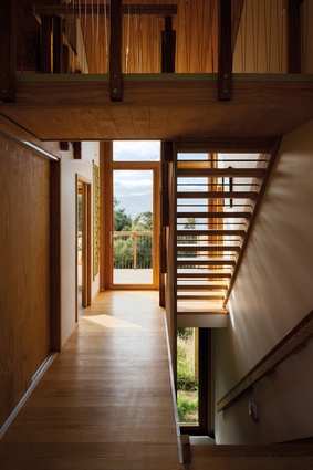
The house is located on a very steep site and privileged with spectacular views to the south; the approach to the house plays an important part in the overall experience of the home.
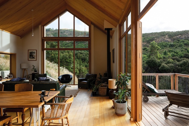
Inside, the main floor plan is both functional and spacious. Full-height ceilings in the entertaining areas express the gable roof structure, making for a light-filled and comfortable space. In comparison, the sleeping wing is more cosy and is separated by an efficiently designed ‘services pod’, which houses the kitchen, laundry, bathroom and separate toilet.
Two distinct elements are expressed throughout the detailing of the home: one, the rustic ‘barn-style’ form and the other, fine, rich elements that highlight the more public spaces of the home, letting in maximum light and sun. The woody palette of the exterior is brought through to the inside, only this time oiled to retain its rich reddish-yellow hues.
The home is designed to be an integral part of the landscape, with the use of honest and enduring materials, predominantly timber, helping it to nestle into its natural surroundings.
Te Horo Beach House
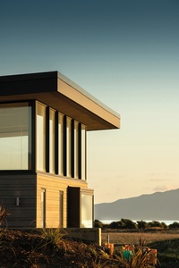
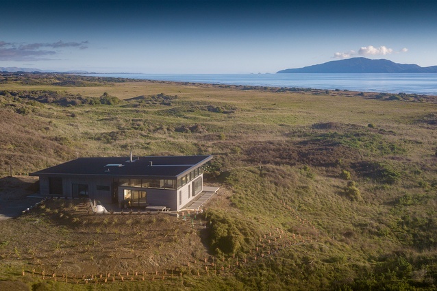
This house is located on the coast, just 300 metres from the water’s edge, where the salt-laden prevailing wind continuously lashes the shifting sand dunes; its design was driven by its dramatic landscape.
In response to its surroundings, the building – long and low, hunkered into the topography – becomes a part of the dunescape itself, with its roof pitch following the land’s natural gradient. Silvery cladding references the driftwood found along the weathered coast, its vertical and horizontal orientation changing with the different activities within the home.
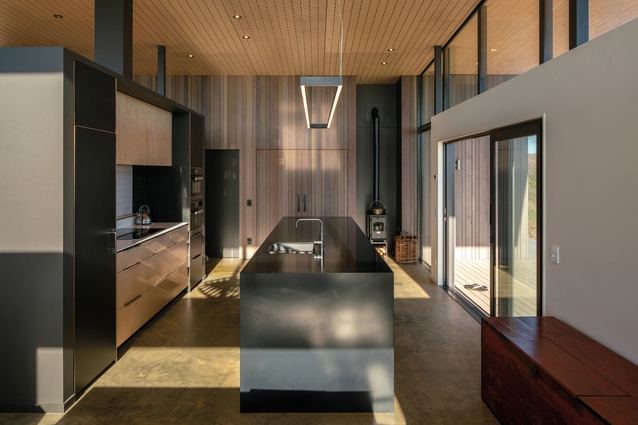
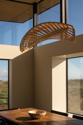
Inside, a lofty, open-plan living space occupies the northern end and enjoys all-day sun, year round. Selected openings frame Kāpiti Island on the horizon, while high clerestory windows capture the Tararua Ranges to the east and create the illusion of the roof hovering high and protectively over the interior spaces below. Outside, the dune batters up and away to protect a private, north-east-facing courtyard.
The sleeping quarters adjacent to the living area comprise a guest bathroom and bedroom to the east, and a master suite to the west with island views. To the south, the low end of the long mono-pitched roof shelters a garage, laundry and cedar hot tub; the latter provides a perfect spot from which to watch the sun as it sets over the sea.
Shark House
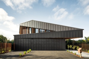
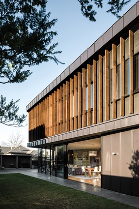
This unique building was designed to stand out from the many rectilinear rebuilds which increasingly dot the Christchurch suburban landscape.
Drawing inspiration from the clients’ love of European supercars and, in particular, the Maserati, the house’s angular planes and crisp lines overlap and converge in a series of vanishing points that twist around the façade, as if the building were forever in motion. No surface is perpendicular to another yet the overall effect is not haphazard; rather, the offset faces and acute edges of seamed steel come together with engineered precision. A rich timber ‘grill’ wraps around the second-level façade, softening the steel’s severity and moderating sunlight penetration over the course of the day.
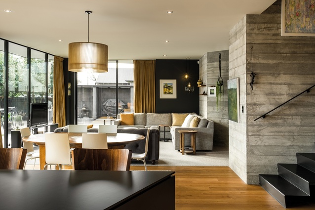
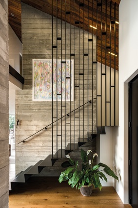
Inside, a textural concrete core reveals the timber grain of its formwork, complementing and contrasting with the rest of the rich timber interior. Black steel steps between levels add to the overall sense of strength and gravity-defying agility.
This house is a building of dualities; its static construction of solid surfaces manages to achieve a fluidity, sculpted inside and out with hard materials that are tactile and malleable. The functional exactitude of a high-performance machine is juxtaposed with a comfortable and relaxed interior. This family home is perfect for inner-suburban life, whether that be chilling at home or entertaining.
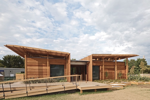
First Light House
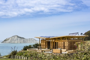
The design concept for this prototype house was based on the classic Kiwi bach, where New Zealanders retreat to ‘get away from it all’ and return to basics.
In terms of building typologies, the bach perhaps best exemplifies our Kiwi values, with its strong connection to the landscape, evidence of a hands-on ‘do it yourself’ mentality and its encouragement of socialising and spending time outdoors.
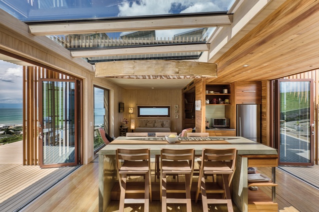
With these values as a starting point, this compact one-bedroomed, 70m² home was designed to be flexible and functional, able to be transformed to suit both the owner and the natural environmental conditions. Through the centre of the house, the kitchen and dining area can accommodate both small and large groups while, at both ends of this space, large bifold doors open to extend the living space outdoors, providing for a continuous flow between inside and out.
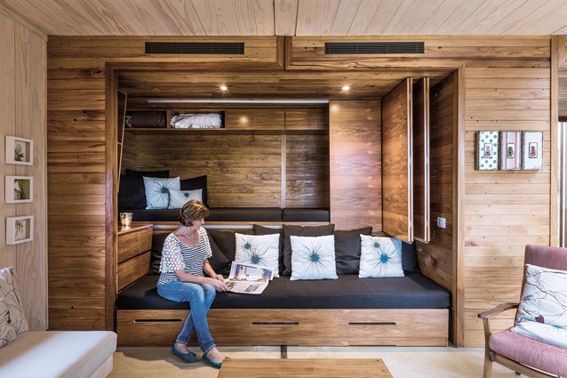
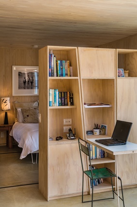
At one end of the house is the ‘snug’ living room, with a custom-designed built-in furniture unit which functions as a seating area during general use but transforms to sleep up to four people. At the other end of the plan is the main bedroom, open to the rest of the interior but visually separated by a study-and-storage furniture unit, which acts as a room divider. The back edge of the bach houses the service areas, including kitchen, bathroom and laundry, cleverly tucked away to make the most of every inch of space.
Despite its simple appearance, this high-tech house has a fully automated energy-recovery ventilation system and an energy-monitoring system, to record how much energy each of the appliances is using, with an overall goal of net zero energy or energy positive.
Family Tree House
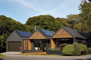
Three homes nestle together as one in this fully wheelchair-accessible dwelling, giving the individual inhabitants ownership and independence over their own spaces, yet a sense of connection.
Situated on the outskirts of Waikanae, the house is protected by a stand of tall kohekohe trees, and surrounded by bird life and common reserve land.
The form is driven by its occupants: three gables for three people divided by two formal ‘boardwalks’. Each gable effectively facilitates separation and independence while maintaining a connection for safety, support and communication. Reconfigurable internal elements, such as full-height sliding ‘walls’, enable individual areas to be closed off or opened up into one shared social space.
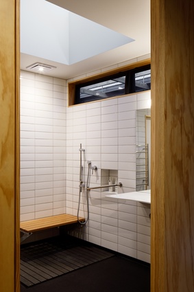
First Light worked closely with the clients on both testing and development, specifically calibrating small details to the dimensions of the chair and the occupants’ reach and range of movements. Wide hallways and integrated safety features, such as intercoms, sensor lights, grab rails and level thresholds, create a Lifemark 5-starred living environment. The goal was to make everyday tasks in the kitchen and bathroom easy without compromising on the feel of the space as a beautiful, light contemporary home.
The communal spaces are emphasised by plywood and timber tones, and a heated swimming pool for rehabilitation is in the private bush-clad courtyard.
This article first appeared in Houses magazine.


