Architects in Profile: Matter Architects
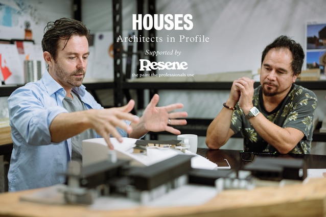
While Matter Architects has grown from designing modestly sized builds to, more recently, large-scale developments, the team still loves the jewel-like nature of a small project.
Amanda Harkness (AH): How was Matter formed?
Jon Smith (JS): I met John (Holley) 15 years ago and the idea of ‘matter’ grew from there, with the majority of our work coming through referrals. We now have clients in Christchurch, the Marlborough Sounds and Leigh, but most are in Auckland.
John Holley (JH): The first eight years of most architectural practices is basically garages and small projects, and building trust with clients. It’s hard work but you gain invaluable industry and client knowledge.
JS: And that slowly turns into larger things. For us, the attraction to any project is a client who is interested in going on a journey and telling a story with what they’re doing – we love that idea.
JH: In some ways, a small project can be quite jewel-like because you can focus on a very small scope and have that just so. The bigger the project, the greater the range of considerations and the challenge becomes maintaining the same level of emphasis on every square metre.
AH: When did the bigger projects start?
JH: We started working on more new builds and then subdivision in pairs. Then, the unitary plan came along and the scope for development was bigger – four, five and six – then people are willing to let you design 30 or 40. So, it’s been a relatively rapid progression over the past few years.
JS: The key for us is when people are able to realise the potential of their property in a well-designed manner. It’s a lovely scale and typology to work on, providing a great balance to our residential additions and alterations, and new builds.
JH: You inherit so much context from a renovation, which is both challenging and inspiring. An old architectural expectation is that, the more constraints there are, the better the design ends up being. You either take on the existing character or you try and distinctly create a new element and recognise that there is a new and an old; I think, broadly, that’s how we tend to approach things.
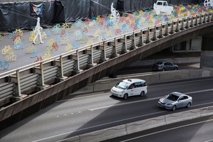
JS: With the bigger projects, like 30 apartments, there’s a whole different aesthetic and different spatial planning. Repetition is involved so the object you create has to resonate in multiples, and above and below and next to, whereas with a single house or a couple, although they have a dialogue with their surroundings and with each other, it’s a different dialogue. Repetition dialogue is really interesting. The tessellation and the linking and the communication between them becomes a part of the design. Patterning, whole apertures, solids and voids are created on a greater scale.
AH: Is it difficult to maintain that creativity cost-effectively with large-scale work?
JS: Many of our clients are trying to create something of value; that’s the key. Designing in a cost-effective manner can add to the creativity and still allows for beautiful design elements.
AH: Do you have a design approach or philosophy that’s inherent in everything you do?
JS: We always look at the context of the project we’re dealing with, which includes the site, the clients and the surrounding community.
JH: Form starts to make itself obvious with enough information. A response to site is one of the most powerful informers. When you immediately think it’s important to be oriented in this way or that, we take advantage of this aspect of the site, it feels natural and it feels right and it pushes the whole project along. If you have a good principle and a good concept early on, then it helps you make decisions right through to the very finish, say, to picking door handles, because you already have the reasons why you arrived here. The decisions become easier and more straightforward when you’re informed by your concept.
AH: Are there any materials you favour?
JH: It always starts with a simple palette and honesty in materials so, concrete, wood, iron and glass. Over time, you work on something and develop it and use it in a certain way – say concrete or brick or timber – and that enters your consciousness and you develop a language.
AH: And your clients see your previous work and like it and so it perpetuates?
JS: It does and, again, it brings that idea of developing a narrative to the fore: making sure that each project is designed for its own context and the people involved.
AH: Tell me about your team.
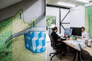
JS: Over time, we’ve picked up some fantastic people. Adam is amazing; he’s been with us for a couple of years. Kolin came on board last year from Siberia, so he can tell some very interesting stories about cold places and Tolstoy – he does incredible work. Will is interning with us at the moment and completing some lovely work.
JH: And we’re the two old men. But, with the team, it’s as much about people – we’re a small team and we all get on.
AH: What lies ahead for Matter?
JS: We will keep pushing innovation in our designs and technology in-house. We’re in the same industry as everyone else, continuing to develop our practice and project types, but the cost of doing that has gone berserk.
JH: What interests us now is whether or not we can inform or actually change something about that. It’s unlikely that simply replicating international models around cost-effective building will provide us with the best solution so we’re excited about developing our own solutions that are right for the New Zealand context.
***

Tree Villa
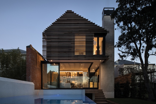
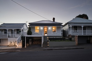
On a cramped, steep site on one of Ponsonby’s busiest residential streets, there was magic to be found in the form of a dilapidated 110-year-old 90m2 heritage villa.
Client objectives were to create a functional family home with privacy, garaging and a pool. We challenged the status quo and gave new life to this heritage building – connecting it to its site and community.
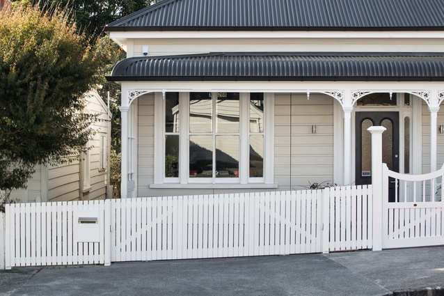
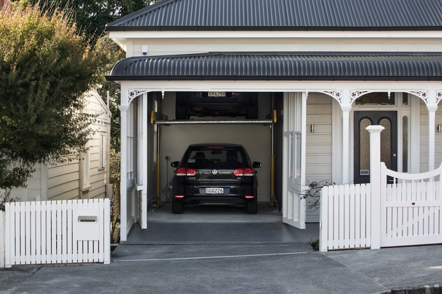
Garaging provision in the traditional sense was impossible so a drive-in garage and car stacker were installed in what was, originally, a front bedroom. The original villa façade was maintained in a seamless manner by retaining the weatherboards and joinery and integrating a hinged door for vehicle access.
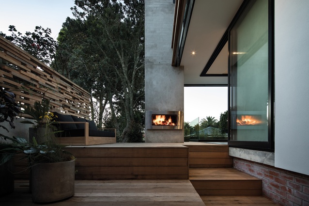
While maintaining the character and streetscape presence of this home, we created a multi-levelled sculptural extension to the north. Brick walls (referencing those found on site and throughout the neighbourhood), cranked at points, connect the new with the old, tectonically and referentially. Along with a masonry vertical element, the brick walls provide north-south structures for the second storey to bridge across, creating an illusion of weightlessness.
A cedar slat screen of differing widths randomly interspersed over the shades beneath, references the layering effect of the aged p-ohutukawa tree’s bark. A no-maintenance cladding system in dark shades of grey and glass-louvred joinery have created an ever-changing depth and shadowing effect.
Post-construction, the villa looks untouched from the front, contributing to the strong aesthetic and heritage of Ponsonby homes.
Sawtooth
The existing dwelling in Ponsonby was a worker’s cottage, typical of the era and area, with a pokey, cellular, dark lean-to at the back end, which required the majority of the work. The brief involved extending the back of the house to create more open living spaces that related to the rear yard, and to the views and field beyond.
In looking to extend the house, referencing the history of the area and the house made sense, and, rather than trying to extrude the existing form and materials to cover the extension, we decided to celebrate the change and embrace a sawtoothed roof form, using exposed steel framing and concrete floors, reminiscent of factories of the time.
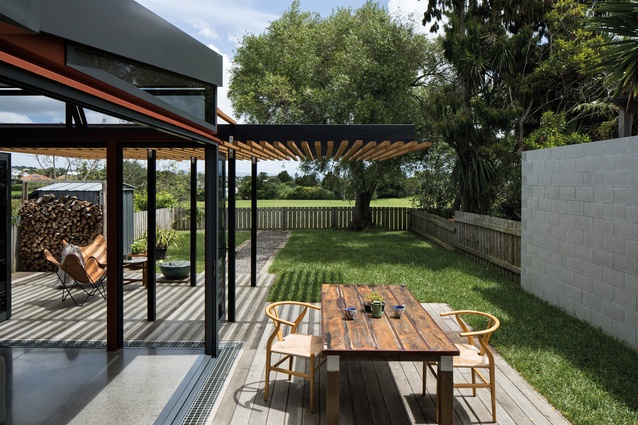
The essentially open-plan, staggered extension recognises the central hallway with rooms either side by creating outdoor ‘deck rooms’ in the missing area of the plan. This idea continues in the rear yard, where a central path runs to the back fence, leading you out into the surrounds with ‘grass rooms’ either side.
The floor levels of the extension were adjusted to create boundaries within the open plan and to meet the ground level of the rear yard, allowing you to take a journey from street to rear fence along a single axis but over several levels, tying the various elements of the house together. The front of the house was touched lightly with some new colour and retaining that gives a hint of the transformation beyond.
Castor Bay
After discussions with our clients, we decided to work with the existing brick-and-tile bungalow on this beautiful coastal site, perched on the side of the bay. It held a special place in their hearts, since they had lived there for many years and had transitioned from being a couple to being a family with their son and daughter, then three and five years old, respectively.
Our approach was to treat the existing home as a piece of cabinetry, removing the irrelevant and unloved areas and revealing the essence of the home upon which to add.
As we progressed through the concept process, ongoing meetings and discussions helped us refine and develop the brief as more information was added and the design solutions were created.
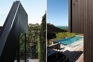
Additions came in the form of slotting new areas into the envelope of the existing home and using materials to highlight the new against the old. The new roof line mirrors the natural site contours, stretching out towards the view and allowing in diffuse light.

Point Chevalier
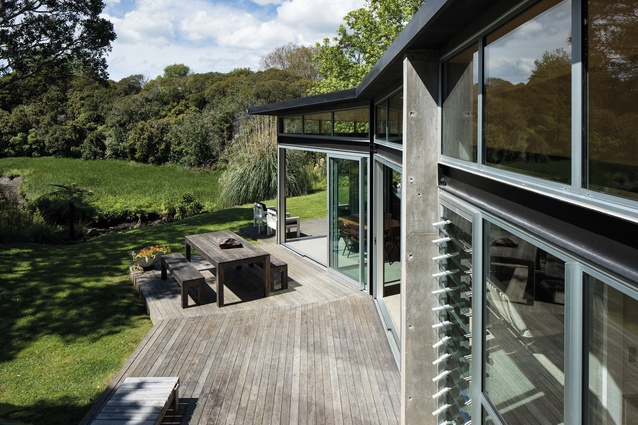
Our clients wanted to create a new build which embraced the beauty and natural setting of this suburban piece of land, featuring established po-hutukawa trees to the north and the reserve to the east, with a picturesque creek meandering by.
The design came from a contextual response to the location, emerging as a linear house form stretching across the site, orientated towards the sun paths and natural features. The split levels relate to the existing contours, naturally delineating between public and private areas, creating intimacy and open spaces, which capture the views and light.
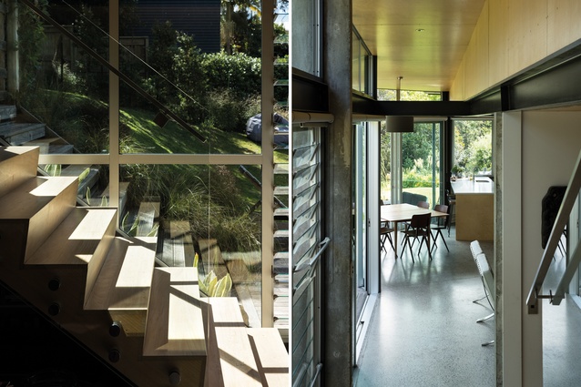
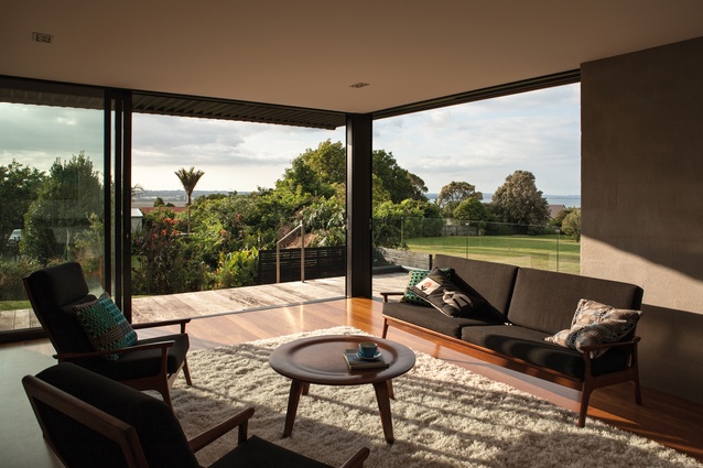
Using heavy, solid materials where the home is anchored and set into the ground and contrasting these with lighter construction forms endowed with high transparency in the north-facing living areas, we created soaring, double-height ceilings to capture the light and connect with the surrounding landscapes.
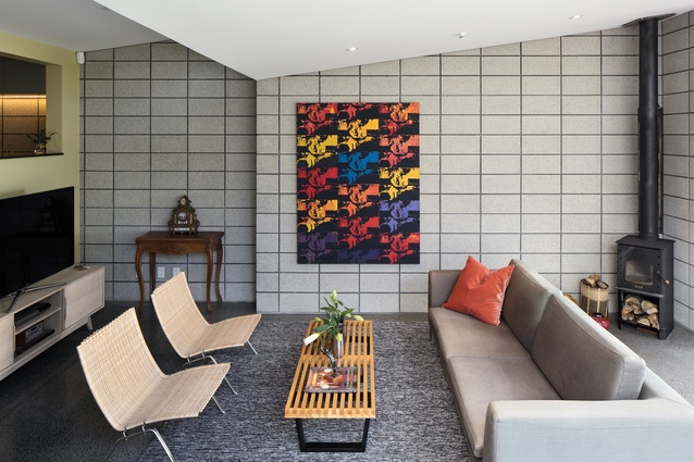
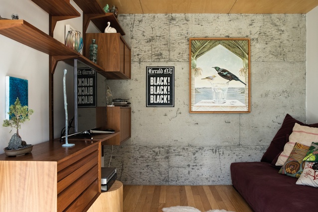
The interior palette is a reflection of the construction materials, pared back and exposed where desired: concrete, timber and steel. The solid mass of concrete offers a sense of warmth and acoustic calm, while the use of timber provides a softening effect.
On completion of the project, we shared a wine with our clients on the deck and it felt as though we were sitting beside a stream in the countryside. On a clear day, you can hear the animals in the zoo nearby calling to each other which, again, reinforces your connection with the natural world.
Waterview
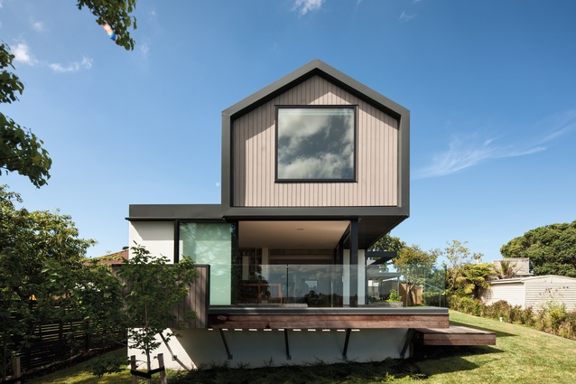
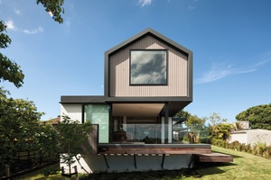
Budget, simplicity and tranquillity were the priorities for this new-build project on a suburban site, gently sloping down from the road towards a northern reserve, with sea views in the distance.
Our proposal consisted of carefully positioning simple forms and materials on site – creating rectangular floor plans stacked on top of one another. The upper level was to be slightly offset and cantilevering over the northern outdoor area below.
We designed a series of cantilevered masonry ballast walls, stretching from the ground to support the cedar and long-run-roofing-clad upper level. These masonry walls allowed for each area within the home to be defined, suspended between them, enabling slight level changes where desired.
To enhance the connection between the site and home, we chose to erode the layered cladding at selected points, overlapping, softening and, finally, disappearing towards the most beautiful views on the site.
This article first appeared in Houses magazine.


