Architects in Profile: McKinney+Windeatt Architects
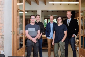
Jack and Bryan of McKinney+Windeatt Architects are a force to be reckoned with, despite seeming somewhat irreverent at times. At one architecture awards ceremony, in which each winning architect arrived at the podium and gave a considered acceptance speech, Jack stood up to accept his award and abruptly replied with a simple “thanks” before walking off-stage to much laughter from the audience. But this dry sense of humour is perhaps a necessary counterpoint to the dedication this firm shows in producing beautifully detailed and thoughtfully planned houses.
Justine Harvey: What brought you guys together?
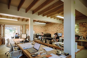
Jack McKinney: We both used to work at what was then called Patterson Co-Partners Architects. Bryan was down one end trying to get stuff built and sorted out on-site, and I was down the other end trying to work out how to divine stuff in a way that would be helpful. We were there for about three and a half years.
JH: Did you go straight into practice together after that?
JM: I went away for a bit of an OE, then came back, and Bryan had some work and needed help.
Bryan Windeatt: It kind of steamrolled from there.
JM: Yes, we worked out that between the two of us, we covered all the bases pretty well, so we’re a good combo in that regard.
JH: What do you each bring to the party?
BW: Sense of humour. [laughter]
JM: Resilience.
JH: Yes, you have to have a sense of humour in this game.
JM: Absolutely. Early on, we would collaborate on everything, wouldn’t we, Bryan? But, as we’ve become busier and bigger, that’s not possible, so now there are some ‘Bryan projects’ and some ‘Jack projects’ and some that we do together. But it depends on what the project is and what the client wants and what the dynamic is.
BW: There’s a good dynamic there to draw on and bounce off.
JM: The discussion we have is ‘what does the project want to be?’ We’ve always done a lot of alteration work, new houses and some commercial projects, but alterations are always a big puzzle. They’re quite tricky because you’re starting with a lot of elements that are in the wrong place and you may not be able to change, so the thinking around that needs to be more strategic, rather than just starting with a blank page. You can see what it is but ‘what is the best it can be?’
You can apply that [thinking] to any project. Instead of having a formal architectural language that we employ every time, we look at each project with a fresh perspective. Obviously we have tendencies in terms of how we like things, but you have to establish that proposition and take it from there design wise; then let it flow through.
We also like the guys in the office to have some input. We’d rather hear if something is wrong or hideous before it gets built! Critique along the way is valuable because once it’s out there, it’s fairly permanent. Although buildings don’t stick around as long as they used to!
JH: I imagine that it’s a challenge to transform villas and bungalows because, even if they look good, they’re typically functionally inadequate for the New Zealand climate.
JM: An adjunct to that is that villas were mass produced, they’re repetitive and then the context changes – so if you don’t want to repeat yourself after 12 years of villa alterations, then you have to get creative to reimagine the same house over and over again. That’s where working out who the clients are and what they want to bring to the project is a good way to make sure it becomes more of a one-off place. People love villas.
JH: And bungalows.
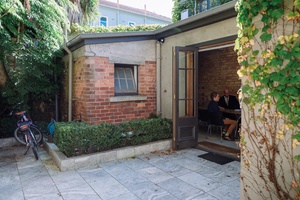
JM: Bungalows are even harder. But the main complexity is that you’re into conservation zoning, heritage and council planners enforcing rules that are fairly ambiguous and open to interpretation. Suddenly you have design decisions dictated by the Unitary Plan, which can be frustrating because we’ve worked out what your design wants to be and how to make it, but it becomes harder to make arbitrary changes if we feel they’re not in the best interests of the project. So, sometimes the heritage-approval process is a bit benign, and other times it’s more of a rocky road.
JH: When you first started your practice, what was your thinking in terms of what you wanted to achieve architecturally?
JM: We are still trying to achieve our best work, and we haven’t arrived there yet, so that hasn’t changed. When you start a business, what you need is an opportunity to do something; so every job has been an opportunity to do something, but it really takes a long time to build your client base and to start to do better things. You can’t just start your practice and say “Look, I’m just going to do cantilevered, concrete brutalist architecture” because nobody’s ringing you for that, you know! They’re saying “I have a garage I want to convert.”
So we’ve pretty much sucked it up for a long time but, to do that, you have to say “there is an opportunity with this project to make a difference, to make it better, so how can we be clever about this?” You learn a lot by not starting with your ideal project and working towards it, then all of that learning can be applied to your current thinking.
JH: I think it must be hard for child film stars and sportspeople who have ‘their moments’ early on but they know the rest of their careers will probably never reach that height.
JM: Yes, I’m fascinated by that in relation to architects too. Does everyone have just one peak? How does it work?
JH: I think architects tend to peak in their fifties, don’t they?
JM: Yes, right. And visual artists have all those dark paintings at the end of their careers, when they’re all black. Can we apply this to architects’ works as well – the bleak black period just before they retire or die? What’s going on? [laughter]
JH: I don’t think architects retire, do they?
JM: Well, it would be a disaster if they peaked too early then, wouldn’t it?
***

Scotts Landing • Mahurangi • 2017
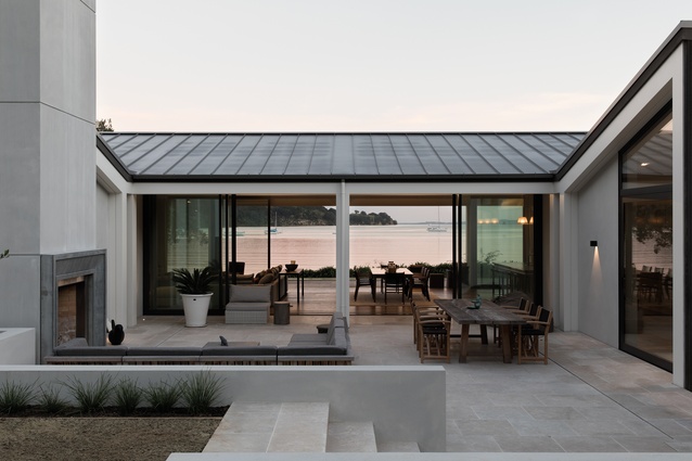
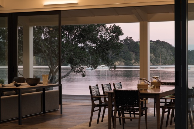
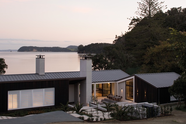
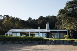
This recently completed coastal home is sited at Scotts Landing, an inlet on the end of the Mahurangi peninsula south-east of Warkworth. It is sculptural and still calm and well-mannered. A single-storeyed pavilion, the houses faces south over a view of paradise, with the beach just a stone’s throw away. The design taps into a rural vernacular but is made modern by being well-composed with rigorous geometry and a devilish attention to detail.
“We were interested in the roofline,” explains Jack McKinney. “It’s a play on gables but with an inverted butterfly roof. You approach the site from up high, and the roof is the first thing that you see, so this fifth elevation had some significance and needed to be well-composed.”
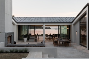
The house features an overscaled timber-frame verandah with a reinforced masonry wall structure. A white, painted timber skeleton contrasts a dark-stained, vertically-clad timber skin and matching seamed metal roof and creates a ribbon effect – rolling in and around the corners of the form. A monolithic chimney anchors a U-shaped courtyard on the northern side facing the sun, providing the main entry point to the house.
Cleverly planned to suit the site, the bedrooms are located at each end, with the main living area, verandah and courtyard concentrated in the middle to contain the view as well as north-facing sun and shelter, giving a real sense of privacy.
“There are other houses scattered around the area,” says McKinney, “but you’re not aware of other houses when you’re there. Contextually I think it works well and is subtle for a fairly large house; it’s not strong and dominating like some houses.”
Poured House • Auckland • 2015
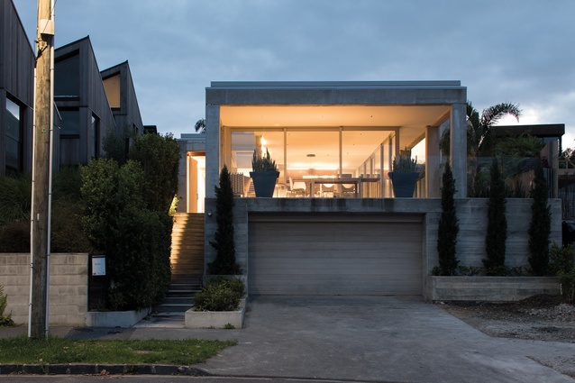
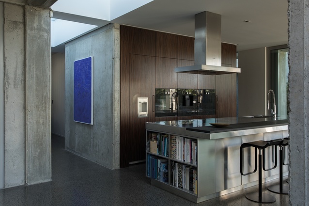
In Auckland’s fashionable city-fringe suburb of Grey Lynn, this concrete house was designed for a dynamic builder client, who also built the project. “Our client works on building sites, and he knows how he wants to do things, so we factored that into our design thinking,” says McKinney.

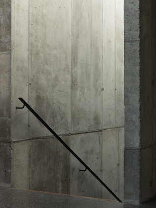
“So instead of our fastidious fascination with alignment and modularity, 10mm here and there, negative detailing and perfection, we thought it could be nice to create something a bit more rugged – a bit less contrived in a way. He’s really good at concrete and has all these cool Brazilian builder guys who work for him and they all understand concrete. Basically, we looked at the client and thought, ‘he’s good at concrete so he can have a concrete house’!”
Sited on a long and narrow east-facing site with an outlook over Grey Lynn Park, the house is layered up the hill, with a garden to one side. “It’s a typical villa-type site but with no heritage or character controls – and an excellent architectural neighbour (architect Richard Naish of RTA Studio),” McKinney comments.
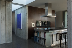
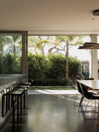
The building is semi-embedded into the ground, with a garage dug into the hillside at street level. You enter at first-floor level up external stairs to one side. At this level, a big verandah addresses the street with set-back glazing, benefiting from the morning and afternoon sun and the park. This frontage is characterised by big, hefty concrete columns: “It’s almost Roman,” explains McKinney.
“It has a classical language although it’s not a classical house. We are hoping it will age well. A big external sheltered space is the best type of Auckland house, with heaps of outdoor cover because it rains three times a day. It’s in the genre of that great little house on Heke Street [Freeman’s Bay, Auckland] by David Mitchell and Julie Stout, which is half verandah, where it’s about the outdoor space as much as the indoor space.”
More Grown-up House • Auckland • 2005
This elegant house in Ponsonby is one of McKinney and Windeatt’s earlier houses. “It’s one where we wouldn’t change anything about it as it has stood the test of time; it’s been a really good project for us. At the time, we thought we were being overly conservative architecturally; you graduate from university and you want to create some cantilevers and some drama so, partly, it’s called More Grown-Up House because it’s a bit more grown-up!”

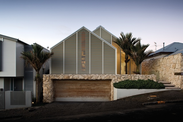
Built on a difficult, constrained site, this 370m2 house features a simple stripped-back gable at the front, with external timber louvres creating privacy to and from the street. “In section, it’s like a giant staircase that steps down,” says McKinney.
“It has a lot of layering in it, even though it’s a very clean, clear obvious form. It’s been impeccably executed in terms of construction and detailing, with negative detailing on either side of the house that needed to be in exactly the same place because it was so small and constrained, so you change one thing and it affects everything else. Every change has a consequence.”
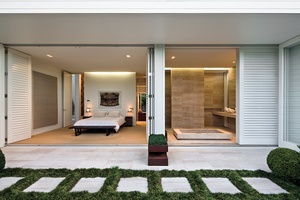
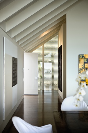
This is essentially a carefully detailed timber structure that sits atop a rocky plinth, which is the lower-level car park. The main entrance is approached via a bridge that crosses a courtyard garden that is cut into the hill. The living space opens up to a harbour view and follows the volume of the gable, with the ridge split to form a continuous skylight running the length of the house – a common tactic in McKinney+ Windeatt’s work.
At the lower level, stone work is more dominant than timber. Here, the rooms follow the contour of the land, stepping down along a long gallery, then culminating in a bedroom suite that opens up to a lush private garden.
Misaligned House • Auckland • 2012
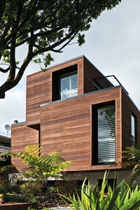
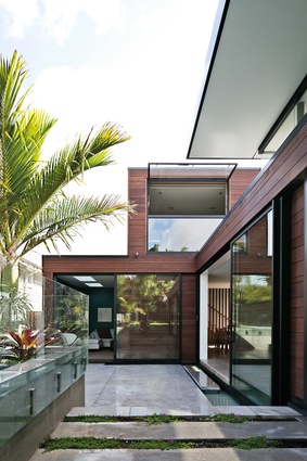
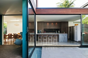
While Misaligned House appears like a series of timber crates haphazardly stacked on top of one another, it still fits nicely in with its inner-city neighbours in terms of scale and grain. The boxes taper and align to accommodate the natural contour of the land and the surrounding trees.
Sited in Cox’s Bay on a narrow plot with a long northern boundary, the architects have designed the living areas, outdoor dining space and a pool to maximise the northern light along this edge. “One of the things that we’re quite good at is achieving spaces that feel really great; that’s quite an intuitive thing,” says McKinney.
“We’re always looking for clarity in some sense; we’re not after a whole lot of visual complexity. A lot of what’s driving the design detail is to pare it back and remove all the static of things that don’t line up and any horrible junctions… but not at the expense of subtlety of experience. But the final experience of how the space actually feels is to do with its proportion, textural elements and how the light’s coming in – all the ineffable stuff that’s quite hard to quantify.”

