Artisanal values: Fish Creek House
Robust, tactile and honest, the design of this new house by Edition Office responds instinctively to its setting, celebrating the human experience and artisanal values.
The site for Fish Creek House by Edition Office runs along a ridgeline in Victoria’s Gippsland, closely adjacent to the main road. A powerline along the edge of the property restricts the building’s footprint on an already narrow site and weather conditions are windy most of the year. What makes the location so special despite these challenges, and why owners Jackie and Richard Dargaville spent five years looking for it, is the panoramic view of Wilsons Promontory National Park.
Jackie and Richard had a strong directive about how they wanted to live. During the building of what would be their permanent home, the retired couple purchased a one-bedroom apartment in Breathe Architecture’s Nightingale project in Brunswick, as a base for their visits to Melbourne. They are actively engaged with issues surrounding design and environmental and social sustainability, and are committed to a lifestyle that has low environmental impact.
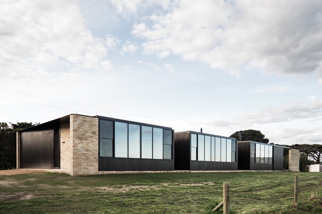
Further to creating a sustainable home, the couple’s brief to Edition Office was to design a dwelling that was comfortable for just the two of them, but could also accommodate their seven children and twelve grandchildren when required. Using a linear plan made sense to meet this brief. Three skewed pavilions are arranged side by side, with the guest bedrooms located in the southernmost pavilion, closed off from the rest of the house when not in use. The pavilions are punctuated by courtyards, which help to slice the house into its various components and retain privacy for guests.
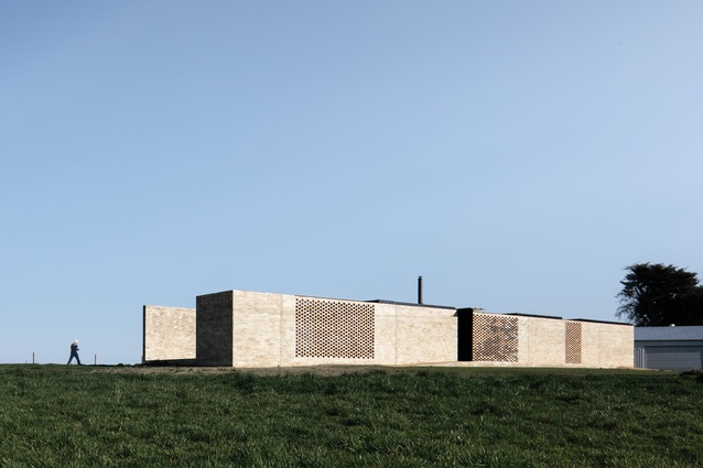
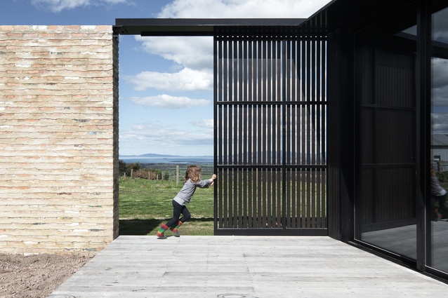
Turning the building away from the road was an instinctual design decision, and this gave rise to the concept of a long, heavy masonry wall that “hugs” the pavilions, which open up to the impressive views. This clear concept was settled on from the start, and although pushed and pulled to fit the brief, it is strongly evident in the finished home.
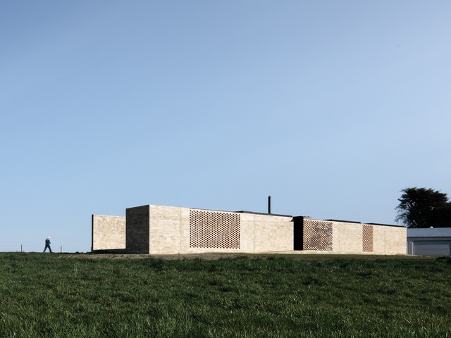
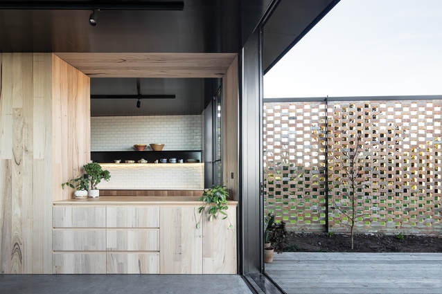
The plan of Fish Creek House is expanded and contracted, the clever arrangement of courtyards and pavilions creating a sense of spatial play. In section, the house appears as a flat-roofed, linear box. The “hugging” brick wall is instrumental in making this arrangement work – although it reads as the one object, it is broken down into hit-and-miss breezeway walls at the points where the courtyards are situated. This allows light and ventilation to penetrate deep into the plan and creates an animated shadow play across the course of the day and into the evening.
The solid parts of the brick wall were made with a customized mortar technique, such that the bricks appear narrower than they are. The intention here was to add another layer of shadow and depth to the wall. The resulting texture is so alluring that the original decision to paint the wall white was overturned.
“The idea was that you’d paint the wall, then the paintwork would peel away and it would look like an ageing relic of sorts,” says Aaron Roberts, who co-directs Edition Office with Kim Bridgland. “But when we saw the brick wall, we just couldn’t paint it.” This textural, layered approach is often seen in contemporary Australian residential architecture and suggests a desire for clarity of form without the perceived modernist sterility.
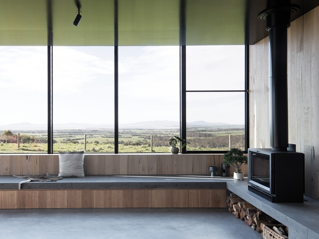
Although the undeniably spectacular landscape is important to this project, the success of the architecture isn’t dependent on the view. The design is more about offering a series of framed vistas that foster connections with the landscape, add drama to the circulation spine and choreograph lines of sight. When you arrive at the house you are faced with the brick wall, which conceals the majority of the skyline; you then follow the wall to the entry, where you can see a snippet of the national park from the entry courtyard.
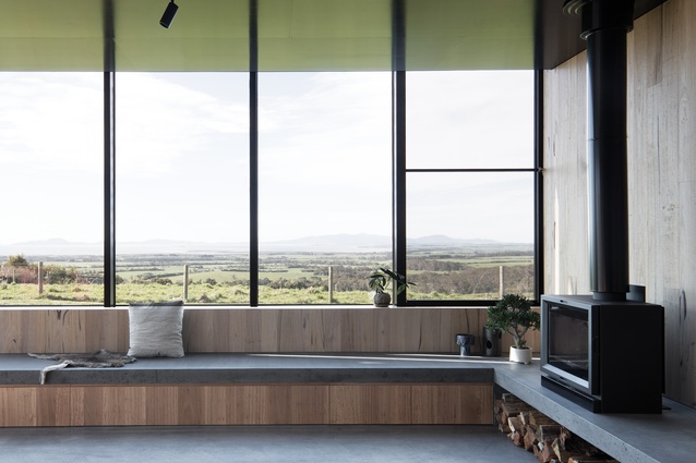
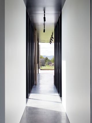
Finally, the full length of Wilsons Promontory is revealed from the main living room. Along the corridor, slithers of view are captured between pavilions, and from the interior you can see from one space to another, across the courtyards.
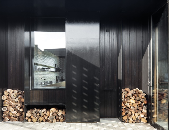
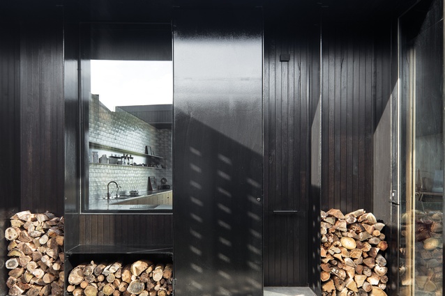
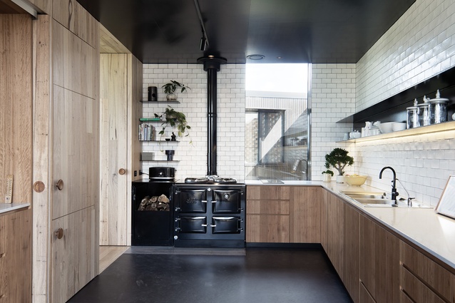
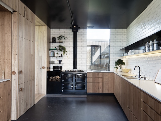
The Fish Creek House is a robust, tactile and honest farm building. “We wanted to avoid making a ‘sharp’ building,” says Kim. The crisp lines of the black steelwork offset the roughness of the recycled brick wall, and when the courtyard gardens grow, they’ll soften the industrial material palette. In a similar way to the combination of brick and steel, the texture and patina of the silvertop ash interior walls is offset by the black formply ceiling surface.
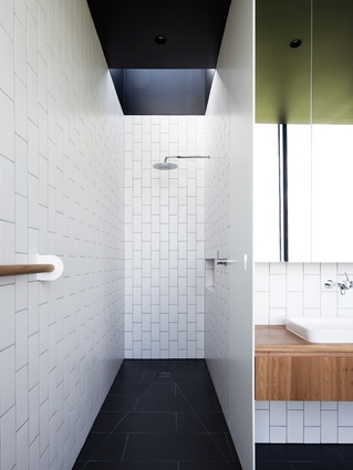
Rather than appearing heavy and dark, as you might expect from a black surface, the ceiling reflects the colours in the landscape and almost disappears. Attention to detail in this project goes right down to the custom gumboot-storage space – a timber dowel cast upright into the honed concrete floor – and the towel hooks, which have been custom designed to also hold a bag when required.
Fish Creek House isn’t “tricked-up” architecture – it’s grounded and modest in its intentions and celebrates artisanal values. Architecture is too often more about status than human experience, but the focus here is definitely the latter.

