ASB North Wharf
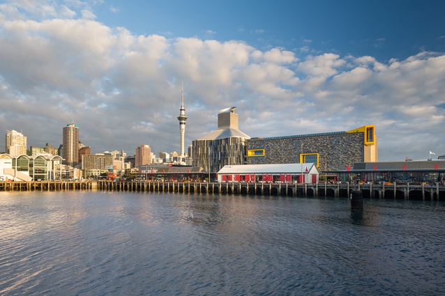
Something big has arrived at Auckland’s waterfront and it’s not the America’s Cup or a visiting billionaire’s mega-yacht. The ASB Bank’s new headquarters by BVN Donovan Hill, in association with Jasmax, is, however, a flagship and a pretty flash one too.
The Wynyard Quarter is the site of Auckland waterfront’s largest urban regeneration scheme; it is an old industrial port area that will evolve over a 20-year time frame to provide new retail, commercial and residential space for 3,000 to 4,000 residents and a working population of 12,000 to 15,000. The ASB headquarters is the first big building here and is both closest to the city and the ASB’s new corporate face. This part of Wynyard Quarter is also slated to be an ‘Innovation Quarter’, whatever that is. According to the Council agency Waterfront Auckland, it’s an ‘ITC and digital media hub’ where ‘entrepreneurs and multinational companies’ rub shoulders, and apparently ‘stylish workplaces’ will be de rigueur. This is, of course, a very sensible reaction to that last boom and subsequent bust in which the fancy boardroom was felt to be the key element in corporate success. As we all know these days, in our 21st-century virtual world, it’s all about branding and perception and style trumps substance most of the time.

So, the first of Wynyard Quarter’s ‘stylish workplaces’ is the new ASB and as it is the closest new building to the precinct entrance, the planners faced some very specific bulk and location requirements for this gateway building. It had to be split into two blocks and the easternmost building (site 23 in their terminology) had to reach a certain height. Most criticism of the ASB’s new building, however, has centred on a planning rather than an architectural issue – its very presence here. Is a bank the right face of this new urban environment? Is a bank branch tucked into the undercroft of a building your best first encounter with this advanced urban environment – even if it does have ‘ASB Innovation Lab’ written across it? This issue of active edges is a key urban design one and, although this banking foyer and lobby do incorporate a café around the back, there is a lot of inactive space as the ‘concierge’ area of the complex is on the next floor up. The second and western block (site 22) is much more successful in its street-front habitation, with a large number of tenancies already occupied. The space between and around the two blocks of the complex is laced with lanes and there is potential for more retail space here but, of course, no one is colonising it at the moment since the southern neighbours are currently a building site and a very large, blank-walled fish factory. There is hope, however, that the Auckland Theatre Company’s proposed theatre in this location could see this part of the patch improve.
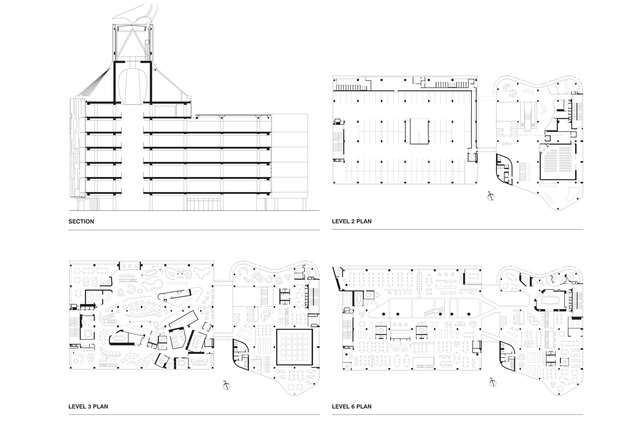
The whole ASB complex has one entry through that dark undercroft. It’s not the most alluring invitation to enter the building and, once inside, you need to dog-leg up to the next level to do the electronic formalities – reception areas are passé. Most visitors stay here to meet with ASB staff in spaces on this level; however, the area also contains a large, multi-purpose cube space that can serve as an auditorium and be kitted out as a theatre space. This and the expansive bar-serviced area around it will ideally be integrated by bridge into the ATC theatre next door. And, as the big cube also opens onto a large balcony over Halsey Street, these links will considerably add to the energy and ambience of both buildings by opening up a variety of spatial options for performance.
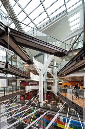
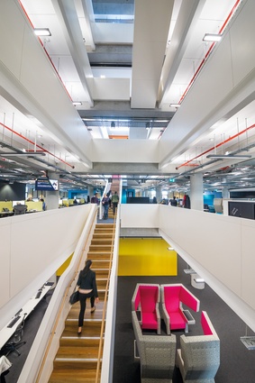
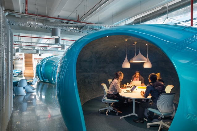
A multi-storeyed glazed link joins the two blocks together and from Level 3 it’s one huge environment with multiple floors, but most of these open to each other at various points throughout the height of the building. The ASB has quite an architectural history in Auckland, not just for a century of suburban banks but in the way it has more recently explored new work environments for its staff, particularly in Albany’s C:Drive and Takapuna’s Sovereign building. Activity Based Working is the methodology here and there are more than 15 themed ‘neighbourhoods’ with no offices or cubicles. It’s an interior designer’s paradise and you are free to roam and find the environment that suits your current needs but there is no place to call home. The flexibility and variety is a plus but, on the other hand, this can de-personalise the workplace. There is a buzz and vitality to the place, but with nowhere to plant yourself on a semi-permanent basis, it can feel like a busy hive full of human resource units. There is terrific variety of form, colour and lighting but, perhaps because everything stems from the hand of the same designers, it has the all-encompassing design-conscious quality of any highly artificial environment, such as airport or mall, unleavened by any personal touches of its perpetually transient inhabitants.

Toilets and lifts are purposely corralled in one corner of the building and this compels people to move around by stair, creating much more of a welcome village-like sense of place, different from the territorial encampments that characterise most multi-storeyed office environments. There is certainly much less sense of hierarchy. I am sure there is a sneaky efficiency at work here as well, in terms of upping efficiency by reducing floor area per person but I’m told that increased social interaction has reduced the number of intra-office emails, so that has to be a plus.
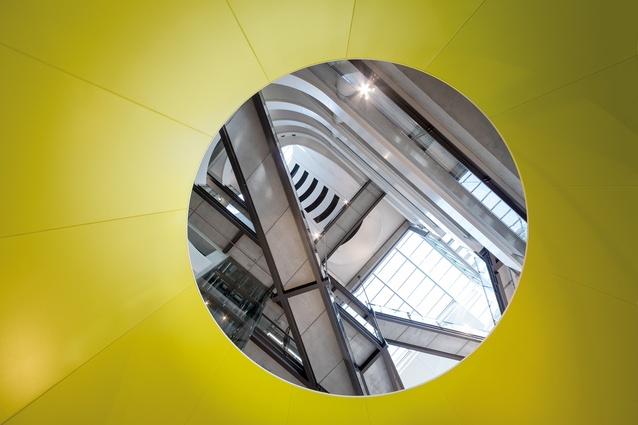
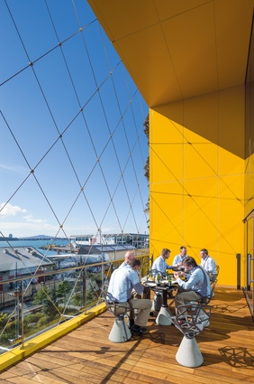
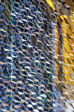
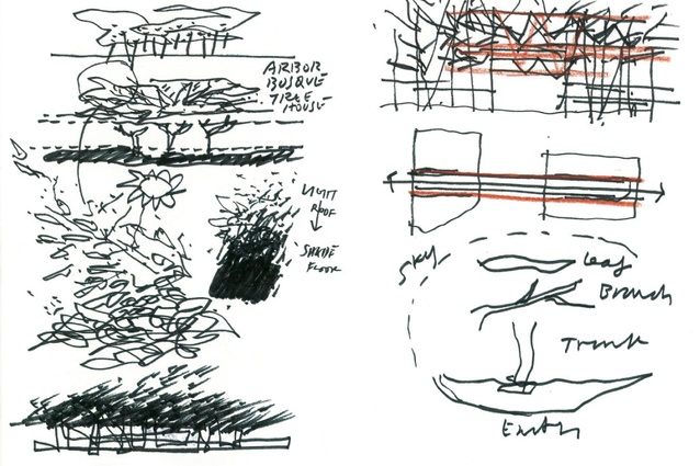
The whole place is ventilated by a combination of regular air conditioning and a fresh-air displacement system, but it’s the latter that contributes most notably to the character of the building with the giant funnel and cube that crown the complex being necessary to create the right air conditions for the system to work. There is light at the end of the funnel as well; a reflector scoops welcome daylight down into the upper regions of the complex. Similarly, the much-commented-on screens of the exterior of the north face of both blocks are primarily designed to provide 65 per cent shading to the interior. It is a refreshing change that this is a building that is all about its interior, its work environment; but this is also a weakness in the extent that this introspective nature seems to take primacy over the role of the building as a key element and cornerstone in the urban design of the precinct. Likewise, the large expanses of fire egress stairs on the outside of the building show more of a concern with the preservation of interior space than with the building’s external expression. Rather than being buried in the building and occupying valuable floor space, they are spread along the exterior. This is okay at the western end, where they add an industrial aesthetic to a lane but, on Halsey Street, they reduce retail area and an active edge on an important gateway intersection – although they
do provide a handy spot for large advertising banners.
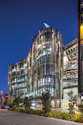
The building’s Michael Parekowhai artwork, based on Cuisenaire rods, does a good job of enlivening the lane space and atrium but also, I suspect, makes wry reference to the somewhat Lego-like nature of the building’s appearance. ASB has the monster blockiness of a contemporary container ship and its large-scale, squared-off, glossily finished features seem to have the slightly alien nature of ship fittings – funnels, fender and forecastle – rather than the more human-scale elements of street-friendly buildings we are used to. This nautical aspect may seem suitable to its waterfront location but, from the outside, the place feels cruise liner-like, free floating, slightly adrift from its environment and ready to head out to sea. Like a ship or an aircraft, its colours are almost entirely corporate: chosen not for any environmental reasons but because those are ASB’s colours – branding as building.
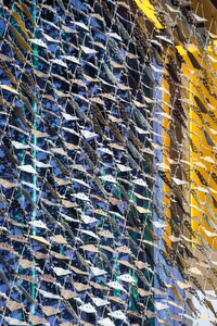
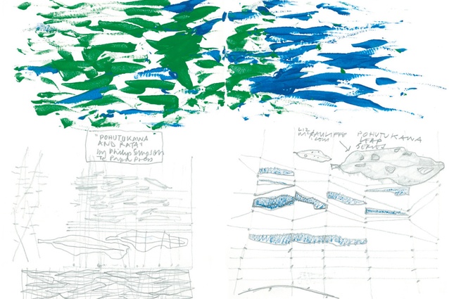
What comes as somewhat of a surprise is that those screens on the exterior also mean something. ASB asked for a sense of ‘New Zealand-ness’ and the architect settled on an abstraction of the pohutukawa, native to the northern coastal regions of Te Ika-a-Maui, where ASB Bank is also endemic. The eastern building’s fins are intended to be redolent of the bark of the tree, while the western screen was generated from an artist’s image of decaying leaves. Despite the subtlety of abstraction, this badge-of-identity business once again reduces a building in this context to the level of branding. This is another aspect of corporate representation appropriating aspects of our cultural and national life for its own advancement one suspects, in the same way that the building has also draped itself in messages of sympathy and pride in response to Team New Zealand’s recent America’s Cup misadventures. It’s probably worth noting that the building’s architects are Australian; can we expect a nuanced view of national identity from outsiders? A local approach would perhaps have explored cultural and environmental aspects of our lives, both future and past, in a more subtle and layered way and, perhaps, reflected on the more-immediate context and heritage of the site, on reclaimed land where shell banks and sea life were suffocated and sacrificed for the sake of the city’s progress. And, once parts of a building start to symbolise things, then a Pandora’s box of interpretation is opened – for example, it’s obvious to me what the main screen is, despite the scale of the place reducing the screens to glitzy tinsel-like accoutrements – a still, gigantic net slung alongside a merchant vessel, bulging with silvery bounty.
So, ASB will be one of Auckland’s most-discussed new buildings and that’s a good thing. Time will tell, however, whether what we see here, in the Wynyard Quarter’s first major building, is a welcome addition to the urban environment for its inhabitants and Aucklanders alike: the shape of things to come in the brave new world of a high-tech innovation precinct.

