AUT University’s Sir Paul Reeves Building
The year AIT swapped their ‘I’ for a ‘U’, I was in 7th form, making decisions about which university to attend. Despite AIT’s promotion, I remember being dismissive of this so-called ‘university’ so I find it interesting to realise how much AUT University (AUT) has repositioned itself as both an academic institution and a brand in just 13 years. A substantial amount of this reputation-building has happened in tandem with physical building and the new Sir Paul Reeves Building, designed by Jasmax, is a particularly significant milestone both as an urban transformation and a strategic one.
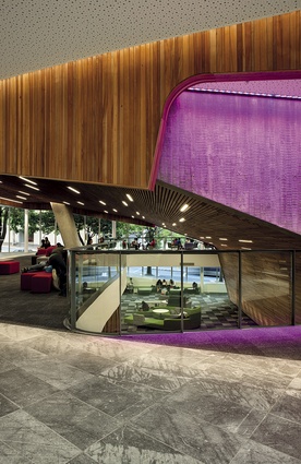
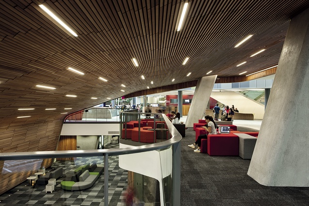
Walking into the cavernous atrium, one is struck by how international it feels. (And indeed research trips by the designers to universities in the United States and Australia meant the brief mirrored the future-looking direction of those top academic institutions.) Curves are everywhere: not swirling around you in arcing sweeps but in contained and consistent ways with radiuses connecting straight lines. The effect is both futuristic and nurturing.
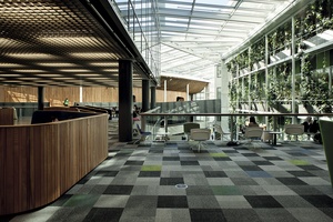
Every surface seems to be of a different material – the bridges are edged in steel, the lecture theatre’s concrete form is sheathed in a drape of cherry beech and there are stone floors, plywood, a greenwall, imprinted concrete and glass. It feels as though it should feel cluttered or haphazard but it doesn’t. Instead, there is a richness and tactility from all these layered surfaces. They’re not entirely disparate either; those straight-lined curves bound every wall, bridge, gateway or structural member, and grids are another consistent motif – the rectilinear grid above the café area and the billowing parametric ceiling encasing the lecture theatres. Even the hanging plants forming a lattice.
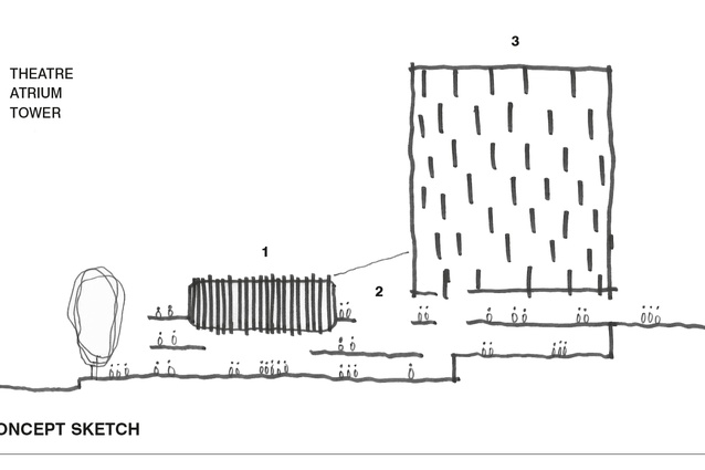
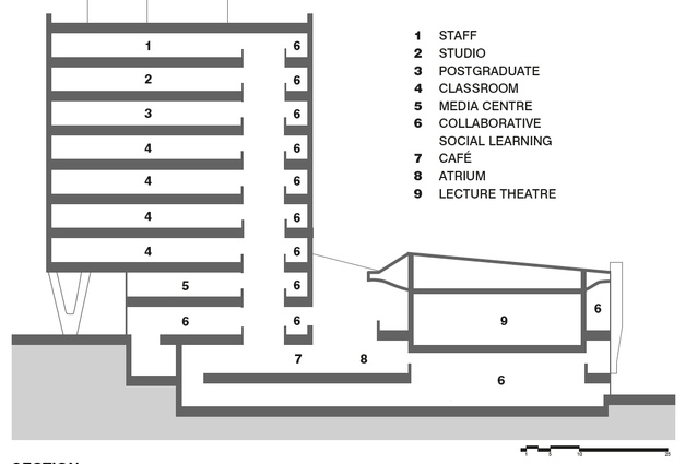
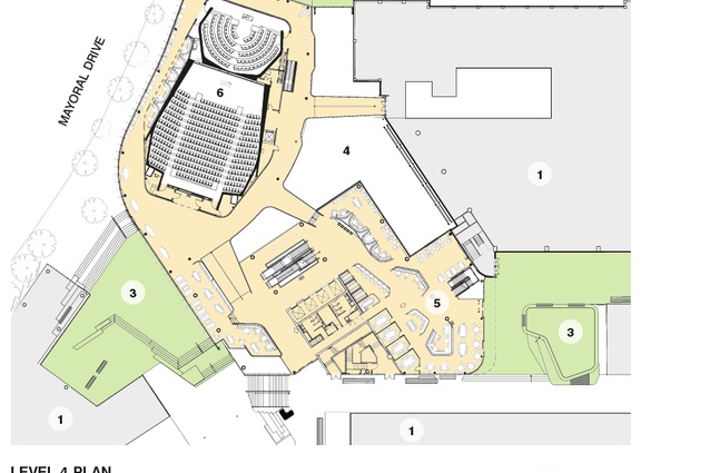
One of the difficulties with the site – that ground level rises four stories over the site’s footprint and this building connects four existing buildings each of which has its own set of floor levels – has become a defining strength. Layering isn’t an artifice here, it is absolutely central to its context and so the deft weaving of bridges, balconies, walkways and concourse to tie together the multiple points of entry makes this building feel dense in all the best senses of the word – bustling, lively, animated. The curving forms of different levels crossing and cantilevering over each other create surprising and poetic views through the building, and the transparency and open sight lines mean this building, for all its seeming complexity, is actually easily understood, and where you need to go and how things connect seem intuitive.
That the planning seems intuitive and organic is a sign of how well it works. This is a building of movement – consider that 4,000 people, or the population of Warkworth or Lyttelton, are often in this building at peak times, with spaces swelling with bodies at the start and finish of lectures. This is a building of circulation and flow but, within this, carving out spaces for study and seating was just as important.

This building is rooted in educational theory: how students learn both in and outside the classroom. Using and applying knowledge has become more essential and this more-practical approach is a strategic differentiator of AUT’s academic offering. Peer-to-peer learning, with students connected to multiple devices, communicating and collaborating with each other is considered as important as are traditional lectures. Even within the teaching tower, the classrooms follow an educational idea of blended learning, where a large flexible space can be used for lectures or group work, and the desking and multiple screens are all on wheels and moveable, so they can be reconfigured easily into different spatial arrangements within the room.
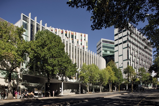
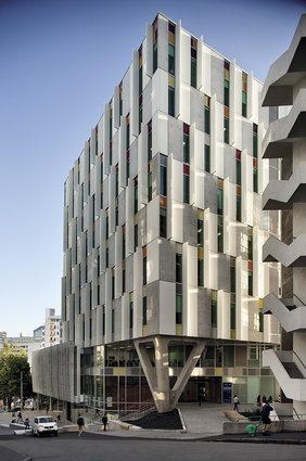
The teaching tower is an elegant addition to the city. There is confidence in the Wardell-esque concrete sunshades that are not pressed or decorated in any way (on the exterior at least) but for the elevation’s checker-board arrangement. These are less successful from the inside the tower when you find your view bludgeoned by these heavy panels, though this is likely to
be a functional brief to block western sun from laptops.
While function and usability have been considered throughout, the building’s success really comes from a brief guided by three of AUT’s strategic visions: to engage the community; enhance academic learning; and enhance the campus.
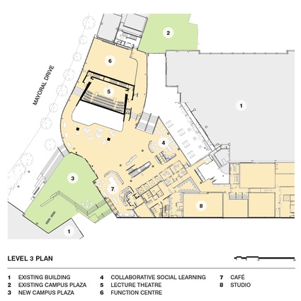
The first stage of this building’s design process was masterplanning. Jasmax was engaged to work on AUT’s Masterplan from as far back as the 1980s, and this is an open document, continually updated. The Mayoral Drive frontage – a gentle curve that follows the road – was of special importance as an urban design element regarding how this building relates to its context and how it links the entire AUT precinct. Interestingly, this project was considered as a precinct rather than a building, which nods to the significance of its urban design elements of gateway, thoroughfare and connection.
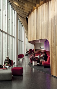
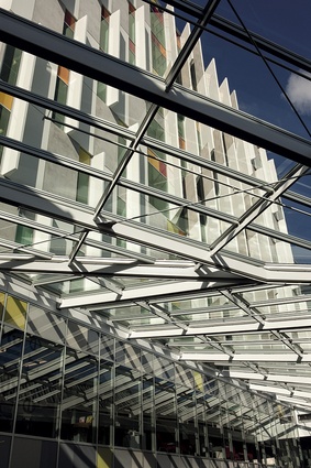
Jasmax’s Chris Scott spoke about the huge floor-to-ceiling glass wall that creates the city edge to the atrium space as a ‘shop front’, allowing those in the city to see what is happening inside AUT. When I visited, having not spoken to Scott yet, I was struck by the same idea but from the opposite point of view – that the glass resolutely connects the university and the students into the city – that the university isn’t a stand-alone silo, but engaged with its environment, and visibly leads out to the commerce and opportunities of the city.
Between this shop front area of the atrium and the Business School is a pedestrian plaza that replaces the service road that formerly divided the campus, creating a gateway to the Learning Quarter. Anchoring the Sir Paul Reeves Building is a huge triangular structural support that, too, borrows the same radial language as has the building to create a sculptural cornerstone to this space. Street furniture and gardens also take on the curved language in a way that feels like Jasmax briefed their designers on the basic visual language and gave them quite a lot of freedom – there’s a welcome sense of multiple authors here in a way that makes everything feel fun, slightly off-kilter, a little playful. Design language can sometimes be strangled with obsessiveness; here, however, there has been some experimentation and novelty, and this translates well into a building for people learning and discovering.
This is a building very much of its time. To me, it responds cleverly and flexibly to a changing world. The curves feel very contemporary and, yes, as things which are very ‘now’ are want to do, this building will likely date over the next few decades. But I don’t think that’s a bad thing or even something to be avoided. Timeless design is a myth and, even if it weren’t an impossibility, it would be a boring aim. Architecture is a mirror of society and here is AUT’s idea of itself reflected for the city to see.

