Quality over ostentation: Balmoral House
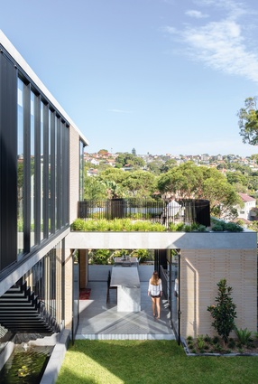
A series of stacked interconnected volumes that carefully negotiate a tricky wedge-shaped site provided the solution for a client wishing to downsize their home without compromising amenity.
Australia holds the inglorious record of having some of the largest houses in the world, placed behind only the United States in terms of average size. Bigger is generally seen as better. There are, however, instances where clients are seeing the benefits of better designed, smaller homes that offer greater amenity and less maintenance. The Balmoral House designed by Chrofi, for example, sits on just half the land area of its neighbours. Though not a particularly small house compared to the national average, it represents a significant downsize for the clients and delivers an upgrade to family life.
The clients’ previous home on Sydney’s North Shore was a rambling, multistorey house with poor connection between the living spaces and the terraced gardens. All their free time was spent maintaining a garden they didn’t use. When looking for a site to build their new family home, the clients were content to reduce the floor space they were accustomed to in order to increase amenity.
With the goal of getting a better home out of a smaller plot, they approached Chrofi and left it up to them to come up with the best solution. Steven Fighera, director at Chrofi, says it “was very unusual that [the] client didn’t give us a fixed brief,” while the clients acknowledge, “we’re not the experts, the architects are … we looked to them to propose the best house for us.” A desire for access to light and views, connection to the garden and for maintaining the neighbours’ amenity drove the design.

Located in Balmoral on Sydney’s North Shore, the site drops steeply from the street level towards the harbour. In the clients’ previous house, the living spaces were on the upper level and the bedrooms on the lower levels. They didn’t want this again, as it meant there was a disconnect between the living spaces and the garden.
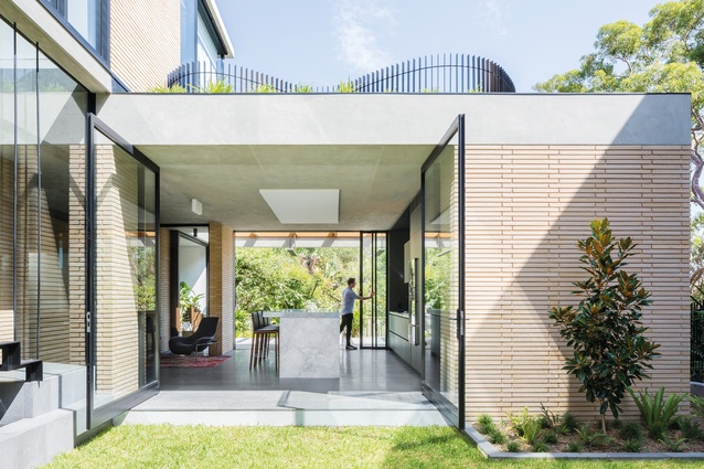
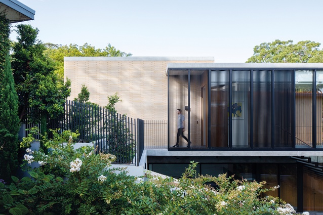
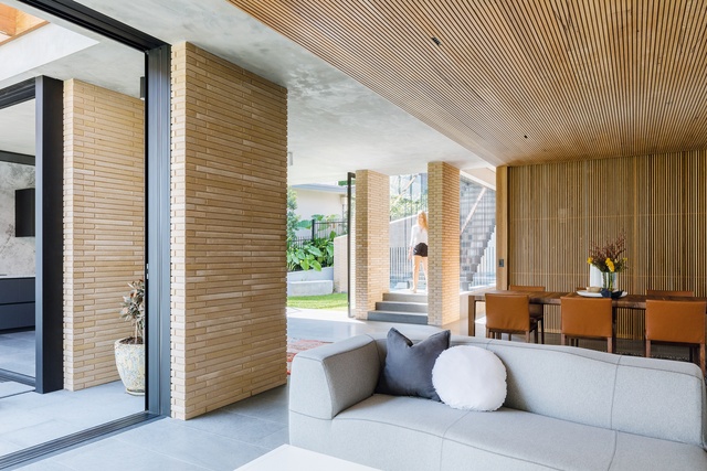
The lower level of Balmoral House is conceived as an interconnected set of living spaces, some more secluded and private – such as the children’s room at the rear – and others more open, such as the kitchen and family room. Steven says that while all the spaces have visual connection to each other the design is consciously not “open plan.” Clad in Roman-style bricks, structural fins mark out the staggered spaces and direct the eye toward the view.
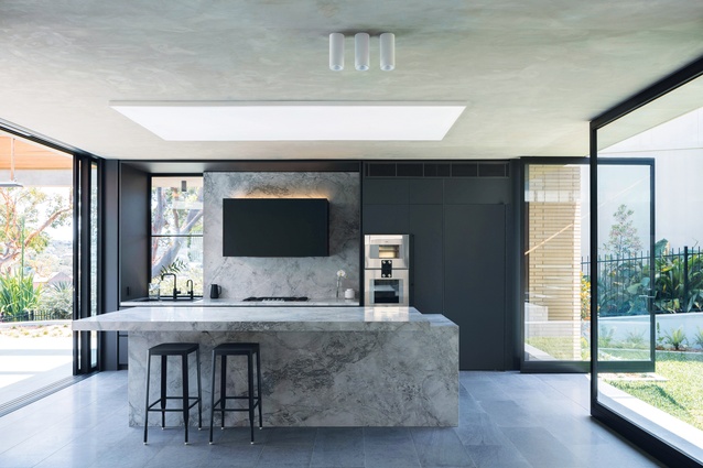
The kitchen has a triple aspect and is the heart of the house. It connects to the inner courtyard garden and upward to the street, outward toward the harbour and across the family room with a borrowed view. Clad in marble, the veined grey countertops work in dialogue with the dark grey joinery and the softer greys of the Basaltina floor and skimmed concrete ceilings. While the clients were very hands-off about the brief, they collaborated closely with the architects in choosing materials – right down to the selection of individual stone slabs for the kitchen.
The clients and architects shared the same aesthetic vision to “keep the material palette consistent and to a minimum.” Restraint and a sense of “quality over ostentation” guided the interior and exterior materials, a characteristic seen throughout Chrofi’s body of work. The clients also worked very closely with the architects to ensure that the lighting was just right for their needs. All spaces have concealed indirect lighting sources as well as recessed direct lighting. Exposed fittings are not “features” but subtle additional elements to the ceiling plane.
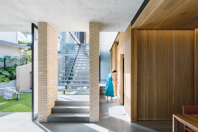
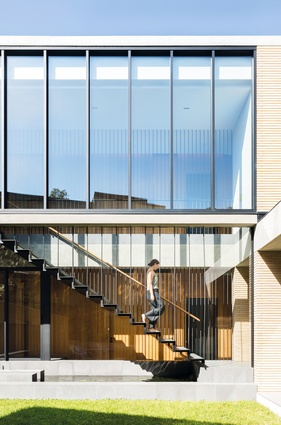
In order to get as much light as possible into the lower living level, Chrofi designed a staircase with clear glass risers. This means that the stairwell is not dark or overwhelming; instead, the treads seemingly float over the water feature that runs underneath them. Steven says that the “hanging stairs were designed as indoor/outdoor space.” The elegant balustrade is formed by a series of repeated steel rods that provide the necessary sense of safety but with minimal spatial impact.
The private “closed-door” zones of the house were envisaged as a timber-clad box that sits within the overall envelope of the building. This is clearly expressed in the blackbutt timber walls that offer a wonderful tactile experience. The upper level houses the sleeping spaces, with the main suite having its own private garden area. This sits atop the kitchen and its curved balustrade design provides a playful counterpoint to the strict geometry that orders the rest of the house.
Balmoral House embodies Chrofi’s signature bold, pared-back tectonic forms and restrained materiality and, most importantly, the principle of “getting the planning right.” Beyond the formal aspects of architectural design, this house delivers amenity. The clients are happy that their new home gives them a greater house-to-garden ratio with far less maintenance required. The visual connection between the spaces means they are closer as a family and enjoy their house far more than their previous sprawler. In this, Balmoral House makes a clear case for quality over quantity.
This article first appeared on architectureau.com.

